CSS3基礎動畫教學
Title Text
<head>
  <link rel="stylesheet" href="animate.css">
</head>
<h1 class="animated infinite bounce">Animate</h1>
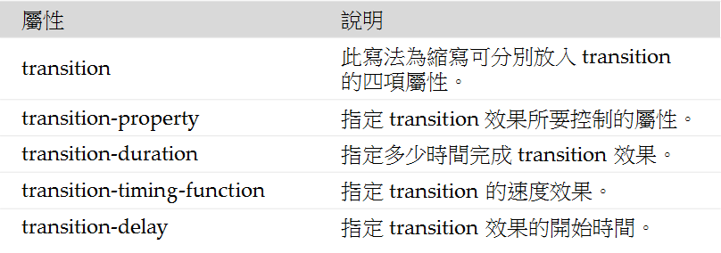
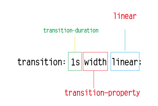
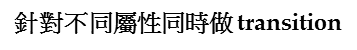
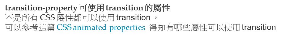
transition-property: width, background-color;
transition-duration: 1s, 2s;
div:hover {
	transition: 1s;
}
.box {
display: table;
width: 100px;
height: 100px;
border: 3px solid black;
color: white;
text-align: center;
background: blue;
}.box:hover {
background: red;
transition: 3s;
} DEMO
.box3:hover{
			width:200px;
			height: 200px;
			background-color:black;
			transition: 1s width,2s background-color;
		}
圖片淡入效果
<style type="text/css">
		#cat img {
		  position:absolute;
		  left:0;
		  -webkit-transition: opacity 1s ease-in-out;
		  -moz-transition: opacity 1s ease-in-out;
		  -o-transition: opacity 1s ease-in-out;
		  transition: opacity 1s ease-in-out;
		}

		#cat img.top:hover {
		  opacity:0;
		}
</style>
<div id="cat">
          <img class="bottom" src="cat1.jpg" />
          <img class="top" src="cat2.jpg" />
 </div>
DEMO
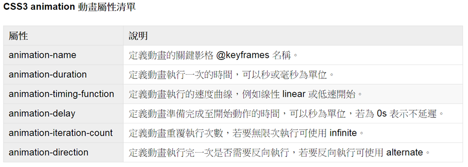
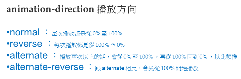
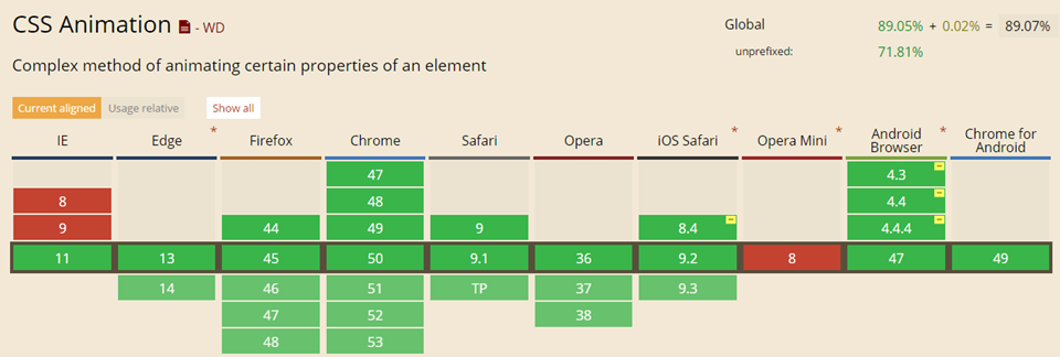
CSS3 animation 動畫屬性
Text
Text
Text
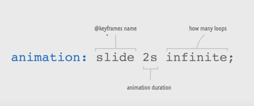
div:hover {
	-webkit-animation: 1s name;
        animation: 1s name;
}
@-webkit-keyframes name { ... }
@keyframes name { ... } 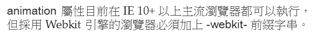
Text
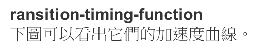
#div1 {animation-timing-function: linear;}div {
width: 100px;
height: 30px;
margin-bottom: 10px;
position: relative;
background: red;
-webkit-animation: mymove 5s infinite; /* Chrome, Safari, Opera */
animation: mymove 5s infinite;
}@-webkit-keyframes mymove {
from {left: 0px;}
to {left: 300px;}
}
@keyframes mymove {
from {left: 0px;}
to {left: 300px;}
}html
#div1 {animation-timing-function: linear;}
#div2 {animation-timing-function: ease;}
#div3 {animation-timing-function: ease-in;}
#div4 {animation-timing-function: ease-out;}
#div5 {animation-timing-function: ease-in-out;}
css
Text
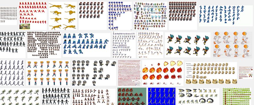
Sprite Sheets

.dog{
		background: url(http://dev.mayujoy.com/teach/dog2.png);
		background-size: cover;
		background-repeat: no-repeat;
		width: 120px;
		height: 120px;
		animation:0.6s dog running infinite;
		animation-timing-function: steps(1);
		animation-timing-function: steps(6);
}
@keyframes dog{
100%{
background-position:-720px 0;
}
}css

CSS3旋轉效果
div { transform: rotate(θ);
      transform-origin: x y;
}

.spin{
			width:300px;
			height: 300px;
			background-image: url(wind.png);
			background-size: cover;
			background-repeat: no-repeat;
			animation:spin 5s infinite linear;
			-webkit-animation:spin 5s infinite linear;
			-moz-animation:spin 5s infinite linear;
			animation:spin 5s infinite linear;
}
@keyframes spin{
0% {transform:rotate(0deg);}
100% {transform:rotate(360deg);}
}DEMO
deck
By jackai


