&
Less?
LESS is a CSS preprocessor: enables the developer to write CSS in a new and enhanced language that, once compiled with js or php, will be readable by web browsers as standard CSS
Less is more
LESS has a simple language, saves time in development and maintenance through the use of:
- Variables
- Nested Classes
- Mixins
Variables
@titles: #FA7900;
@sub-titles: #FA7900;
@text: #000;
h4 {
	color: @titles;
}

h3 {
	color: @sub-titles;
}

p {
	color: @text;
}
variables.less
type.less
h4 {
	color: #FA7900;
}

h3 {
	color: #FA7900;
}

p {
	color: 000;
}
compiled
Nested Classes
.rank {
    height: 57px;
    line-height: 57px;
    color:@text;
    text-align:center;
    font-size:1.4em;
    font-weight: bold;
	@media (min-width: @screen-sm-min) {
            line-height: 85px;
	    background-size: 67px 52px;
	}

	.img-avatar {
	    width: 109px;
	    margin-left: -26px;
	}

}
leaderboard.less
.rank {
    height: 57px;
    line-height: 57px;
    color:#000;
    text-align:center;
    font-size:1.4em;
    font-weight: bold;
}
@media (min-width: 768px) {
    .rank {
        line-height: 85px;
        background-size: 67px 52px;
      }
}
.rank .img-avatar {
    width: 109px;
    margin-left: -26px;
}
compiled
Mixins
Classes with parameters
.my-transition-transform (@duration; @timing; @delay) {
      -webkit-transition: -webkit-transform @duration @timing @delay;
      -moz-transition: -moz-transform @duration @timing @delay;
      -o-transition: -o-transform @duration @timing @delay;
      transition: transform @duration @timing @delay;
}
my-mixins.less
.sb-slidebar {
	.my-transition-transform (200ms; ease; 0s);
}
home.less
menu.less
.menu {
   .my-transition-transform (500ms; linear; 5s);
   color:@text-color;
   text-align:center;
}
Mixins
Classes with parameters
//home
.sb-slidebar {
    -webkit-transition: -webkit- transform 200ms ease 0s;
    -moz-transition: -moz- transform 200ms ease 0s;
    -o-transition: -o- transform 200ms ease 0s;
    transition: transform 200ms ease 0s;
}
//menu
.menu {
    -webkit-transition: -webkit- transform 500ms linear 5s;
    -moz-transition: -moz- transform 500ms linear 5s;
    -o-transition: -o- transform 500ms linear 5s;
    transition: transform 500ms linear 5s;
   color:#000;
   text-align:center;
}
compiled
Mixins
Classes with function and guards
.button (@size) when (@size < 100px) {
 padding: 3px;
 font-size: 0.7em;
 width: @size;
}
.button (@size) when (@size >= 100px) {
  padding: 10px;
  font-size: 1.0em;
  font-weight: 700;
  background-color: red;
  width: @size;
}
my-mixins.less
account.less
.account {
     button {
      .button(50px);
      background:@bg-button-account;
      text-align:center;
     }
}
home.less
.home {
     button {
      .button(150px);
      line-height:150px;
     }
}
Mixins
Classes with function and guards
//account
.account button {
  padding: 3px;
  font-size: 0.7em;
  width: 50px;
  background:#ff0;
  text-align:center;
}
//home
.home button {
    padding: 10px;
    font-size: 1.0em;
    font-weight: 700;
    background-color: red;
    width: 150px;
    line-height:150px;
}
http://lesscss.org/features/
compiled
Bootstrap?
Bootstrap is the most popular HTML, CSS, and JS framework for developing responsive, mobile first projects on the web.
And now...
Less + Bootstrap
- Mobile First
- Grid system
- Components (e.g. font Awesome)
Mobile first
/* Extra small devices (phones, less than 768px) */
/* No media query since this is the default in Bootstrap */

/* Small devices (tablets, 768px and up) */
@media (min-width: @screen-sm-min) { ... }

/* Medium devices (desktops, 992px and up) */
@media (min-width: @screen-md-min) { ... }

/* Large devices (large desktops, 1200px and up) */
@media (min-width: @screen-lg-min) { ... }
Version 3 has been designed to be compatible with mobile devices
Grid system
Fluid grid system that appropriately scales up to 12 columns as the device or viewport size increases
<div class="container”>
	<div class="col-sm-6 col-md-4" ></div>
	<div class="col-sm-6 col-md-4" ></div>
	<div class="col-sm-6 col-md-4" ></div>
	<div class="col-sm-6 col-md-4" ></div>
</div>
col-md-4
col-sm-6
Font icon
http://getbootstrap.com
http://startbootstrap.com/bootstrap-resources/
<span class="fa fa-heart"></span>
<span class="fa fa-bolt"></span>
<span class="fa fa-flash"></span>
<span class="fa fa-star"></span>
<span class="fa fa-user"></span>
<span class="fa fa-bar-chart"></span>
<span class="fa fa-clock-o"></span>
<span class="fa fa-bars"></span>
<span class="fa fa-trophy"></span>
- Scalability
- Color customization
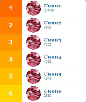
Case study

Leaderboard-a
//LEADERBOARD
.loop-lists (@n; @class-list; @bg-color) {
	.generate-li(@n);
	.generate-li(@n, @i: 1) when (@i =< @n) {
	  li.@{class-list}-@{i} > div:first-child {
	  	background-color: extract(@bg-color, @i);
	  }

	  .generate-li(@n, (@i + 1));
	}
}
my-mixins.less
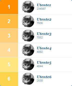
Leaderboard-a
.loop-lists (6; userposition; @bg-list;);

//compiled
li.userposition-1 > div:first-child {
  background-color: #ff8e01;
}
li.userposition-2 > div:first-child {
  background-color: #ffbc41;
}
li.userposition-3 > div:first-child {
  background-color: #ffcf7a;
}
li.userposition-4 > div:first-child {
  background-color: #ffdb97;
}
li.userposition-5 > div:first-child {
  background-color: #ffe681;
}
li.userposition-6 > div:first-child {
  background-color: #fbd34d;
}
leaderboard.less
css.less
@bg-list:#FF8E01, #FFBC41, #FFCF7A, #FFDB97, #FFE681, #FBD34D;Leaderboard-b
//LEADERBOARD-b
.loop-lists-b (@n; @class-list; @bg-color) {
	.generate-li(@n);
	.generate-li(@n, @i: 1) when (@i =< @n) {
	  li.@{class-list}-@{i} > div:first-child when (@i =< 1) {
	  	background-color: (@c-base-leaderboard);
	  }

	  li.@{class-list}-@{i} > div:first-child when (@i > 1) {
	  background-color:  spin(lighten(@c-base-leaderboard, @i * 25% / @n ), 10);
	  }

	  .generate-li(@n, (@i + 1));
	}

}
my-mixins.less
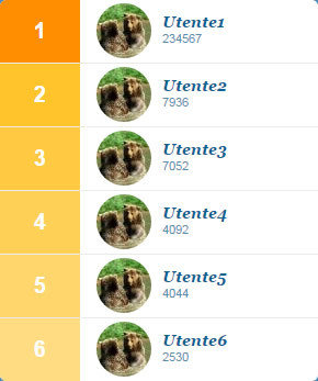
Leaderboard-b
@c-base-leaderboard:#FF8E01;css.less
leaderboard-b.less
.loop-lists-b (6; userposition; @c-base-leaderboard;);
//compiled
li.userposition-1 > div:first-child {
  background-color: #ff8e01;
}
li.userposition-2 > div:first-child {
  background-color: #ffc42c;
}
li.userposition-3 > div:first-child {
  background-color: #ffca41;
}
li.userposition-4 > div:first-child {
  background-color: #ffd056;
}
li.userposition-5 > div:first-child {
  background-color: #ffd66b;
}
li.userposition-6 > div:first-child {
  background-color: #ffdc81;
}
Leaderboard-c
//LEADERBOARD-c
.loop-lists-c (@n; @class-list; @bg-color; @bg-color2) {
    .generate-li(@n);
	.generate-li(@n, @i: 1) when (@i =< @n) {
	  li.@{class-list}-@{i} > div:first-child {
	  background-color: spin(mix(@bg-color, @bg-color2, @i * 50% / @n), 20);
	  }

	  .generate-li(@n, (@i + 1));
	}
}
my-mixins.less
Leaderboard-c
@c-base-leaderboard-c1:#FFFF00;
@c-base-leaderboard-c2:#FF0000;
css.less
leaderboard-c.less
.loop-lists-c (6; userposition; @c-base-leaderboard-c1; @c-base-leaderboard-c2);
//compiled
li.userposition-1 > div:first-child {
  background-color: #ff8e01;
}
li.userposition-2 > div:first-child {
  background-color: #ffc42c;
}
li.userposition-3 > div:first-child {
  background-color: #ffca41;
}
li.userposition-4 > div:first-child {
  background-color: #ffd056;
}
li.userposition-5 > div:first-child {
  background-color: #ffd66b;
}
li.userposition-6 > div:first-child {
  background-color: #ffdc81;
}
Loader
//ANIMATION SPINNER
.keyframes (@name, @fromRules, @toRules) {
    @-webkit-keyframes ~'@{name}' { 0% { @fromRules(); } 100% { @toRules(); } }
	    @keyframes ~'@{name}' { 0% { @fromRules(); } 100% { @toRules(); } }
}
my-mixins.less

Loader
@bg-spinner1:#0C6396;
@bg-spinner2:#fff;
css.less
spinner.less
.keyframes(fadeG, {
	background-color:@bg-spinner1;
},
{
	background-color:@bg-spinner2;
});

//compiled
@-webkit-keyframes fadeG {
  0% {
    background-color: #0c6396;
  }
  100% {
    background-color: #ffffff;
  }
}
@keyframes fadeG {
  0% {
    background-color: #0c6396;
  }
  100% {
    background-color: #ffffff;
  }
}
Take away
- Easy to learn and use
- Powerful for development
- Easy to maintain
Why Less:
Why Bootstrap:
- Good sinergy with less
- Customizability
- Compatibility
Jenny Cipolli - jenny.cipolli@buongiorno.com
https://github.com/jennycip/lessismore
Twitter - @jennycip
Join our team!

Visit
http://www.buongiorno.com/work-with-us
Less e Bootstrap usi e costumi
By jenny cipolli
