How I develop Frontend
Theming
CSS Framework
CSS in JS ?
Although there are a lot of props in CSS in JS
I don't want to introduce
But since there are two major cons
More bundle size + Runtime css
For my opinion, I will choose


.b {

}

.a {
  .b {
  }
}
const b = css``;

const classes = {
  a: css`
   .${b} {

   }
  `
};

export default classes;
const A = styled.div`
`;
const B = styled.div`
.${A} {
}
`;CSS Modules
/* some.css */
.green {
  color: green;
}

/* some.js */
import classes from './some.css';

<div className={classes.green}>
  ...
</div>


classes === {
  // develop, format: [name]__[local]--[hash:base64:5]
  green: 'some__green--b8bW2',
  // production
  green: '_23_aKvs-b8bW2Vg3fwHozO'
}
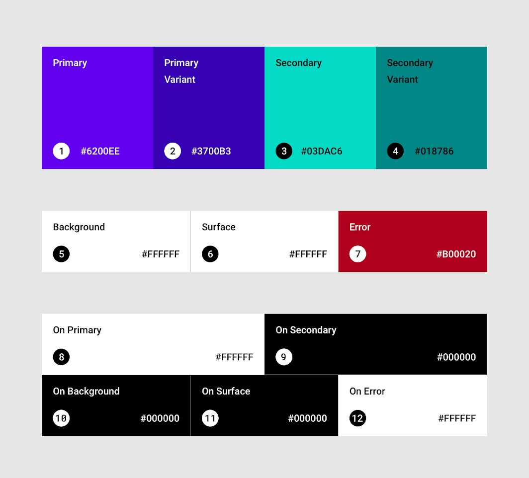
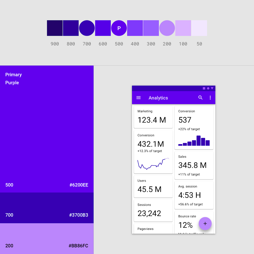
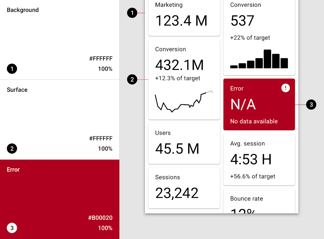
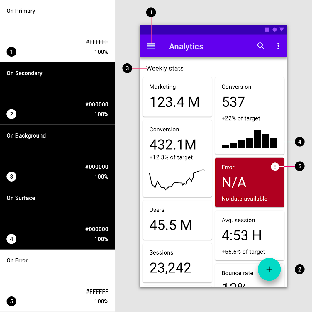
Palette
Take(X) Copy(O)
Material Design
as reference
Material Design
Material Design
Material Design
Material Design
Material Design
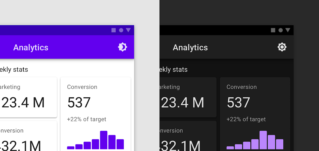
Friendly to dark mode
/* _palette.scss */
@use 'sass:map';

$variables: (
  primary: #b52023
  ...
);

@mixin get($name) {
  map.get($variables, $name);
}

/* some.scss */
@use 'palette';

.some {
  palette.get(primary);
}
:root {
  --primary: #b52023
  ...
}


.some {
  color: var(--primary);
}
Typography
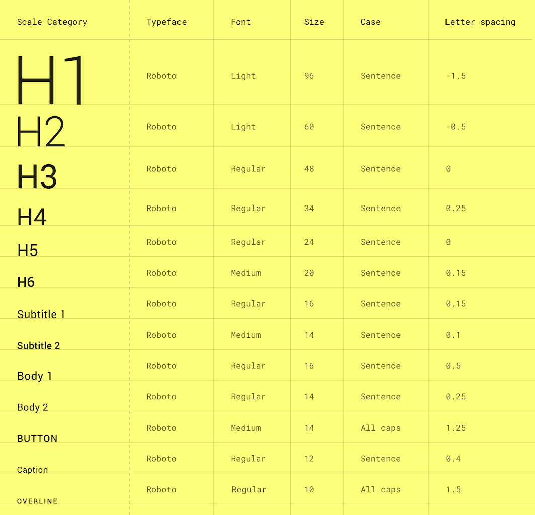
Material Design
$variables: (
  h1: (
    font-size: 24px,
    letter-spacing: 1.2px,
    line-height: 32px
  ),
  h2: (
    font-size: 20px,
    letter-spacing: 1px,
    line-height: 28px
  ),
  h3: (
    font-size: 18px,
    letter-spacing: 0.8px,
    line-height: 24px
  ),
  h4: (
    font-size: 15px,
    letter-spacing: 0.6px,
    line-height: 20px
  ),
  body1: (
    font-size: 14px,
    letter-spacing: 0.6px,
    line-height: 20px
  ),
  body2: (
    font-size: 13px,
    letter-spacing: 0.6px,
    line-height: 18px
  ),
  body3: (
    font-size: 12px,
    letter-spacing: 1px,
    line-height: 16px
  ),
  button: (
    font-size: 15px,
    letter-spacing: 0.8px,
    line-height: 20px
  )
);
<Typography variant="h1" component="h2" gutterBottom>
h1. Heading
</Typography>
<Typography variant="subtitle1" gutterBottom>
subtitle1. Lorem ipsum dolor sit amet, consectetur adipisicing elit. Quos blanditiis tenetur
</Typography>
<Typography variant="body1" gutterBottom>
body1. Lorem ipsum dolor sit amet, consectetur adipisicing elit. Quos blanditiis tenetur
unde suscipit, quam beatae rerum inventore consectetur, neque doloribus, cupiditate numquam
dignissimos laborum fugiat deleniti? Eum quasi quidem quibusdam.
</Typography>
align, ellipsis, no-wrap, ...etc.
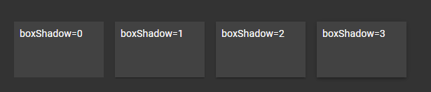
Shadows(box-shadow)
Spacing(padding, margin)
positions(z-index)
breakpoints
...etc.
/* _z-index.scss */
@use 'sass:list';
@use 'sass:map';
$orderes: (modal, popover, feedback-box);
$base: 100;
@function get($name) {
@return list.index($orderes, $name) + $base;
}
/* some.scss */
@use 'z-index';
.some {
z-index: z-index.get(modal); // 101
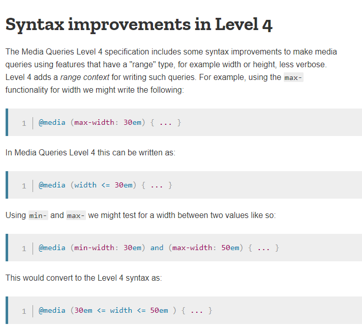
}/* _breakpoints.scss */
$tablet-width: 768px;
$desktop-width: 1024px;
@mixin tablet {
@media (min-width: #{$tablet-width}) and (max-width: #{$desktop-width - 1px}) {
@content;
}
}
@mixin desktop {
@media (min-width: #{$desktop-width}) {
@content;
}
}
/* some.scss */
@use 'breakpoints';
.some {
padding: 20px;
@include breakpoints.tablet {
padding: 30px;
}
@include breakpoints.desktop {
padding: 40px;
}
}
Share theme in js/css
const ThemeContext = createContext();

export function useTheme() {
  return useContext(ThemeContext);
}

function ThemeProvider({ children, container = document.body, theme }) {
  useEffect(() => {
    for(const key in theme) {
      container.style.setProperty(`--${key}`, theme[key]);
    }

    return () => {
      for(const key in theme) {
        container.style.removeProperty(`--${key}`);
      }
    };
  }, [container, theme]);

  return (
    <ThemeContext.Provider value={theme}>
      {children}
    </ThemeContext.Provider>
  );
}

export default ThemeProvider;
/* main.tsx */
const theme = {
  primary: 'red'
};

<ThemeProvider theme={theme}>
</ThemeProvider>

/* some.scss */
.some {
  color: var(--primary);
}

/* some.tsx */
const { primary } = useTheme();
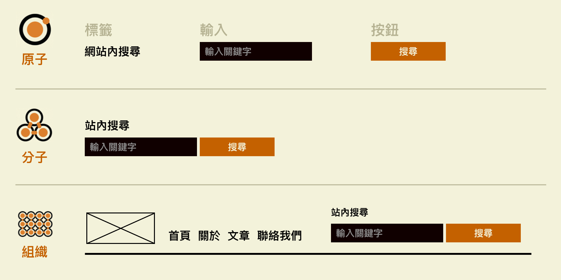
Atomic Design
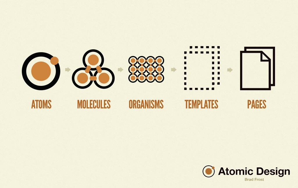
- Atoms 原子:為網頁構成的基本元素,HTML的tags,例如標籤、輸入,或是一個按鈕,也可以為抽象的概念,例如字體、色調等。
- Molecules 分子:由元素構成的簡單UI物件
- Organisms 組織:相對分子而言,較為複雜的構成物,由原子及分子所組成。
- Templates 模板:以頁面為基礎的架構,將以上元素進行排版
- Pages 頁面:將實際內容(圖片、文章等)套件在特定模板
MVC/MVP/MVVM ???
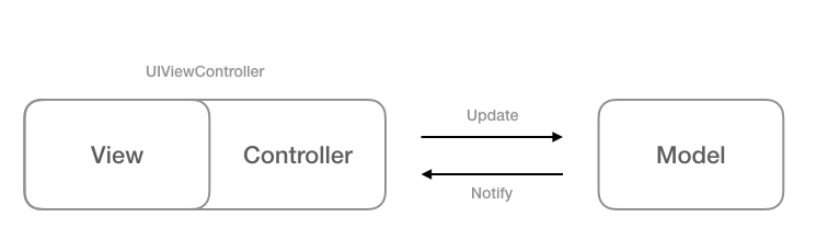
w/o conception of component/container
view is a config file, like .html, .xml
Massive Controller
event binding
animation
view show/hide
form
fetch data
...etc
Once upon a time...
component
In react, view + view controller
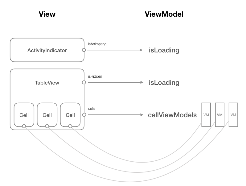
Massive
Service A
Service D
Service C
Service B
Services in react are just hooks.
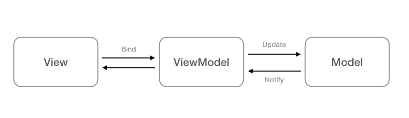
Model
View
Presenter
Controller
ViewModel
apollo/redux/rxjs
routes/components
Query, Mutation(apollo)/connect(redux)/components w/ useSelector, useDispatch, useQuery, useMutation, ...etc.
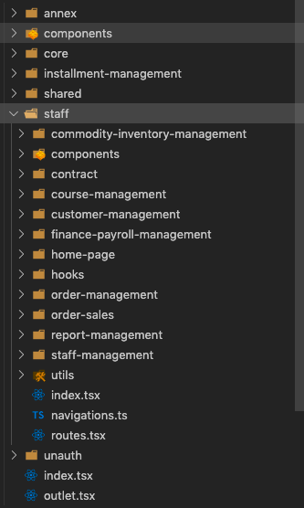
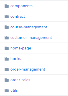
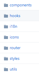
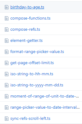
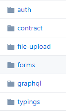
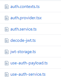
File & Module Structure
Type vs Feature
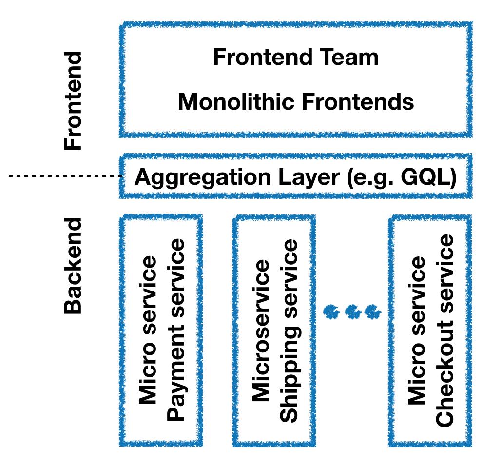
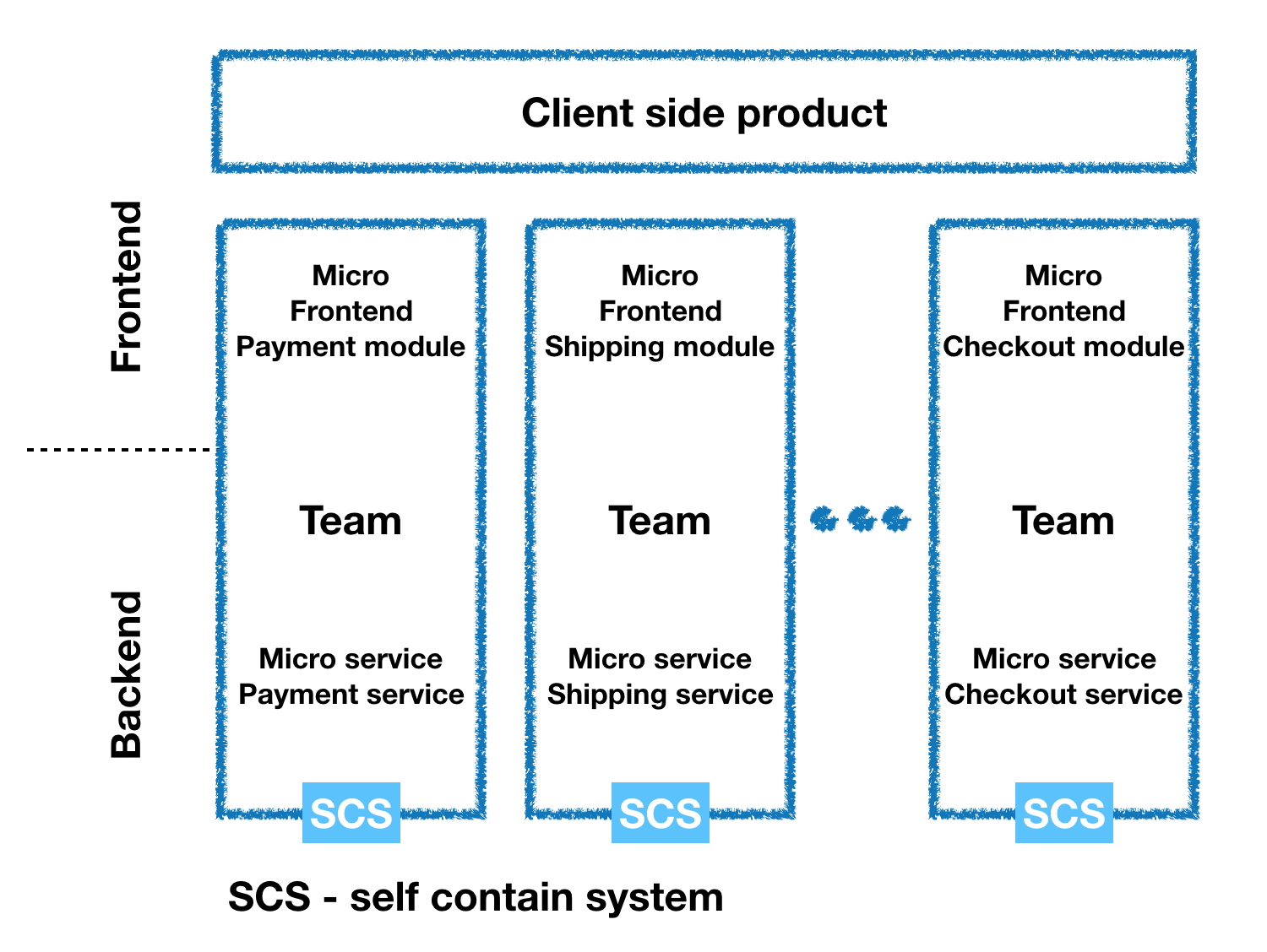
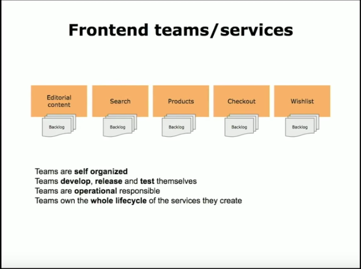
Micro Frontends
Domain
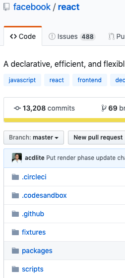
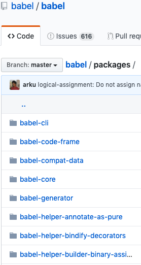
Monorepo
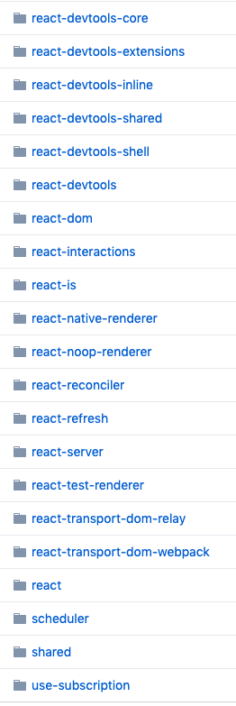
Where is src ?
submodules
shared and reusable views,
view models, logics, ...etc.
Overview of Module
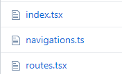
root, routes, ...etc.
- a
  - components
    - b
  - a1
    ...
  - a2
    ...
    - components
      - c
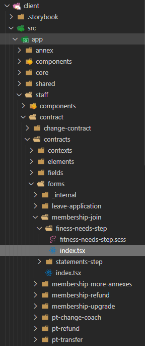
Module Hierarchy
Component b in module a can be injected, imported, used
by its submodules(a1, a2).
You can see it like a context.
But component c in module a2 can not be used in module a1
- a
  - a1
    ...
  - a2
    ...
    - components
      - b
Add a feature or other
- a
  - a1
    ...
  - a2
    ...
    - components
      - b
      - c
- a
  - components
    - c
  - a1
    ...
  - a2
    ...
    - components
      - b
If other modules in module a also need component c, just lift up.
Just add it to the nearest module first.
Specific Modules
Shared(global and commonly without business logics)
Specific Modules
Core (like shared but with logic)
Props
Directory path is like an address.
If it's a local thing.
No need to add additional prefix on naming.
Module as namespace

Cons
Directory level growing speed as fast as possible : )


But it's not a problem if written in Typescript
Benchmark
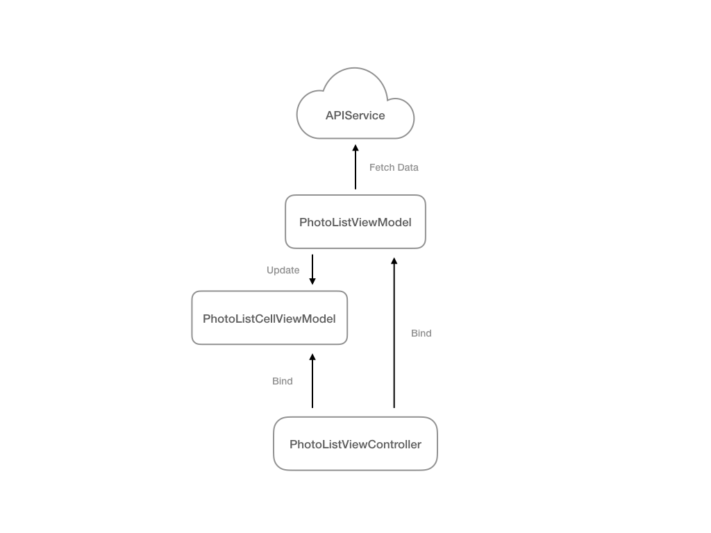
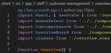
Divide view&view model
Just like component vs container
If there is an ui package
87% components are view models
AnnexSelect Select
View(UI)
View Model
View(composed)
View Controller
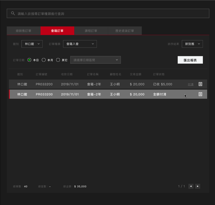
OrderSalesDetailsTabs Tabs
OrderTypeSearch AutoComplete InputSearch
OrderTypeSelect Select
SortOrderSelect Select
ExportMembershipOrderSalesReport Button
Pagination
MembershipOrderInfos Typography
MembershipOrderTable Table Icon
OrderDateInterval DatePresetsRadioGroup Radio RadioGroup DatePicker
OrderSalesDetails
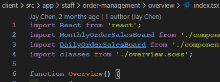
Or use angular style
[name].[type].[ext]
Style on view model
components(views) are idiots
/* view-model.scss */
.search {
  .margin-bottom: 40px;
}


/* view-model.tsx */
import classes from './view-model.scss';

<OrderTypeSearch className={classes.search} />
Q & A
How I develop Frontend
By jjaayy


