James Sherry
Web Development Tutor and Co-Founder of { The Jump } Digital School
Session 3
<!-- Simple table with header -->
<table>
  <tr>
    <th>First name</th>
    <th>Last name</th>
  </tr>
  <tr>
    <td>John</td>
    <td>Doe</td>
  </tr>
  <tr>
    <td>Jane</td>
    <td>Doe</td>
  </tr>
</table>
<!-- Simple table -->
<table>
<caption>People</caption>
<tr>
<td>John</td>
<td>Doe</td>
</tr>
<tr>
<td>Jane</td>
<td>Doe</td>
</tr>
</table><!-- Table with thead,
tfoot, and tbody -->
<table>
<thead>
<tr>
<th>Header content 1</th>
<th>Header content 2</th>
</tr>
</thead>
<tbody>
<tr>
<td>Body content 1</td>
<td>Body content 2</td>
</tr>
</tbody>
<tfoot>
<tr>
<td>Footer content 1</td>
<td>Footer content 2</td>
</tr>
</tfoot>
</table>What the heading applies to.
Can be set to:
<table>
  <colgroup>
    <col style="background-color: #0f0">
    <col span="2">
  </colgroup>
  <tr>
    <th scope="col">Product</th>
    <th scope="col">Width</th>
    <th scope="col">Height</th>
  </tr>
  <tr>
    <th scope="row">mini</th>
    <td>200</td>
    <td>100</td>
  </tr>
  <tr>
    <th scope="row">maxi</th>
    <td>500</td>
    <td>300</td>
  </tr>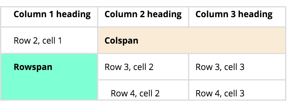
</table>colspan and rowspan allow you to bridge gaps
<table>
    <tr>
        <th>Column 1 heading</th>
        <th>Column 2 heading</th>
        <th>Column 3 heading</th>
    </tr>
    <tr>
        <td>Row 2, cell 1</td>
        <td colspan="2">Row 2, cell 2, also
            spanning Row 2, cell 3</td>
    </tr>
    <tr>
        <td rowspan="2">Row 3, cell 1, also
            spanning Row 4, cell 1</td>
        <td>Row 3, cell 2</td>
        <td>Row 3, cell 3</td>
    </tr>
    <tr>
        <td>Row 4, cell 2</td>
        <td>Row 4, cell 3</td>
    </tr>
</table> <form method="GET">
<label for="firstName">First Name</label>
<input type="text" name="firstname" id="firstName" placeholder="First name">
<button type="submit">Submit</button>
</form>Form attributes of note:
Attributes:
<!-- standard text box -->
<input type="text">

<!-- password input -->
<input type="password">

<!-- number input -->
<input type="number">

<!-- email input -->
<input type="email">

<!-- tel input -->
<input type="tel">
For large blocks of free-form text, like messages or address input
'rows' and 'cols' determine how much text is visible before scrolling.
Text between tags becomes text in the box (no value attribute)
For placeholder to work tag ends must be touching
<textarea name="textarea" rows="10" cols="50">
Write something here
</textarea><label for="first_name">First Name</label>
<input type="text" id="first_name" name="first_name"
placeholder="What is your first name?">
<!-- or -->
<label for="first_name">
First Name
<input type="text" id="first_name" name="first_name"
placeholder="What is your first name?">
</label>These are there for 'OR' choices, like 'adult/child'.
They will only work if the 'name' attribute is set to the same thing.
The 'value' attribute is what is sent.
'checked' attribute selects it by default.
<input type="radio" name="status"
    value="adult" id="adult">

<input type="radio" name="status"
value="child" id="child">These are there for 'AND' choices, like sports.
Again, the 'name' attribute should be set to the same thing.
Again, the 'value' attribute is what is sent.
'checked' attribute selects it by default.
<input type="checkbox" name="sport"
    value="badminton" id="badminton">

<input type="checkbox" name="sport"
    value="sailing" id="sailing"
checked="checked">

<input type="checkbox" name="sport"
    value="football" id="football">

<input type="checkbox" name="sport"
value="rugby" id="rugby"><select name="title">
<option value="0">Mr.</option>
<option value="1">Mrs.</option>
<option value="2">Dr</option>
<option value="3">Prof.</option>
</select>
<select name="hobbies" multiple>
<option value="squash">Squash</option>
<option value="climbing">Climbing</option>
<option value="chess">Chess</option>
<option value="dogging">Dogging</option>
</select>
<label for="dino-select">Choose a dinosaur:</label>
<select id="dino-select">
<optgroup label="Theropods">
<option>Tyrannosaurus</option>
<option>Velociraptor</option>
<option>Deinonychus</option>
</optgroup>
<optgroup label="Sauropods">
<option>Diplodocus</option>
<option>Saltasaurus</option>
<option>Apatosaurus</option>
</optgroup>
</select><!-- old ways -->
<input type="submit" value="save!">
<input type="reset" value="Reset!">
<input type="button" value="open menu">
<!-- new ways -->
<button type="submit">Sign up!</button>
<button>Show menu</button>
<button type="reset">Reset</button>
<form>

    <fieldset>
        <legend>Name</legend>
        <label for="first_name">First Name</label>
        <input type="text" id="first_name"
            name="first_name">

        <label for="last_name">Last Name</label>
        <input type="text" id="last_name"
            name="last_name">
    </fieldset>

    <fieldset>
        <legend>Gender</legend>
        <label for="male">Male</label>
        <input type="radio" id="male"
            name="gender" value="male">

        <label for="female">Female</label>
        <input type="radio" id="female"
            name="gender" value="female">

        <label for="other">Other</label>
        <input type="radio" id="other"
            name="gender" value="other">
    </fieldset>

    <button type="submit">Submit</button>

</form>Must have:
Use <form method="POST" action="https://form-reader.netlify.app/.netlify/functions/formReader"> as the form tag
<label for="course-level">Dive Course Level</label>
<input list="course-level-options" id="course-level" name="course-level">

<datalist id="course-level-options">
    <option>Discover Diving</option>
    <option>Open Water Diver</option>
    <option>Sports Diver</option>
    <option>Rescue Diver</option>
    <option>Dive Master</option>
</datalist>
Text
Painlessly add form handling with 1 word! (docs)
By James Sherry
HTML5 tags, forms & tables


