Chainable BEM Modifiers
Jordan Lewis
@jordanlewiz

Senior Frontend Dev
Co-organiser
BEM syntax 101
block__element--modifier
block__element--modifier
Modifiers are used in 2 different ways
Single class
&
Multiple classes
Single class
(aka @extend)
<button class="btn--primary">Multiple classes
(aka chaining)
<button class="btn btn--green btn--large">Finding a better solution
What if told you
'single' and 'multiple' classes
are complete different things?

Single class
=
variation
Multiple classes
=
chainable modifiers
Introducing....
BEVM
block__element--variation -modifier
block__element--variation -modifier
block__element--variation -modifier
block__element--variation -modifier
block__element--variation -modifier
Variation
Single class approach
Variation
A different or distinct form or version of something
Oxford Dictionary
Variation
Same syntax as old
BEM modifiers
<button class="btn--primary">Variation Rules
- Can only apply one 'variation' at a time
- Can use Sass @extends to build
- Can write a custom variation (no @extends)
- Can combine with Chainable Modifiers*
Chainable Modifiers
Mutliple class approach
A ... thing that makes partial
or minor changes to something
Oxford Dictionary
Modifier
<button class="btn -color-primary -size-large">Chainable modifiers provide us with the ability to configure a module in the HTML with a short, concise syntax.
Leading hyphen
New syntax
-color-primary
Namespace
Descriptor for the modification
-color-primary
Golden rule:
Chainable modifiers should never modify the same CSS property twice for a given module
Rules
- See 'Golden rule'
- Use a namespace which describe the change
- e.g. size, color, position etc
- Use generic descriptors
- e.g. large, primary etc
Recap
How we got here?
// Multiple Classes
<button class="btn btn--green btn--large">
// Single Classes
<button class="btn--primary">// Chainable Modifer
<button class="btn -color-primary -size-large">But won't that make things hard to find?
nope
Benefits of BEVM
- Build a super flexible UI Library
- Configure modules in the HTML
- Short, concise syntax
- Reducing the amount of CSS that we need to write
- Increases development speed
- Can still use 'variations' if you want
- Works with 'helper' and 'state' classes
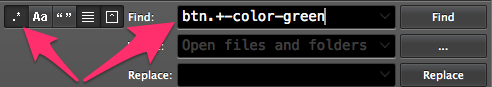
- Greppable
Thank you
Resources
- "Chainable Bem Modifiers"
http://webuild.envato.com/blog/chainable-bem-modifiers
- Sassier (BE)Modifers
http://viget.com/extend/bem-sass-modifiers
- "BEM modifiers: multiple classes vs @extend"
http://bensmithett.com/bem-modifiers-multiple-classes-vs-extend
.btn{
  font-size: 20px;
  background-color: grey;

  &.-size-large{
    font-size: 30px;
    padding: 10px;
  }

  &.-color-primary{
    background-color: green;
  }
}
.btn{
font-size: 20px;
background-color: grey;
}
.btn.-color-primary{
background-color: green;
}
.btn.-size-large{
font-size: 30px;
padding: 10px;
}SCSS
CSS (generated)
Chainable Modifiers
.t-body
  +font-smoothing
  color: $grey-a-bit-dark
  font-family: $helvetica
  font-size: 16px
  font-weight: 400
  line-height: 1.5
  margin-bottom: 1em

  a
    +typography-link

  // Size
  // ------------------------------------------------
  &.-size-xl
    font-size: 20px

  &.-size-l
    font-size: 18px

  // default size (16px)

  &.-size-m
    font-size: 14px

  &.-size-s
    font-size: 12px

  // Color
  // ------------------------------------------------
  &.-color-light
    color: $white

  &.-color-inherit
    color: inherit

  // Style
  // ------------------------------------------------
  &.-style-italic
    font-style: italic

  // Weight
  // ------------------------------------------------
  &.-weight-bold
    font-weight: 700
Chainable Modifiers full example (.sass)
.btn{
  font-size: 20px;
  background-color: grey;
}

.btn--primary{
  @extend .btn;
  background-color: green;
  font-size: 30px;
  padding: 10px;
}
.btn, .btn--primary{
font-size: 20px;
background-color: grey;
}
.btn--primary{
background-color: green;
font-size: 30px;
padding: 10px;
}SCSS
CSS (generated)
Original BEM Modifier (single class approach)
.btn{
  font-size: 20px;
  background-color: grey;
}

.btn--green{
  background-color: green;
}

.btn--large{
  font-size: 30px;
  padding: 10px;
}
SCSS == CSS (generated)
Original BEM Modifier (multiple class approach)
Chainable BEM Modifiers
By Jordan Lewis
Chainable BEM Modifiers
BEVM and in particular 'chainable modifiers' are an extension to a popular CSS syntax (BEM) and provide us with the ability to quickly and concisely configure a module in HTML. webuild.envato.com/blog/chainable-bem-modifiers/


