styled-components
-
What they are
-
How they work
-
Common usage patterns
-
Best practices
-
CSS at Megaphone
an intro to
styled-components: a css in js library
It removes the mapping between components and styles. This means that when you're defining your styles, you're actually creating a normal React component, that has your styles attached to it.
-
Automatic critical CSS
-
No class name bugs
-
Easier deletion of CSS
-
Simple dynamic styling
-
Visibility and easier maintenance
-
Automatic vendor prefixing
styled-components: an example
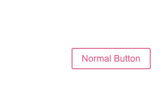
import styled from 'styled-components'

const Button = styled.button`
  background: transparent;
  border-radius: 3px;
  border: 2px solid palevioletred;
  color: palevioletred;
  margin: 0 1em;
  padding: 0.25em 1em;
`

const App = () => {
  return (
      <Button>Normal Button</Button>
  );
}
-
import the `styled` factory
-
declare a s-c by using the method that corresponds to the DOM element you want to render
-
invoke using tagged template literals and add your CSS
-
render like a normal React component
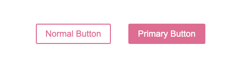
styled-components: adding props
const Button = styled.button`
  background: transparent;
  border-radius: 3px;
  border: 2px solid palevioletred;
  color: palevioletred;
  margin: 0 1em;
  padding: 0.25em 1em;

  ${props =>
    props.primary &&
    `background: palevioletred;
     color: white;`
    }
`

const App = () => {
  return (
    <>
      <Button>Normal Button</Button>
      <Button primary>Primary Button</Button>
    </>
  );
}-
create an interpolation with an inline function that expects props
-
return additional css based on props (within backticks)
-
pass the prop to the s-c just like a normal react component
behind the scenes: lifecycle
3. Create a React Component and invokes the template
1. Create a counter & unique ID for the component

4. Inject classnames into stylesheet
// Arguments received by the .button`` call
([
  'background: transparent;border-radius: 3px; border: 2px solid palevioletred;...',
  (props) => props.primary && `background: palevioletred; color: white;`
]) => ...


// className for component based on parsed styles and id
const className = hash(componentId, styles)
5. Render the correct jsx tag (button) with the classname
Tagged templates allow you to parse template literals with a function.
behind the scenes: tagged templates
// tagged template literals
// these are both function invocations!
styled.button``

styled.button()
// template literals
let a = 5;
let b = 10;
console.log(`Fifteen is ${a + b}`);
// "Fifteen is 15.You're probably familiar with template literals...
const Button = styled('button')([
  'background: transparent;border-radius: 3px; border: 2px solid palevioletred;...',
  (props) => props.primary && `background: palevioletred; color: white;`
]);
Our previous example rewritten to use normal function syntax...
[
  'background: transparent;border-radius: 3px; border: 2px solid palevioletred;...',
  (props) => props.primary && `background: palevioletred; color: white;`
]
When the .button method is called using tagged template literals, it's arguments look like...
usage patterns: extending components
// A new component based on Button,
// but with some override styles
const TomatoButton = styled(Button)`
  color: tomato;
  border-color: tomato;
`;


const App = () => {
  return (
    <>
      <TomatoButton>Tomato Button</TomatoButton>
    </>
  );
}-
to make a new component that inherits the styling of another, wrap it in the `styled()` constructor
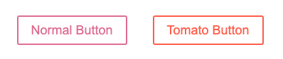
-
this works with 3rd party components too! as long as the classname prop is passed down
import { Button } from "spotify-internal/encore-web"

const StyledEncoreButton = styled(Button)`
  color: purple;
  border-color: purple;
`;
usage patterns: extending components
const App = () => {
  return (
    <>
      <TomatoButton as="a" href="#">Link with Tomato Button styles</TomatoButton>
    </>
  );
}-
another powerful tool is the `as` prop. it allows you to inherit all the styles of the original component but with a different DOM element
-
a common example for this use case is a navigation bar, where there are a mix of anchor links and buttons but they should be styled identically.
-
it works on custom components too!
import { NavLink } from 'react-router-dom'

const App = () => {
  return (
    <>
      <TomatoButton as={NavLink} to="/">Tomato Button as NavLink</TomatoButton>
    </>
  );
}
usage patterns: attaching attributes
-
To avoid unnecessary wrappers that just pass on some props to the rendered component, or element, you can use the `.attrs` constructor. It allows you to attach additional props (or "attributes") to a component.
const TextInput = styled.input.attrs(props => ({
  // we can define static props
  type: "text",

  // or we can define dynamic ones
  size: props.size || "1em",
}))`
  color: palevioletred;
  font-size: 1em;
  border: 2px solid palevioletred;
  border-radius: 3px;

  /* here we use the dynamically computed prop */
  margin: ${props => props.size};
  padding: ${props => props.size};
`;
// Resulting DOM element looks like:
<input type="text" class="sc-dkPtRN kdxeKE">-
It only passes down valid html attributes to the final rendered DOM element
usage patterns: component selector pattern
-
You can reference other styled-components as selectors
const Link = styled.a`
  display: flex;
  align-items: center;
  padding: 5px 10px;
  background: papayawhip;
  color: palevioletred;
`;

const Icon = styled(SomeIcon)`
  flex: none;
  transition: fill 0.25s;
  width: 48px;
  height: 48px;

  ${Link}:hover & {
    fill: rebeccapurple;
  }
`;


<Link href="#">
  <Icon viewBox="0 0 20 20" />
   Hovering my parent changes my style!
</Link>-
Because of that unique className that is assigned to each styled-component, it can easily inject that into the styles at render time and you don't have to worry about collisions
-
This behaviour is only supported within the context of styled-components (won't work with regular React components)
usage patterns: theming and global styles
import {
  ThemeProvider,
  createGlobalStyle } from 'styled-components'


const lightTheme = {
  color: black;
  background: white;
};

const GlobalStyle = createGlobalStyle`
  * {
    box-sizing: border-box;
  }
  body {
    color: ${props => props.theme.color};
    background: ${props => props.theme.background};
  }
`

const App = () => {
  return (
    <ThemeProvider theme={lightTheme}>
      <GlobalStyle />
      <Main />
    </ThemeProvider>
  );
}
- `createGlobalStyle` allows you to add generate a special StyledComponent that handles global styles. CSS resets or base stylesheets can be applied.
- Place it at the top of your React tree and the global styles will be injected when the component is rendered. Should only be used once in an app
- It also has access to the theme just like any other s-c
- ThemeProvider Injects the theme into all styled components anywhere beneath it in the component tree, via the context API.
best practices: component architecture
Use the single responsibility principle
The single responsibility principle is a computer programming principle that states that every module or class should have responsibility over a single part of the functionality provided by the software, and that responsibility should be entirely encapsulated by the class. All its services should be narrowly aligned with that responsibility.
Identify the discrete UI states the component needs to satisfy
Consider Reusability
1. Very specific use case?
2. App specific use cases?
3. Completely generic and reusable? (Can be used in any context)
Try to keep props state-oriented. Avoid adding props that shadow CSS properties.
best practices: state-oriented props
const Button = styled.button`
  background: ${props => props.background};
  border-radius: ${props => props.borderRadius};
  border: 2px solid ${props => props.color};
  color: ${props => props.color};
  margin: ${props => props.margin ? props.margin : "1em"};
  padding: ${props => props.padding ? props.padding : "1em"};
`

const App = () => {
  return (
      <Button
    	background="red"
        color="yellow"
        borderRadius="2px"
        margin="2em"
        padding="2em"
       >
        Button with Props
      </Button>
  );
}
Style declarations should be derived from UI state
const Button = styled.button`
  background: transparent;
  border-radius: 3px;
  border: 2px solid palevioletred;
  color: palevioletred;
  margin: 0 1em;
  padding: 0.25em 1em;

  ${props =>
    props.primary &&
    `background: palevioletred;
     color: white;`
    }
`

const App = () => {
  return (
    <>
    <Button primary>Primary Button</Button>
    </>
  );
}best practices: code style
const Button = styled.button`
  background: transparent;
  border-radius: 3px;
  border: 2px solid palevioletred;
  color: palevioletred;
  margin: 0 1em;
  padding: 0.25em 1em;

  ${props =>
    props.primary &&
    `background: palevioletred;
     color: white;`
    }
`

const App = () => {
  return (
    <>
    <Button primary>Primary Button</Button>
    </>
  );
}const Button = styled.button`
background: transparent;
border-radius: 3px;
border: 2px solid palevioletred;
color: palevioletred;
margin: 0 1em;
padding: ${({ primary, secondary }) =>
primary ? primary : '24px' ? secondary : '32px'};
`;
const App = () => {
return (
<Button secondary>Secondary Button</Button>
);
}Document props with Typescript
best practices: typescript
const Button = styled.button<{ primary: boolean }>`
  background: transparent;
  border-radius: 3px;
  border: 2px solid palevioletred;
  color: palevioletred;
  margin: 0 1em;
  padding: 0.25em 1em;

  ${props =>
    props.primary &&
    `background: palevioletred;
     color: white;`}
`;

const App = () => {
  return (
    <>
     <Button primary>Primary Button</Button>
    </>
  );
}
Define s-c outside of the render method
best practices: rendering
const Button = styled.button`
  background: transparent;
  border-radius: 3px;
  border: 2px solid palevioletred;
  color: palevioletred;
  margin: 0 1em;
  padding: 0.25em 1em;
`

const App = () => {
  return (
    <>
      <Button>Button</Button>
    </>
  );
}const App = () => {
const Button = styled.button`
background: transparent;
border-radius: 3px;
border: 2px solid palevioletred;
color: palevioletred;
margin: 0 1em;
padding: 0.25em 1em;
`;
return (
<>
<Button>Button</Button>
</>
);
}-
babel-plugin-styled-components
- server side rendering
- minification
- adds displayName to class for better debugging
-
jest-styled-components
- snapshot testing
- toHaveStyleRule()
-
vscode-styled-components
- syntax highlighting
-
stylelint-config-styled-components
- linting
best practices: tooling
best practices: tooling
-
css modules
-
always use :local
-
use `composes` to bring in global styles
-
create a sass file for each react component
-
-
Try not to restyle shared components
-
Don't use hardcoded colors/pixel values
-
Encore
-
add wrappers/use them when you can!
-
use styled-components to style them (if absolutely necessary)
-
add css variables to override certain styles
-
-
Read the ADR's
best practices: css at megaphone
Happy styling! 🥳
intro styled-components
By Kaitlin Moreno


