FRONTEND
dla początkujących

Wstęp
O czym będziemy mówić?
HTML 5
JS
CSS 3
div
section
attributes
table

list
http://slides.com/kamillolo/frontend/live
input
controls
podstawy js
typy proste
typy referencyjne
document
canvas
events
jak użyć css
składnia
box model
storage
geolocation
function
podstawa składni
selectors
pseudo class
grid
animation
client-server
fetch
transition
Kamil Lolo

https://klolo.github.io
scrum master
javascript
administrator
devops
programista
javascript
lider techniczny
projektant
Java
kung-fu
cross fit
mors
runmageddon
https://kariera.comarch.pl/oferty-pracy/


Dlaczego warto to znać?

HTML 5
teoria I

Co to jest HTML?
Java script
CSS
HTML


Przykładowy html
<!DOCTYPE html>
<html lang="en">

<head>
    <meta charset="utf-8">
    <title>Hello World</title>
</head>

<body>
    <h1>Lorem ipsum</h1>
</body>

</html>
nagłowek informacja o tym że dokument to html
nagłówek strony
zawartość strony
tag html
Jak jest zbudowany znacznik?
<a href="http://en.wikipedia.org" rel="external" >click me</a>atrybut href
atrybut rel
otwarcie znacznika
wartość atrybutu
zamknięcie znacznika
zawartość
wartość atrubutu
Zagnieżdzanie znaczników
   <article>
        <h1>Lorem ipsum</h1>
        <img src="sonny.jpg" ... />
        <p>... continually <em>amazed</em> ... delicate <a ...>Blue Flax</a> ...</p>
    </article>
zagnieżdzone znaczniki (dzieci dla article)
znacznik rodzic
Komentarze i fomatowanie
<!--
<div>lorem ipsum</div>
-->
<p>Lorem <!-- ipsum --> dorem</p>
<!-- Zle sformatowany kod: -->
<article> <h1>The grün Blue Flax</h1>
<img src="blueflax.jpg" ... /> <p>... continually <em>amazed</em>... ⩵
<a ...>Blue Flax</a> ...</p></article> <article>
<h1>The Ephemeral Blue Flax</h1> <img src="blueflax.jpg" ... />
<p>... continually
<em>amazed</em> ... delicate sd ♂ <a ...>Blue Flax</a> ...</p>
</article> -->
Komentarze w HTML otwiera się porzez "<!--" a zamyka przez "-->".
Formatowanie kodu nie wpływa na wygląd dokumentu, ważne jest jednak
żeby domument był jak najbardziej czytelny.
Entity
znaki które nie występują na klawiaturze bądź mogą zostać zinterpretowane błednie przez przeglądarkę możemy zapisać w formie tzw. HTML entity. Entity ma formę:
&<nazwa entity>;
&#<kod dziesiętny>;
&#x<kod szestnastkowy>;
| Wartość | Opis | Nazwa/Numer |
|---|---|---|
| < | less than | < lub < |
| > | greater than | > lub > |
| & | ampersand | & lub & |
| " | double quotation mark | " lub " |
| non-breaking space | lub   | |
| ♂ | male symbol | ♂ lub ♂ |
Przykłady Entity
https://dev.w3.org/html5/html-author/charref
Kategorie znaczników
https://html.spec.whatwg.org/multipage/dom.html#kinds-of-content

| Grupa | Opis | Znaczniki |
|---|---|---|
| Metadata content | content that sets up the presentation or behavior of the rest of the content, or that sets up the relationship of the document with other documents, or that conveys other "out of band" information. | base, link, meta, noscript, script, style, template, title |
| Flow content | Most elements that are used in the body of documents and applications are categorized as flow content. | a, abbr, address, area (if it is a descendant of a map element), article, aside, audio, b, bdi, bdo... |
| Sectioning content | Sectioning content is content that defines the scope of headings and footers. | article, aside, nav, section |
| Heading content | Heading content defines the header of a section (whether explicitly marked up using sectioning content elements, or implied by the heading content itself). | h1, h2, h3, h4, h5, h6, hgroup |
| Phrasing content | Phrasing content is the text of the document, as well as elements that mark up that text at the intra-paragraph level. Runs of phrasing content form paragraphs. | a, abbr, area (if it is a descendant of a map element), audio |
| Embedded content | Embedded content is content that imports another resource into the document, or content from another vocabulary that is inserted into the document. | audio, canvas, embed, iframe img, MathML math, object... |
| Interactive content | Interactive content is content that is specifically intended for user interaction. | a (if the href attribute is present), audio (if the controls attribute is present), button |
Pełna lista: https://developer.mozilla.org/en-US/docs/Web/HTML/Element
Najważniejsze znaczniki semantyczne*
*Znacznik semantyczny to taki znacznik, którego nazwa opisuje jego zawartość i nie posiada szczególnych atrybutów.
Header
- https://developer.mozilla.org/en-US/docs/Web/HTML/Element/Heading_Elements
- Zestaw 6 znaczników służących do tworzenia nagłówków w dokumencie
- Możliwe wartości od największego do najmniejszego: h1, h2, h3, h4, h5, h6
- Tytuły powinny być poukładane od największego do najmniejszego
<h1>Duzy naglowek</h1>
<h2>Mniejszy nagłówek</h2>
<h3>Jeszcze mniejszy</h3>
<h4>Malutki</h4>
<h5>Tyci</h5>
<h6>Najmniejszy</h6>

<h7>bledny naglowek - normalny text</h7>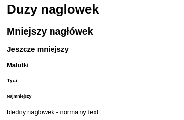
1/6
Article
Artykuł reprezentuje samodzielną część dokumentu lub aplikacji, która potencjalnie mogłaby być opublikowana niezależnie od pozostałej treści na stronie (np. w kanale RSS). Może to być np.: wiadomość wysłana na forum dyskusyjnym, wpis na blogu, komentarz użytkownika pod artykułem,
  <article>
        <h1>Mój pierwszy wpis na blogu</h1>
        <p>Stało się. Postanowiłem założyć własnego bloga.</p>
        <section>
            <h2>Komentarze</h2>
            <article>
                <p>Życzę powodzenia.</p>
            </article>
            <article>
                <p>Nareszcie.</p>
            </article>
        </section>
    </article>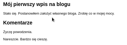
2/6
Section
Sekcja dokumentu lub aplikacji to tematyczna grupa treści, zwykle zawierająca nagłówek. Przykładami sekcji mogą być: rozdziały książki lub pracy badawczej, przełączane zakładki okna dialogowego. Treść sekcji może być dodatkowo podzielona na podsekcje - poprzez umieszczenie w elementach głównych sekcji dodatkowych znaczników section. W takim przypadku mamy do czynienia z podrozdziałami.
    <section>
        <h1>1 Rozdział</h1>
        <section>
            <h1>1.1 Podrozdział</h1>
            <p>Akapit </p>
        </section>

        <section>
            <h1>1.2 Podrozdział</h1>
            <p>Kolejny akapit </p>
        </section>
    </section>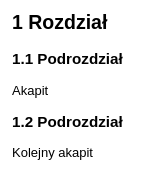
3/6
Aside
Wstawka reprezentuje sekcję na stronie, która jest tylko nieznacznie powiązana tematycznie z treścią elementu, w którym się znajduje. Jednocześnie gdybyśmy usunęli taką sekcję z dokumentu, zarówno sam artykuł jaki i wyrwana z kontekstu sekcja nie utracą sensu ani swojej wewnętrznej kompletności. Typowe przeznaczenie: cytaty umieszczone w treści artykułu w postaci osobno wyróżnionych bloków, bannery reklamowe, grupy linków nawigacyjnych.
   <article>
        <h1>Komputery</h1>
        <p>W dzisiejszych czasach komputery towarzyszą człowiekowi.</p>
        <aside>
            <h1>Laptop</h1>
            <p>Ten przenośny rodzaj komputera</p>
        </aside>
    </article>
4/6
Nav
Reprezentuje sekcję strony, która zawiera odnośniki nawigacyjne do innych stron albo do określonych fragmentów na tej samej stronie. Nie wszystkie linki na stronie powinny być umieszczane w tym znaczniku. Został on przewidziany przede wszystkim do oznaczania nim podstawowej nawigacji witryny.
    <nav>
        <ul>
            <li>
                <a href="#sec1">Rozdział 1</a>
            </li>
            <li>
                <a href="#sec2">Rozdział 2</a>
            </li>
        </ul>
    </nav>
5/6
Footer
Stanowi stopkę dla zawierającego ją elementu sekcji (ARTICLE, ASIDE NAV, SECTION). Stopka przechowuje zwykle informacje na temat sekcji - np.: autor, linki do powiązanych dokumentów, prawa autorskie itp. Stopka może również zawierać w sobie znaczniki sekcji. W takim przypadku stosuje się ją do oznaczania: załączników, skorowidzów (alfabetycznych indeksów haseł), kolofonów (opisów na zakończenie książki), szczegółowych praw autorskich itp.
<article>
	<h1>Mój artykuł</h1>
	<p>To jest mój artykuł...</p>
	<footer>
		Autor: <address>Jan Kowalski (jan.kowalski@example.com)</address>
		<p>wszelkie prawa zastrzeżone</p>
	</footer>
</article>
6/6
Jakich znaczników użylibyście tutaj?
nav
footer
article
section
section
paragraph
paragraph
Wyświetlanie w linii i blokowe
- An inline flow distributes its content in lines (useful if you want to display some text).
- A block flow renders each element on a new line (useful for separating the document in sections, like paragraphs).
- Some CSS doesn't work with inline elements
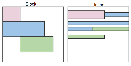
| Block elements | Inline elements |
|---|---|
| <address>, <article>, <aside>, <blockquote>, <canvas>, <dd>, <div>, <dl>, <dt>, <fieldset>, <figcaption> <figure>, <footer>, <form>, <h1>-<h6> <header>, <hr>, <li>, <main>, <nav>, <noscript>, <ol>, <output>, <p>, <pre> <section>, <table>, <tfoot>, <ul>, <video> |
<a>, <abbr>, <acronym>, <b>, <bdo>, <big>, <br>, <button>, <cite>, <code>, <dfn>, <em>, <i>, <img>, <input>, <kbd> <label>, <map>, <object>, <q>, <samp>, <script>, <select>, <small>, <span>, <strong>, <sub>, <sup>, <textarea>, <time>, <tt>, <var> |
Najważniejsze znaczniki formatujące*
* mają za zadanie tylko i wyłącznie zmienić wygląd tekstu, który obejmują, bez żadnego odniesienia do znaczenia tego tekstu.
Akapit
Akapit jest to część tekstu objęta znacznikami: <p>...</p>. Następujące bezpośrednio po sobie akapity są oddzielone przerwą w tekście (pustą linią). Dzięki umieszczaniu w kolejnych akapitach treści nieco różniącej się tematycznie, strona stanie się bardziej estetyczna oraz czytelniejsza
<p align="justify">lorem ipsum</p>przestarzały atrybut(powinno się używać css)
Div
The HTML Content Division element (<div>) is the generic container for flow content. It has no effect on the content or layout until styled using CSS. As a "pure" container, the <div> element does not inherently represent anything
<div>
<p>Any kind of content here. Such as
<p>, <table>. You name it!</p>
</div>Span
The HTML <span> element is a generic inline container for phrasing content, which does not inherently represent anything. It can be used to group elements for styling purposes (using the class or id attributes), or because they share attribute values, such as lang.
<p><span>Some text</span></p>Globalne atrybuty
Most important attributes
Global attributes may be specified on all HTML elements, even those not specified in the standard.
| nazwa | opis |
|---|---|
| class | Is a space-separated list of the classes of the element. Classes allows CSS and JavaScript to select and access specific elements via the class selectors or functions like the method Document.getElementsByClassName(). |
| id | Defines a unique identifier (ID) which must be unique in the whole document. Its purpose is to identify the element when linking (using a fragment identifier), scripting, or styling (with CSS). |
| style | Contains CSS styling declarations to be applied to the element. Note that it is recommended for styles to be defined in a separate file or files. This attribute and the <style> element have mainly the purpose of allowing for quick styling, for example for testing purposes. |
| hidden | Is a Boolean attribute indicates that the element is not yet, or is no longer, relevant. For example, it can be used to hide elements of the page that can't be used until the login process has been completed. The browser won't render such elements. |
| title | Contains a text representing advisory information related to the element it belongs to. Such information can typically, but not necessarily, be presented to the user as a tooltip. |
Other important attributes
Elements in HTML have attributes; these are additional values that configure the elements or adjust their behavior in various ways to meet the criteria the users want.
| nazwa | opis | Atrybuty |
|---|---|---|
| align | Specifies the horizontal alignment of the element. | <applet>, <caption>, <col>, <colgroup>, <hr>, <iframe>, <img>, <table>, <tbody>, <td>, <tfoot> , <th>, <thead>, <tr> |
| alt |
Alternative text in case an image can't be displayed. | <applet>, <area>, <img>, <input> |
| async | Indicates that the script should be executed asynchronously. | <script> |
| autofocus |
The element should be automatically focused after the page loaded. |
<button>, <input>, <keygen>, <select>, <textarea> |
| for |
Describes elements which belongs to this one. | <label>, <output> |
| height |
Specifies the height of elements listed here. For all other elements, use the CSS height property. | <canvas>, <embed>, <iframe>, <img>, <input>, <object>, <video> |
| required | Indicates whether this element is required to fill out or not. | <input>, <select>, <textarea> |
| maxlength/ minlenght |
Defines the maximum number of characters allowed in the element. | <input>, <textarea> |
| name | Name of the element. For example used by the server to identify the fields in form submits. | <button>, <form>, <fieldset>, <iframe>, <input>, <keygen>, <object>, <output>, <select>, <textarea>, <map>, <meta>, <param> |
Other important text tag
| nazwa | opis |
|---|---|
| <strong>, <b> | Pogrubienie tekstu |
| <em>, <i> | Pochylenie tekstu |
| <sub>, <sup> | Index dolny, górny |
| <code> | Element <code>...</code> służy do definiowania użytego kodu. Jest on elementem inline z przypisaną domyślnie czcionką Lucida Console. Alternatywa to: pre i samp |
| <mark> | zakreślenie fragmentu textu |
| </br> | Przejście do nowej lini |
| <s> | przekreślenie |
Ćwiczenie

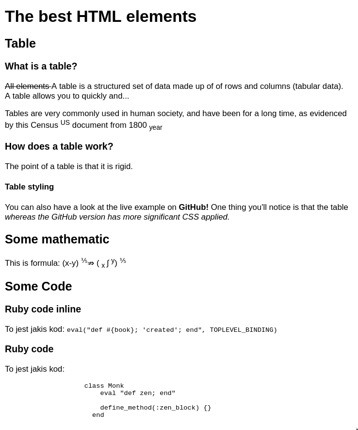
The best HTML elements Table What is a table? All elements A table is a structured set of data made up of of rows and columns (tabular data). A table allows you to quickly and... Tables are very commonly used in human society, and have been for a long time, as evidenced by this Census US document from 1800 year How does a table work? The point of a table is that it is rigid. Table styling You can also have a look at the live example on GitHub! One thing you'll notice is that the table whereas the GitHub version has more significant CSS applied. Some mathematic This is formula: WSTAW_TUTAJ_WZÓR Some Code Ruby code inline To jest jakis kod: eval("def #{book}; 'created'; end", TOPLEVEL_BINDING) Ruby code To jest jakis kod: class Monk eval "def zen; end" define_method(:zen_block) {} end
Utwórz dokument html o podanej treści
Póki co nie korzystamy z span oraz div, br - szukamy odpowiednich znaczników semantycznych
HTML 5
teoria II
Table
Table
A table is a structured set of data made up of of rows and column.
<table>
<colgroup>
<col span="1">
<col span="3" style="background-color:#ffeedd">
</colgroup>
<caption>Opis tabelki</caption>
<tr>
<th> </th>
<th>Knocky</th>
<th>Ella</th>
<th>Juan</th>
</tr>
<tr>
<td headers="df df">Breed</td>
<td rowspan="2" style="background-color: #ddeeff">
Jack Russell
</td>
<td>Streetdog</td>
<td>Cocker Spaniel</td>
</tr>
<tr>
<td>Age</td>
<td>10</td>
<td>5</td>
</tr>
<tr>
<td>Owner</td>
<td>Mother-in-law</td>
<td colspan="2" style="background-color: pink">
collspan td lorem ipsum
</td>
</tr>
<tr>
<td>Eating</td>
<td>Eats</td>
<td>Nibbles</td>
<td>Hearty eater</td>
</tr>
</table>początek tabeli
wiersz
nagłówek
komórka
połączenie kolumn
połączenie wierszy
opis tabelki
grupowanie kolumn
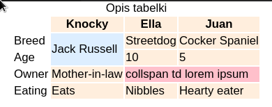
Table as page layout
In the bad old days, people used to create page layouts using HTML tables — using different table cells to contain the header, footer, side bar, main content column, etc. Table layouts are a relic of the past — they made sense back when CSS support was not widespread in browsers, but they create confusion for screenreader users, as well as being bad for many other reasons (abuse of tables, arguably requires more markup, make designs more inflexible). Don't do it!

Lista
| Tag | Description |
|---|---|
| <ul> | Defines an unordered list |
| <ol> |
Defines an ordered list |
| <li> |
Defines a list item |
| <dl> |
Defines a description list |
| <dt> |
Defines a term in a description list |
| <dd> | Describes the term in a description list |
Lista
    <ul>
        <li>Element listy</li>
        <li>Zagnieżdzona lista:
            <ol>
                <li>numerowany 1 item</li>
                <li>numerowany 2 item</li>
                <li type="a">item 2 item</li>
                <li type="I">item 2 item</li>
                <li type="A">item 2 item</li>
            </ol>
        </li>
        <li>Puste kropki:
            <ul style="list-style-type: circle">
                <li>Kwadratowe kropki:
                    <ul style="list-style-type: square">
                        <li>lorem</li>
                        <li>ipsum</li>
                    </ul>
                </li>
                <li>Bez znaczników:
                    <ul style="list-style-type: none">
                        <li>lorem</li>
                        <li>ipsum</li>
                    </ul>
                </li>
            </ul>
        </li>
    </ul>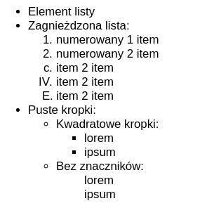
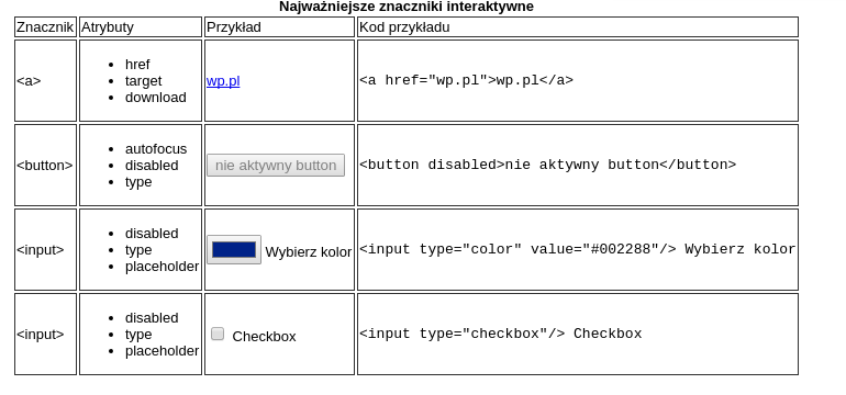
Elementy
interaktywne

A
The HTML <a> element (or anchor element) creates a hyperlink to other web pages, files, locations within the same page, email addresses, or any other URL.
<a href="tel:+491570156">+49 157 0156</a>
<a href="mailto:nowhere@mozilla.org">Send email to nowhere</a>

<a href="https://developer.mozilla.org/en-US/" target="_blank">
  <img src="logo.png" alt="MDN logo" />
</a>| Attribute | Description |
|---|---|
| href | Contains a URL or a URL fragment that the hyperlink points to. A URL fragment is a name preceded by a hash mark (#), which specifies an internal target location (an ID of an HTML element) within the current document. URLs are not restricted to Web (HTTP)-based documents, but can use any protocol supported by the browser. For example, file:, ftp:, and mailto: work in most browsers. |
| download | This attribute instructs browsers to download a URL instead of navigating to it, so the user will be prompted to save it as a local file. |
| target |
Specifies where to display the linked URL. It is a name of, or keyword for, a browsing context: a tab, window, or <iframe>. The following keywords have special meanings: _self: Load the URL into the same browsing context as the current one. This is the default behavior. _blank: Load the URL into a new browsing context. This is usually a tab, but users can configure browsers to use new windows instead. _parent: Load the URL into the parent browsing context of the current one. If there is no parent, this behaves the same way as _self. _top: Load the URL into the top-level browsing context (that is, the "highest" browsing context that is an ancestor of the current one, and has no parent). If there is no parent, this behaves the same way as _self. |
Button
The HTML <button> element represents a clickable button, which can be used in forms, or anywhere in a document that needs simple, standard button functionality. By default, HTML buttons are typically presented in a style similar to that of the host platform the user agent is running on, but you can change the appearance of the button using CSS.
<button name="button">Click me</button>| Attribute | Description |
|---|---|
| autofocus | This Boolean attribute lets you specify that the button should have input focus when the page loads, unless the user overrides it, for example by typing in a different control. |
| disabled | This Boolean attribute indicates that the user cannot interact with the butto |
| name | The name of the button, which is submitted with the form data. |
| type | The type of the button. Possible values are: submit: The button submits the form data to the server. reset: The button resets all the controls to their initial values. button: The button has no default behavior. It can have client-side scripts associated with the element's events, which are triggered when the events occur. |
| value | The initial value of the button. It defines the value associated with the button which is submitted with the form data |
Input
The HTML <input> element is used to create interactive controls for web-based forms in order to accept data from the user.
<input type="text" name="input" value="Type here">| Attribute | Description |
|---|---|
| autocomplete | This attribute indicates whether the value of the control can be automatically completed by the browser.Possible values: on/off |
| value | The initial value of the control. This attribute is optional except when the value of the type attribute is radio or checkbox. |
| checked | When the value of the type attribute is radio or checkbox, the presence of this Boolean attribute indicates that the control is selected by default; otherwise it is ignored. |
| disabled | This Boolean attribute indicates that the form control is not available for interaction. In particular, |
| maxlength/minlength | If the value of the type attribute is text, email, search, password, tel, or url, this attribute specifies the minimum number of characters (in Unicode code points) that the user can enter; for other control types, it is ignored. |
| placeholder | A hint to the user of what can be entered in the control . The placeholder text must not contain carriage returns or line-feeds. |
| readonly | This Boolean attribute indicates that the user cannot modify the value of the control. |
| required |
Input types
button
checkbox
color
date
datetime
file
hidden
image
number
password
radio
range
text
tel
Select
The HTML <select> element represents a control that provides a menu of options
<!-- The second value will be selected initially -->
<select name="text"> <!--Supplement an id here instead of using 'text'-->
  <option value="value1">Value 1</option>
  <option value="value2" selected>Value 2</option>
  <option value="value3">Value 3</option>
</select>| Attribute | Description |
|---|---|
| multiple | This Boolean attribute indicates that multiple options can be selected in the list. If it is not specified, then only one option can be selected at a time. |
Ćwiczenie
Zbuduj tabelkę
Obramowanie zrób poprzez dodanie w sekcji head:
<style>
    td {
        border: 1px solid #333333;
    }
</style>
JavaScript
podstawy
Co to jest?

JavaScript to skryptowy (interpretowany lub kompilowany metodą JIT) język programowania, w którym funkcje "są obywatelami pierwszej kategorii". Chociaż JavaScript jest najbardzej znany jako język skryptowy dla stron internetowych, używa go również wiele środowisk poza przeglądarką, takich jak Node.js,
*funkcje pierwszej kategorii są obiektami, które można przechowywać
w zmiennych jako referencje i przekazywać jak każde inne obiekty.
Typy proste
| typ | opis | przykład |
|---|---|---|
| boolean | wartość logiczna | let x = true; |
| number | liczba całkowita lub zmiennoprzecinkowa | let counter = 25; const PI = 3.14; |
| string | znak lub łańcuch znaków | let x = "1"; let y = '1'; |
| null | typ prosty posiadający tylko jedną wartość | let x = null; |
| undefined | domyślna wartość nie zainicjalizowanych zmiennych | let x; let x = undefined; |
Wartości wszystkich typów prostych mają reprezentacje w postaci literałów. Wrappery na typy proste nie powinny być używane!

Jak sprawdzić czy zmienna
jest typem prostym?

typeof and falsy value
typeof "ble ble" // 'string'
typeof 10        // 'number'
typeof 3.14      // 'number'
typeof true      // 'boolean'
typeof undefined // 'undefined'
typeof null      // 'object'


// falsy value
if (false)
if (null)
if (undefined)
if (0)
if (NaN)
if ('')
if ("")
Porównywanie
zmiennych
let someString = "123"
let num = 123.0

console.log(someString == num);
Always use 3 equals unless you have a good reason to use 2.
Koercja - źródło wszelkiego zła
Typy referencyjne
let user = {
    name: "Henry"
};

user.lastName = "Nowak";

let users = ['Adam', 'Stefan'];

function User(name) {
    const _name = name;

    this.showName = () => console.log(_name);
}

const zenek = new User('Zenek');
zenek.showName();
Function
- Kiedy nie umieścimy instrukcji return funkcja zwraca undefined
- Funkcje jako first citizen
- Funkcja mogą służyć do tworzenia obiektów (ES<6 nie było klas)
- Dowolna liczba parametrów, możemy ich nawet nie definiować
- Fukcje anonimowe vs arrow
- Brak możliwości przeciążania
- Parametry domyślne, rest params
- Można zwrócić dane dowolnego typu
function foo() {
    console.log(this);
}

let f = new foo();
Jak połączyć js z html?
DOM
The W3C Document Object Model (DOM) is a platform and language-neutral interface that allows programs and scripts to dynamically access and update the content, structure, and style of a document."
What is the HTML DOM?
The HTML DOM is a standard object model and programming interface for HTML. It defines:
- The HTML elements as objects
- The properties of all HTML elements
- The methods to access all HTML elements
- The events for all HTML elements
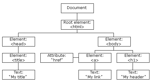
In other words: The HTML DOM is a standard for how to get, change, add, or delete HTML elements.
DOM
- change all the HTML elements in the page
- change all the HTML attributes in the page
- change all the CSS styles in the page
- remove existing HTML elements and attributes
- add new HTML elements and attributes
- react to all existing HTML events in the page
- can create new HTML events in the page
JavaScript can:
Jak połączyć js z html?
<!DOCTYPE html>
<html lang="en">

<head>
    <script src="some-script.js"></script>
    <title>Hello World</title>
</head>

<script>
    function helloWorld() {
        alert('Hello world');
    }
</script>

<body>
    <button onclick="helloWorld()">click me</button>
</body>

</html>
Kod js umieszczamy w tagu script
Funkcje deklarujemy
za pomocą słowa function
Popięcie funkcji js do button
Dołączenie zewnętrznego pliku js
document
Document stanowi w DOM sposób reprezentowania dokumentów HTML oraz jest interfejsem do pracy z dokumentami HTML
-
document.body
-
document.title
-
document.cookie
-
document.height
-
document.firstChild
-
document.createElement
-
document.getElementById
-
document.getElementsByName
-
document.getElementsByTagName
function addElement()
{
  // tworzy nowy element div
  // i daje jego zawartość
  newDiv = document.createElement("div");
  newDiv.innerHTML = "<h1>Hi there and greetings!</h1>";

  // add the newly created element and it's content into the DOM
  my_div = document.getElementById("org_div1");
  document.body.insertBefore(newDiv, my_div);
}
DOM Events
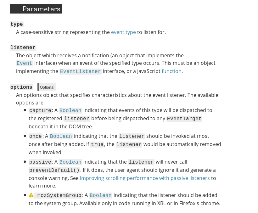
The Web platform provides several ways to get notified of DOM events. Two common styles are: the generalized addEventListener() and a set of specific on-event handlers. This page focuses on the details of how the latter work.
The on-event handlers are a group of properties offered by DOM elements to help manage how that element reacts to events. Elements can be interactive (e.g. links, buttons, images, forms) or non-interactive (e.g. the base document). Events are the actions like being clicked, detecting pressed keys, getting focus, etc. The on-event handler is usually named according to the event it is designed to react to, such as onclick, onkeypress, onfocus, etc.
<script>
    function init() {
        const magicButton = document.getElementById('magicButton');
        magicButton.addEventListener('click', function () {
            alert('Button was clicked');
        });
    }
</script>

<body onLoad="init()">
    <button id="magicButton">click me</button>
</body>
DOM Events
EventTarget.addEventListener()
Ćwiczenie
Gra w HTML + JS
Canvas
Co to jest Canvas?
Added in HTML5, the HTML <canvas> element can be used to draw graphics via scripting in JavaScript. For example, it can be used to draw graphs, make photo compositions, create animations, or even do real-time video processing or rendering.
<canvas id="canvas"></canvas>

...
<script>
const canvas = document.getElementById('canvas');
const ctx = canvas.getContext('2d');

ctx.fillStyle = 'green';
ctx.fillRect(10, 10, 100, 100);
</script>
https://developer.mozilla.org/en-US/docs/Web/API/CanvasRenderingContext2D
HTML+JS
teoria III
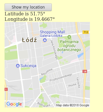
Geolokalizacja
Geolokalizacja
The geolocation API allows the user to provide their location to web applications if they so desire. For privacy reasons, the user is asked for permission to report location information.
<p><button onclick="geoFindMe()">Show my location</button></p>
<div id="out"></div>

function geoFindMe() {
  var output = document.getElementById("out");

  if (!navigator.geolocation){
    output.innerHTML = "<p>Geolocation is not supported by your browser</p>";
    return;
  }

  function success(position) {
    var latitude  = position.coords.latitude;
    var longitude = position.coords.longitude;

    output.innerHTML = '<p>Latitude is ' + latitude + '° <br>Longitude is ' + longitude + '°</p>';

    var img = new Image();
    img.src = "https://maps.googleapis.com/maps/api/staticmap?center=" +
                    latitude + "," + longitude + "&zoom=13&size=300x300&sensor=false";

    output.appendChild(img);
  }

  function error() {
    output.innerHTML = "Unable to retrieve your location";
  }

  output.innerHTML = "<p>Locating…</p>";

  navigator.geolocation.getCurrentPosition(success, error);
}
Storage
Co to jest?
Mechanizm Magazynu DOM w głównej mierze polega na bezpiecznym przechowywaniu par kluczy i wartości możliwych do późniejszego odtworzenia. Celem tego dodatku jest dostarczenie wszechstronnego środka, dzięki któremu mogą być budowane w pełni interaktywne aplikacje (włączając w to zaawansowane cechy, takie jak możliwość pracowania bez dostępu do sieci nawet przez dłuższe okresy czasu).
SessionStorage
LocalStorage
vs.
localStorage.setItem('bgcolor', document.getElementById('bgcolor').value);Do dyspozycji mamy metody:
- key
- getItem
- setItem
- removeItem
- clear
Notification
Praca domowa
- użyj notyfikacji w grze
JS + REST


client


Client-server architecture

server
browser
internet
Wejście na: www.my-app.pl, załadowanie: index.html
Załadowanie www.my-app.pl/app.js
zasób statyczny
na dysku serwera
API request HTTP GET: www.my-app.pl/api/users
serwer
aplikacji
baza danych
JSON response: { users: ['Jan', 'Zosia']}
Jak w JS wywołać usługę REST?
Fetch
The Fetch API provides an interface for fetching resources (including across the network). The fetch() method takes one mandatory argument, the path to the resource you want to fetch. It returns a promise that resolves to the Response to that request, whether it is successful or not. You can also optionally pass in an init options object as the second argument
const userListURL = 'https://randomuser.me/api/?results=10';
fetch(userListURL)
      .then( resp => resp.json())
      .then( data => data.results.forEach(console.log));
Fetch - another example
const data = {
    name: 'Kamil',
    age: 18
};

const headers = {
    'Content-Type': 'application/json'
};

fetch(url, {
      method: 'POST',
      body: JSON.stringify(data),
      headers: new Headers(headers)
  }
)
.then(res => res.json())
.catch(error => console.error('Error:', error))
.then(response => console.log('Success:', response));
https://developer.mozilla.org/en-US/docs/Web/API/Fetch_API/Using_Fetch
Ćwiczenie
- Pobierz użytkowników z:
-
https://randomuser.me/api/?results=10
-
- Wyświetl ich w formie listy po lewej stronie ekranu
- Na liście prezentujemy imię, nazwisko, mail, avatar
- Po kliknięciu w usera z prawej strony powinny się pojawić jego szczegółowe informacje
Praktyczne wywołanie RESTa
CSS 3

Teoria I

Wstęp
The basic goal of the Cascading Stylesheet (CSS) language is to allow a browser engine to paint elements of the page with specific features, like colors, positioning, or decorations.

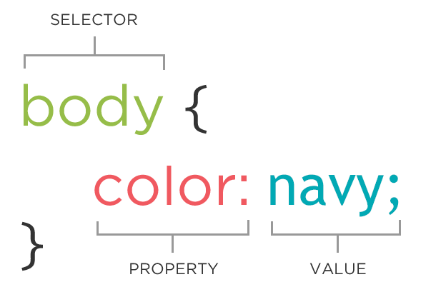
Składnia
The CSS syntax reflects this goal and its basic building blocks are:
The property which is an identifier, that is a human-readable name, that defines which feature is considered.
The value which describe how the feature must be handled by the engine. Each property has a set of valid values, defined by a formal grammar, as well as a semantic meaning, implemented by the browser engine.
http://anything.codes/gdi-intro-html-css/cheatsheets/beginners-class2.html
Dlaczego kaskadowe?
The final style for an element can be specified in many different places, which can interact in complex ways. CSS is an acronym of Cascading Style Sheets, which indicates that the notion of the cascade is important. At its most basic level it indicates that the order of CSS rules matter, but it's more complex than that.
What selectors win out in the cascade depends on three factors (these are listed in order of weight — earlier ones will overrule later ones):
- Importance
- Specificity
- Source order
1. Importance
In CSS, there is a special piece of syntax you can use to make sure that a certain declaration will always win over all others: !important. (We would advise you to never use it unless you absolutely have to. )
2.Specificity
Specificity is basically a measure of how specific a selector is - how many elements it could match
3. Source order
As mentioned above, if multiple competing selectors have the same importance and specificity, the third factor that comes into play to help decide which rule wins is source order — later rules will win over earlier rules.
Source order: inline -> style -> external file
// inline
<p style="color: pink">Lorem ipsum</p>


// style tag
<style>
    p {
        color: pink;
    }
</style>

// external file
<link rel="stylesheet" type="text/css" href="mystyle.css">
Units

| opis | |
|---|---|
| em | Relative to the font-size of the element (2em means 2 times the size of the current font) |
| ex | Relative to the x-height of the current font (rarely used) |
| px | pixels (1px = 1/96th of 1in) |
| % | |
| rem | Relative to font-size of the root element |
| vw | Relative to 1% of the width of the viewport* |
| vh | Relative to 1% of the height of the viewport* |
| vmin | Relative to 1% of viewport's* smaller dimension |
| vmax | Relative to 1% of viewport's* larger dimension |
| ch | Relative to width of the "0" (zero) |
| cm/mm | centimiters, milimiters |
h1 {
  font-size: 20vh;
}

div {
    font-size: 30px;
    border: 1px solid black;
}
Box model

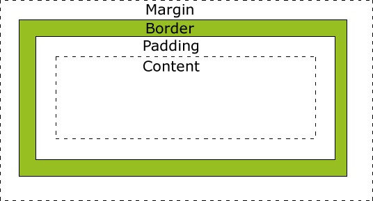
The CSS box model is the foundation of layout on the Web — each element is represented as a rectangular box, with the box's content, padding, border, and margin built up around one another like the layers of an onion.
Overflow
When you set the size of a box with absolute values (e.g. a fixed pixel width/height), the content may not fit within the allowed size, in which case the content overflows the box. To control what happens in such cases, we can use the overflow property. It takes several possible values, but the most common are:
- auto: If there is too much content, the overflowing content is hidden and scroll bars are shown to let the user scroll to see all the content.
- hidden: If there is too much content, the overflowing content is hidden.
- visible: If there is too much content, the overflowing content is shown outside of the box (this is usually the default behavior.)
overflow: visible|hidden|scroll|auto|initial|inherit;
Selectors
Podstawowe selectory
| rule | example | description |
|---|---|---|
| element | p | Selects all <p> elements |
| .class |
.intro |
Selects all elements with class="intro" |
|
#id |
#firstname |
Selects the element with id="firstname" |
|
* |
* | Selects all elements |
Selectory relacyjne
| rule | example | description |
|---|---|---|
| element |
p | Selects all <p> elements |
| element, element | div, p | Selects all <div> elements and all <p> elements |
| element element | div p | Selects all <p> elements inside <div> elements |
| element > element | div > p | Selects all <p> elements where the parent is a <div> element |
| element + element | div + p | Selects all <p> elements that are placed immediately after <div> elements |
| element1 ~ element2 | p ~ ul | Selects every <ul> element that are preceded by a <p> element |
Selektory atrybutów
| rule | example | description |
|---|---|---|
| [attribute] | [target] | Selects all elements with a target attribute |
| [attribute=value] | [target=_blank] | Selects all elements with target="_blank" |
| [attribute~=value] | [title~=flower] | Selects all elements with a title attribute containing the word "flower" |
| [attribute|=value] | [lang|=en] | Selects all elements with a lang attribute value starting with "en" |
| [attribute^=value] | a[href^="https"] | Selects every <a> element whose href attribute value begins with "https" |
| [attribute$=value] | a[href$=".pdf"] |
Selects every <a> element whose href attribute value ends with ".pdf" |
| [attribute*=value] |
a[href*="w3schools"] |
Selects every <a> element whose href attribute value contains the substring "w3schools" |
Selektory pseudoklas*
| rule | example | description |
|---|---|---|
| :active | a:active | Selects the active link (when you click on it) |
| ::after ::before |
p::after { content: " lorem ipsum"; } |
Insert something after the content of each <p> element |
| :checked | input:checked | Selects every checked <input> element |
| :disabled | input:disabled | Selects every disabled <input> element |
| :empty | p:empty | Selects every <p> element that has no children (including text nodes) |
| :enabled | input:enabled | Selects every enabled <input> element |
| :first-child | p:first-child | Selects every <p> element that is the first child of its parent |
| ::first-letter ::first-line |
p::first-letter | Selects the first letter of every <p> element |
| :focus | input:focus | Selects the input element which has focus |
| :not(selector) | :not(p) | Selects every element that is not a <p> element |
| :nth-child(n) :nth-last-child(n) |
p:nth-child(2) | Selects every <p> element that is the second child of its parent |
*A CSS pseudo-class is a keyword preceded by a colon (:) that is added on to the end of selectors to specify that you want to style the selected elements only when they are in certain state.
CSS properties
https://developer.mozilla.org/en-US/docs/Web/CSS/Reference
Common CSS properties
| property | description |
|---|---|
| background-color | The background-color CSS property sets the background color of an element, using either a <color> value or the keyword transparent. |
| border | The border CSS property is a shorthand property for setting all individual border property values at once: border-width, border-style, and border-color. |
| color | The color CSS property sets the foreground color value of an element's text content and text decorations. |
| font | The font CSS property is either a shorthand property for setting font-style, font-variant, font-weight, font-size, line-height, and font-family; or a way to set the element's font to a system font, using specific keywords. |
| margin | The margin CSS property sets the margin area on all four sides of an element. It is a shorthand that sets all individual margins at once: margin-top, margin-right, margin-bottom, and margin-left. |
| padding | The padding CSS property sets the padding area on all four sides of an element. It is a shorthand that sets all individual paddings at once: padding-top, padding-right, padding-bottom, and padding-left. |
| width/height | |
| z-index | The z-index CSS property specifies the z-order of a positioned element and its descendants |
*A CSS pseudo-class is a keyword preceded by a colon (:) that is added on to the end of selectors to specify that you want to style the selected elements only when they are in certain state.
Ćwiczenie


Stwórz szablony strony bazując na grafice:
https://dribbble.com/shots/2544298-Dashboard
CSS 3
Tematy zaawansowane
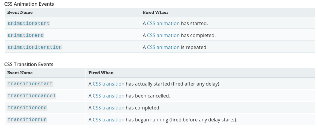
Transform
Transform
The transform CSS property lets you modify the coordinate space of the CSS visual formatting model. Using it, elements can be translated, rotated, scaled, and skewed.
p {
  border: solid red;
  transform: translate(100px) rotate(20deg);
  transform-origin: 0 -250px;
}
Transform functions:
matrix, translate, translateX, translateY, scale, scaleX, scaleY, rotate, skew, skewX, skewY, matrix3d, translate3d, translateZ, scale3d, scaleZ, rotate3d, rotateX, rotateY, rotateZ
transform: transformFunction(params);
Transition
Transition
CSS transitions provide a way to control animation speed when changing CSS properties. Instead of having property changes take effect immediately, you can cause the changes in a property to take place over a period of time. For example, if you change the color of an element from white to black, usually the change is instantaneous. With CSS transitions enabled, changes occur at time intervals that follow an acceleration curve, all of which can be customized.
#delay {
  font-size: 14px;
  transition-property: font-size;
  transition-duration: 4s;
  transition-delay: 2s;
}

#delay:hover {
  font-size: 36px;
}- transition-property
- transition-duration
- transition-timing-function
- transition-delay
div {
  transition-property: opacity, left, top, height;
  transition-duration: 3s, 5s;
}
Transition
| property | description | example |
|---|---|---|
| transition-property | Specifies the name or names of the CSS properties to which transitions should be applied. Only properties listed here are animated during transitions; changes to all other properties occur instantaneously as usual. |
none - No property will get a transition effect all - Default value. All properties will get a transition effect property - Defines a comma separated list of CSS property names the transition effect is for initial - Sets this property to its default value. inherit - Inherits this property from its parent element. |
| transition-duration | Specifies the duration over which transitions should occur. You can specify a single duration that applies to all properties during the transition, or multiple values to allow each property to transition over a different period of time. | |
| transition-timing-function | Specifies a function to define how intermediate values for properties are computed. Timing functions determine how intermediate values of the transition are calculated | linear, ease, ease-in, ease-in-out, ease-out, step-start, step-end, |
| transition-delay | Defines how long to wait between the time a property is changed and the transition actually begins. |


Timing function -examples
linear
ease

ease-in-out
Skrócony zapis:
transition: <property> <duration> <timing-function> <delay>;
// animacja powiekszenia tekstu po najechaniu myszka

#delay {
  font-size: 14px;
  transition-property: font-size;
  transition-duration: 4s;
  transition-delay: 2s;

   // lub:
   // transition: font-size 4s easy 2s;
}

#delay:hover {
  font-size: 36px;
}
Transition - wchich property can be transitioned?
all
backdrop-filter
background
background-color
background-position
background-size
border
border-bottom
border-bottom-color
border-bottom-left-radius
border-bottom-right-radius
border-bottom-width
border-color
border-left
border-left-color
border-left-width
border-radius
border-right
border-right-color
border-right-width
border-top
border-top-color
border-top-left-radius
border-top-right-radius
border-top-width
border-width
bottom
box-shadow
caret-color
clip
clip-path
color
column-count
column-gap
column-rule
column-rule-color
column-rule-width
column-width
columns
filter
flex
flex-basis
flex-grow
flex-shrink
font
font-size
font-size-adjust
font-stretch
font-variation-settings
font-weight
grid-column-gap
grid-gap
grid-row-gap
height
left
letter-spacing
line-height
margin
margin-bottom
margin-left
margin-right
margin-top
mask
mask-border
mask-position
mask-size
max-height
max-width
min-height
min-width
object-position
offset
offset-anchor
offset-distance
offset-path
offset-position
offset-rotate
opacity
order
outline
outline-color
outline-offset
outline-width
padding
padding-bottom
padding-left
padding-right
padding-top
perspective
perspective-origin
right
scroll-snap-coordinate
scroll-snap-destination
shape-image-threshold
shape-margin
shape-outside
tab-size
text-decoration
text-decoration-color
text-emphasis
text-emphasis-color
text-indent
text-shadow
top
transform
transform-origin
vertical-align
visibility
width
word-spacing
z-index
Animation
Animation
The animation property is used to call @keyframes inside a CSS selector. Animation can have multiple properties:
- animation-name: @keyframes name (remember we chose tutsFade).
- animation-duration: the timeframe length, the total duration of the animation from start to the end.
- animation-timing-function: sets the animation speed ( linear | ease | ease-in | ease-out | ease-in-out | cubic-bezier ).
- animation-delay: the delay before our animation will start.
- animation-iteration-count: how many times it will iterate through animation.
- animation-direction: gives you the ability to change the loop direction, from start to end ,or from end to start, or both.
- animation-fill-mode: specifies which styles will be applied to the element when our animation is finished ( none | forwards | backwards | both )
@keyframes
The main component of CSS animations is @keyframes, the CSS rule where animation is created. Think of @keyframes as being stages along a timeline. Inside @keyframes, you can define these stages, each having a different style declaration.
@keyframes identifier {
  0% { top: 0; left: 0; }
  30% { top: 50px; }
  68%, 72% { left: 50px; }
  100% { top: 100px; left: 100%; }
}
/* @keyframes duration | timing-function | delay |
iteration-count | direction | fill-mode | play-state | name */
animation: 3s ease-in 1s 2 reverse both paused slidein;
/* @keyframes duration | timing-function | delay | name */
animation: 3s linear 1s slidein;
/* @keyframes duration | name */
animation: 3s slidein;The animation CSS property is a shorthand property for the various animation properties: animation-name, animation-duration, animation-timing-function, animation-delay, animation-iteration-count, animation-direction, animation-fill-mode, and animation-play-state.
Flexbox
https://css-tricks.com/snippets/css/complete-guide-grid/
Flexbox
The Flexible Box Module, usually referred to as flexbox, was designed as a one-dimensional layout model, and as a method that could offer space distribution between items in an interface and powerful alignment capabilities.


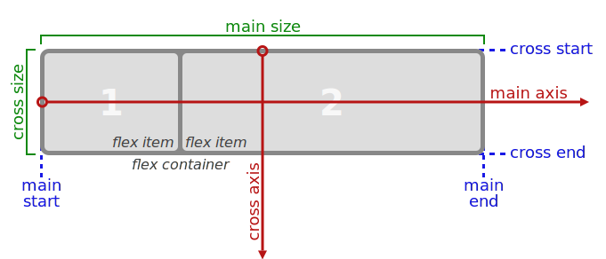
Elementy wewnątrz układu flexbox’owego rozkładają się wzdłuż osi nazwanych main axis i cross axis. Os
flex container i flex items
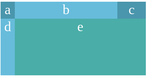
Flexbox w akcji
    <nav class="container">
        <div id="it1"> a </div>
        <div id="it2"> b </div>
        <div id="it3"> c </div>
    </nav>
.container {
display: flex;
}
#it1 {
background-color: #558C89;
}
#it2 {
background-color: #74AFAD;
flex: 1;
}
#it3 {
background-color: #558C89;
}
        .container {
            display: flex;
        }

        #it1 {
            background-color: #558C89;
        }

        #it2 {
            background-color: #74AFAD;
        }

        #it3 {
            margin-left: auto;
            background-color: #558C89;
        }
        .container {
            display: flex;
            justify-content: space-between;
        }

        #it1 {
            background-color: #558C89;
        }

        #it2 {
            background-color: #74AFAD;
        }

        #it3 {
            background-color: #558C89;
        }
       nav>div {
            display: inline-block;
            color: #fefefe;
            font-size: 3em;
            text-align: center;
            flex: 1;
        }

        .container {
            display: flex;
        }
        nav>div {
            display: inline-block;
            color: #fefefe;
            font-size: 3em;
            min-width: 250px;
            text-align: center;
        }

        .container {
            display: flex;
            justify-content: center;
            flex-wrap: wrap;
        }
A Complete Guide to Flexbox
https://css-tricks.com/snippets/css/a-guide-to-flexbox/
Grid
https://css-tricks.com/snippets/css/complete-guide-grid/
CSS Grid Layout is the most powerful layout system available in CSS. It is a 2-dimensional system, meaning it can handle both columns and rows, unlike flexbox which is largely a 1-dimensional system. You work with Grid Layout by applying CSS rules both to a parent element (which becomes the Grid Container) and to that elements children (which become Grid Items).
    <nav class="container">
        <div> a </div>
        <div> b </div>
        <div> c </div>
        <div> d </div>
        <div> e </div>
        <div> f </div>
    </nav>
    <style>
    <style>
        nav div {
            text-align: center;
            color: #fefefe;
            font-size: 3em;
        }

        nav>div:nth-child(even) {
            background-color: #67BCDB;
        }

        nav>div:nth-child(odd) {
            background-color: #4A96AD;
        }

        .container {
            display: grid;
            grid-template-columns: 50px auto 100px;
            grid-template-rows: 60px 20vh;
        }

        #itemE {
            grid-column: 2 / span 2;
            background-color: rgb(74, 173, 168);
        }
    </style>
    </style>
grid-template-rows:
none|auto|max-content|min-content|length|initial|inherit;
grid-template-columns:
none|auto|max-content|min-content|length|initial|inherit;
The grid-column property is a shorthand property for the grid-column-start and the grid-column-end properties.
Position
Position property
| value | description |
|---|---|
| static | HTML elements are positioned static by default. Static positioned elements are not affected by the top, bottom, left, and right properties. |
| relative | An element with position: relative; is positioned relative to its normal position. Setting the top, right, bottom, and left properties of a relatively-positioned element will cause it to be adjusted away from its normal position. Other content will not be adjusted to fit into any gap left by the element. |
| fixed | An element with position: fixed; is positioned relative to the viewport, which means it always stays in the same place even if the page is scrolled. The top, right, bottom, and left properties are used to position the element. |
| absolute | An element with position: absolute; is positioned relative to the nearest positioned ancestor (instead of positioned relative to the viewport, like fixed). However; if an absolute positioned element has no positioned ancestors, it uses the document body, and moves along with page scrolling. |
| sticky | An element with position: sticky; is positioned based on the user's scroll position. A sticky element toggles between relative and fixed, depending on the scroll position. It is positioned relative until a given offset position is met in the viewport - then it "sticks" in place (like position:fixed). |
@Media query
Media queries are useful when you want to apply CSS styles depending on a device's general type (such as print vs. screen), specific characteristics (such as the width of the browser viewport, or environment (such as ambient light conditions). With the huge variety of internet-connected devices available today, media queries are a vital tool for building websites and apps that are robust enough to work on whatever hardware your users have.
@media not|only mediatype and (media feature) {
    CSS-Code;
}- all
- screen
- speech
- height
- light-level
- max-aspect-ratio
- max-device-height
- max-device-width
- max-height
- max-resolution
- max-width
@media (min-width: 30em) and (orientation: landscape) { ... }

@media speech and (aspect-ratio: 11/5) { ... }

<link rel="stylesheet" media="only screen and (color)" href="modern-styles.css" />
Ćwiczenie 5
Koniec

Wykorzystane zasoby:
- https://pl.freepik.com
- http://www.kurshtml.edu.pl/html/section,html5.html
- https://www.flaticon.com
- https://developer.mozilla.org
Icons made by Freepik from www.flaticon.com is licensed by CC 3.0 BY
Wstęp do frontendu
By Kamil Lolo


