Jagat Jeevan Sahoo
UI Developer @ThoughtWorks A tech enthusiast
.container {
    display: flex;
}
A layout module from Css3 to improve alignment, direction and order of the items (dynamic or even unknown size) present in a container.
This slide expects, you should be already familiar with HTML & CSS.
A basic understanding would suffice.
.container {
    display: flex;
}
You can check the browser support from http://caniuse.com/#search=flexbox
.container {
    display: -webkit-box;  /* OLD - iOS 6-, Safari 3.1-6, BB7 */
    display: -ms-flexbox;  /* TWEENER - IE 10 */
    display: -webkit-flex; /* NEW - Safari 6.1+. iOS 7.1+, BB10 */
    display: flex;         /* NEW, Spec - Firefox, Chrome, Opera */
}
In case of old browsers, you might have to add the prefix to work.
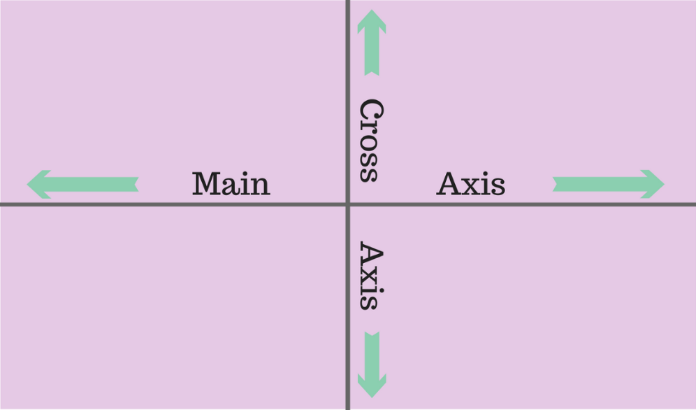
This property is given on the container. This specifies which direction the items should flow. Either from left to right, or top to bottom. You can also specify the reverse way as well.
.container {
    display: flex;
    flex-direction: row | row-reverse | column | column-reverse
}The items would not wrap to the next lines by default. You can do that by giving a "flex-wrap" property. It follows the wrapping of items on the direction specified.
.container {
    display: flex;
    flex-wrap: wrap | no-wrap | wrap-reverse;
}If "flex-direction" is "row", then normal wrap would happen.
If "flex-direction" is "row", and flex-wrap is "wrap-reverse", then the wrapping would be reverse. It seems interesting, check the codepen url mentioned below
Reverse would flip it to the other direction. Like row-reverse would flip along main axis.
column-reverse would flip it along cross axis.
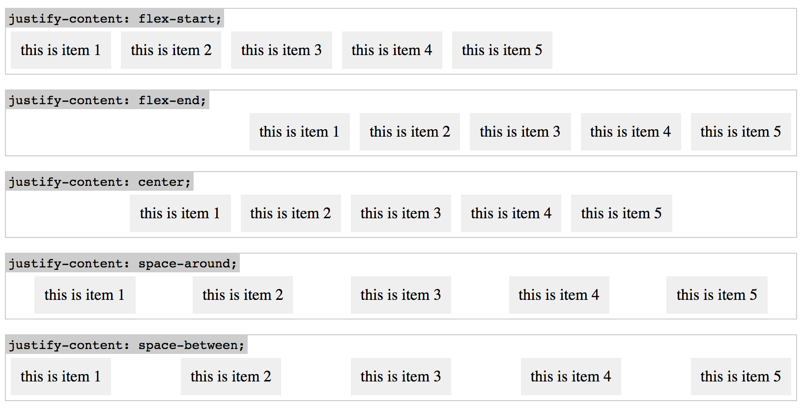
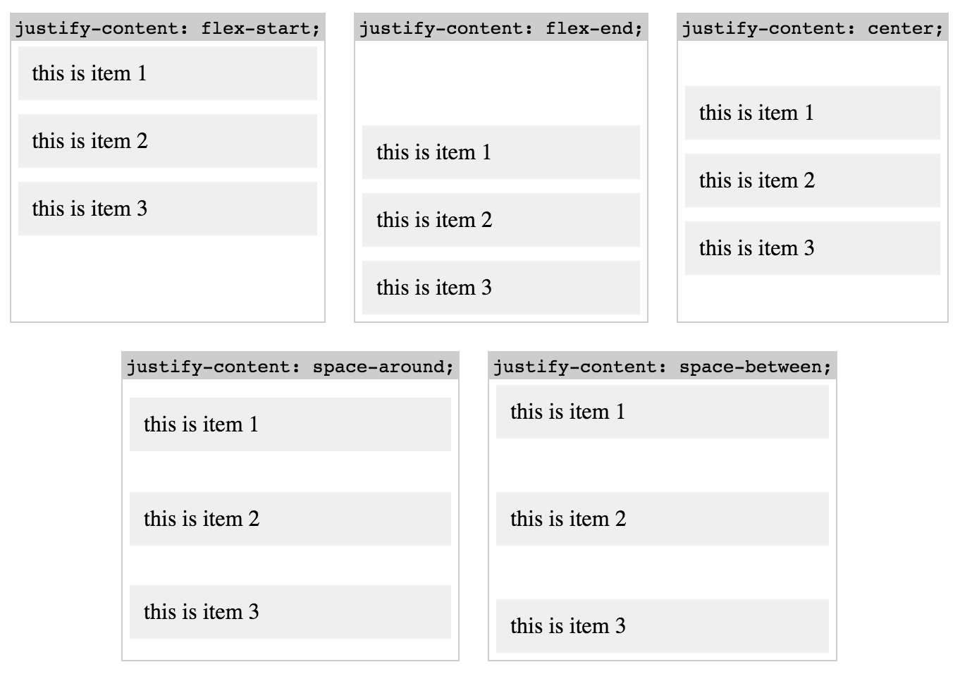
justify-content
For Flex-direction: row,justify-content has the following values:
justify-content
Same holds true for flex-direction: column
Now the main axis is transposed to the cross axis
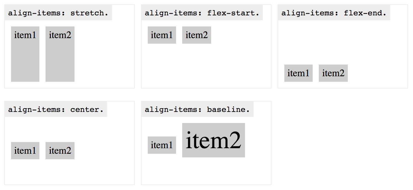
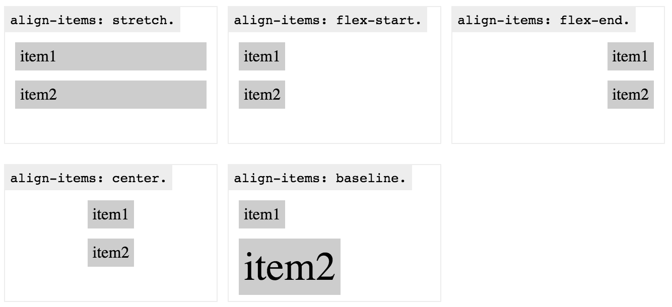
align-items
For Flex-direction: row,align-items has the following values: flex-start / flex-end / center / stretch / baseline.
align-items
Again, making "flex-direction: column", would change the rendering along main-axis
align-self
This overrides the general styles of the container-set-styles. So of the container says all items to be in flex-start and one item overrides it with flex-end with "align-self", only that element would be at the end of the container(same position to the bottom).
flex-basis
Flex-basis = width / height along the axis the content flows.
So if the flex-direction is "row", you can give flex-basis for width and for flex-direction "column", the flex-basis would be height. This can be interesting,
flex-grow
If we want to make any item relatively big or small, we can use flex-grow property.
0: Means items would take the space of their content. This is the default value.
Greater the value more wide it is. One given 2, second given 1 means the first one would be twice as big as the second one.
The below link is very interesting in to play in flexbox. Before clicking the below link do like the tutorial.
Do mention if you want any changes or feedback on the slides.
Thank you.
By Jagat Jeevan Sahoo
Most powerful way of layout-ing of elements without any grid module.


