
Jagat Jeevan Sahoo
UI Developer @ThoughtWorks A tech enthusiast
Web layout the page without using framework and leveraging browser support
Table of contents
Lets recap our web
The first web page went live on August 6, 1991. It was dedicated to information on the World Wide Web project and was made by Tim Berners-Lee
In 1993 we got tables for page layout
Pros: Can be show more information in formatted way.
Cons: Complex table layouts, hard to style
In 1997, Divisions, a.k.a divs was introduced and made the layout more simpler and semantic rich.
Pros: Easy to maintain and style
Cons: Not perfect suit for layout with nested div. Need to switch for CSS libraries like Bootstrap, Foundation and many more.
Lets recap our web
Though CSS flex box supports flexible layouts and provides the flexibility of creating complex layouts, it fails when the need for creating responsive layouts in 2-dimensional space arises. That is where CSS grid layout shines.
In early 2014 flex layout was introduced which is very powerful to do component layout-ing.
Comparison to Bootstrap4
Let's re-arrange things in the above mentioned url and see how easy it is in both.
Concepts
container
<div class="container">
    <div class="item">
        <div class="sub-item"></div>
    </div>
    <div class="item"></div>
</div>
container-items
<div class="container">
    ...
    ...
</div>
grid-line
grid-track
grid-cell
grid-area
Creating the first grid
Lets define the rows and columns of the grid.
.container {
  display: grid;
  grid-template-rows: 40px 40px 80px 80px;
  grid-template-columns: 130px 230px 330px;
}
other values: 33.33% 33.33% 33.33%; 200px auto 200px; repeat(3, 1fr);
Grid is fluid and responsive
We need to set the minimum and maximum value of the width of the column.
.container {
  display: grid;
  grid-template-rows: 40px 40px 80px 80px;
  grid-template-columns: repeat(auto-fit, minmax(200px, 1fr));
}
Positioning the grid elements
Define position where elements should start and end.
.grid-child {
    grid-column-start: 1;
    grid-column-end: 3;
}

.grid-child {
    grid-row-start: 1;
    grid-row-end: 3;
}
Grid template area
Understanding template areas for a quick mock-up.
Without changing the markup you still change the layout. Css grid gives a nice segregation of the markup and the styles.
Aligning of elements inside grid
// Horizontal
.container {
    justify-content: start | end | center | stretch | space-between | space-around;
}

// Vertical
.container {
    align-content: start | end | center | stretch | space-between | space-around;
}
Aligning of grid items inside the grid.
Container alignment
Aligning of elements inside grid
horizontal alignment
// If you want all the items to follow some alignment
.grid {
    justify-items: start | end | center | stretch;
}


// This is for any specific cell.
.item {
    justify-self: start | end | center | stretch;
}
vertical alignment
// If you want all the items to follow some alignment
.grid {
    align-items: start | end | center | stretch;
}


// This is for any specific cell.
.item {
    align-self: start | end | center | stretch;
}
Content alignment
Aligning elements in grid
shortcut: aligning content
// This is for any specific cell.
.item {
    place-self: center stretch;
}
The direction is y-axis and then x-axis.
Create your own grid system
Define the number of grid-columns you need
.container {
    display: grid;
    grid-template-columns: repeat(<no. of cols>, 1fr);
}
Summing up
Lets put all the things that we have just learn together to an example of a mosaic view of the image gallery. Majorly we use some jquery / javascript plugin for making it consume all the view space.
Is browser ready ?
You can check the browser support from https://caniuse.com/#search=css-grid
Thank you
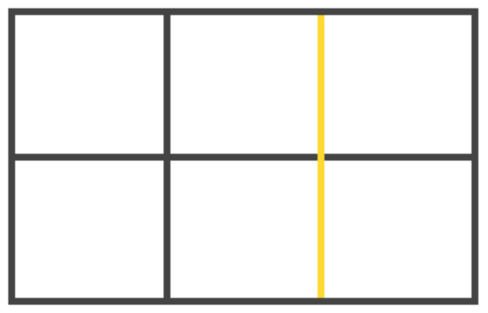
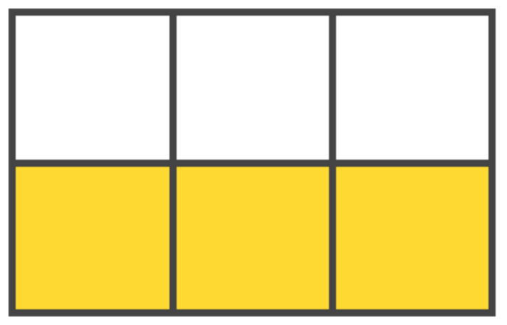
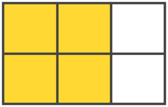
Quiz
By Jagat Jeevan Sahoo
Css Grid Layout: A powerful and modern way to layout the page components leveraging browser support with minimal code. We have been using frameworks like bootstrap, etc to get the layout. This new way of implementing code, we would be making a good isolation of the semantics and style. While flex box being a 1-dimensional, css grid layout is a 2-dimensional layout-ing technique to help us in layout of the page. Other advantages of using the modern techniques are keeping the code clean, segregated and sanity of the markup. Here, we would take a simple comparison with bootstrap and create a image gallery.


