Animating SVG with CSS and JavaScript

SVG ... what?
Scalable Vector Graphics
-
Animating with CSS
- Transition & Transform & Rotate
- Keyframes Animation
- Demo: Alien Ship / Letter Drawing
-
Animating with CSS and Javascript*
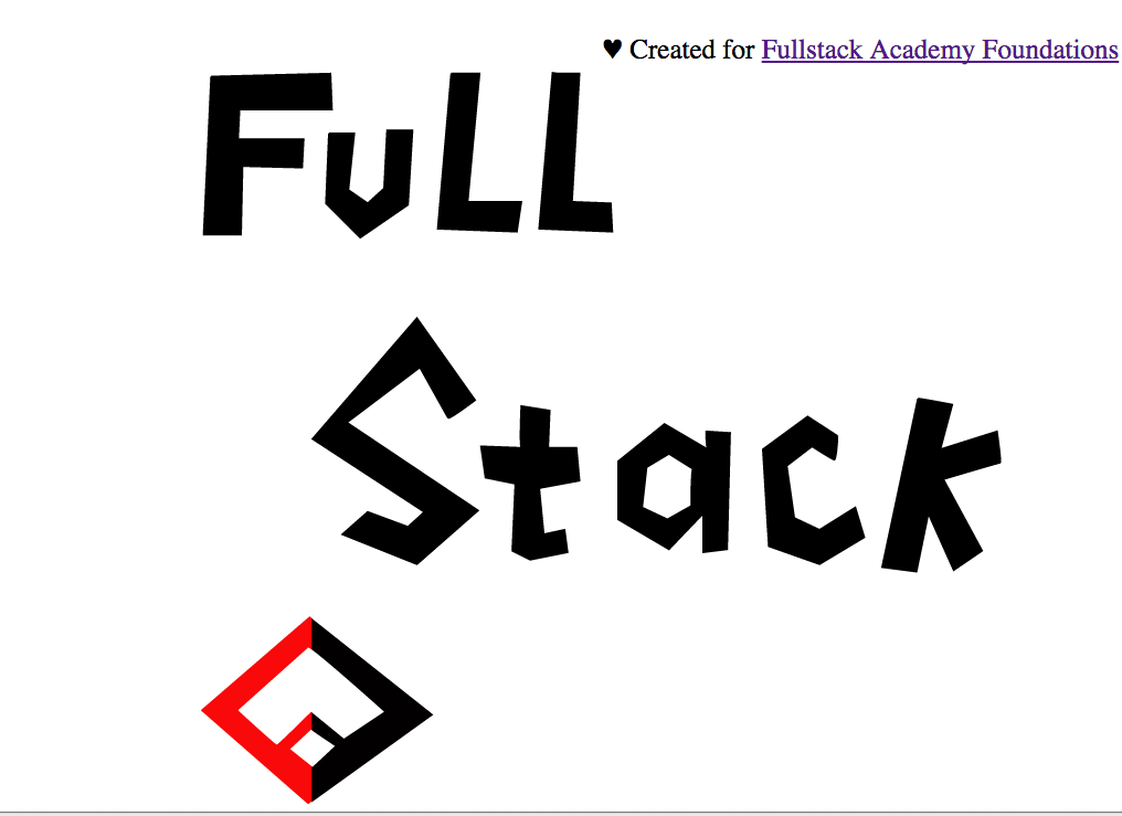
- Demo: Fullstack
Text
* we will not cover details on this
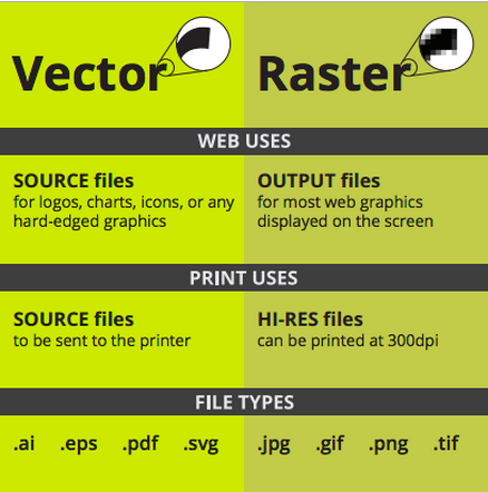
Vector
Made of mathematical calculations that form objects and lines.
Resolution-independent: Can be printed at any size/resolution.
Easily convertible to raster
cons: It is not the best format for photographs or photo-like elements with blends of color.
Raster
Made of pixels
cons: It cannot be scaled up without losing quality.
Depending on the complexity of the image, conversion to vector may be time consuming.
CSS'ing SVGs
<svg xmlns="http://www.w3.org/2000/svg" viewBox="0 -50 400 200">
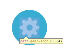
<g class="gear">
<circle class="gear-bg" fill="#39ADD1" cx="200" cy="50" r="90"></circle>
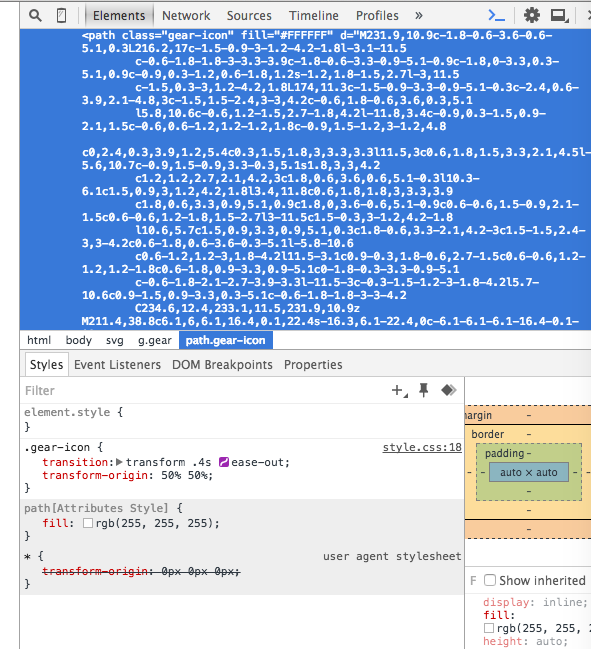
<path class="gear-icon" fill="#FFFFFF" d="M231.9,10.9c-1.8-0.6-3.6-0.6-5.1,0.3L216.2,17c-1.5-0.9-3-1.2-4.2-1.8l-3.1-11.5
6,1.
......... (mathematical calculations....more about this)
2.7-3.9-3.3l-11.5-3c-0.3-1.5-1.2-3-1.8-4.2l5.7-10.6c0.9-1.5,0.9-3.3,0.3-5.1c-0.6-1.8-1.8-3-3-4.2
C234.6,12.4,233.1,11.5,231.9,10.9z M211.4,38.8c6.1,6,6.1,16.4,0.1,22.4s-16.3,6.1-22.4,0c-6.1-6.1-6.1-16.4-0.1-22.4
S205,32.5,211.4,38.8z"></path>
</g>
</svg>
Before CSS: SVG Presentation Attributes
gear.svg
Shared with CSS |
SVG-Only |
|---|---|
|
|
clip-rule, flood-color, flood-opacity, stop-opacity, kerning, tech-anchor, color-profile, color-rendering, fill, fill-opacity, fill-rule, marker, marker-end, marker-mid, marker-start, stroke, stroke-width, stop-color, lighting-color, enable-background, dominant-baseline, color-interpolation-filters, color-interpolation, glyph-orientation-horizontal, glyph-orientation-vertical, shape-rendering, baseline-shift, alignment-baseline, stroke-miterlimit, stroke-linejoin, stroke-linecap, stroke-dashoffset, stroke-dasharray, stroke-opacity |
In SVG2, more presentation attributes will be added.
CSS recipe
Transition: <property> <duration> <time-function> <delay>
Defaults to all
Defaults to ease
Defaults to 0
example:
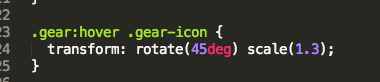
.gear-icon {
transition: transform .4s ease-out;
transform-origin: 50% 50%;
}
Animating SVGs with CSS
Using CSS Transitions
Rotate & Scale
Source: Treehouse
Checkout time functions in Dev tool !
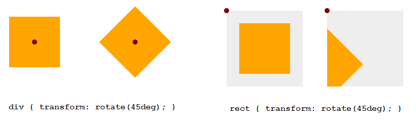
transform-origin: SVG vs HTML
transform-origin (default value)
HTML Elements (div, ::before, etc.)
SVG Elements (circle, rect, etc.)
50% 50%
(the center of the element itself, calculated relative to its box model)
0 0
(top left corner of the SVG canvas, not of the element itself)
transform-origin: SVG vs HTML
Example: 45deg Rotation
<!DOCTYPE html>
<div style="width: 100px; height: 100px; background-color: orange"> </div>
<svg style="width: 150px; height: 150px; background-color: #eee">
<rect width="100" height="100" x="25" y="25" fill="orange" />
</svg>
Setting transform-origin in SVG using CSS
- Using percentage values: The value is set relative to the element's bounding box, which includes the stroke used to draw its border.
- Using absolute values: The origin is set relative to the SVG canvas.
Setting transform-origin in SVG using CSS
Example
<!DOCTYPE html><style>
div, rect { transform-origin: 50% 50%; }
</style>
Using CSS Animations & Transforms
Keyframes
Keyframe Animation
Text
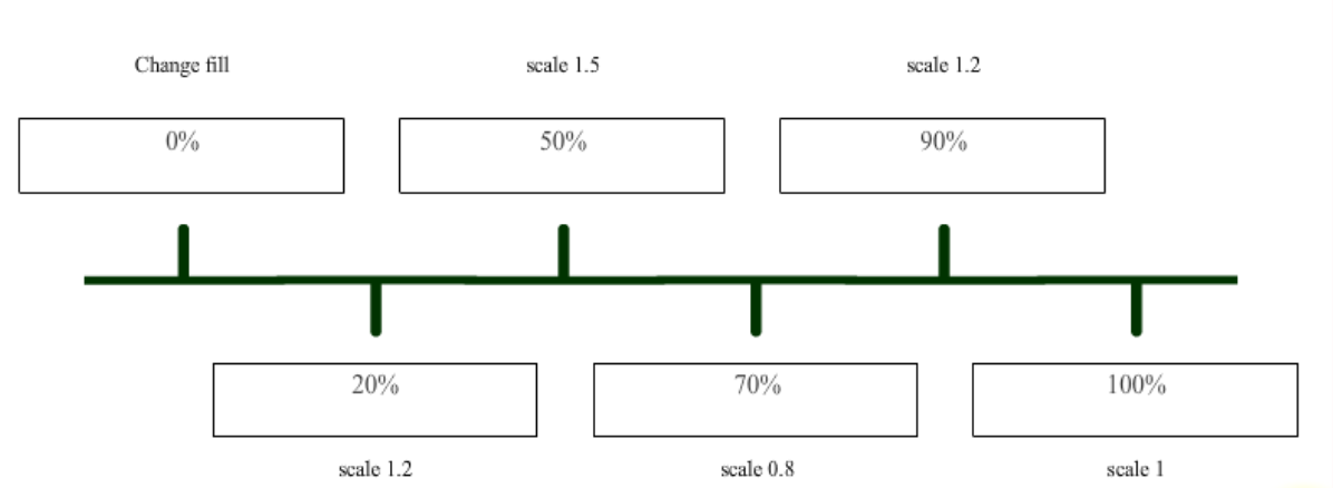
The list of transitions should happen over the course of the animation
Example: bouncing shape
codepen source

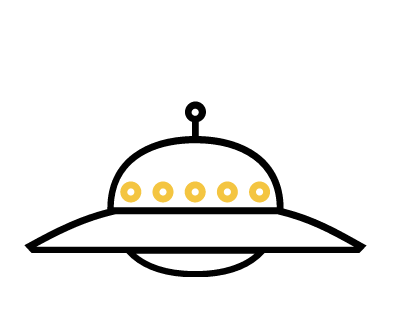
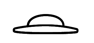
Demo: Alien Ships
<svg xmlns="http://www.w3.org/2000/svg" xmlns:xlink="http://www.w3.org/1999/xlink" version="1.1" x="0px" y="0px" viewBox="0 0 450 250" enable-background="new 0 0 450 250" xml:space="preserve" class="svg ufo-building">
  <g class="ufo-building-float">
    <g class="building">
      .........
      <g class="building-body">
       .......
      </g>
      <g class="building-flames">
        .......
      </g>
    </g>
    <g class="ufo-big">
      ........
      <g class="ufo-big-lights">
       .........
      </g>
    </g>
    <g class="ufo-small">
      .........
    </g>
  </g>
</svg>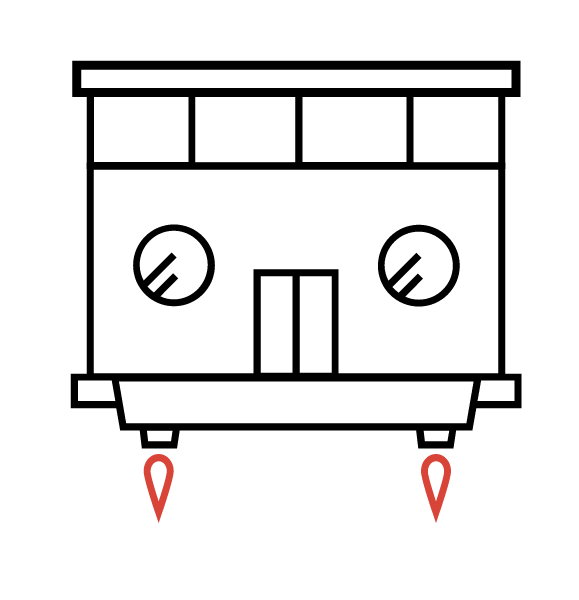
"building"
"ufo-big"
"ufo-small"
All three are grouped in the "ufo-building-float" class
index.html
keyframes
@keyframes ufo-building-float {
  0%   {transform: translateY(0)}
  25%  {transform: translateY(-25px)}
  75%  {transform: translateY(25px)}
  100% {transform: translateY(0)}
}

.ufo-building-float {
  animation: ufo-building-float 5s linear infinite;
}

@keyframes ufo-big {
  0%        {opacity: 0}
  15%, 70%  {opacity: 1}
  85%, 100% {opacity: 0}
}

@keyframes ufo-small {
  0%, 10%  {opacity: 0}
  25%, 85% {opacity: 1}
  100%     {opacity: 0}
}

.ufo-big {
  animation: ufo-big 5s ease infinite;
}

.ufo-small {
  animation: ufo-small 5s ease infinite;
}


@keyframes ufo-big-lights {
  0%        {fill: #000}
  20%       {fill: #fbcb43}
  40%, 100% {fill: #000}
}

.ufo-big-lights-light {
  animation: ufo-big-lights 2.5s ease infinite;
}

.ufo-big-lights--2 {animation-delay: .2s}
.ufo-big-lights--3 {animation-delay: .4s}
.ufo-big-lights--4 {animation-delay: .6s}
.ufo-big-lights--5 {animation-delay: .8s}


@keyframes building-flames {
  0%   {transform: scale(1, 1)}
  50%  {transform: scale(1, 1.1)}
  100% {transform: scale(1, 1)}
}

.building-flames path {
  fill: #d84437;
  animation       : building-flames .15s ease infinite;
  transform-origin: center top;
}
Moving up and down
hide and show
style.css
Animate Recipe
@keyframes kfName {
  0%        { <property> : <value>; }    //from here
  20%       { <property> : <value>; }
  40%, 100%  { <property> : <value>; }   // to here
}

<property name / animate target> {

        animation: kfName <duration> <delay> <iteration>; //iteration can be infinite / finite

}
Creating the Illusion
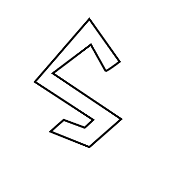
<svg viewBox="0 0 500 500" xmlns="http://www.w3.org/2000/svg">
  <defs/>
  <path class="letterS" d=" ...... "/>
</svg>


svg {
    display: block;
    margin: 2em, auto 0;
    width: 70%;
}

@keyframes offset {
	100% {
		stroke-dashoffset: 0;
	}
}

.letterS {
    fill: #FFF;
    stroke: #000;
    stroke-width: 2;
    stroke-dasharray: 800;      // in JS: pathclassName.getTotalLength()
    stroke-dashoffset: 800;
    animation: offset 5s linear forwards;
}
index.html
style.css
And animating other attributes that simply cannot be set/styled/changed via CSS..
Animating SVG with Javascript
Demo: Fullstack drawing
Sources
<Library>
Javascript: Snap
<Tool>
Creating SVG: Adobe Illustrator / Boxy SVG (Chrome Extension)
<Course/Tutorial>
1. SVG Basics (Treehouse)
2. Web Animation (CodeSchool)
3. Animating SVG with CSS (Treehouse)

Questions?
Animating SVG with CSS and Snap.svg
By Karen mao
Animating SVG with CSS and Snap.svg
Fronteers, October 2014, Amsterdam.


