


Karl Ho
Data Generation datageneration.io
Karl Ho
School of Economic, Political and Policy Sciences
University of Texas at Dallas
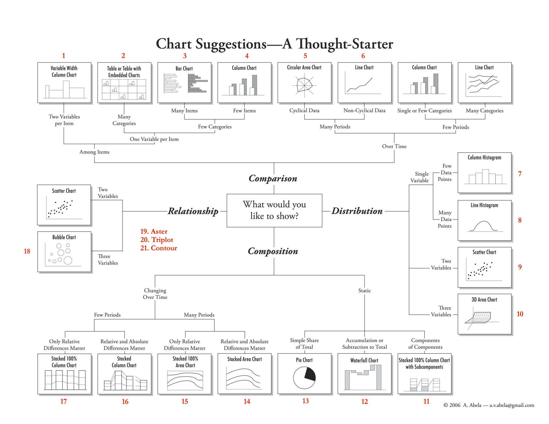
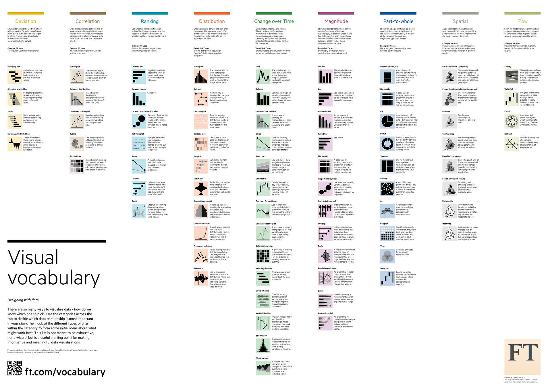
Module 1:
Module 2:
Module 3:
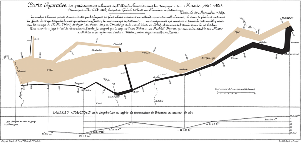
Source: Yau 2011
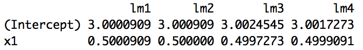
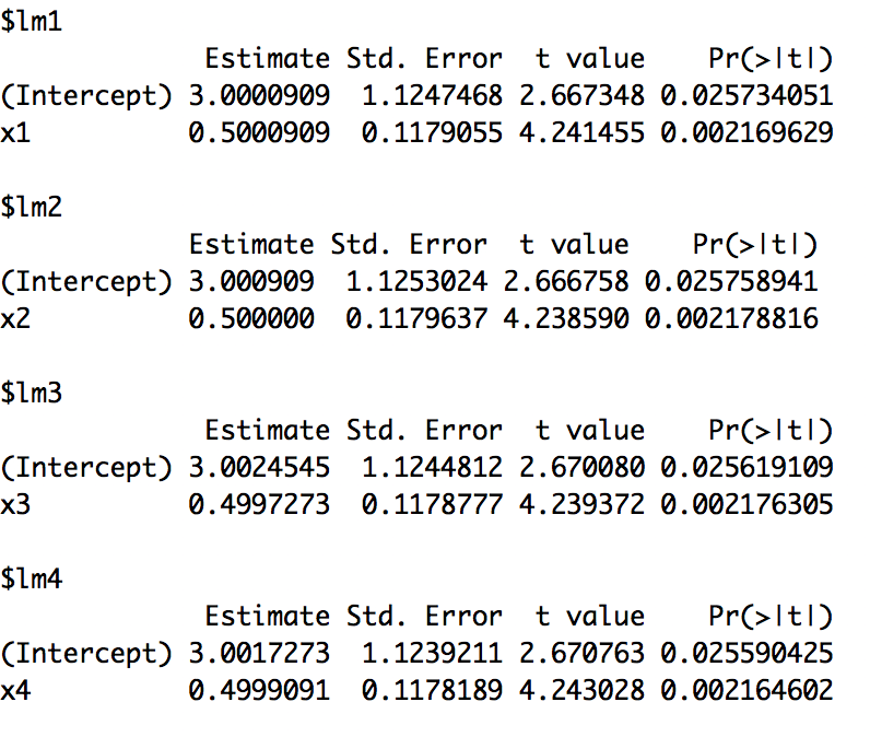
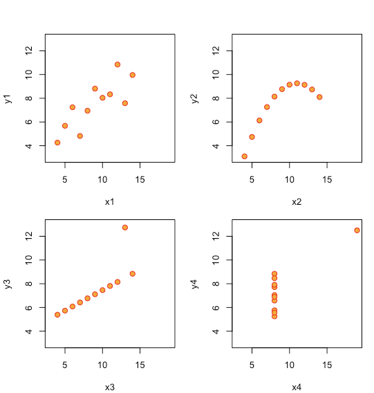
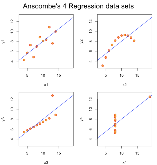
> >
= =
Source: https://en.wikipedia.org/wiki/Charles_Joseph_Minard
How much information?
1. Latitude of army & features (Y-coordinate) . 2. Longitude of army & features (X-coordinate)
3. Size of army (width of line, numerals) . 4. Advance vs. Retreat color of line
5. Division of army splitting of line 6. Temperature linked lineplot
7. Time linked lineplot
Murrell, Paul. 2019. R Graphics. CRC Press.
Murrell, Paul. 2019. R Graphics. CRC Press.
Murrell, Paul. 2019. R Graphics. CRC Press.
coord_trans(x="exp", y="exp"))"p" for points
"l" for lines
"b" for both
"c" for the lines part alone of "b"
"o" for both ‘overplotted’
"h" for ‘histogram’ like (or ‘high-density’) vertical lines
"s" for stair steps, moves first horizontal, then vertical
"S" for other steps, contrary to "s"
"n" for no plotting.
pch = 0,square
pch = 1,circle
pch = 2,triangle point up
pch = 3,plus
pch = 4,cross
pch = 5,diamond
pch = 6,triangle point down
pch = 7,square cross
pch = 8,star
pch = 9,diamond plus
pch = 10,circle plus
pch = 11,triangles up and down
pch = 12,square plus
pch = 13,circle cross
pch = 14,square and triangle down
pch = 15, filled square
pch = 16, filled circle
pch = 17, filled triangle point-up
pch = 18, filled diamond
pch = 19, solid circle
pch = 20,bullet (smaller circle)
pch = 21, filled circle blue
pch = 22, filled square blue
pch = 23, filled diamond blue
pch = 24, filled triangle point-up blue
pch = 25, filled triangle point down blue
Additional:
*
.
o
O
note: takes longer to plot
& - ampersand
‘ - apostrophe or single quote
* - asterisk
@ - at
{} - braces or curly brackets
[] - brackets
^ - carat
<> - angle brackets or chevron
~ - tilde
| - pipe
# - pound
- - hyphen
Line types can be specified with:
An integer or name:
0 = blank,
1 = solid,
2 = dashed,
3 = dotted,
4 = dotdash,
5 = longdash,
6 = twodash
44
13
1343
73
2262
plot object p cannot be displayed without adding at least one layer at this point, there is nothing to see!
install.packages("ggplot2")
library(ggplot2)
p <- ggplot(data = gm)
p <- ggplot(data = gm,
            mapping = aes(x = gdpPercap,
                          y = lifeExp))
p + geom_point(size=2)# install.packages("shiny")
# install.packages("shinythemes")
library(shiny)
library(shinythemes)
# Create User Interface
ui <− fluidPage ()
# Build R objects displayed in UI
server <− function(input , output){}
# Create Shiny app
shinyApp(ui = ui, server = server)
ui: Nested R functions that assemble an HTML user interface for the app (some HTML knowledge needed)
server: A function with instructions on how to build and rebuild the R objects displayed in the UI
shinyApp: Combines ui and server into a functioning app
library(shiny)
ui = fluidPage(
  numericInput(inputId = "n", "Sample size", value = 50),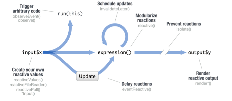
plotOutput(outputId = "hist")) server = function(input , output){ output$hist = renderPlot ({
hist(rnorm(input$n)) })}shinyApp(ui = ui , server = server)Reactive values work together with reactive functions. Call a reactive value from within the arguments of one of these functions to avoid the error
Operation not allowed without an active reactive context.
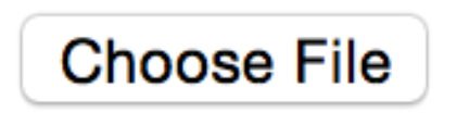
fileInput(inputId, label, multiple, accept)
numericInput(inputId, label, value, min, max, step)
passwordInput(inputId, label, value)
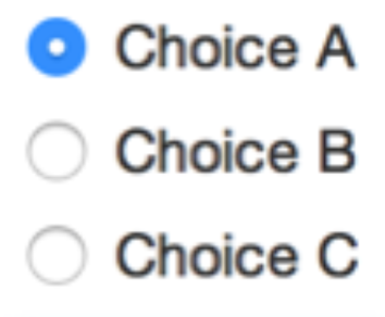
radioButtons(inputId, label, choices, selected, inline)
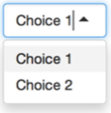
selectInput(inputId, label, choices,
selected, multiple, selectize, width, size) (also selectizeInput())
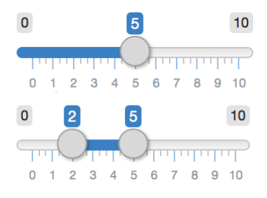
sliderInput(inputId, label, min, max, value, step, round, format, locale, ticks, animate, width, sep, pre, post)
By Karl Ho


