


Karl Ho
Data Generation datageneration.io
Karl Ho
School of Economic, Political and Policy Sciences
University of Texas at Dallas
John T. Behrens lists the objectives of EDA for researchers to:
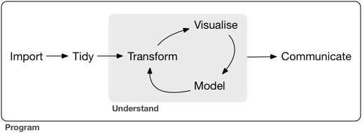
Grolemund and Wickham describe the EDA process as an iterative cycle:
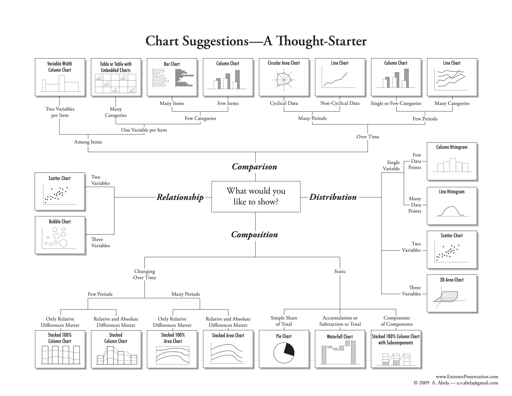
Univariate
Groups
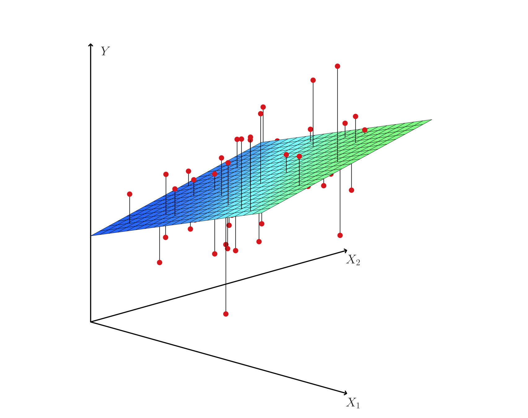
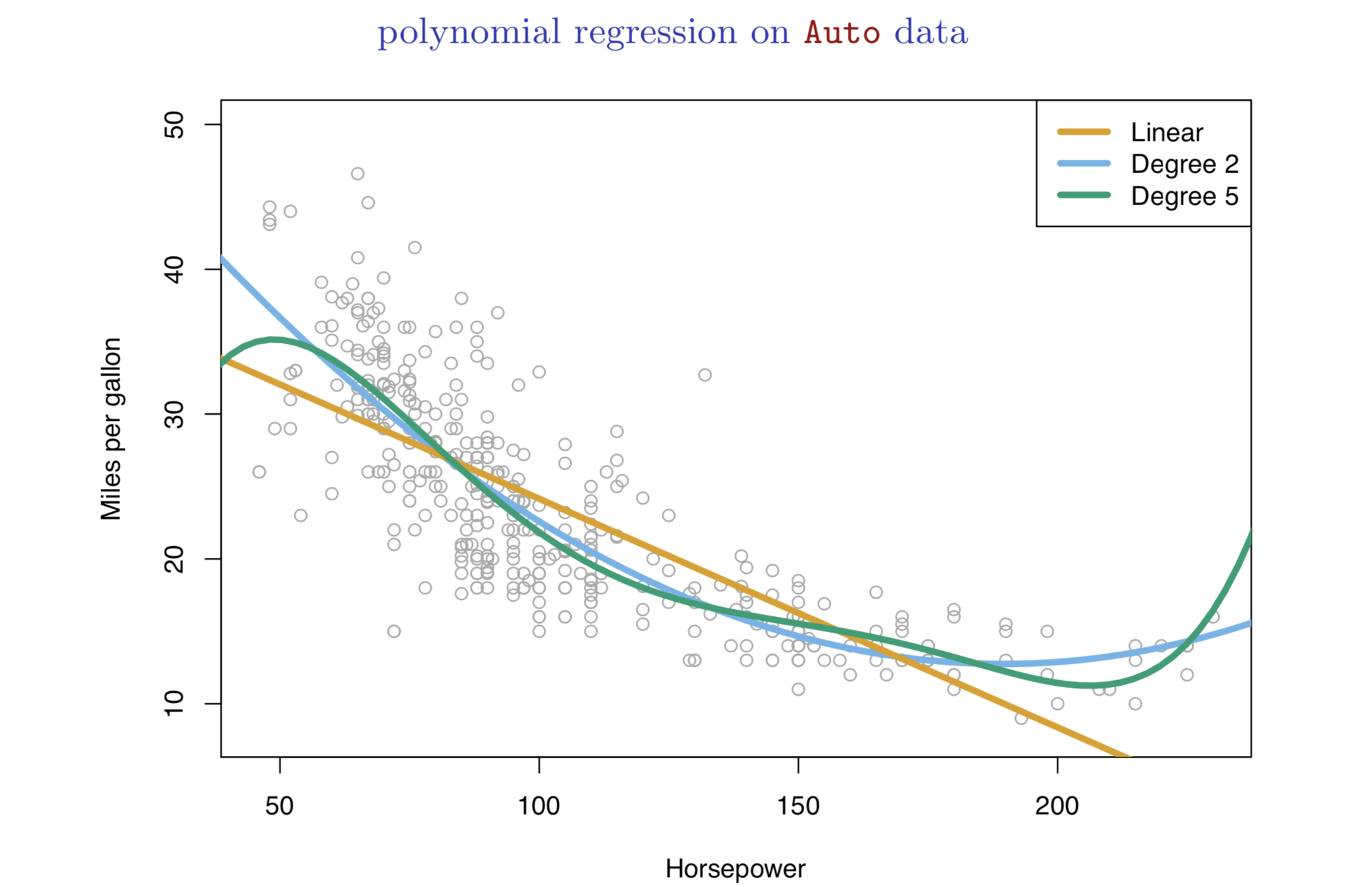
Bivariate or Multivariate Relationship
Time series
Multiple variables multiple methods
Ensemble
Univariate: Distribution
Univariate: Composition
Groups: Comparison
Bivariate or Multivariate Relationship: Relationship
Time series: Trend/Projection
Multiple variables multiple methods: Combination of information
Ensemble: Combination of information
Source: Grolemund, Garrett, and Hadley Wickham. 2018. R for data science. (https://r4ds.had.co.nz/).
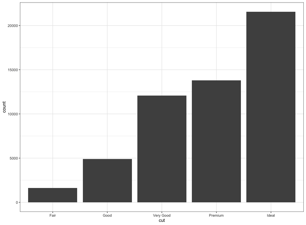
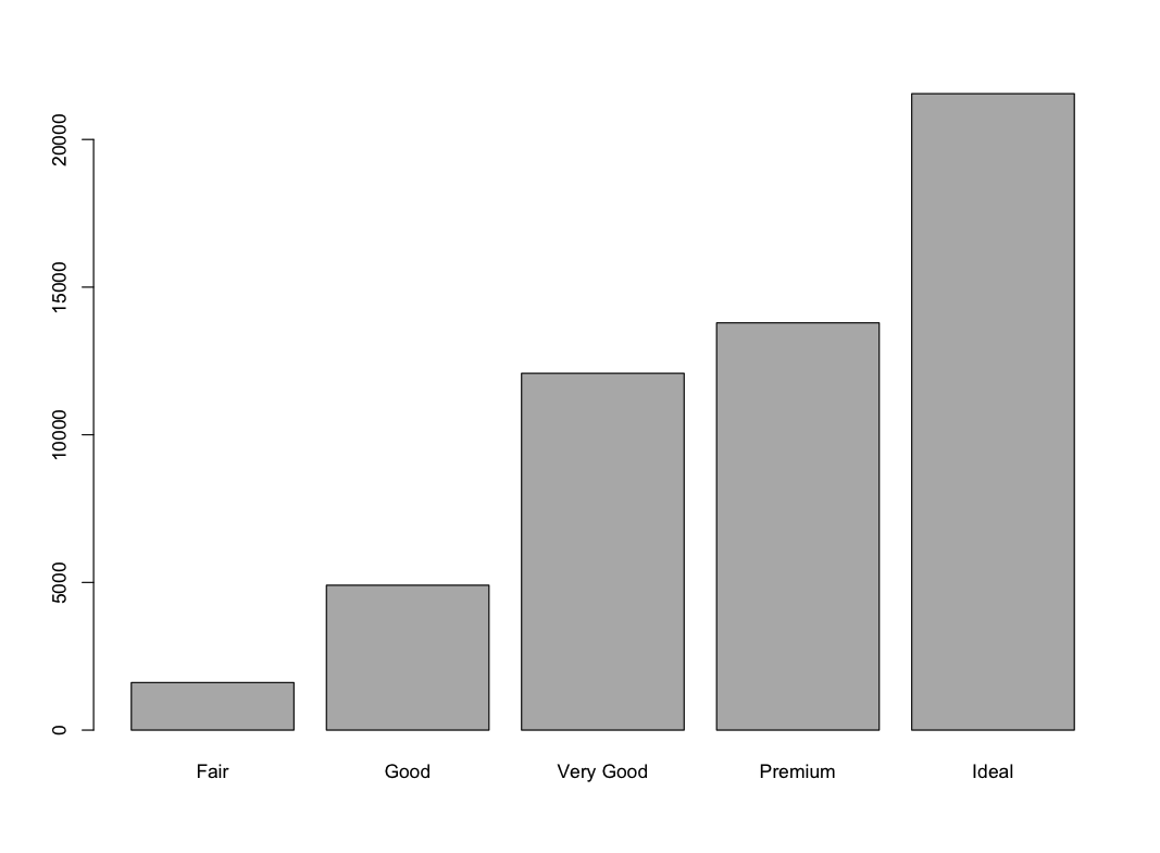
ggplot(data = diamonds) +
  geom_bar(mapping = aes(x = cut)) +
  theme_bw()
> library(descr)
> freq(diamonds$cut)
diamonds$cut
Frequency Percent Cum Percent
Fair 1610 2.985 2.985
Good 4906 9.095 12.080
Very Good 12082 22.399 34.479
Premium 13791 25.567 60.046
Ideal 21551 39.954 100.000
Total 53940 100.000> library(descr)
> freq(diamonds$cut)
diamonds$cut
Frequency Percent Cum Percent
Fair 1610 2.985 2.985
Good 4906 9.095 12.080
Very Good 12082 22.399 34.479
Premium 13791 25.567 60.046
Ideal 21551 39.954 100.000
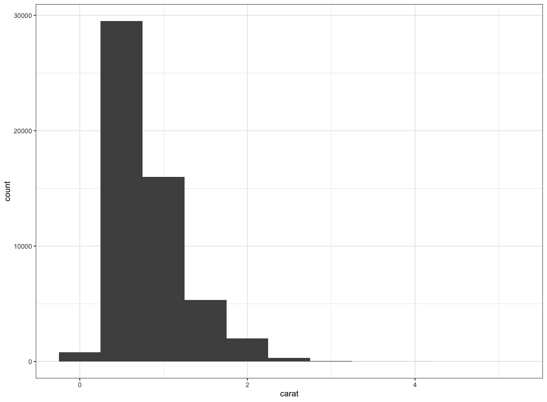
Total 53940 100.000ggplot(data = diamonds) +
geom_histogram(mapping = aes(x = carat), binwidth = 0.5) +
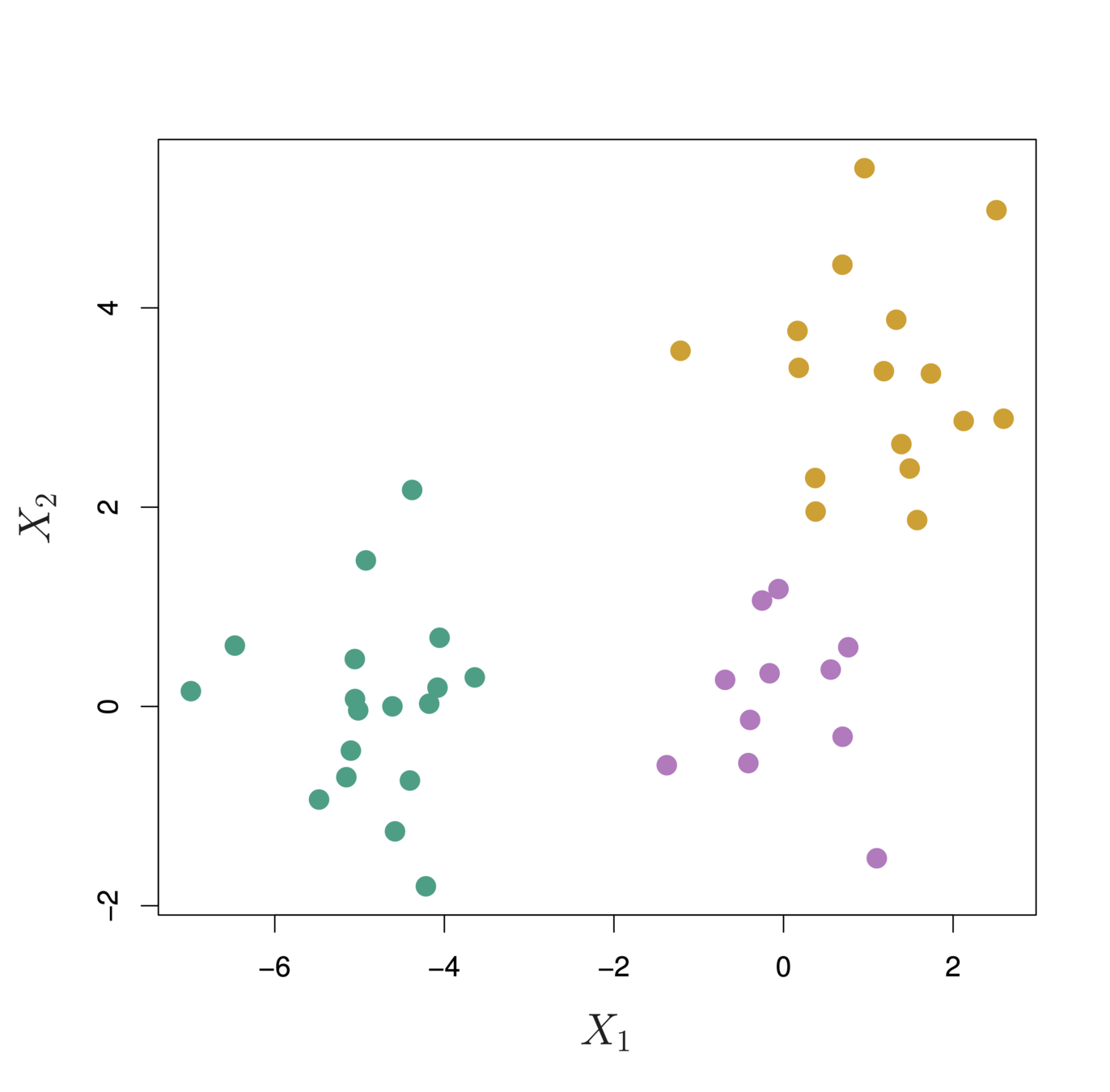
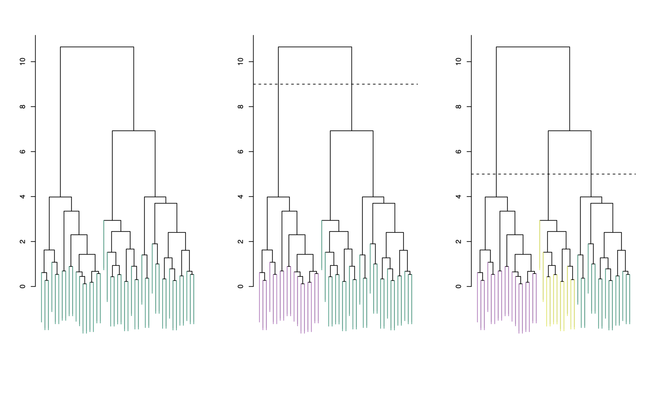
theme_bw()Each “leaf” of the dendogram represents one of the 45 observations
At the bottom of the dendogram, each observation is a distinct leaf. However, as we move up the tree, some leaves begin to fuse. These correspond to observations that are similar to each other.
As we move higher up the tree, an increasing number of observations have fused. The earlier (lower in the tree) two observations fuse, the more similar they are to each other.
Observations that fuse later are quite different
To choose clusters we draw lines across the dendrogram
We can form any number of clusters depending on where we draw the break point.
One cluster
Two clusters
Three clusters
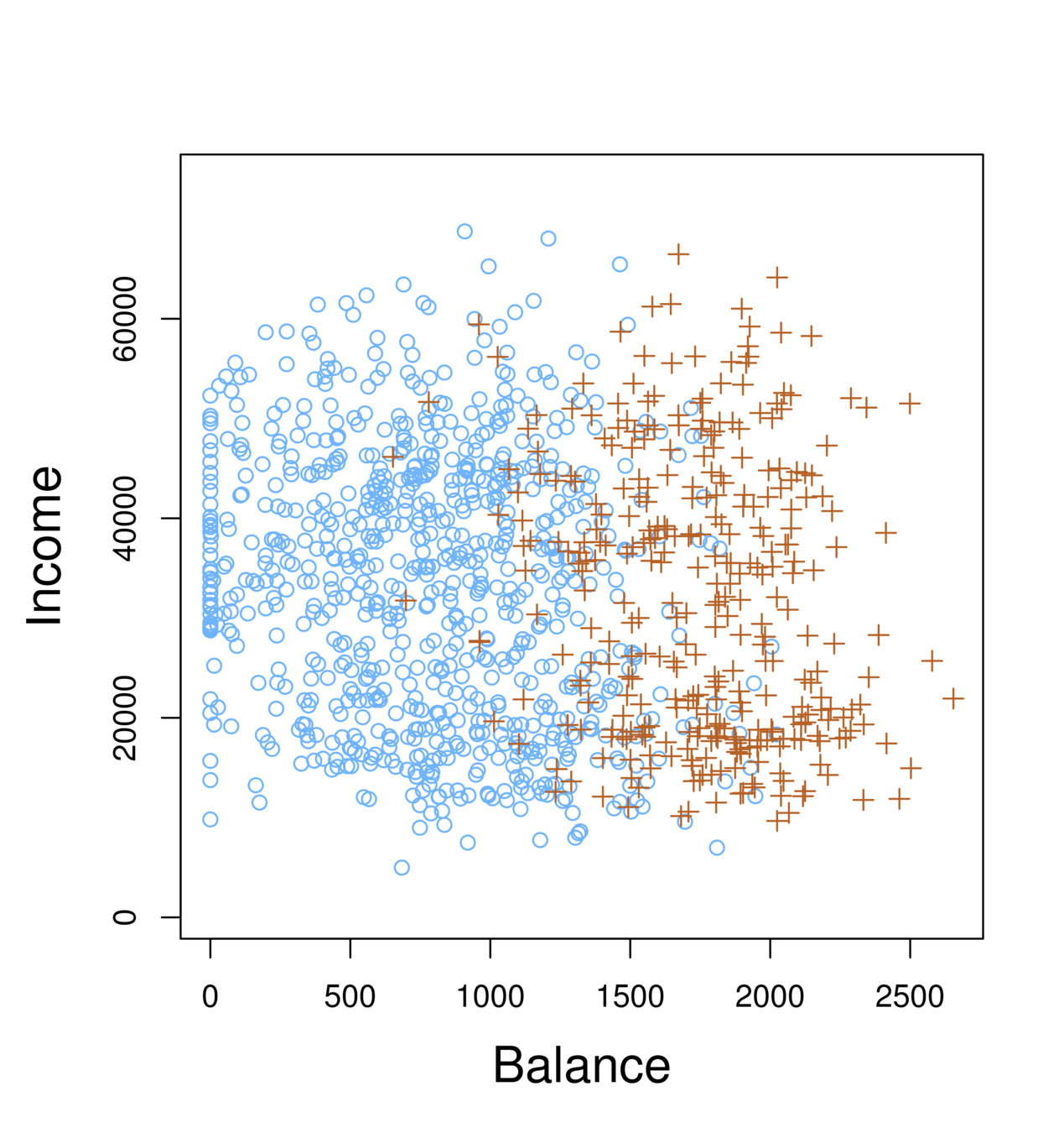
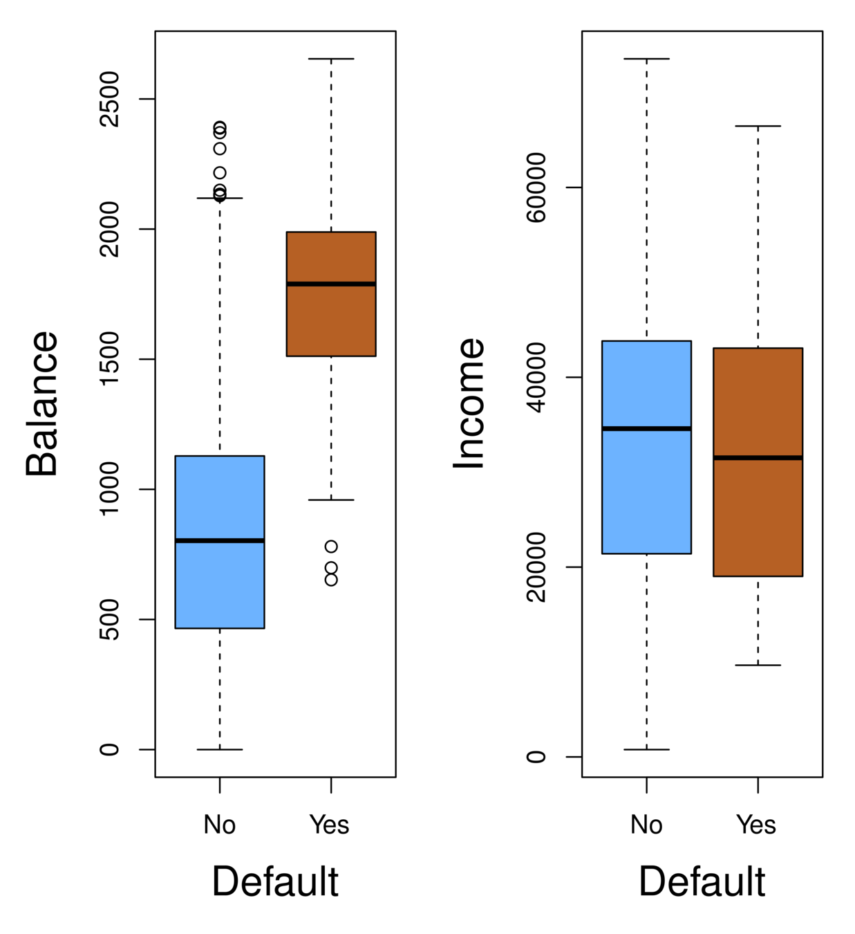
Orange: default, Blue: not
Overall default rate: 3%
Higher balance tend to default
Income has any impact?
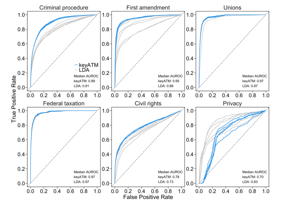
The Receiver Operating Characteristics (ROC) curve display the overall performance of a classifier, summarized over all possible thresholds, is given by the area under the (ROC) curve (AUC). An ideal ROC curve will hug the top left corner, so the larger the AUC the better the classifier.
Source: Eshima, Shusei, Kosuke Imai, and Tomoya Sasaki. "Keyword Assisted Topic Models." arXiv preprint arXiv:2004.05964(2020).
By Karl Ho


