THE SCIENCE BEHIND FONTS
HOW WE READ
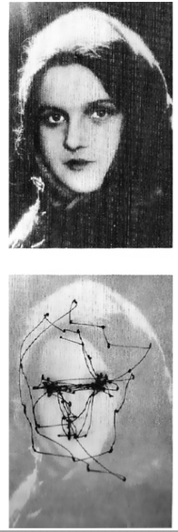
Scan path
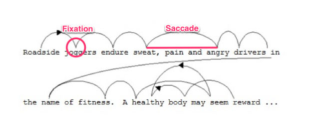
HOW WE READ
saccadic eye movement
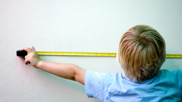
Your eyes typically move across a page for between 7 to 9 letters before needing to pause to process what you’re reading.
As you scan a sentence, no useful visual processing is happening in your brain.
Visual processing is completely dependent upon the information taken in when you pause.
WHY THE RIGHT FONT LAYOUT
makes you feel good
SCIENCE BEHIND THE FONTS
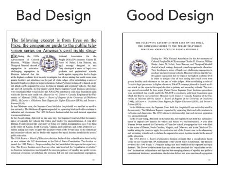
The researchers found that readers felt bad while reading the poorly designed layout.
Sometimes, this feeling would be expressed physically with a frown.

Meanwhile, the participants who read content from the good reading layout, felt like it took less time to read and felt better.
People exposed to the well-designed layout were found to have higher cognitive focus, more efficient mental processes, and a stronger sense of clarity.

CULTURE
impacts your
preference for fonts

Because fonts are designed by humans, there is usually some meaning attached to them.
You don’t want to choose
a font that is easily associated with something in our culture that’s markedly different than the vibe you’re trying to give off.
HOW TO DESIGN
better content
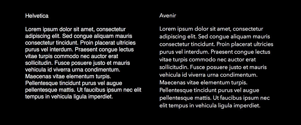
CHOOSE AN ANCHOR FONT


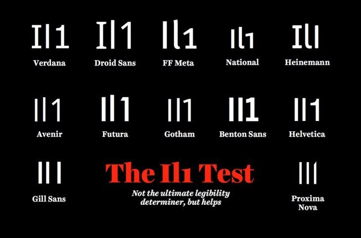
Il1 TEST
CHOOSE FONT SIZE BIGGER THAN 12pt

WATCH YOUR LINE LENGTH
MIND YOUR SPACING
QUESTIONS
1. How does handwriting-like font affect you?
2. How does the experiment look like?
3. What is the conclusion of the video?
Bibliography
- http://www.etymonline.com/index.php?term=font
- http://affect.media.mit.edu/pdfs/05.larson-picard.pdf
- https://www.templatemonster.com/blog/font-psychology/
The science behind fonts
By kaszmar