Visualizing Event Sequence Data
By Kevin Jahns (314391) & Dominik Sturm (332270)
Seminar: Post-Desktop User Interfaces
RWTH Aachen
Visualizing Event Sequence Data
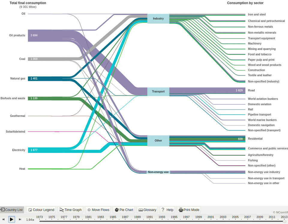
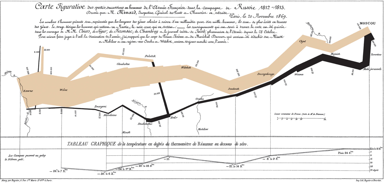
Sankey Diagram
Riehmann, P., Hanfler, M., and Froehlich, B.
Interactive sankey diagrams. In IEEE Symposium on Information Visualization, 2005. INFOVIS 2005. (Oct 2005), 233–240.
Sankey Diagram
Visualizing Time
Visualizing Time
Interaction
+ Intuitive
+ Flexible
+ Well suited for flows
+ Visualizes proportions
- Created by hand
- Requires a lot of space
Sankey Diagram
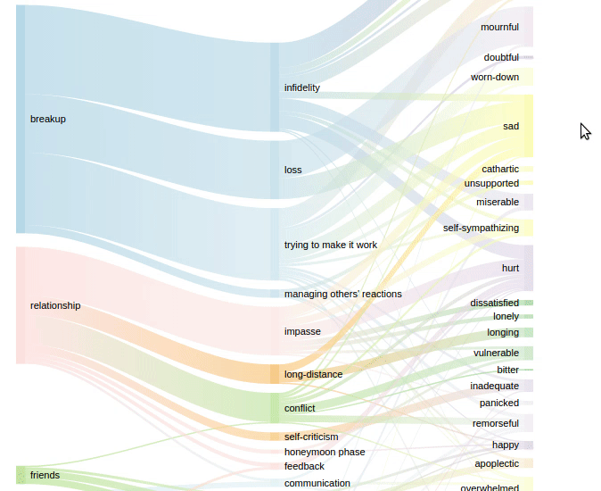
Life Lines
Plaisant, C., Milash, B., Rose, A., Widoff, S., and Shneiderman, B.
Lifelines: Visualizing personal histories. In Proceedings of the
SIGCHI Conference on Human Factors in Computing Systems (1996), 221–227.
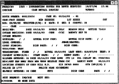
Juvenile Records in 1996
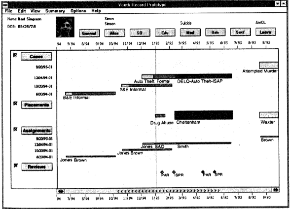
Visualizing Records
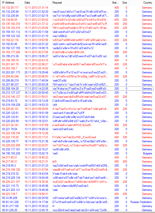
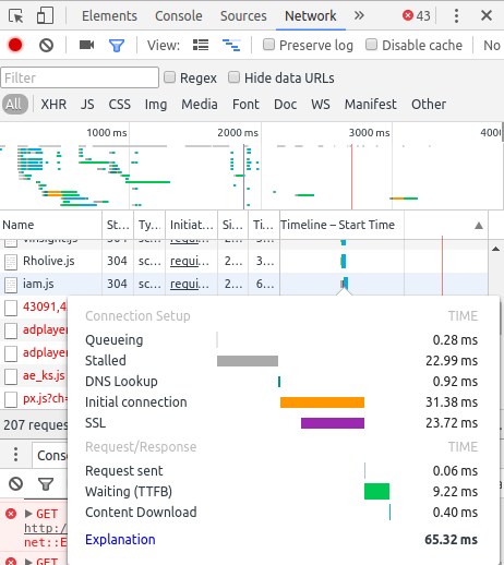
HTTP Requests
In the Chrome Developer Tools
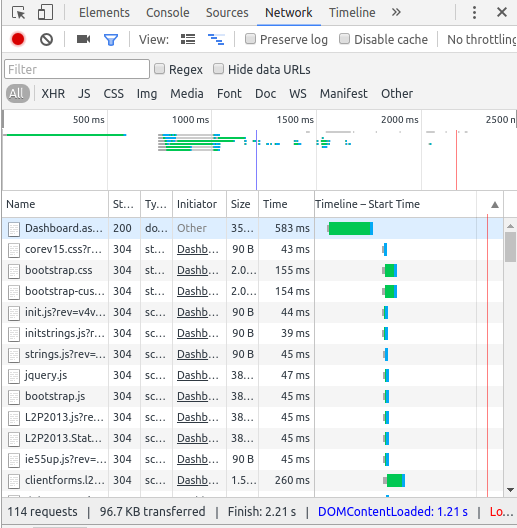
HTTP Requests
In the Chrome Developer Tools
- More information on-demand
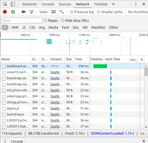
HTTP Requests
In the Chrome Developer Tools
- Focus on relevant data
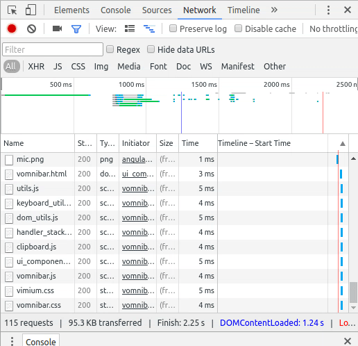
+ Intuitive
+ Requires little space
- Only shows the existence of an event
- Unsuited for complex data
Life Lines
MIGAARD
Bade, R., Schlechtweg, S., and Miksch, S.
Connecting time-oriented data and information to a coherent interactive visualization. In Proceedings of the SIGCHI Conference on Human Factors in Computing Systems (2004), 105–112.
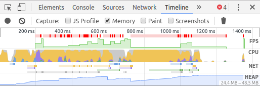
-
DOM operations (blue)
-
JavaScript (yellow)
-
Painting (green)
-
CSS styling (purple)
Performance Debugging
In the Chrome Developer Tools
- Overview first
- More information on-demand
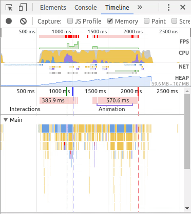
+ Requires little space
+ Visualizes proportions
- Approximations only
MIGAARD
MatrixWave
Zhao, J., Liu, Z., Dontcheva, M., Hertzmann, A., and Wilson, A. Matrixwave: Visual comparison of event sequence data. In Proceedings of the 33rd Annual ACM Conference on Human Factors in Computing Systems (2015), 259–268.
Visualizing Clickstream Data
- Where do visitors entry a website?
- Where do visitors leave a website?
- Which path is frequently used?
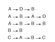
A -> main page B -> shop C -> Contact D -> support page
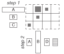
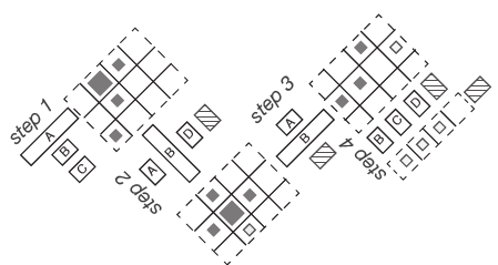
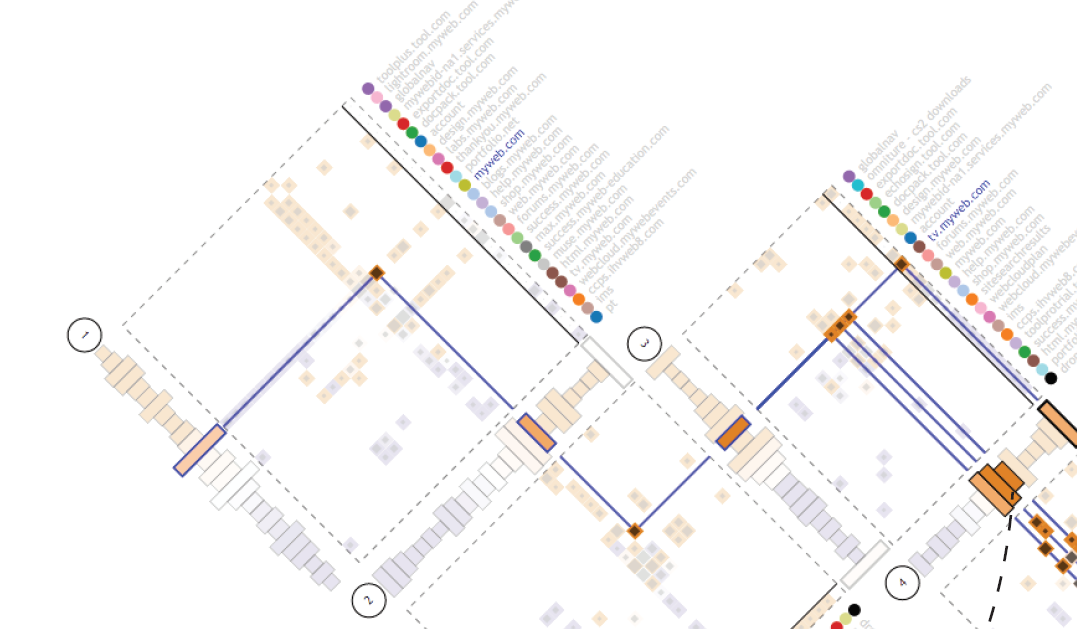
Matrix Wave
Comparing

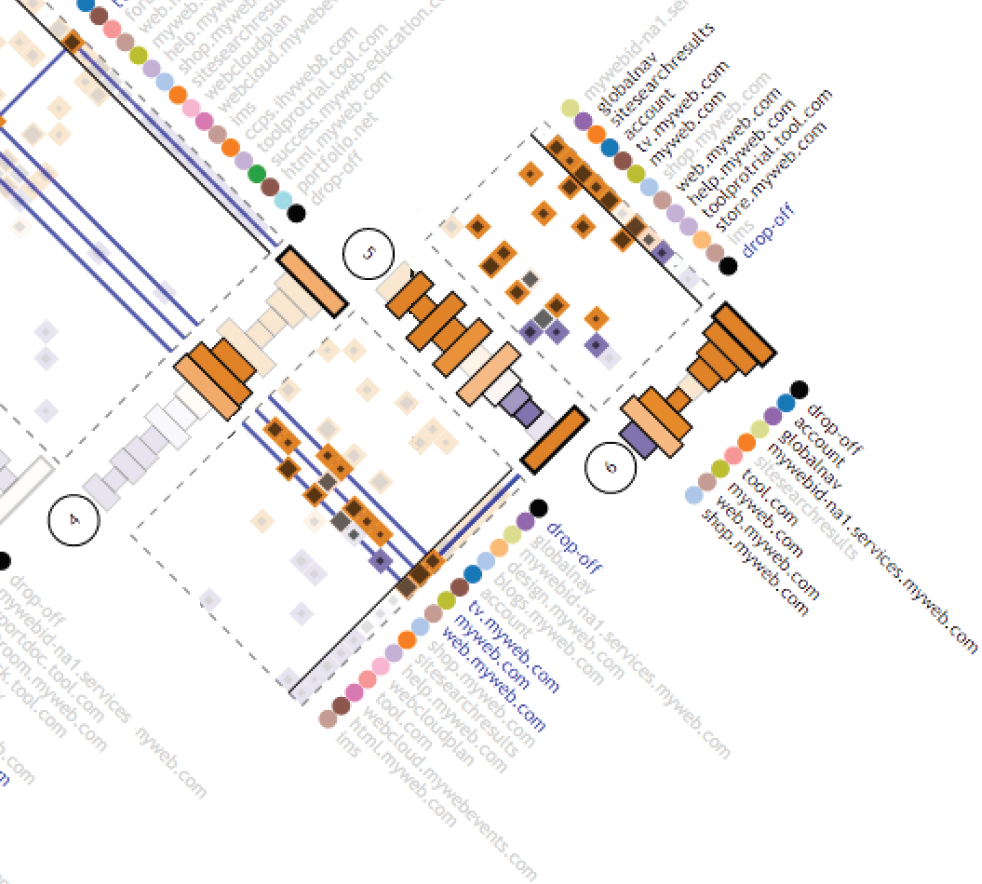
slightly more traffic volume on A
average traffic volume
Interaction
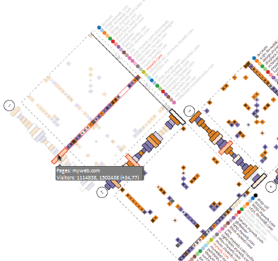
Pages: myweb.com
Visitors: 1114838, 1502438 (+34,77%)
Interaction
+ Good overview
+ Good information
in detail
+ Visualizes browsing trails
- Hard to learn
(not intuitive)
- Needs a lot of space for visualization
Matrix Wave
Time Curves
Bach, B., Shi, C., Heulot, N., Madhyastha, T., Grabowski, T., and Dragicevic, P. Time curves: Folding time to visualize patterns of temporal evolution in data. IEEE Transactions on Visualization and Graphics 22, 1 (Jan 2016), 559–568.
Time Curves
Folding
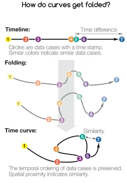
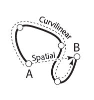
How do curves get folded?
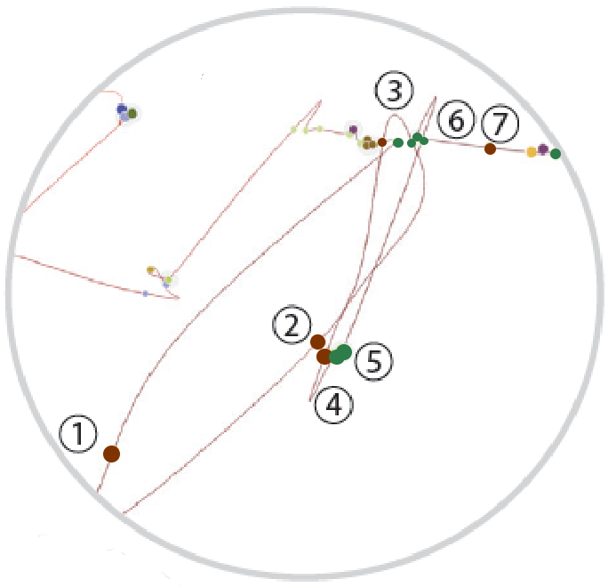
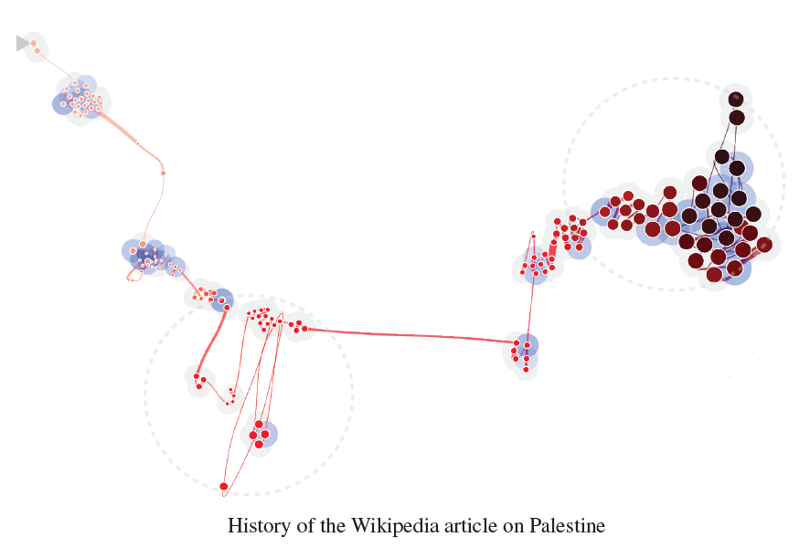
Time Curves - Example

Time Curves - Example
Characteristics


+ Quick overview
+ Intuitive thinking
- No quantitative
aspects of time (duration)
- Folding is not deterministic
- Time scale is only approximated
Time Curves
Data Exploration
"Overview first, zoom and filter, then details on demand"
-- Ben Shneiderman

Copy of Visualizing Event Sequence Data
By Kevin Jahns


