A Quick Overview of Web Accessibility
Kora Lajoie


Why?
- It's the law
- Better UX, Accessibility IS Usability
- Web Accessibility increases your audience
- Everyone deserves it
- and it's the right thing to do


Is this your website?
How do I start?
- It's okay to start small
- It's a process
- You will never be finished
-
Being wrong
- Prepare to be wrong
- Prepare for others to be wrong (even us)
Semantics
- Use elements for their intended purpose
- Know when to use an <a> vs <button>
- Do your links make sense out of context?
- Use lists for lists (like relating groups of links)
- Use tables ONLY for tabular data
- Use Headings correctly (they're not just for making text bigger)
- Use the title tag
- Know when to use an <a> vs <button>
- Make sure your markup is valid!
- e.g. No duplicate IDs, correct nesting
- Validator
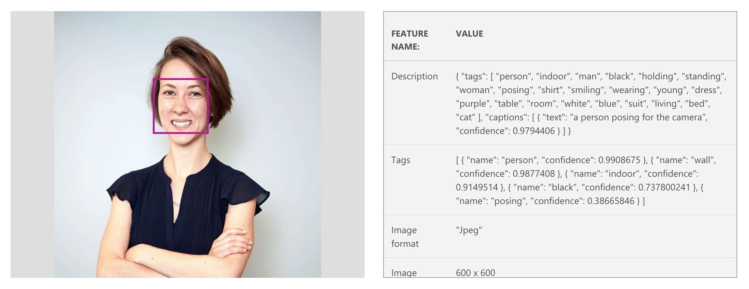
Images
- ALL images require the alt attribute
- Empty alt means the image is decorative
- An empty alt is usually better than a bad alt
- Having trouble writing alt?
- How would you describe this over the phone?
- Check this tool out
-
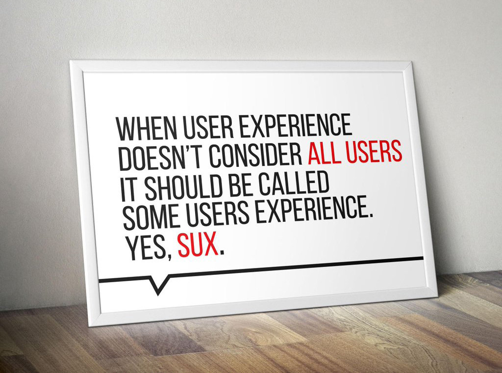
ALWAYS avoid images with text
- If you must provide a detailed textual summary
Audio and Video
- Don't autoplay (unless it's expected)
- Provide controls
- Provide text alternative
- Avoid flashing
Forms
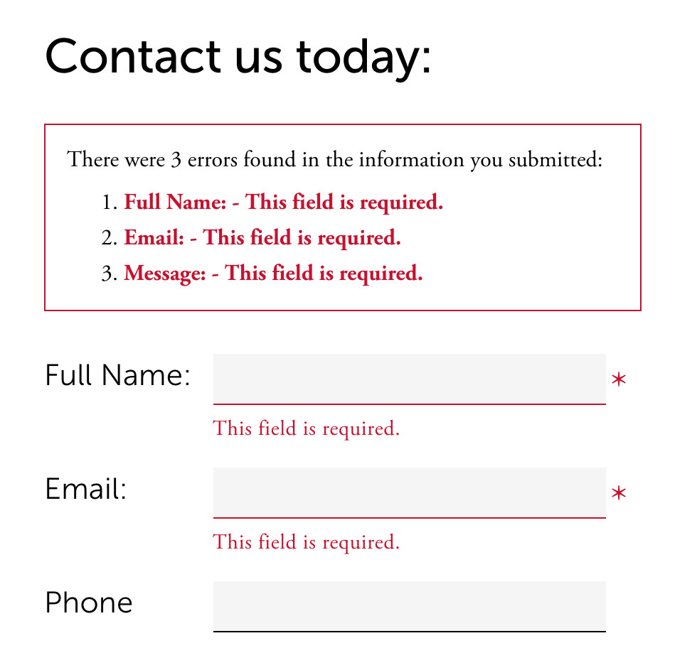
- Provide instructions for form
- (ex. instructions for what is required)
- All fields need label
- Labels need to be associated to the input
- Mark required fields
- Use fieldsets with legends for related fields
- Checkboxes, radio buttons
- Provide helpful errors
Keyboard
- All interactive elements should be accessible via keyboard
- Skip to content link
- Provide more than one way to navigate the site (e.g. sitemaps)
- Tab/focus management
- Don't let user get lost or stuck (e.g. pop-ups, modals, off-canvas)
- Don't be unpredictable
- Focus order matters
- If you apply :hover styles, consider :focus too
- Don't use colour alone
Visual
- Entire site should be readable and usable up to 200% zoom
- Contrast
- 4.5:1 contrast between the non-link text color
and background. - 4.5:1 contrast between the link text color
and background. - A 3:1 contrast between the link text color
and the surrounding non-link text color.
- 4.5:1 contrast between the non-link text color
-
Screen readers hide elements from their users when they are styled using display none and visibility hidden
- sr-only css

Tools & Resources
Website Accessibility, a quick overview
By Kora Lajoie
Website Accessibility, a quick overview
A quick overview on accessibility, and some quick notes on why you should care.


