flex-grow
Let's start with an example
What we saw:
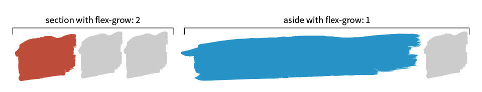
- flex-grow set to 1 would have an equal width.
- If one of the items had flex-grow set to 2 that item would be twice as big as all the others.
- The parent element is 900px wide, the section with flex-grow: 2 has a calculated width of 600px and the aside element with flex-grow: 1 has a calculated width of 300px.
But, this isn't real life!
Let's check another example.
Explanation
- display: flex; will stack it's children horizontally.
- If there isn't enough space, they will shrink in size.
- If there is more than enough space, they won't grow!
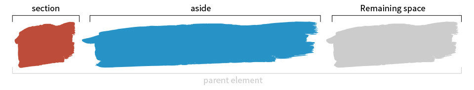
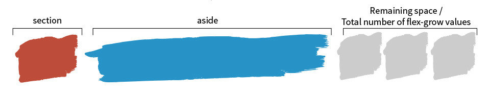
- flex-grow determines how the remaining space is distributed among the flex items and how big the share is each item receives.
Let's have some pictures
Now we know how the first demo works!
flex-grow and flex-basis
flex-basis
- flex-basis which defines the initial size of an element, before free space is distributed according to the flex factors
- Example pen with flex-basis.
Some useful examples
TIP:
We should use the flex shorthand rather than flex-grow directly. Like:
flex: 2 1 auto; /* (<flex-grow> | <flex-shrink> | <flex-basis>) */
Questions?
Reference: https://css-tricks.com/flex-grow-is-weird/
THANKS
flex-grow
By ktasim