Mobile + CSS3
float vs inline-block
float
Pros
- 브라우저 호환성(IE7+)
- 코드가 간결?
Cons
- 부모는 자식에 높이에 영향(X)
- 리스트에 높이는 고정되야 한다
inline-block
Pros
- clear 해제가 필요 없다.
- 리스트 높이가 유동적
Cons
- IE7 미지원(IE8+)
- inline 요소 사이에 공백이 있음
//HTML
<ul class="list">
    <li></li>
    <li></li>
    <li></li>
</ul>

//CSS
.list {letter-spacing:-3px;word-spacing:-3px;}
.list li {letter-spacing:normal;word-spacing:normal;}


.list {font-size:0;}
.list li {font-size:13px;} /* 폰트 사이즈를 재정의함 */
hasLayout 속성
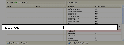
hasLayout이란?
Layout은 각각의 요소가 어떻게 렌더링되고,
다른 요소들과 어떻게 상호작용 하는지를 결정하는
윈도우즈 버전 IE만의 독자적인 개념(concept)입니다.
IE Developer Toolbar
<div class="block-element">
<span class="inline-element">

.block-element {display:inline-block;}
*:first-child+html .block-element {display:inline;zoom:1;}
/*
block요소에는 필요
div, p, h, ul, li 등등
*/

.inline-element {display:inline-block;}Internet Explorer 8+
Pseudo-Elements
:before, :after
::before, ::after
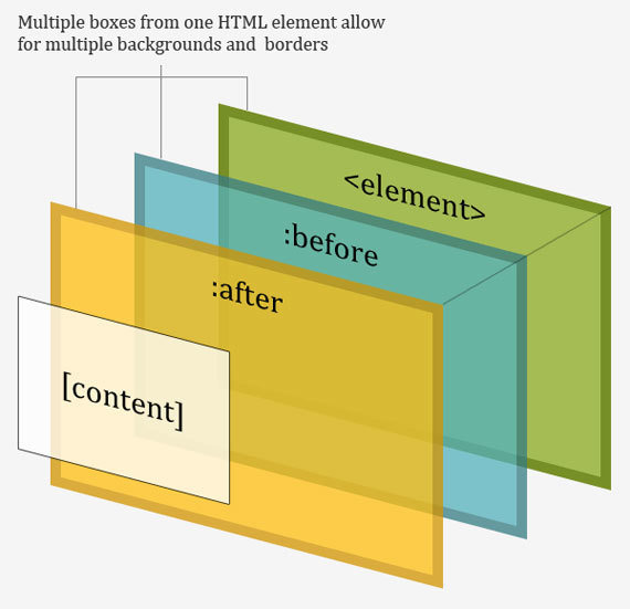
<p>
   <before>Start</before>
      Actual content
   <after>End</after>
</p>

p:before {
   content: "Start";
}

p:after {
   content: "End";
}
: / :: 차이는 CSS3에서 가상 클래스와 가상 요소를 구분
응용 사례1
도형 만들기
p.speech:before {
    content: ' ';
    position: absolute;
    left: 30px;
    top: 100px;
    width: 0;
    height: 0;
    border:30px solid #333333;
}
30px
p.speech:before {
    content: ' ';
    position: absolute;
    left: 30px;
    top: 100px;
    width: 0;
    height: 0;
    border: 30px solid transparent;
    border-top-color:#333333;
}응용 사례2
attr(print)
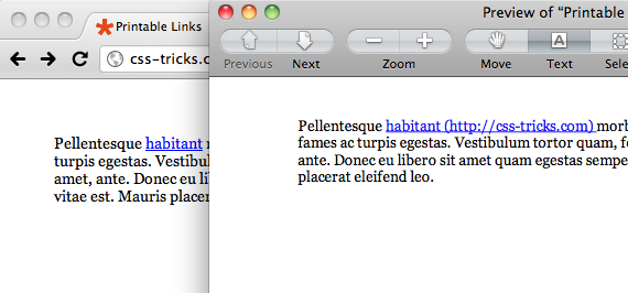
<a href="http://css-tricks.com">habitant</a>

@media print    {
    a[href]:after    {
        content: " (" attr(href) ") ";
    }
}
응용 사례3
attr(pdf, email)
응용 사례4
counter 증가
counter-reset: initial | 카운터 이름 / 숫자(시작값) | none;
counter-increment: initial | 카운터 이름 / 숫자(증가할 숫자 단위) | none;
content: counter(카운터 이름, '문자열', 스타일); /* list-style-type 동일 */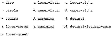
그외 지원하는 속성들
display
block | inline | inline-block | inline-table | list-item | run-in | table | table-caption | table-cell | table-column | table-column-group | table-footer-group | table-header-group | table-row | table-row-group | none | inherit
Internet Explorer 9+
border-radius
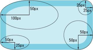
border-radius : 100px 25px 50px 50px / 50px 25px 50px 25px;

/* 개별적으로 지정할때 */
border-top-left-radius : 100px 50px;
border-top-right-radius : 25px 25px;
border-bottom-left-radius : 50px 50px;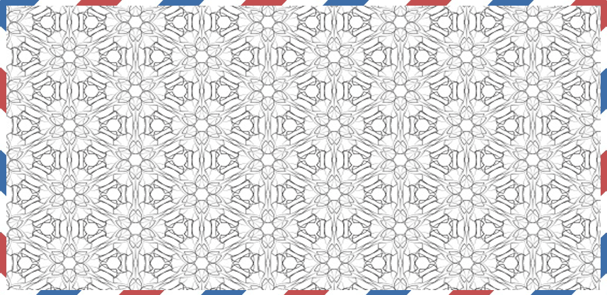
border-bottom-right-radius : 50px 25px;border-image
.box	{
    border-image-source:url(border.png);
    border-image-width: 30; /* 이미지 테두리의 너비값을 지정하는 속성 */
    border-image-repeat: round; /* stretch(Default)/repeat/round 이미지의 반복 여부를 지정하는 속성 */
    border-image:url(border.png) 30 30 round; /* 단축형 */
}
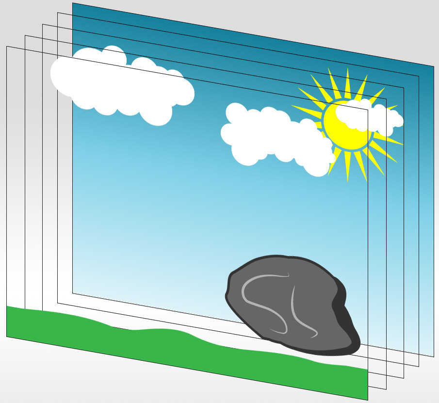
multi background
body {
  background: url(images/background_grass.png)  bottom repeat-x,
  url(images/background_stone.png)  bottom right no-repeat,
  url(images/background_clouds.png) left top repeat-x,
  url(images/background_sun.png) right top no-repeat,
  url(images/background_sky.png) top repeat-x rgba(255,255,255,1);
}
background-size
background-size: <length> | <percentage> | auto | contain | cover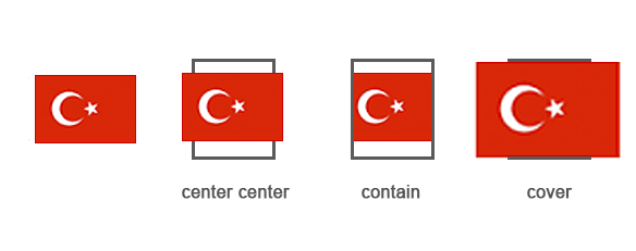
background-clip
p { background-clip: content-box; }
p { background-clip: padding-box; }
p { background-clip: border-box; }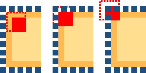
background-origin
p { background-origin: content-box; }
p { background-origin: padding-box; }
p { background-origin: border-box; }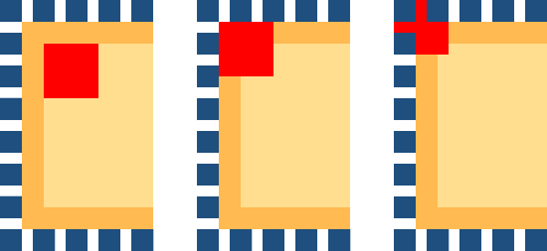
nth-child
vs
nth-of-type
nth-child
<div class="list">
    <div class="item"></div>
    <h2></h2>
    <h2></h2>
    <div class="item"></div>
    <div class="item"></div>
</div>
nth-of-type
<div class="list">
    <div class="item"></div>
    <h2></h2>
    <h2></h2>
    <div class="item"></div>
    <div class="item"></div>
</div>그외 지원하는 속성들
Pseudo-Classes And Pseudo-Elements
:checked | :target | :first-of-type | :last-of-type
:only-child | :only-of-type |
:nth-last-child | :nth-last-of-type
CSS3(Mobile)
flexbox
Cons
2009 - display:box
2011 - display:flexbox
Final - display:flex
android 4.3 이하
android 4.4 이상, internet explorer 11
internet explorer 10
Pros
.list    {display: flex;}
.list .item {flex: 1;}

<div class="list">
    <div class="item"></div>
    <div class="item"></div>
    <div class="item"></div>
</div>
<div class="list">
    <div class="item"></div>
    <div class="item"></div>
</div>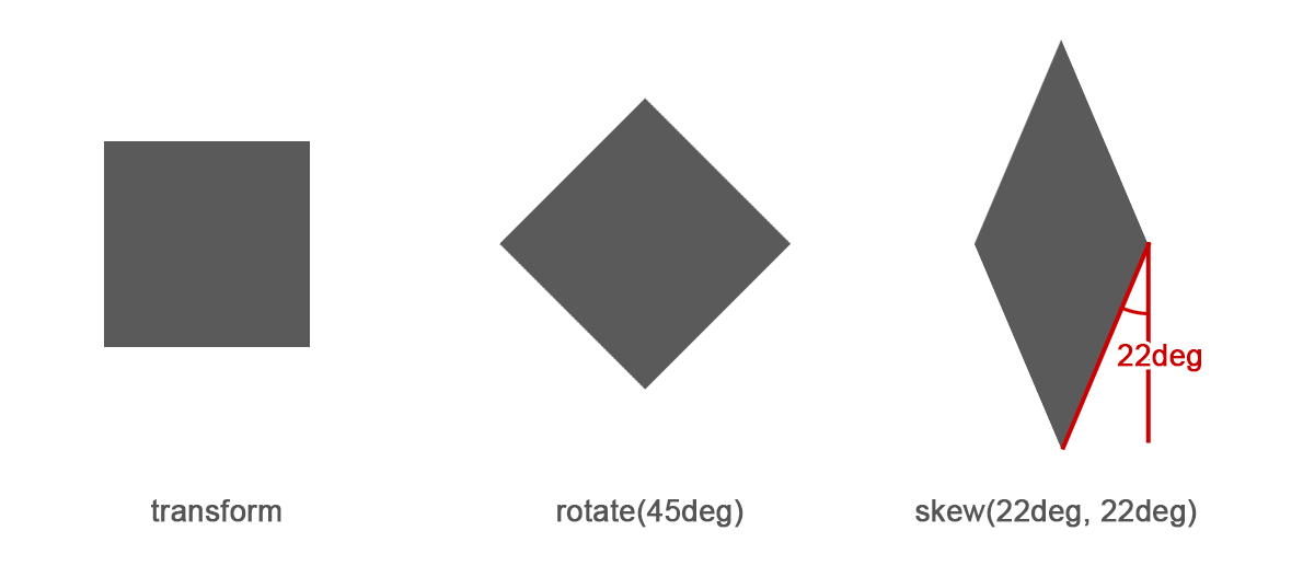
Generator
Flexbox가 어렵다면?
Horizontal Center
Transform
Mobile
viewport
컴퓨터나 휴대 단말기 등 장치에
Display요소가 표현되는 영역을 말한다.
<meta name="viewport" content="user-scalable=yes, initial-scale=0.5, maximum-scale=0.5, minimum-scale=0.5, width=device-width">- user-scalable : 확대, 축소 지원 여부
- initial-scale : 초기 배율값
- maximum-scale : 승수지정
- minimum-scale : 승수지정
- width : viewport 넓이
-
target-densitydpi :
- device-dpi
- low-dpi
- medium-dpi
- high-dpi
<meta name="viewport" content="user-scalable=no, initial-scale=1.0, maximum-scale=1.0, minimum-scale=1.0, width=device-width">The Future Of CSS
CSS Grid
Shape-Outside
Clip-path
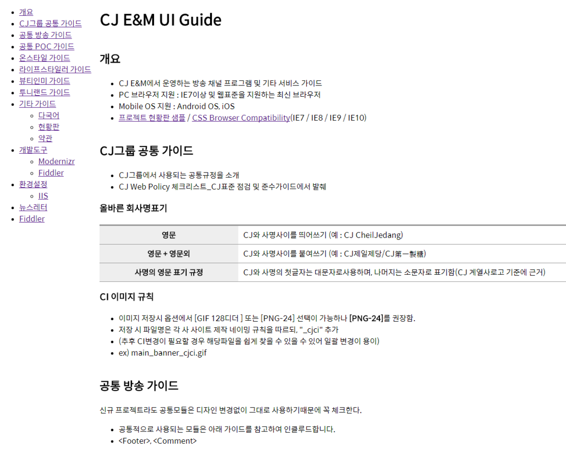
UI GUIDE
Title Text
CJ E&M UI Guide
다음 시간에...
Mobile + CSS3
By kyoo119@gmail.com

