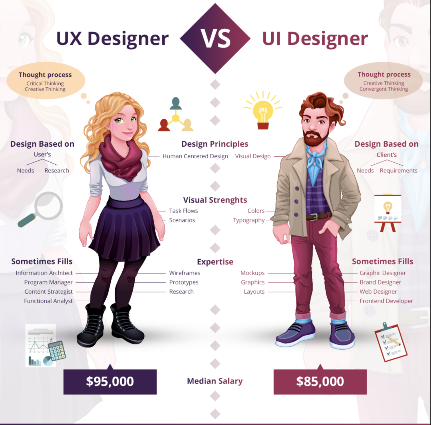
UX vs UI
Something that looks great
but is difficult to use is exemplary
of great UI and poor UX.
While something very usable
that looks terrible is exemplary
of great UX and poor UI.
UX vs UI
Chicken & Egg

You don’t need to learn all of it from the start.
Do you enjoy talking to people and feel comfortable doing that?
Start moderating user research and
user testing sessions
Do you prefer designing simple, innovative interactions?
Start with wireframing and sketching
Do you like numbers and feel comfortable speaking to that?
Start getting involved more closely with
analytics and metrics.
Do you like to write and appreciate how the choice of words can impact the user’s experience?
Start partnering with a professional
copywriter to learn from them.
UX IS ABOUT...
UNDERSTANDING USERS
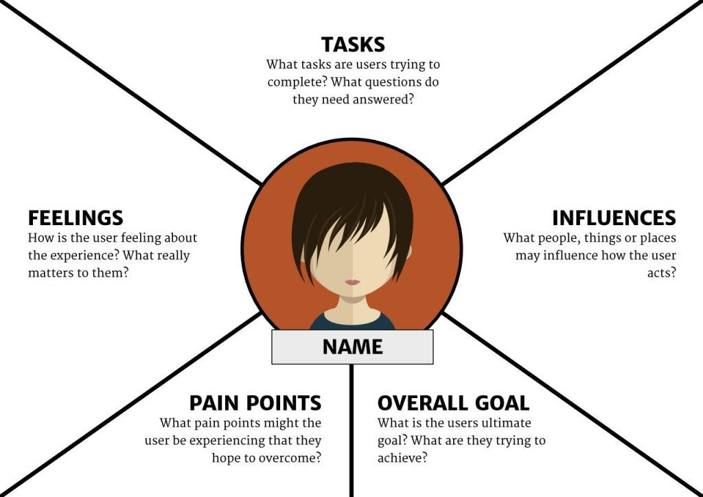
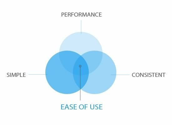
EASE OF USE
ACCESSIBILITY

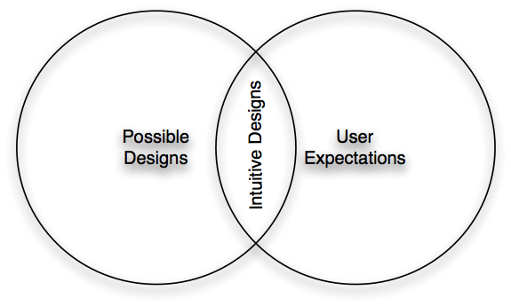
INTUITIVENESS
FORGIVING
"Good design, when it’s done well, becomes invisible. It’s only when it’s done poorly that we notice it.”
Jared Spool
What About UI
UI is a tool, defines the point of interaction, means of communication between a person and a device/system
FOCAL POINT
▶ elements or areas of dominance
▶ are areas of interest, emphasis or difference within a composition that capture and hold the viewer’s attention.
①
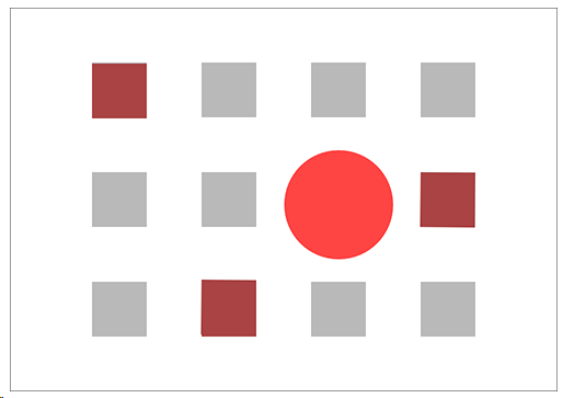
The red circle and squares are focal points. The circle is the dominant element or dominant focal point.
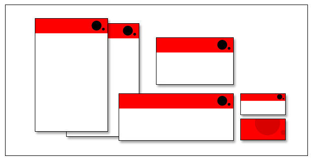
GROUPING
▶ helps creates organisation. By grouping similar elements together or in close proximity, you create a relationship between those elements.
▶ It also provides a focal point and can give the reader and idea of where they should start and finish reading.
②
GROUPING
▶ Grouping doesn’t mean that elements have to be placed together, it means they should be visually connected in someway.
②
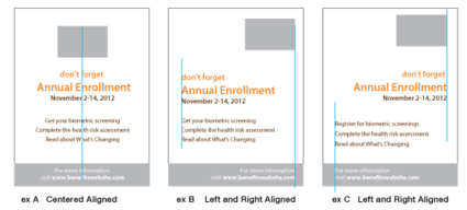
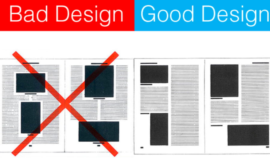
ALIGNMENT
▶ creates a sharper, more ordered design.
▶ aligning elements allows them to create a visual connection with each other.
▶ tightens the design and eliminates the haphazard, messy effect which comes when items are placed randomly.
③
ALIGNMENT
▶ aligning elements which are not in close proximity with each other, helps to provide an invisible connection between them.
▶ Alignment is one of the most basic and important principles of design. It allows us to create order and organisation among elements.
③
CONSISTENCY
▶ strengthens a design by tying together individual elements.
▶ helps to create association
▶ consistent repetition of an element is widely used in multi-page documents & websites.
▶ elements can be as simple as colour, shapes, typefaces or even texture.
④
EXAMPLES
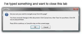
BAD UI
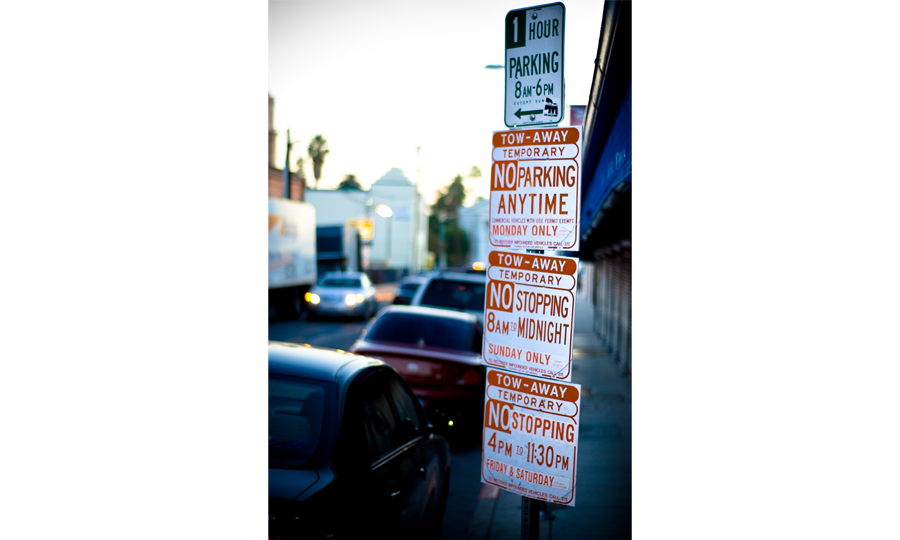
Confusing?
- Imagine you are a driver along this road on a Tuesday morning at 9 a.m.
- Can you park at this spot? What sounds like a simple question takes a lot of mental processing to answer.
SOLUTION
Still Confusing?
- use of visuals, rather than text, to convey information
- green for OK, red for No Parking.
- It’s even designed for the colour blind, with stripes for No Parking.
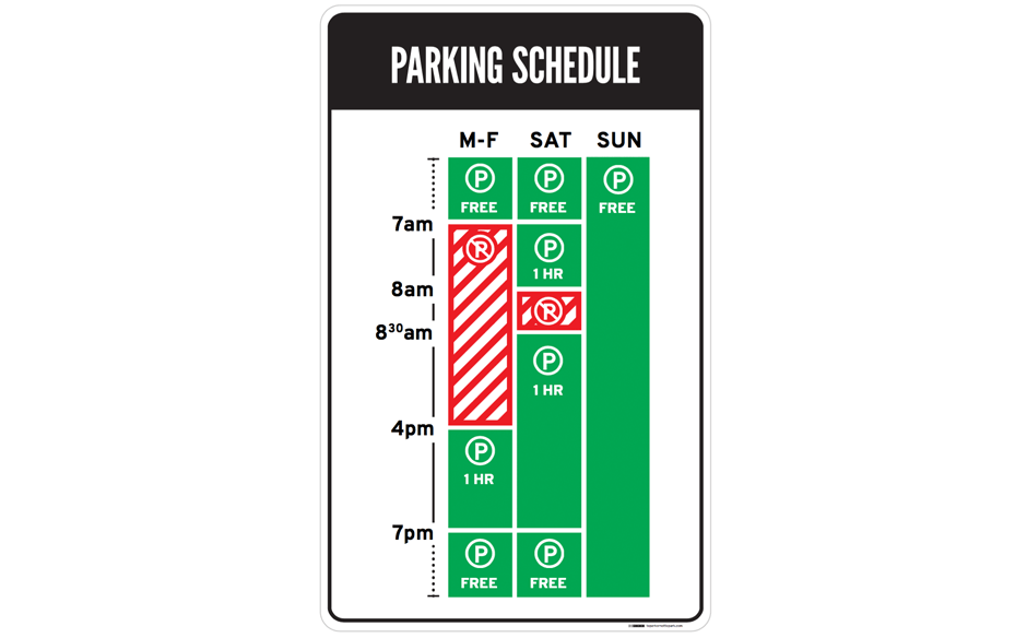
Author/Copyright holder: Nikki Sylianteng. Copyright terms and licence: CC BY-NC-SA 4.0
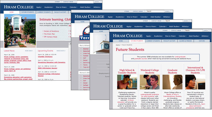
bad UI design will make the users feel the website is complicated and difficult to operate
The design lacks of contrast
The Good: Contrast in Design
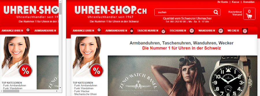
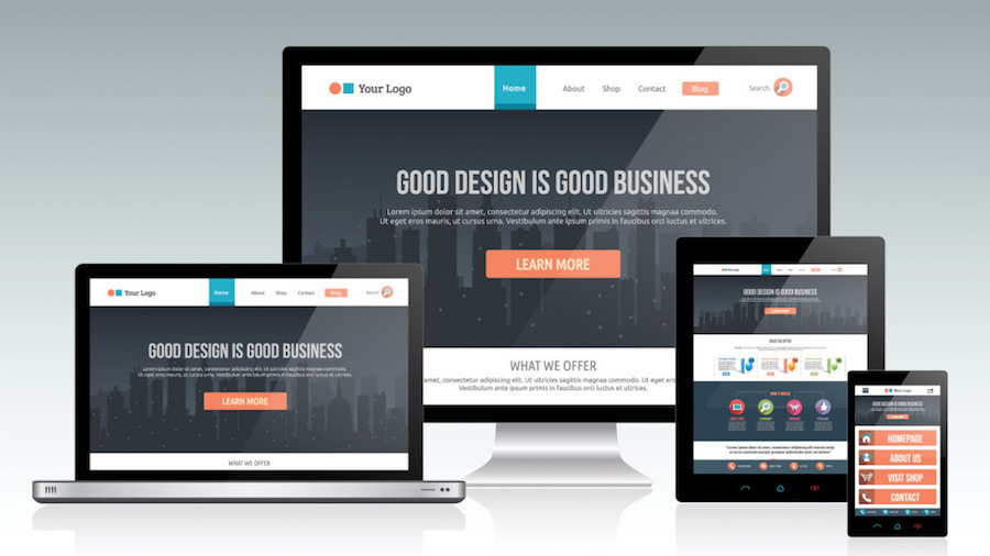
The Bad: Not Responsive Design
The Good: Responsive Design
UX
- is the entirety of the website (or product) that you build. It's how the pages are structured and organized.
- It's how users navigate from page to page. It's the process they follow to get from "point A" to "point B".
- The process of designing the user experience can often involve research, interviews, creating user personas, examining the usability and accessibility concerns, and so many other things.
UI
User interface design (UI) is just that:
the interface itself.
- It's the layout, the colors, the buttons, images, illustrations ... everything visual.
- It's the part of the website that the user actually sees and clicks on.
THANK YOU.
MINTER1 - DMA11T.2019
By Lea Sacdalan Abarentos


