I Love You But
I Don't Need You
the use of color in accessible design
@LetaCodes
Leta Keane


@LetaCodes
land
acknow
ledge
ment
@LetaCodes
@LetaCodes
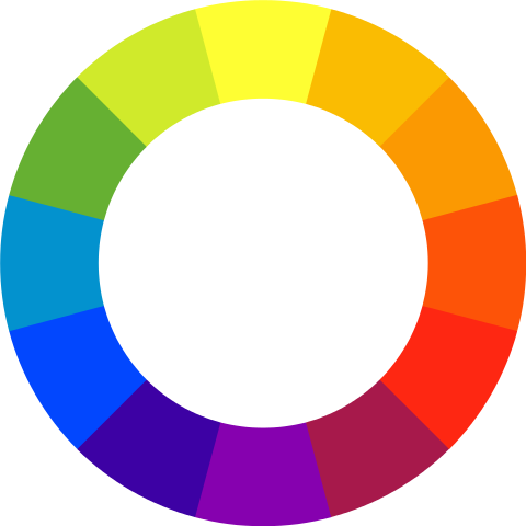
color
hue
SATURATIoN
light/value
@LetaCodes

EYE: TONY GRAHAM/GETTY IMAGES, ADAPTED BY J. HIRSHFELD; WEBVISION.MED.UTAH.EDU, ADAPTED BY J. HIRSHFELD
vision
trichromatic color vision

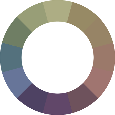
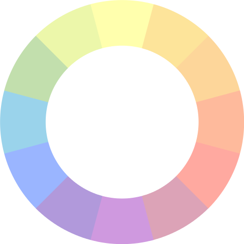
protanopia/Protanomaly

deuteranopia/deuteranomaly

tritanopia/tritanomaly

Achromatopsia/achromatomaly

🦜@LetaCodes
Vision
attention
understanding
🦜@LetaCodes
🦜@LetaCodes
🦜@LetaCodes

🦜@LetaCodes
🦜@LetaCodes
🦜@LetaCodes
🦜@LetaCodes
🦜@LetaCodes
🎨
🦜@LetaCodes
🐢🎨
🦜@LetaCodes
so how do you build color-accessible apps?

🦜@LetaCodes
Avoid palettes of similar brightness
🙅♀️
🦜@LetaCodes

Avoid palettes of similar brightness
🙅♀️
🦜@LetaCodes
Change it up!

🦜@LetaCodes

Change it up!
🦜@LetaCodes
Start with Semantics;
Add color l a t e r

🦜@LetaCodes
Never rely solely on
color to communicate something
🦜@LetaCodes

🦜@LetaCodes
Use good contrast for text
Use good contrast for text
🦜@LetaCodes
especially when
you're using a photo background
🦜@LetaCodes
especially when
you're using a photo background
Label
stuff
🦜@LetaCodes
Label
stuff
🦜@LetaCodes
Label
stuff
🦜@LetaCodes
🦜@LetaCodes
USE YOUR tools
🦜@LetaCodes
YOU GOT THIS!
that person from the thing .com
Leta Keane
leta@turing.io
@LetaCodes

The use of color in accessibility
By letakeane
The use of color in accessibility
Given at Develop Denver 2019


