Form UX
How to design & code a user-friendly form

Liam Jay
Designer, Code Monkey,
Cyclist, Gamer, Coffee Addict
at Love Creative UK
Assumptions
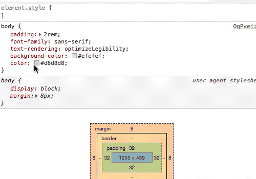
p {
    color: DarkGoldenRod;
    font-size: 50px;
    font-weight: bold;
    text-align: center;
}
<p>Hello Bristol!</p>
Wait, this talk includes
a lot of information
about accessibility.

Why Forms?
Making a habit of flouting convention will garner you attention, spark controversy and earnest debate — even earn you awards. But it will also confound and alienate your readers and users — the people your work is really meant for. That is abject failure.
— Heydon Pickering

Interfaces that are obvious are also inclusive
Let's start with a registration form
Nobody wants to sign up to your service!

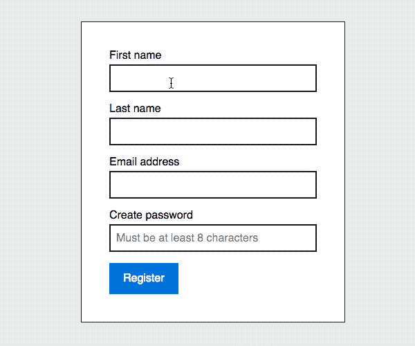
Register
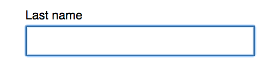
First name
Last name
Email address
Password
Must be at least 8 characters long
Let's Go
*
*
*
<form>

    <label for="firstName">First name</label>
    <input type="text" id="firstName" name="firstName">

    <label for="lastName">Last name</label>
    <input type="text" id="lastName" name="lastName">

    <label for="email">Email address</label>
    <input type="email" id="email" name="email">

    <label for="password">Create password</label>
    <input type="password" id="password" name="password"
           placeholder="Must be at least 8 characters">

    <input type="submit" value="Let's Go">

</form>
Here's the HTML for that form
Colour contrast
First name
*
https://accessibility.blog.gov.uk/2016/06/17/colour-contrast-why-does-it-matter/
First name
*
First name
*
Before
After
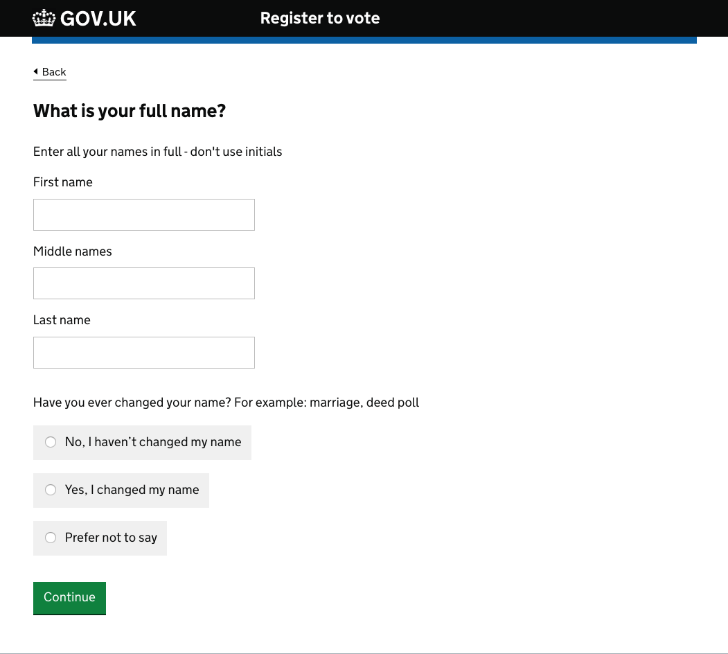
Labels
What makes a good label?
1. Visual: make it easy to see.
2. Auditory: make it easy to hear.
3. Motor: make it easy to interact with.
4. Cognitive: make it easy to understand.
<label for="firstName">First name</label>

<input type="text" id="firstName" name="firstName">
To connect an input to a label, the input’s id
and the label’s for attribute should match and
be unique to the page.
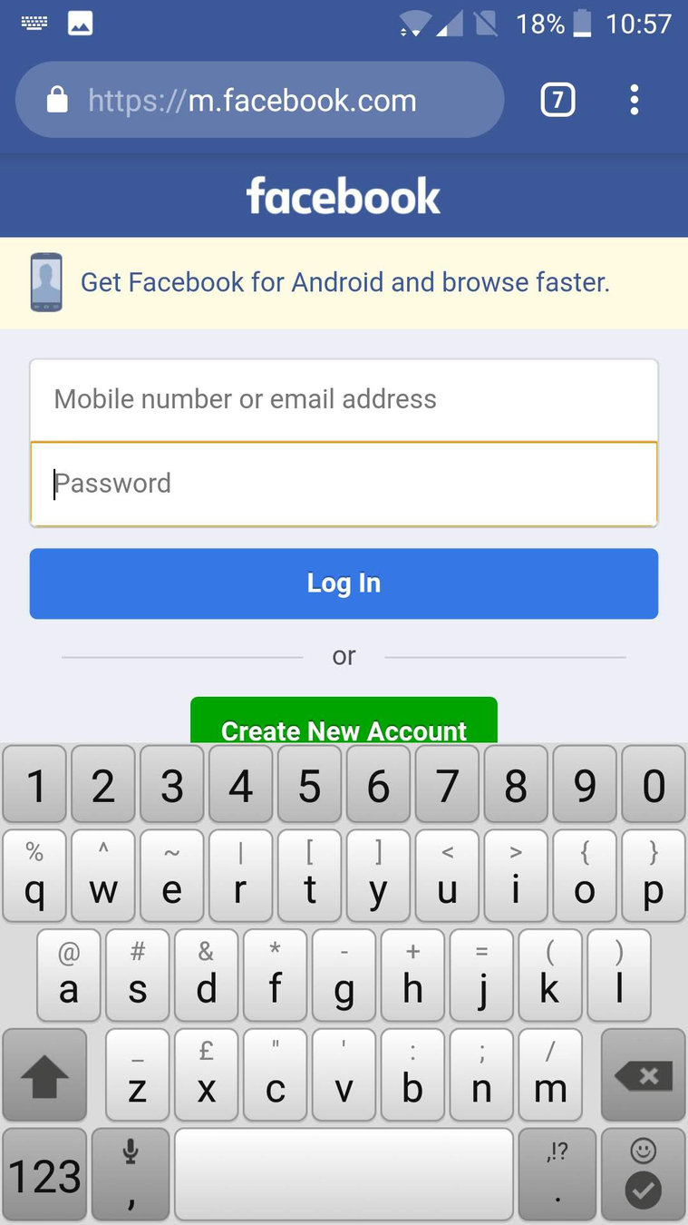
Placeholders
The placeholder attribute is intended
to store a hint to guide us
Password
Must be at least 8 characters
They are optional!
First name
Enter your first name
They are not the solution you've been looking for!

They disappear when the user types
Password
Must be at least 8 characters
Password
* * *
Users often mistake placeholder text for a value, causing the field to be skipped
Location
Bristol
Gray-on-white text often lacks good contrast, making it hard-to-read
Password
Must be at least 8 characters
Longer text hints may get cut off
Password
Must be at least 8 characters long and include at least one num...
And to top it off, some browsers don’t support placeholders and some screen readers don’t announce them.

So what should we do?

Password
Must be at least 8 characters long and include at least 1 number,
1 lowercase letter and 1 uppercase letter
  <div class="field">

    <label for="password">

      <span class="field__label">Password</span>
      <span class="field__hint">Must contain...</span>

    </label>

    <input type="password" id="password" name="password">

  </div>
Here's the HTML for that section
What About Float Labels?


What do they solve?
- Keeps the placeholder text visible
- Takes up less space
- Ummm... it makes your site look modern*
* I just copy what Google does

Label Position
Email address
Email address
Above
To the side
Placing a label right over its input field permitted users to capture both elements
with a single eye movement.
https://www.uxmatters.com/mt/archives/2006/07/label-placement-in-forms.php
Email address
Email address
Password
Must be at least 8 characters long
1 lowercase letter and 1 uppercase letter
Password
Must be at least 8 characters long and include at least 1 number,
1 lowercase letter and 1 uppercase letter
and include at least 1 number,
What about hints?
Form fields should
look like form fields
First name
First name
Last name
Empty space should be boxed in
First name
Last name
Email address
Password
Empty boxes signify “fill me in”
*
*
*
First name
Last name
Email address
The label should be closest to its form element
*
*
First name
Last name
Email address
*
*
Before
After
Default Focus Styles
Custom Focus Styles

input:focus {
    outline: 4px solid #ffbf47;
}
Here's the CSS
Email address
Sentence case, title case or uppercase?
Email Address
EMAIL ADDRESS
Email address
The email field
<div class="field">

    <label for="email">
        <span class="field__label">Email address</span>
    </label>

    <input type="email" id="email" name="email">

</div>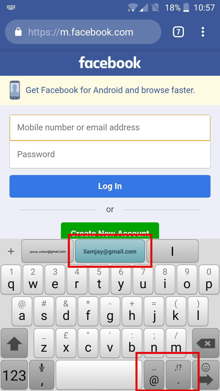
Regular
The password field
Password
Must be at least 8 characters long and include at least 1 number,
1 lowercase letter and 1 uppercase letter
Choose password
Must be at least 8 characters long and include at least 1 number,
1 lowercase letter and 1 uppercase letter
The button field
Let's go
Let's go
Let's go
Let's go
“One material should not be used as a substitute for another. Otherwise the end result is deceptive.” Making a link look like a button is materially dishonest. It tells users that links and buttons are the same when they’re not.
Jeremy Keith
Ghost buttons
Let's go
Let's go
Let's go
Let's go
Ghost buttons
Traditional buttons
Let's go
Let's go
Let's go
Let's go
Register
First name
Last name
Email address
Let's go
Choose password
Must be at least 8 characters long and include at least 1 number,
1 lowercase letter and 1 uppercase letter
*
*
*


Email address
Let's go
Choose password
Must be at least 8 characters long and include at least 1 number,
1 lowercase letter and 1 uppercase letter
Button placement
Let's go
Let's go
Register
First name
Last name
Email address
Let's go
Choose password
Must be at least 8 characters long and include at least 1 number,
1 lowercase letter and 1 uppercase letter
*
*
*
The button text
Submit
Register
Let's go
First name
Last name
Email address
*
*
Mandatory fields
“[…] including the phrase 'optional' after a label is much clearer than any visual symbol you could use to mean the same thing. Someone may always wonder ‘what does this asterisk mean?’ and have to go hunting for a legend that explains things.
Luke Wroblewski
First name
Last name (optional)
Email address
Optional fields
Validation messages

Register
Choose password
Must be at least 8 characters long
Email address
Please include an '@' in the email address
Register
Choose password
Must be at least 8 characters long
Email address
Please enter a password
Please include an '@' in the email address
Register
Choose password
Must be at least 8 characters long
Email address

Please enter a password
Include an '@' in the email address
Register
Choose password
Must be at least 8 characters long
Email address
Enter a password
Avoid pleasantries
Register
First name
Last name
Email address
Password
Must be at least 8 characters long
Let's Go
*
*
*
Register
First name
Last name (optional)
Email address
Register
Choose password
Must be at least 8 characters long
https://codepen.io/Sweetums66/pen/PLGPea?editors=1100
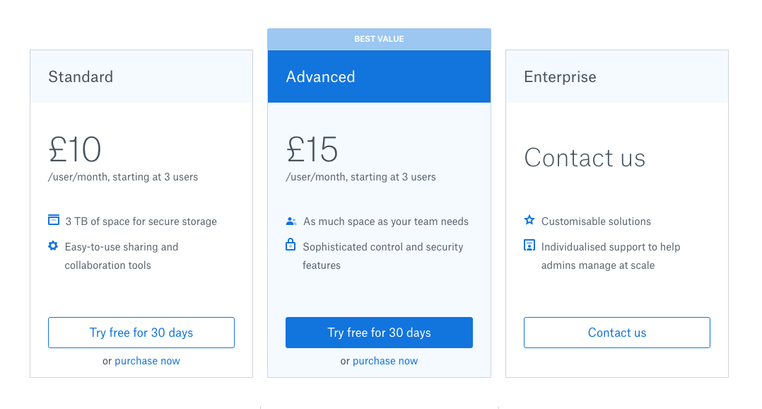
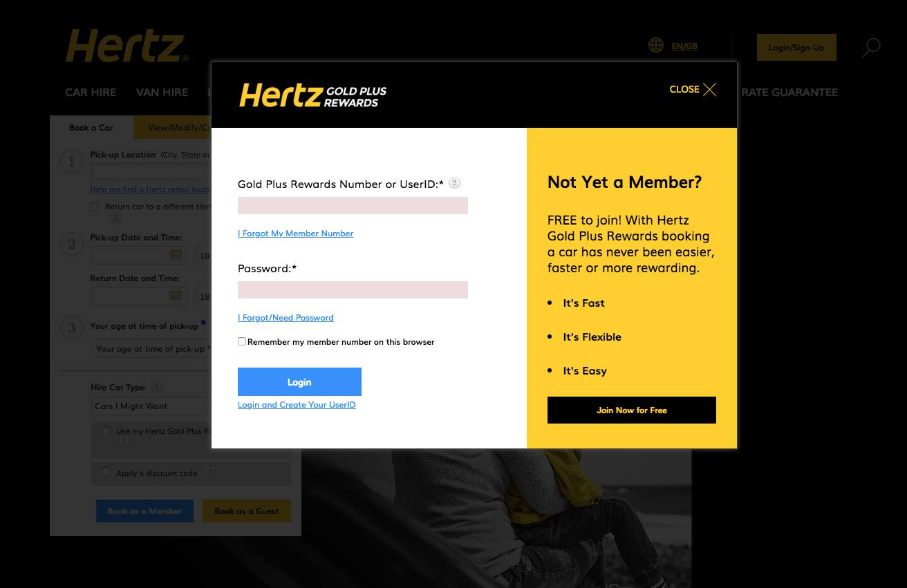
Don't put forms in modals (pop up boxes)
Things to avoid
-
Using colours without enough contrast.
-
Using the placeholder attribute as a mechanism for storing label and hint text.
-
Using incorrect input types.
-
Styling buttons and links the same.
- Using complex jargon and brand-influenced text.
- Using asterisk to mark required fields.
- Putting forms in pop up boxes.
Further reading
Accessibility for everyone
https://abookapart.com/products/accessibility-for-everyone
Forms are boring
https://mrjoe.uk/forms-are-boring/
Forms design patterns
https://www.smashingmagazine.com/printed-books/form-design-patterns/
Liam Jay
Form UX
By Liam Jay
Form UX
How to design & code a user-friendly form

