El CSS de las

Animaciones
Luisa Vaca
Web UI - Globant
Organizadora de:
-
Medellín CSS
-
CSS Conf.
@otra_gris
🐶🐢🐙🐨🐥 🌿🌸🌾🍁 🤱🏻

Ejemplos
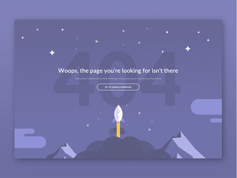
Imaginemos una web sin :hover
-
Botones
-
Listas
-
Grillas
El :hover como explicación básica de qué es una animación.
Importancia de las animaciones

TIPOS DE ANIMACIONES
Feedback
Progreso
Carga
Atención
Error
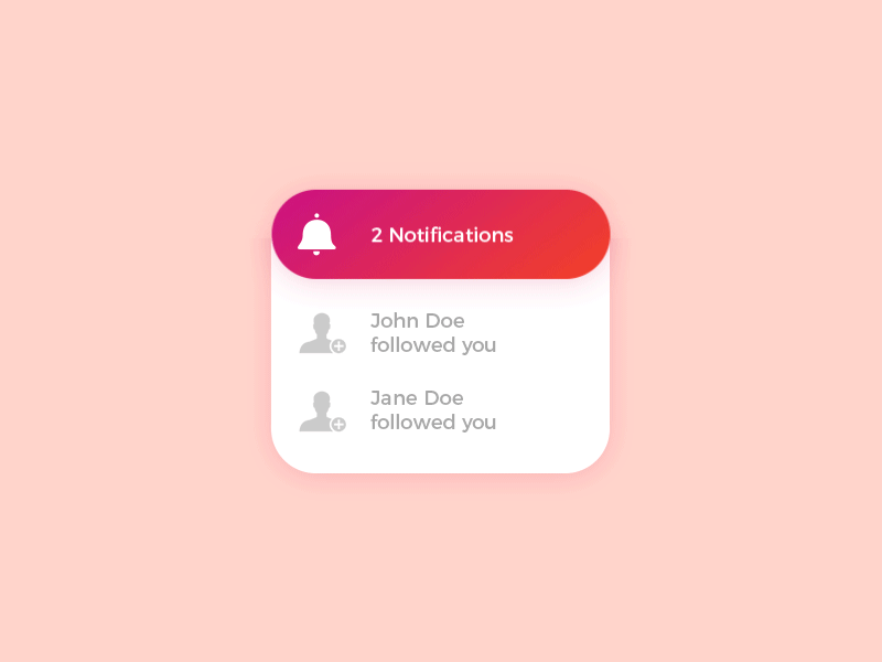
Notificación
Reactivas
Progresivas
Estado
Instructivas
Transitorias
Hablemos de CSS
Trancisiones
.element {
  	transition
  	transition-delay
	transition-duration
	transition-property
	transition-timing-function
}
Propiedades
body {
  display: flex;
  justify-content: center;
  align-items: center;
  background-color: #0ebeff;
  height: 100vh;
}

div {
  width: 100px;
  height: 100px;
  background-color: coral;
  transition-delay: 1s;
}

div:hover {
  background-color: pink;
  border-radius: 100px;
}
Delay
body {
  display: flex;
  justify-content: center;
  align-items: center;
  background-color: #0ebeff;
  height: 100vh;
}

div {
  width: 100px;
  height: 100px;
  background-color: coral;
  transition-property: width, height;
  transition-duration: 2s;
}

div:hover {
   width: 200px;
  height: 200px;
  background-color: pink;
  border-radius: 100px;
}
Duration
body {
  display: flex;
  justify-content: center;
  align-items: center;
  background-color: #0ebeff;
  height: 100vh;
}

div {
  border-radius: 100px;
  width: 100px;
  height: 100px;
  background-color: coral;
  transition-property: background-color;
  transition-duration: 2s;
}

div:hover {
  background-color: pink;
  border-radius: 100px;
}
Property
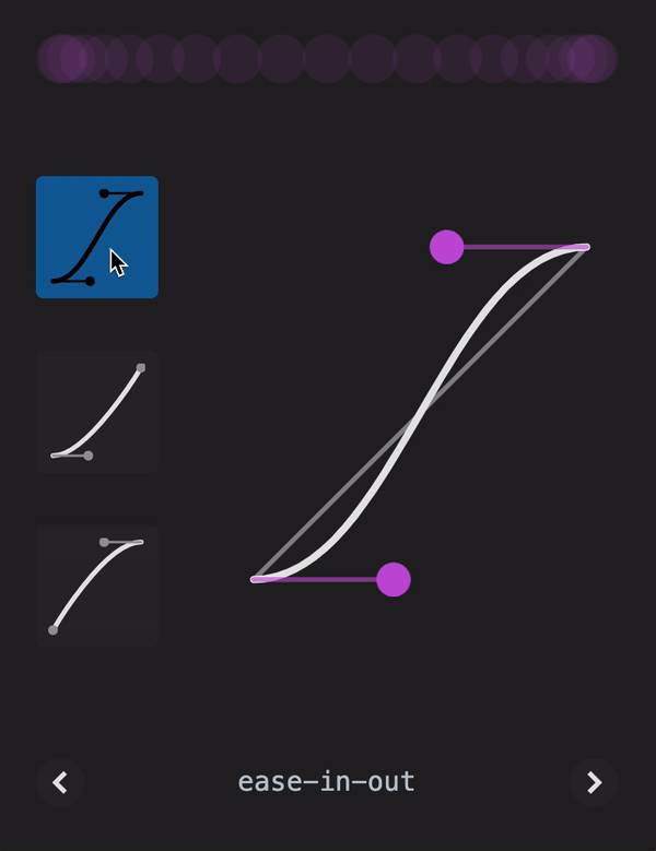
Timing-Funtion
Animaciones con Key - Frames
Title Text
.element {
  animation: myAnimation;
  animation-name: none,
  animation-duration: 0s,
  animation-timing-function: ease,
  animation-delay: 0s,
  animation-iteration-count: 1,
  animation-direction: normal,
  animation-fill-mode: none,
  animation-play-state: running,
}

@key-frames myAnimation {
  from
  to
}

@key-frames myAnimation {
  10%
  50%
  90%
}
Propiedades
div {
  width: 100px;
  height: 100px;
  font-size: 100px;
  animation: spinner 1s infinite;
}

@keyframes spinner {
 from {
    transform: rotate(0deg);
  }
  to {
    transform: rotate(360deg);
  }
}
FROM - TO
div {
  width: 100px;
  height: 100px;
  font-size: 100px;
  animation: spinner 1s infinite;
  color: #fff;
}

@keyframes spinner {
 0% {
    transform: rotate(0deg);
  }
 100% {
    transform: rotate(360deg);
  }
}
%
.square {
  width: 30px;
  height: 30px;
  background-color: #ff0072;
  border-radius: 10px;
  animation: loading 1.5s ease-out infinite;;
}

@keyframes loading {
  0% {
    transform: translate(0,0)
    rotate(0deg);
  }
  50% {
    transform: translate(70px,0)
    rotate(360deg);
  }
  100% {
    transform: translate(0,0)
    rotate(0deg);
  }
}
Functions
.square {
  width: 30px;
  height: 30px;
  background-color: #ff0072;
  border-radius: 10px;
  animation-name: loading;
  animation-duration: 1.5s;
  animation-timing-function: ease-out;
  animation-iteration-count: infinite;
}

@keyframes loading {
  0% {
    transform: translate(0,0)
    rotate(0deg);
  }
  50% {
    transform: translate(70px,0)
    rotate(360deg);
  }
  100% {
    transform: translate(0,0)
    rotate(0deg);
  }
}
Functions
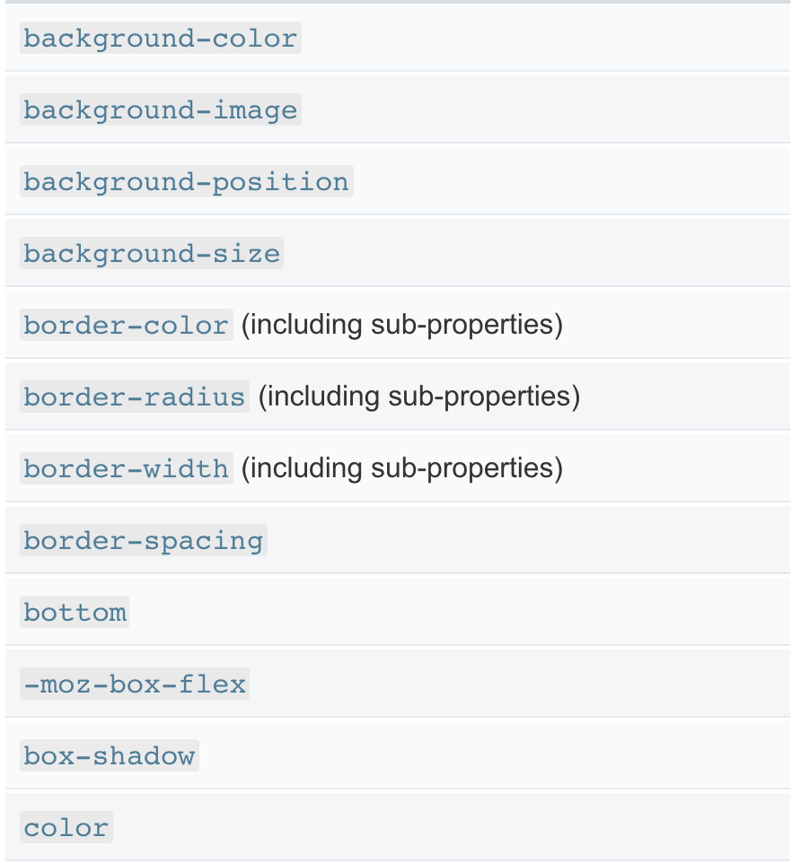
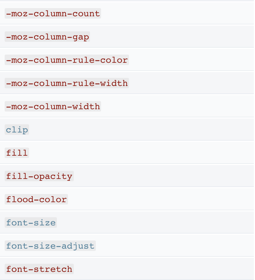
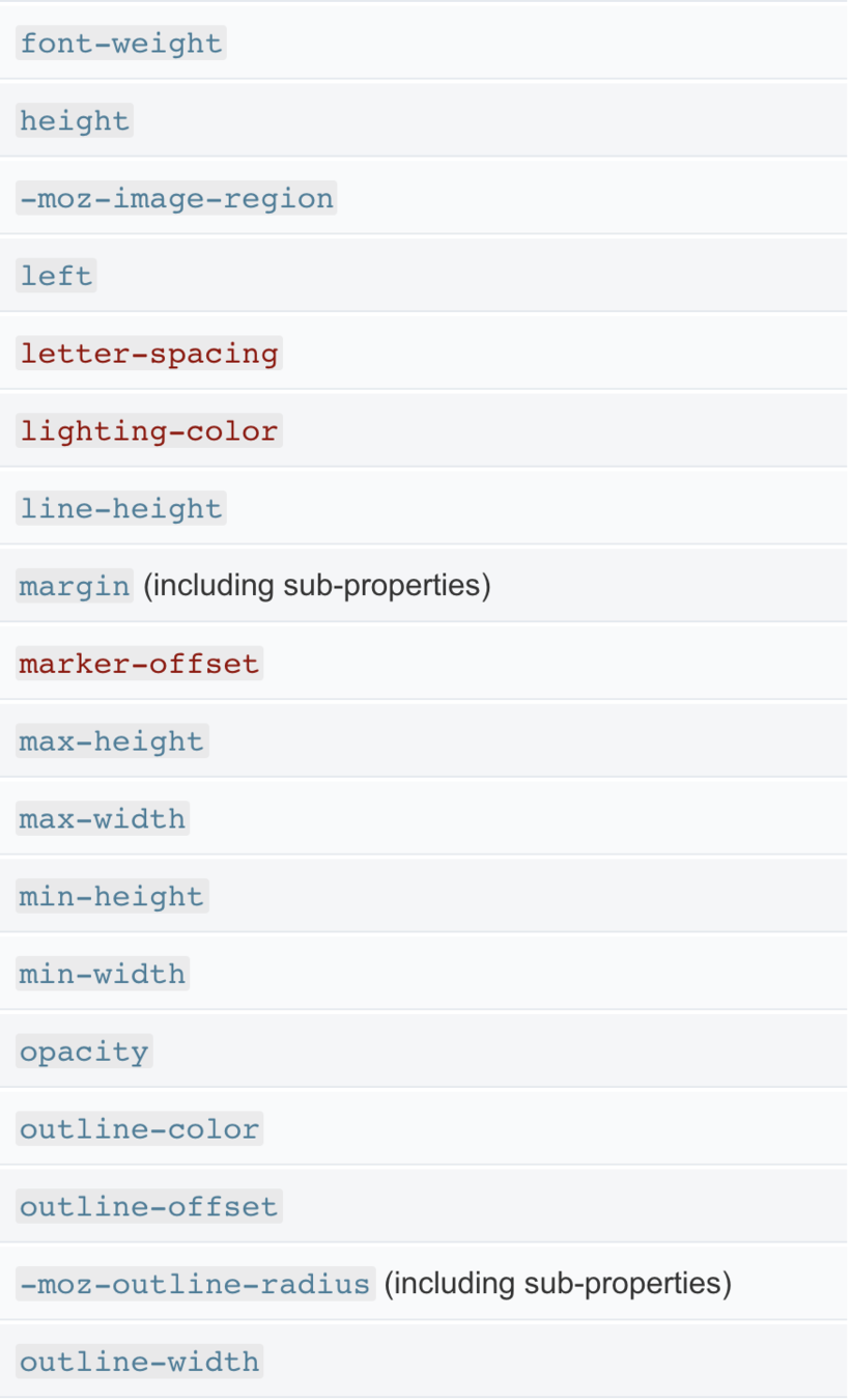
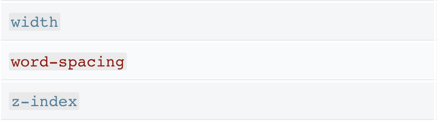
Lista de propiedades que pueden ser animadas

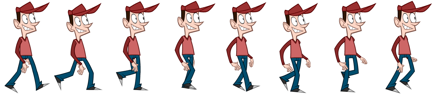
Sprites
Text
Librerias que ayudan a animar
Bounce.js
Anime.js
DynCss
D O N E
MEDELLINJS
-20 USD = 60 USD
10
Animaciones con css
By LUISA FERNANDA VACA CORREA


