Let's make an owl!
CSS Art - What is it good for, anyway?
- Positioning
- Sizing
- DOM and Layering
- Animations, Transitions
- Shadows
CSS Art is a way to get a better grasp of:
What do you need to know?
This will be as basic as possible, but there are a few things you would benefit from knowing in advance
- SASS/SCSS
- nesting, mixins, @for loops
- CSS Custom Properties
- calc()
- :nth-child
- Pseudo Elements
- Media Queries
*None of this is mandatory, and is really simple to learn.
CSS Custom Properties
(AKA CSS Variables)
Just like the name suggests, CSS Custom Properties allow you to dynamically change a property's value without having to fully override it
Variables are usually declared in the :root {} selector, and changed wherever needed, be it deeper in the cascade or using JavaScript.
calc()
calc is a function in CSS that allows you to run simple calculations, for example:
.some-parent {
    width: 50vw;
    .someChild {
        width: calc(100% - 35px); // = 50vw - 35px
    }
}
Pseudo Elements
In CSS, ::before creates a pseudo-element that is the first child of the selected element. It is often used to add cosmetic content to an element with the content property. It is inline by default.
.some-class {
    &::before {
        content: '♥';  //will add a ♥ before the element.
    }
}
(::before, ::after)
* In CSS art, we use Pseudo Elements to add styles to elements without adding elements in proper HTML.
:nth-child
The nth-child pseudo-class is specified with a single argument, which represents the pattern for matching elements.
.some-class {
    &:nth-child(1) {  //first element. can use :first-child as well.
        color: blue;
    }
    &:nth-child(even) { //all matching elements that are the even children
        color: green;
    }
    &:nth-child(3n+2) { //Select every third element starting at #2
        background: pink;
    }
}
Some examples:
@media Queries
Media queries are useful when you want to modify your site or app depending on a device's general type (such as print vs. screen) or specific characteristics and parameters (such as screen resolution or browser viewport width).
body { //default style
background-color: #fff;
color: #000;
}
@media screen and (max-width: 720px) {
body { //screens up to 720px wide
background-color: #000;
color: #fff;
}
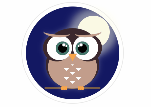
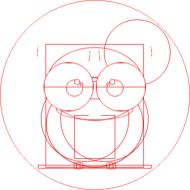
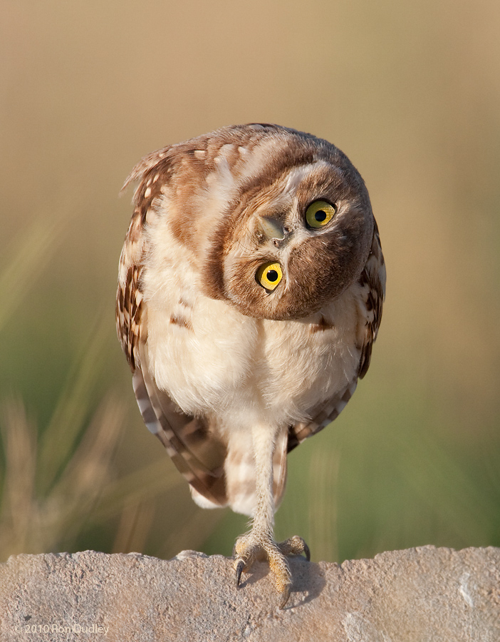
}Step 1 - Find your image
Here is our basic image for tonight, this cute little owl
Step 2 - Find the shapes
Let's start writing some code!
-
Prefer percentages, where possible.
It'll make your life easy when you want to make your image responsive.
-
Usually, you'd have to measure sizes and calculate ratios
I saved you the hassle, due to our short time.
Start from the outside, going in
Starting outside and building inwards, makes it easier to control positions, sizes, and inherited styles
Basic CodePen Template
SCSS:
Vanilla CSS:
* This workshop assumes you use the SCSS version, but if you're not confident with your SASS skills, the Vanilla CSS version will be fine
Go to codepen and fork the template
Step 1
<div class="owl--circle"></div>@mixin absolute_center() {
position: absolute;
top: 0;
right: 0;
bottom: 0;
left: 0;
margin: auto;
}
DIV {
@include absolute_center();
}@mixin circle($w, $h:$w) {
width: $w;
height: $h;
border-radius: 50%;
}
DIV {
@include circle(50px, 50px);
}--circle-bg: #131862;
--circle-size: 37.1rem;
&--circle {
@include absolute_center;
@include circle(var(--circle-size));
background-color: var(--circle-bg);
box-shadow: var(--circle-box-shadow);
}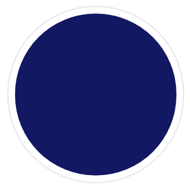
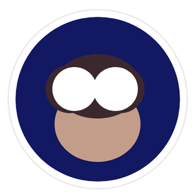
Step 1 Result
Step 2
<div class="owl--body"></div>@mixin absolute_center() {
position: absolute;
top: 0;
right: 0;
bottom: 0;
left: 0;
margin: auto;
}
DIV {
@include absolute_center();
}@mixin circle($w, $h:$w) {
width: $w;
height: $h;
border-radius: 50%;
}
DIV {
@include circle(50px, 50px);
}--body-w: 52.05%;
--body-h: 65.5%;
--body-t: 4rem;
--body-drop-shadow: drop-shadow(0 0 10px rgba(#fff,0.25));
&--body {
@include absolute_center;
width: var(--body-w);
height: var(--body-h);
top: var(--body-t);
filter: var(--body-drop-shadow);
}Step 2 Result
(If you'll inspect your work, you'll see a rectangle where the body is)
Step 3
<div class="owl--lower-body"></div>@mixin absolute_center() {
position: absolute;
top: 0;
right: 0;
bottom: 0;
left: 0;
margin: auto;
}
DIV {
@include absolute_center();
}@mixin circle($w, $h:$w) {
width: $w;
height: $h;
border-radius: 50%;
}
DIV {
@include circle(50px, 50px);
}--lower-body-w: 100%;
--lower-body-h: 70%;
--lower-body-b: 0;
--lower-body-box-shadow: 0 calc(0.3rem / 2) 0.3rem 0 rgba(0,0,0,0.25);
&--lower-body {
@include circle(var(--lower-body-w), var(--lower-body-h));
background-color: var(--belly);
position: absolute;
bottom: var(--lower-body-b);
box-shadow: var(--lower-body-box-shadow);
}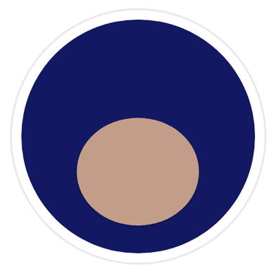
Step 3 Result

Step 4
<div class="owl-head"></div>@mixin absolute_center() {
position: absolute;
top: 0;
right: 0;
bottom: 0;
left: 0;
margin: auto;
}
DIV {
@include absolute_center();
}@mixin circle($w, $h:$w) {
width: $w;
height: $h;
border-radius: 50%;
}
DIV {
@include circle(50px, 50px);
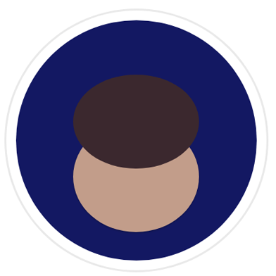
}--head-w: 100%;
--head-h: 60%;
--feathers: #3b282e;
&--head {
@include circle(var(--head-w), var(--head-h));
background: var(--feathers);
position: absolute;
}
Step 4 Result
Step 5
<div class="owl--eye"></div>@mixin circle($w, $h:$w) {
width: $w;
height: $h;
border-radius: 50%;
}
DIV {
@include circle(50px, 50px);
}--eye-w: 52%;
--eye-h: 68%;
--eye-t: 20%;
&--eye {
@include circle(var(--eye-w), var(--eye-h));
background: #fff;
position: absolute;
top: var(--eye-t);
overflow: hidden;
}When you're done, find the eyes in the hidden elemets list and remove/comment them out to see the eyes.
Step 5 Result
Step 6
<div class="owl--iris"></div>@mixin circle($w, $h:$w) {
width: $w;
height: $h;
border-radius: 50%;
}
DIV {
@include circle(50px, 50px);
}--iris-size: 35%;
--iris-color: #000;
--iris-t: 0.5rem;
--iris-b: 0;
--iris-box-shadow: 0 0 0 1rem var(--iris-box-shadow-color);
&--iris {
@include circle(var(--iris-size));
background: var(--iris-color);
box-shadow: var(--iris-box-shadow);
top: var(--iris-t);
bottom: var(--iris-b);
position: absolute;
margin: auto;
}When you're done, find the iris in the hidden elemets list and remove/comment them out to see the irides.
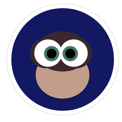
Step 6 Result
Step 7
show pre-existing styles//eyebrows:
&--head::before, &--head::after,
//left/right eye specifics:
&--eye.left, &--eye.right,
//eyelids:
&--eye::before, &--eye::after,
//iris
&--iris,
&--iris::before, &--iris::after,
//face, beak, wing, bright feathers, foot, moon, branch, zzz:
&--face, &--beak, &--wing, &--bright-feathers, &--foot,
&--moon, &--branch, &--zzz {
display: none !important;
}Simply remove the following bunch of code, if you haven't yet:
Step 7 Result
Let's add some animation!
@keyframes blink {
    0% {
        height: 0%;
    }
    100% {
        height: 50%;
    }
}
&--eye {
&::before, &::after {
animation: 4s blink ease-in-out forwards;
}
}CSS Animations
CSS animations make it possible to animate transitions from one CSS style configuration to another. Animations consist of two components, a style describing the CSS animation and a set of keyframes that indicate the start and end states of the animation’s style, as well as possible intermediate waypoints.
CSS Transitions
CSS transitions provide a way to control animation speed when changing CSS properties. Instead of having property changes take effect immediately, you can cause the changes in a property to take place over a period of time.
<div class="owl--circle"></div>@mixin absolute_center() {
position: absolute;
top: 0;
right: 0;
bottom: 0;
left: 0;
margin: auto;
}
DIV {
@include absolute_center();
}@mixin circle($w, $h:$w) {
width: $w;
height: $h;
border-radius: 50%;
}
DIV {
@include circle(50px, 50px);
}--circle-bg: #131862;
--circle-size: 37.1rem;
&--circle {
@include absolute_center;
@include circle(var(--circle-size));
background-color: var(--circle-bg);
box-shadow: var(--circle-box-shadow);
}The selector we're working on:
Mixins, their content and how to use them
Relevant CSS vars and final CSS code
Expected result
...Time's up!
If you didn't get to finish your owl, you can either continue on your own
(or fork this pen and play around with the finished owl later)
Thank you for participating
I hope it's been a hoot 😉
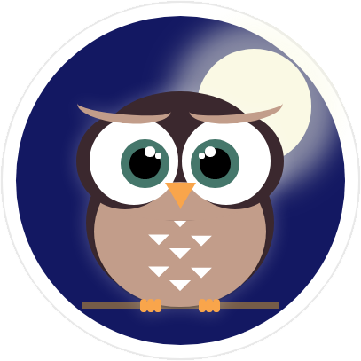
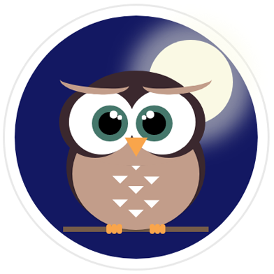
My final version:
Let's make an owl!
By lurx
Let's make an owl!
Step-by-step instructions on how to make a basic animated owl with CSS & HTML