Effective data visualisation
Maarten
Lambrechts
CFO Top
21 November 2019
Data visualisation?
| Year | Imports | Exports |
|---|---|---|
| 1700 | 71,1 | 32,8 |
| 1705 | 74,5 | 40,9 |
| 1710 | 82,6 | 59 |
| 1715 | 87,2 | 77,9 |
| 1720 | 96,8 | 75,2 |
| 1725 | 102,6 | 71,3 |
| 1730 | 96,4 | 64,7 |
| 1735 | 93,7 | 60,5 |
| 1740 | 92,9 | 65,1 |
| 1745 | 92,5 | 74,3 |
| 1750 | 90,1 | 77,4 |
| 1755 | 79,9 | 82,8 |
| 1760 | 76,6 | 117,5 |
| 1765 | 79,6 | 151,8 |
| 1770 | 83,8 | 163,8 |
| 1775 | 90,4 | 175,7 |
| 1780 | 92,7 | 185,4 |


Explanatory data visualisation
Exploratory data visualisation
You have a message
You want people to understand
You want people to take action
Explanatory data visualisation
using an appropriate chart type
using text on charts smartly
designing your charts well
using storytelling techniques
Help your data message to get across by
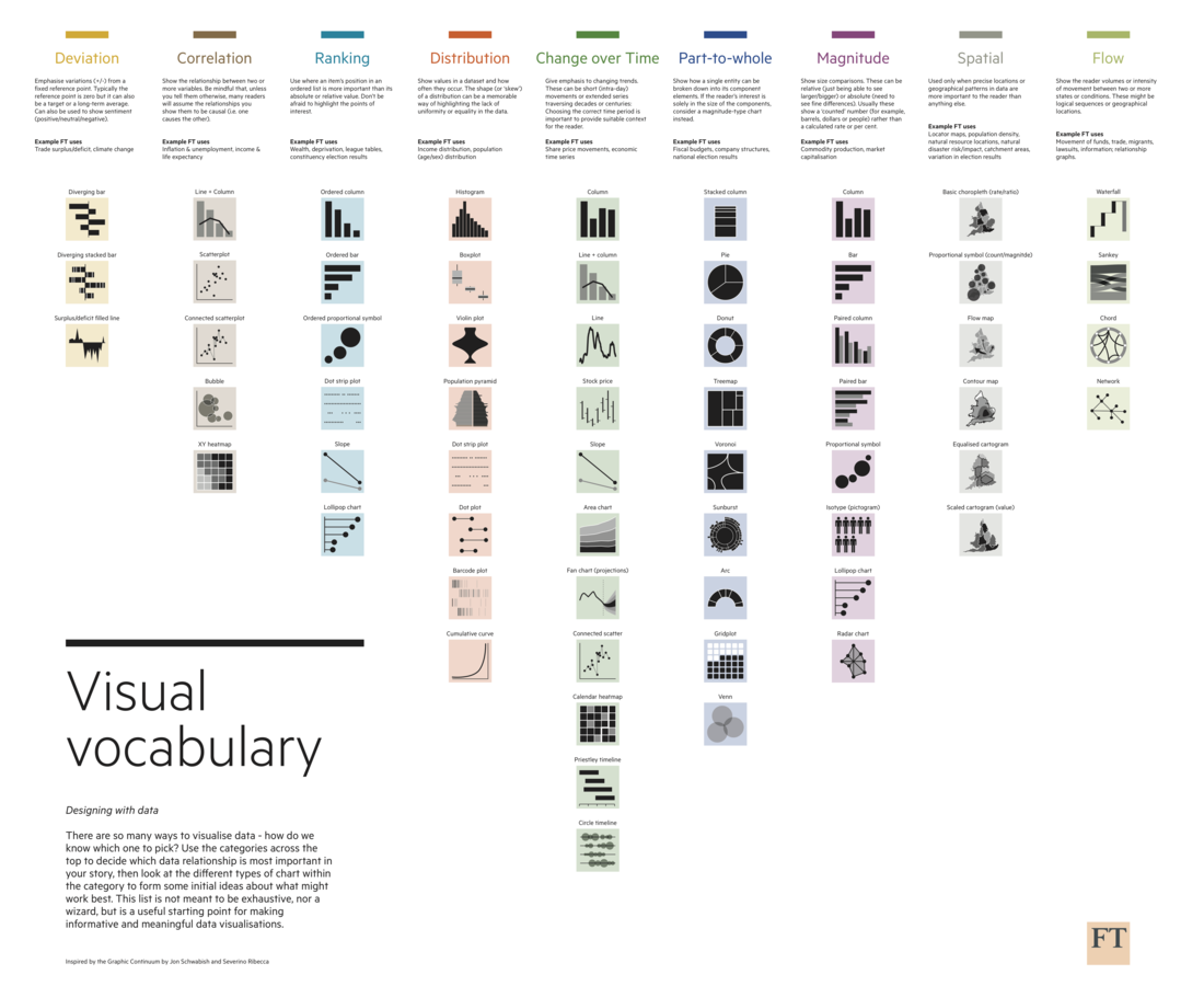
Chart types


Save the pies for dessert


Don't cut bars


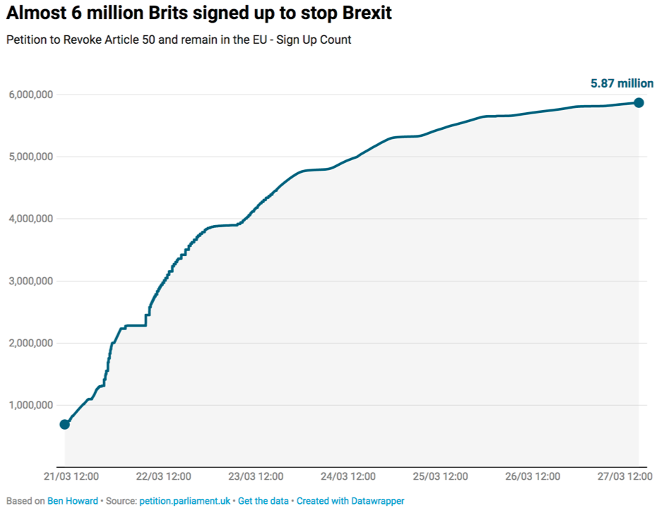
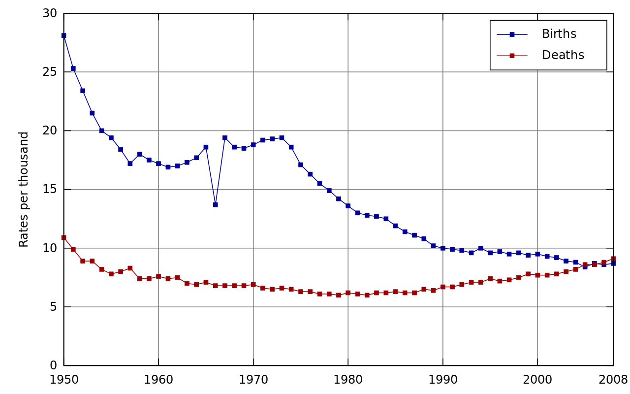
Show evolution over time with line charts


Don't break time axes

Compare 2 moments in time with slopecharts

Treemaps can show numbers in a hierarchy


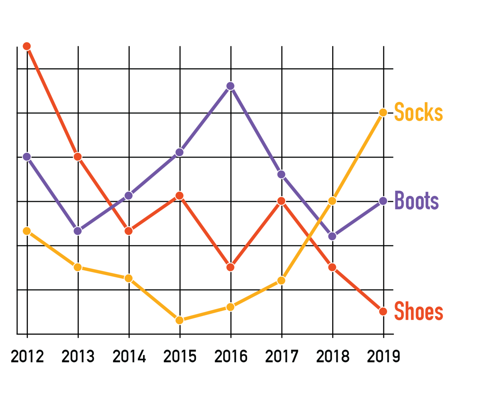
Use small multiples to avoid spaghetti charts

Introducing:
the Benchmark Plot™
🛠️

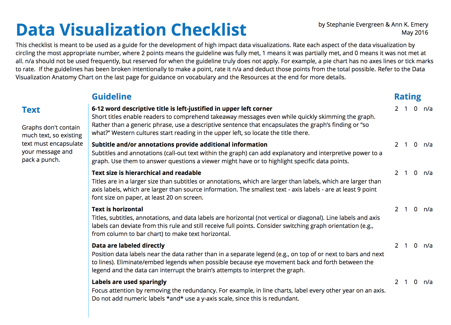
Text & charts


Tell your message in the chart title


"The annotation layer is the most important thing we do. Otherwise it's a case of here it is, you go figure it out."
Amanda Cox, The New York Times


Use direct labelling
Chart design


Use colors deliberately


Use colors sparingly
Don't let the data compete for attention

Avoid chart junk


The width:height ratio of a chart matters
🛠️
Storytelling
"You have to be like the worst tabloid newspaper in the front and the Academy of Science in the back."
Hans Rosling

1 chart,
1 message
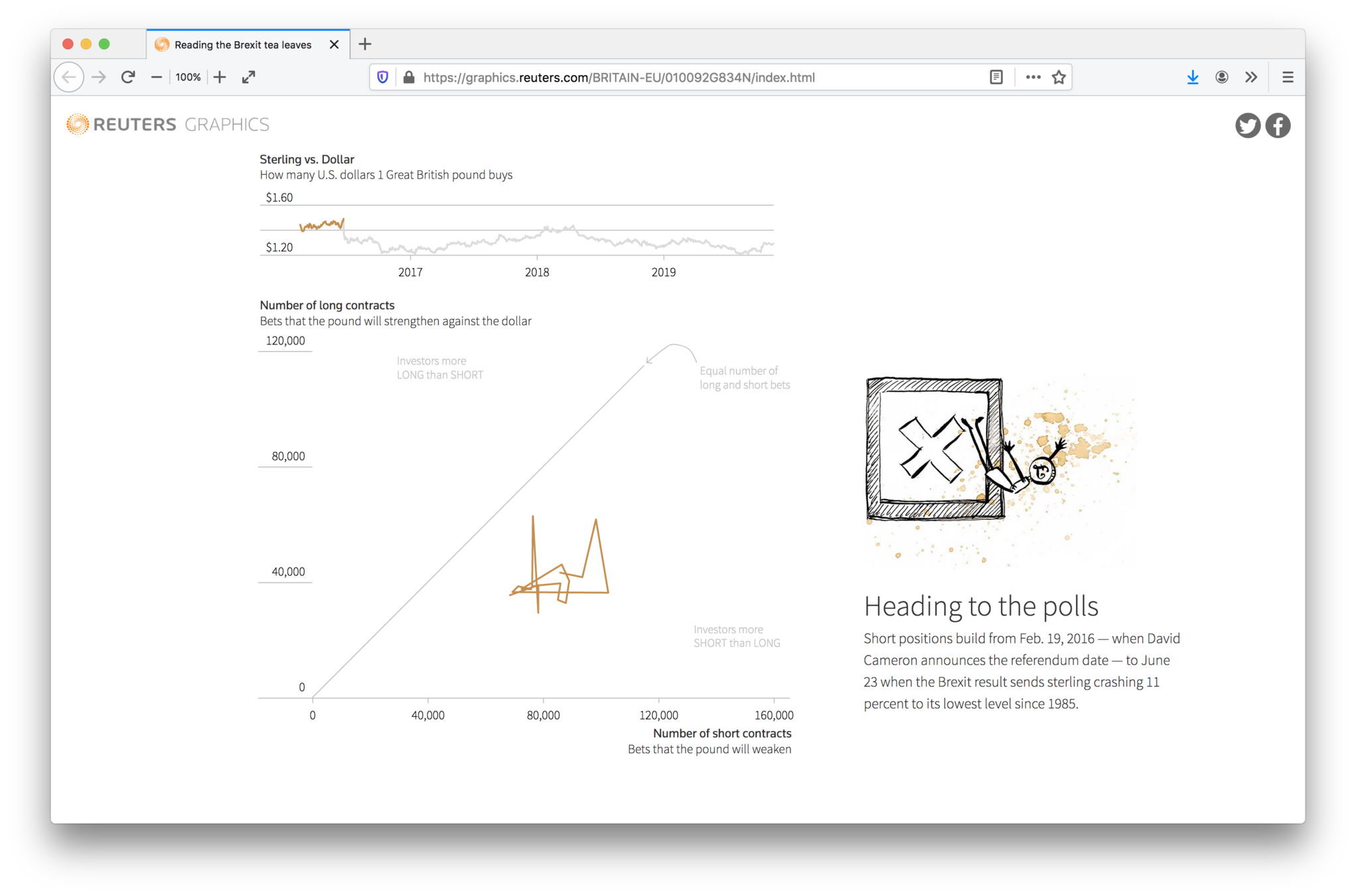
Data story patterns
Intersections
Outliers
Components
Repetition
Gradual visual reveal


using an appropriate chart type
using text on charts smartly
designing your charts well
using storytelling techniques
Help your data message to get across by
What are your questions?
slides.com/maartenzam/cfotop
maartenlambrechts.com
@maartenzam
CFO top
By maartenzam


