Analysis of ideas for Digipak
By Madihah Hussain

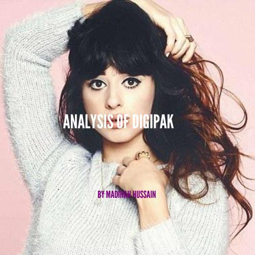
First album cover
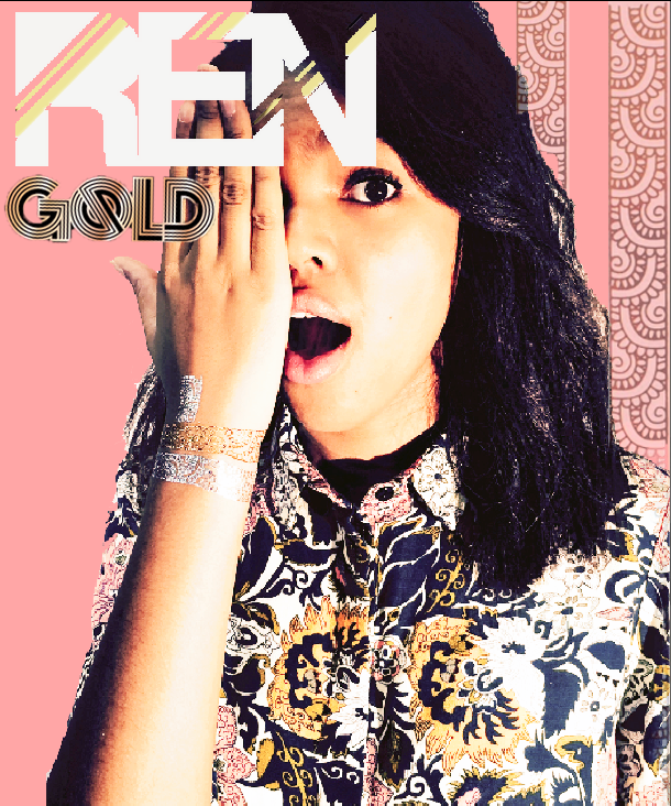
I used white font, so it stands out against the pink background. I used hints of Yellow, so it relates to the album name 'GOLD' and also the synergy. (metallic tattoos)
I put some of the synergy in the background, to indicate it to the audience that, that's her image brand. It's also the same one she's got on her hand.
Strong image used of the artists, which dominates the whole cover, we can also see the synergy. Bright colours used, which represent her personality. The image itself promotes her.
For the background, I used a light pink, this will attract our target audience which are mostly females. The soft colour palette makes our artists stand out more.
Second album cover
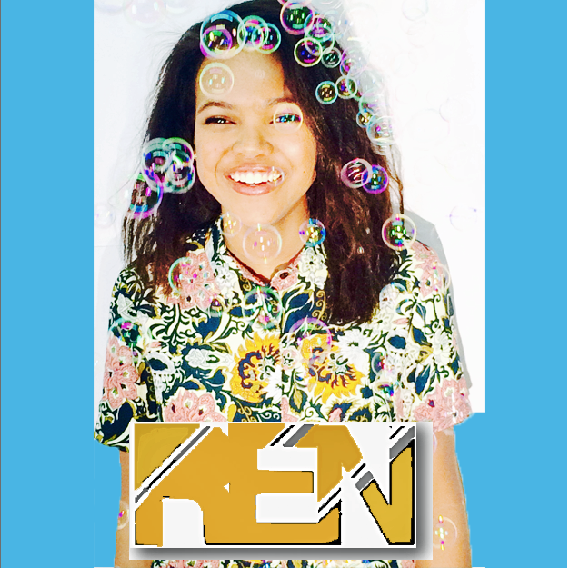
I changed the colour of the font into a more goldish colour so it could relate to the metallic colour of the tattoos.
I chose this image because I think it expressed how our music feels, the fun, and being childish. The bubbles bring back childhood memories, and would be a candidate in an album cover.
The strong image captivates you, as she's looking directly into the camera, which helps the viewers interact.
The white and blue contrast against each other but work very well, again this will also attract our target audience.
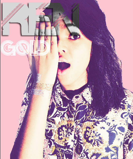
Third album cover

I limited myself to use only two colours (Gold and grey/ silver) I have done this because the synergy worn by the artist wore gold and silver tattoos.
I placed the synergy (the one the artist used during the music video) as a border, to get the idea of brand image onto our album cover.
I used a shot of the artist without showing her face, this helps people want to find out who she is, therefore they'll watch the video. She's also holding a camera; and this concept is used in our music video. A selfie is taken in the beginning of the video, with also shots of recording footage. In this day and age, selfie's are very modern. By putting the selfie it will help younger viewers relate to our music video.
The font is behind her, instead of in front of the artist this makes it look more like a magazine cover
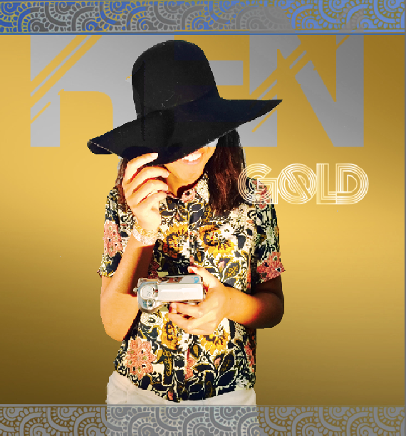
fourth album cover
This is my favourite one that i've made, I particularly used this photo because it's a mid shot of the artist, but also shows the synergy (tattoos on her hand)
I used a lighter colour as a background which attracts the majority of female viewers.
I changed the colour of the text to grey- and when it's onto of the image, the part of the text also turns to greyscale. Which is my favourite thing about this album cover. It looks more professionally done and the album name 'Gold' is in white, which world well with the colours used throughout the album cover.
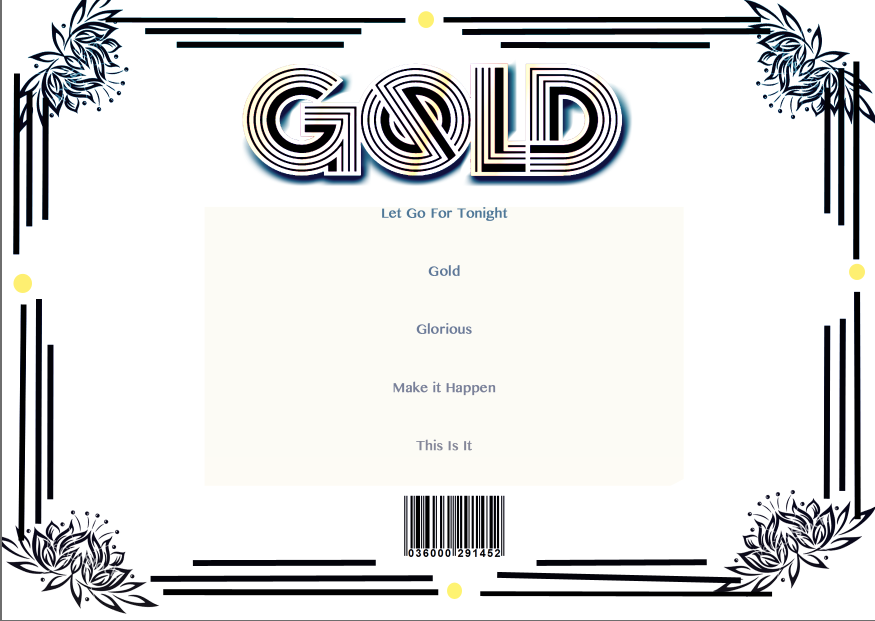
First back cover
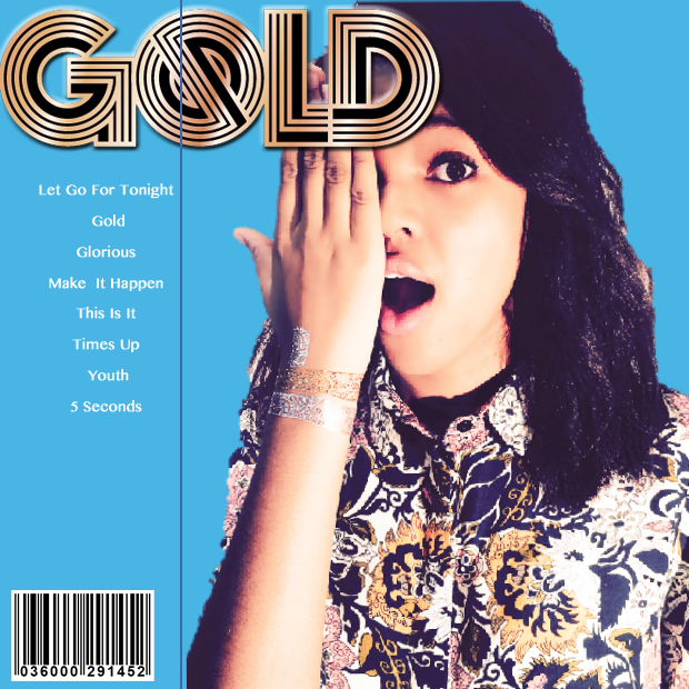
This back cover links to the blue album cover. I used the same background colour so it matches.
The album name 'GOLD' is in gold, and is scaled up, so people are aware of the album name.
I've written the songs which are in order- like a list.
Barcode is used so people can purchase the product.
Image of the artists once again so the audience know who she is.
Front & back cover


second back cover

This style would link to the gold album cover. it's very simple, but effective.
I used two colours- black and yellow. The yellow is supposed to indicate the tattoo colours and the black is used to make it look attractive.
I used these flower vine designed because in 'let go for tonight' music video, it was shot in parks and places were greenery is found.
The album name is once again at the top centre of the cover, which is bold so it stands out.
front & back cover
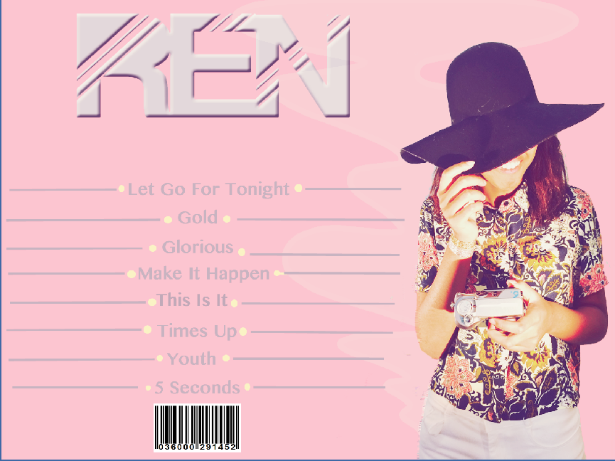
Third back cover

The font is exactly the same as it is on the front cover. This allows the artists name to be recognisable.
A different image of the artist with a hat, standing is used. This helps the artists stay recognisable and is also attracts viewers.
Same colour scheme is also used here. The pink is used though out the whole album- this attracts the female audience.
They layering of the songs is different compared to the other two i've made. This one is much more complicated within designing. It's in a grid format and makes the back cover look more busy.
front & back cover

Album advert
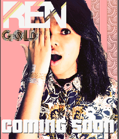
This album advert is the same album cover seen before. I only added 'Coming soon' so the audience will know that it's coming soon.
If I have a new design, i'll use this format, so nothing major will change.
Artsist name in bold, and stands out against the whole advert.
The 'Coming soon' text is also white and bold, it almost looks 3-D which helps promote the artist.
deck
By madihahh