Tipografia na web para designers
Explorando os recursos do CSS
Marcelo Villela Gusmão
marcelovillelagusmao@gmail.com
Text
Entender como funciona o CSS permite que você, como designer, consiga transmitir melhor suas idéias ao desenvolvedor.
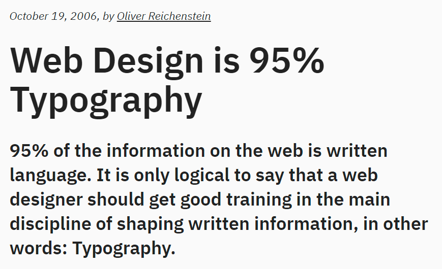
A typical roman face can take a type designer at least a year or two to complete.
On Web Typography
Jason Santa Maria
CSS (Cascading Style Sheets) é uma linguagem declarativa que controla a apresentação visual de páginas web em um navegador.

HTML
HTML
+
CSS
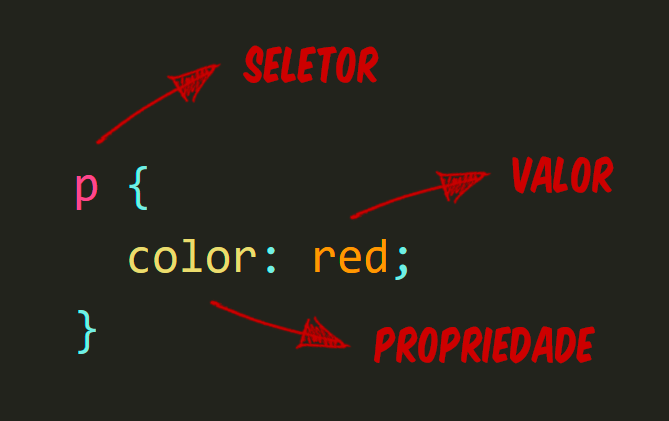
Anatomia de uma regra
O "cascading"?
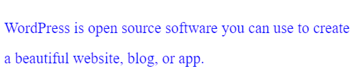
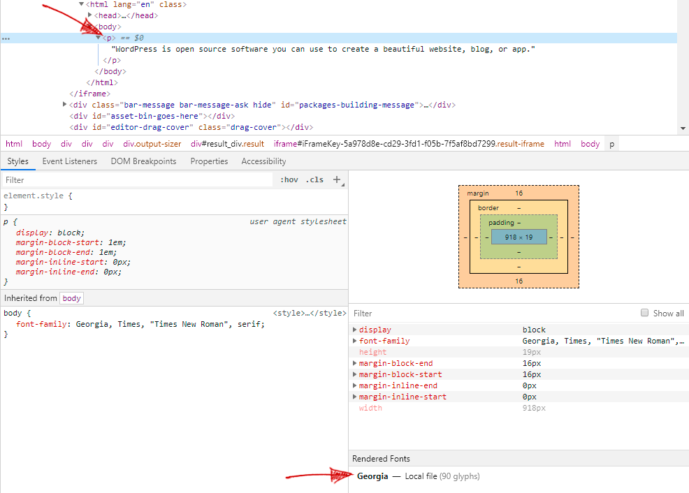
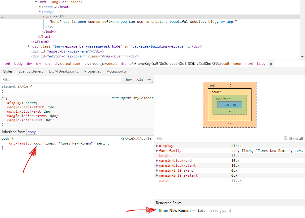
<p>WordPress is open source software you can use to create a beautiful website, blog, or app.</p>p {
color: red;
}
p {
color: blue;
}
E a especificidade
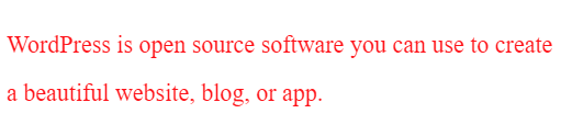
<p id="text">WordPress is open source software you can use to create a beautiful website, blog, or app.</p>#text {
color: red;
}
p {
color: blue;
}
Tipografia
...os princípios nos quais a tipografia se baseia são suficientemente estáveis para resistir às inúmeras levas de nossas modas e manias.
Elementos do Estilo Tipográfico
Robert Bringhurst
Experiência de leitura
(familiaridade e contraste)
O brilho da tela
As distrações da web
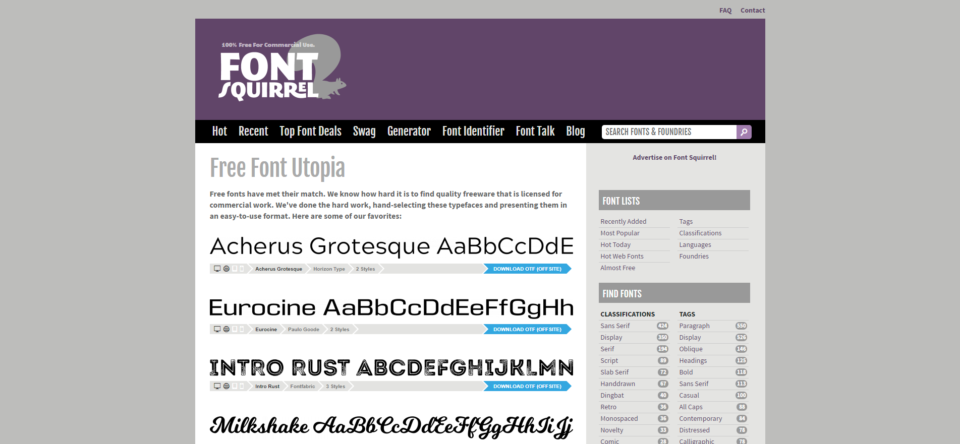
Escolhendo fontes
Fontes de sistema:
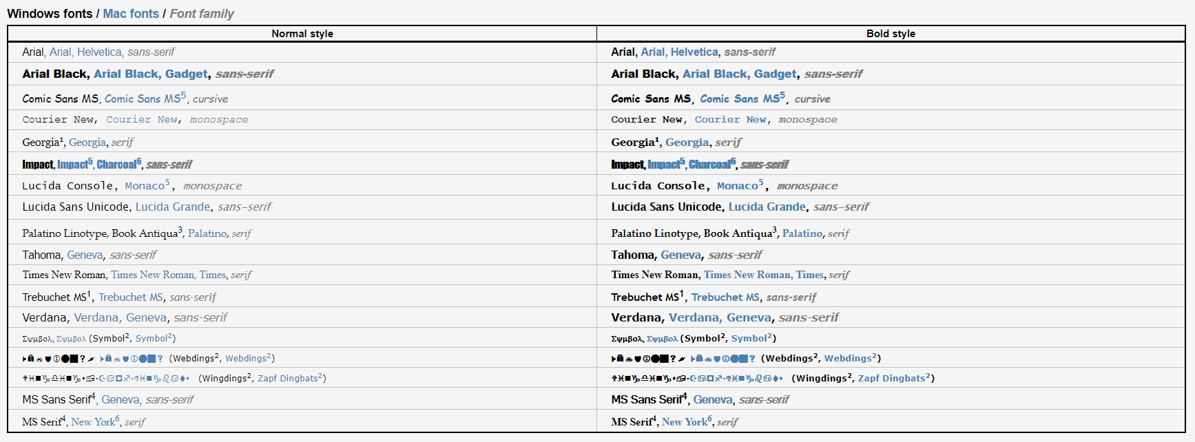
Escolhendo fontes
Fontes de sistema:
Escolhendo fontes
Fontes de sistema:
body {
  font-family: Georgia, Times, "Times New Roman", serif;
}

body {
  font-family: Georgia, Times, Times New Roman, serif;
}

/* shorthand */
body {
  font: 14px Georgia, Times, "Times New Roman", serif;
}
font stack
Escolhendo fontes
Fontes de sistema:
Escolhendo fontes
Fontes de sistema:
Escolhendo fontes
Fontes de sistema:
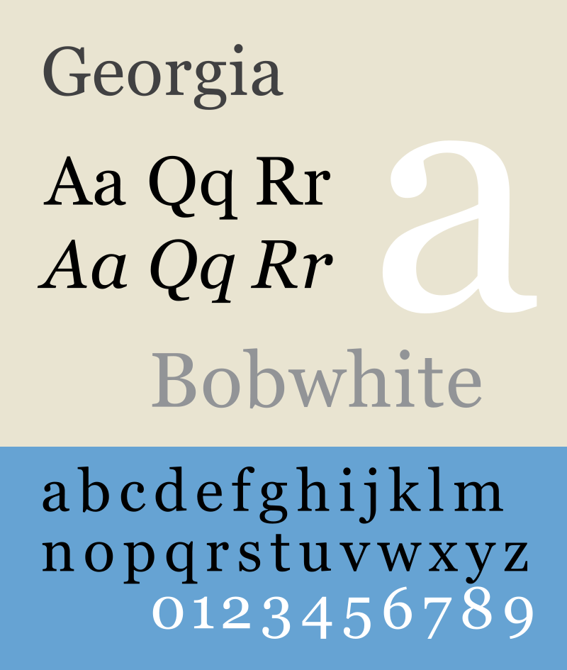
h1 {
  font-family: Georgia, serif;
  font-size: 80px;
}
h1 {
font-family: "Adobe Garamond Pro", serif;
font-size: 80px;
}Escolhendo fontes
Fontes de sistema:
Android
Escolhendo fontes
Fontes de sistema:
Android
h1 {
  font-family: Arial, sans-serif;
  font-size: 80px;
}
h1 {
font-family: Roboto, sans-serif;
font-size: 80px;
}
Escolhendo fontes
Fontes de sistema:
iOS
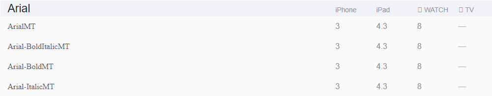
Escolhendo fontes
Fontes de sistema:
+ Simples de serem usadas.
+ Não precisam ser carregadas pelo site.
+ Suporte em todos os navegadores.
- Pouca variedade.
- Sujeito às condições do dispositivo do usuário.
- Suporte parcial em dispositivos móveis.
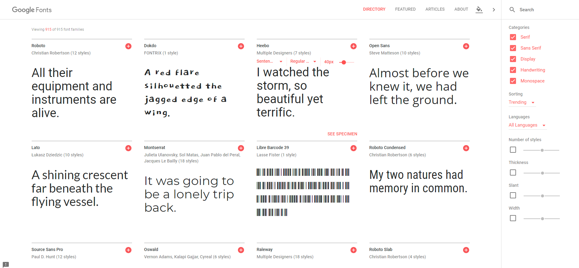
Escolhendo fontes
Web fonts:

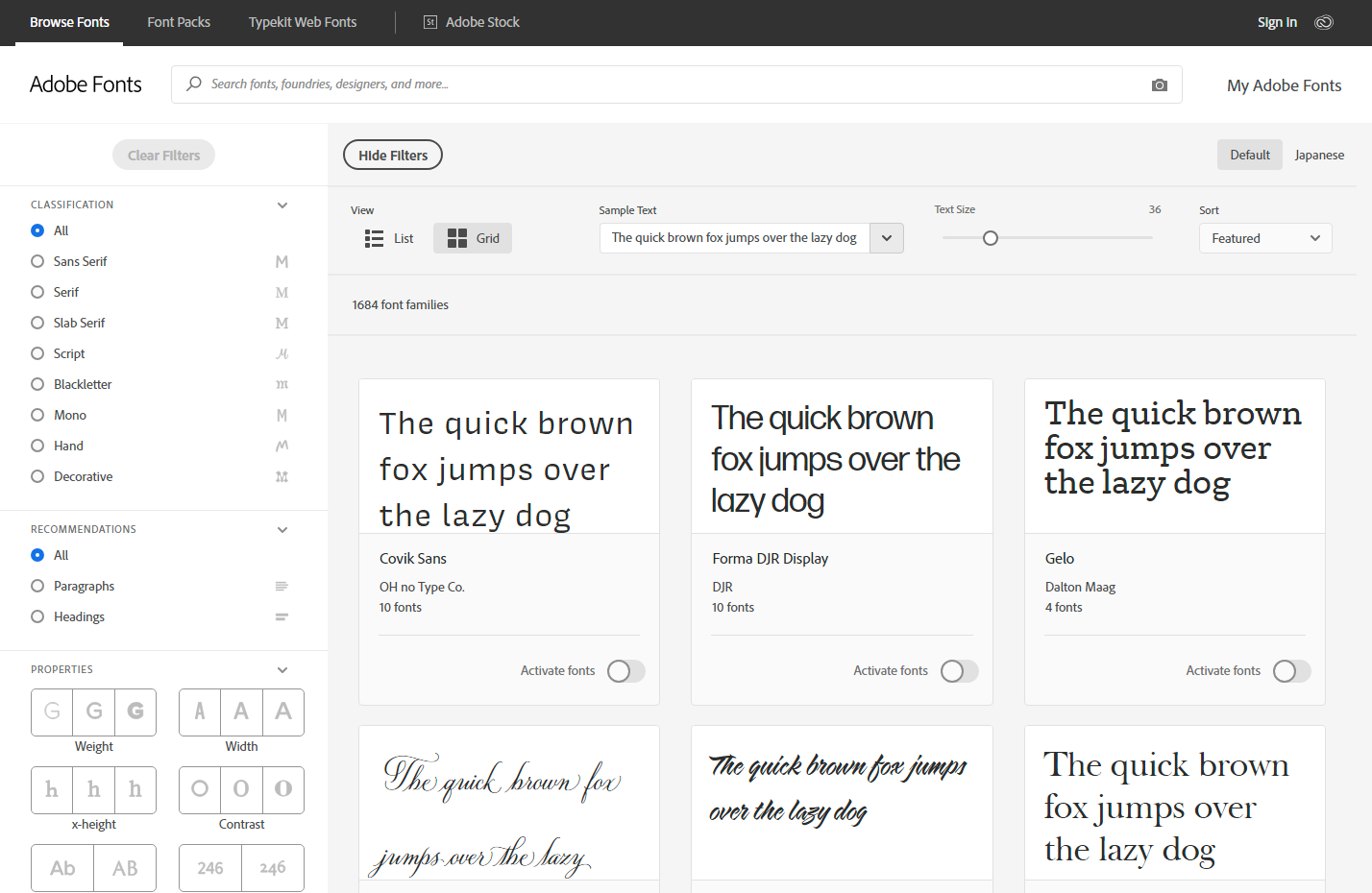

Escolhendo fontes
Web fonts:
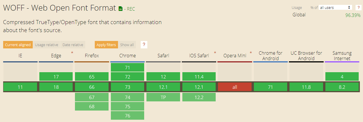
Escolhendo fontes
Web fonts:
@font-face {
    font-family: 'open_sans';
    src: url('OpenSans-webfont.woff2') format('woff2'),
         url('OpenSans-webfont.woff') format('woff');
    font-weight: normal;
    font-style: normal;
}

body {
    font-family: open_sans, sans-serif;
}
Escolhendo fontes
Web fonts:
<head>
	<meta charset="UTF-8">
	<title>Meu site</title>
	<link href="https://fonts.googleapis.com/css?family=Open+Sans" rel="stylesheet">
</head>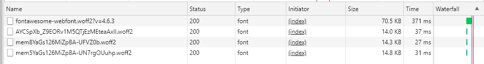
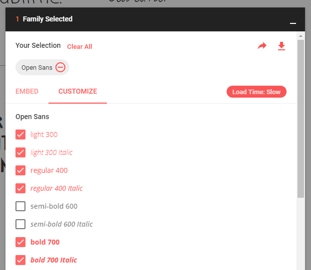
Escolhendo fontes
Web fonts:
FOUT
(Flash Of Unstyled Text)

Escolhendo fontes
Web fonts:
<p>1º lugar na competição.</p>body {
font-family: 'Mukta', sans-serif;
}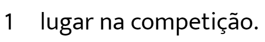
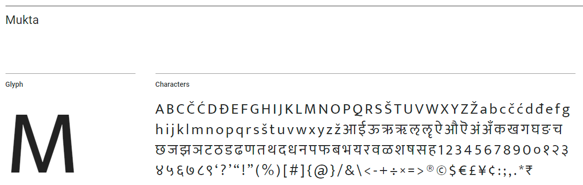
Escolhendo fontes
Web fonts:
@font-face {
  font-family: 'Special';
  src: local('Arial');
  unicode-range: U+BA;
}

body {
  font-family: Special, 'Mukta', sans-serif;
}
@font-face {
font-family: 'Special';
src: local('Bad Script');
unicode-range: U+26;
}
body {
font-family: Special, Verdana, sans-serif;
}
Escolhendo fontes
Web fonts:
+ Grande variedade.
+ Suporte aos principais navegadores.
- Precisam ser carregadas pelo site.
- Qualidade das fontes.
Corpo
Unidades fixas:
p {
  font-size: 16px;
  font-size: 16pt; /* ~21px */
}
Corpo
Unidades relativas:
body {
  font-size: 16px;
}

p {
  font-size: 1.5em; /* 24px */
  font-size: 1.5rem; /* 24px */
}

blockquote {
  font-size: 2em; /* 32px */
}

blockquote p {
  font-size: 1.5em; /* 48px */
  font-size: 1.5rem;  /* 24px */
}
Corpo
Unidades responsivas:
p {
  font-size: 10%; /* ~0.8em */
  font-size: 2vw;
  font-size: 2vh;
}
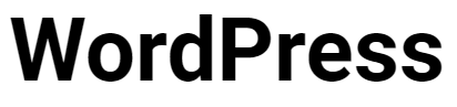
Peso
p {
  font-weight: 700;
  font-style: italic;
}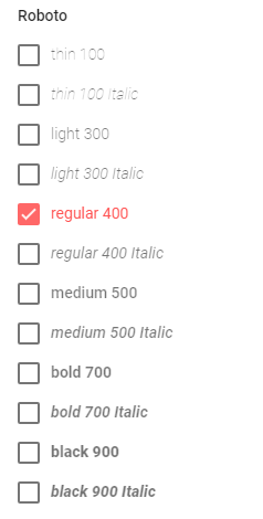
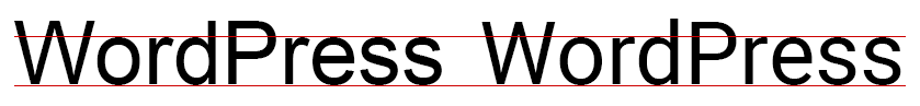
Bold original
Bold falso
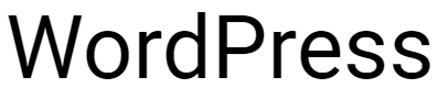
Regular

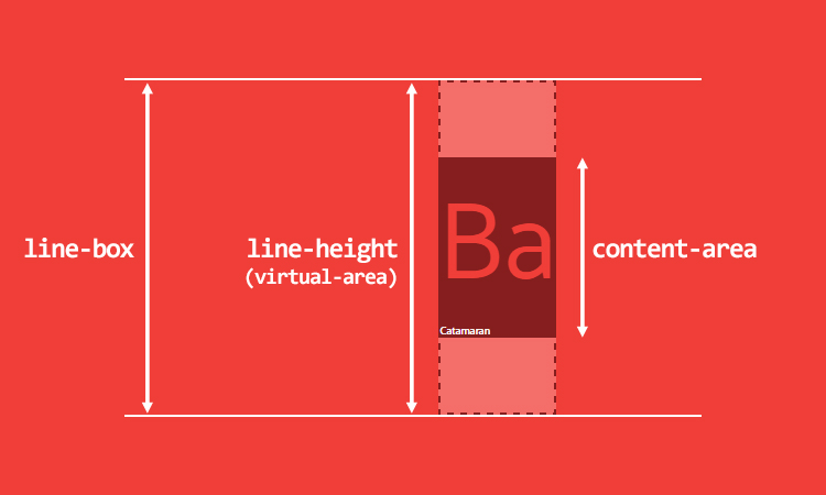
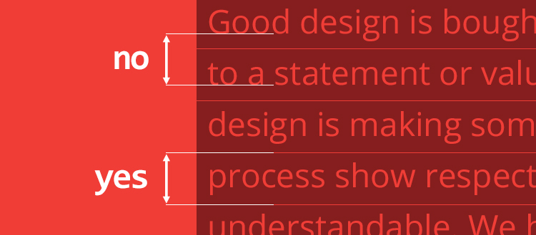
Entrelinha
p {
  font-size: 16px;
  line-height: 24px;
  line-height: 1.5; /* 24px */
}

p {
  font-size: 20px;
  /* 24px -> 24px */
  /* 1.5 -> 30px */
}
Espaçamentos
p {
  text-indent: 20px;
  word-spacing: 10px;
  letter-spacing: 0.09em; /* 90px/1000 */
  font-kerning: none;
}
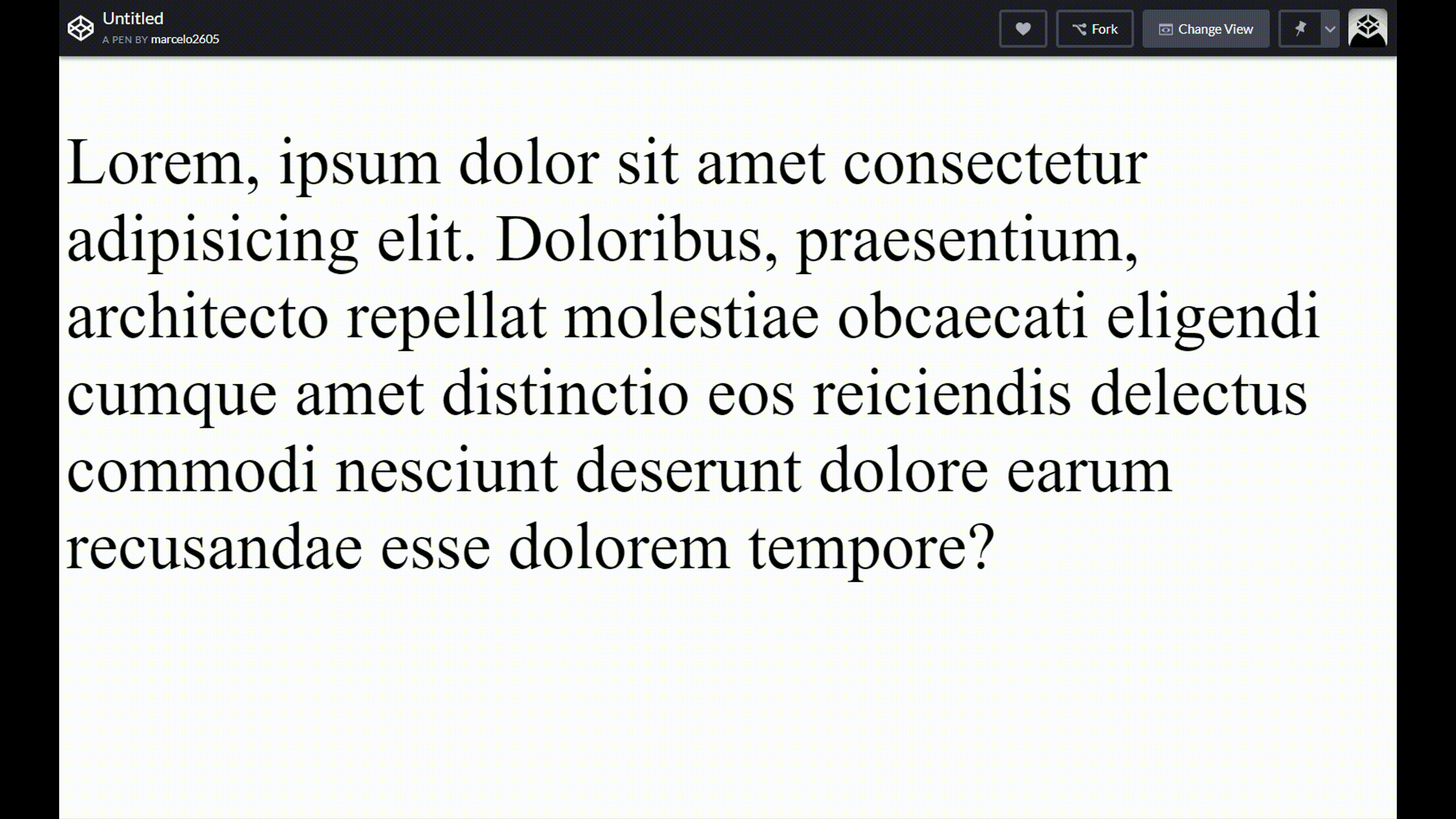
p {
/* NÃO USAR */
text-align: justify;
hyphens: auto;
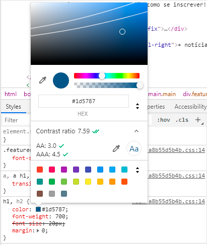
}Cores
p {
  color: red;
  color: tomato;
  color: #f48000;
  color: rgb(214, 122, 127);
  color: rgba(214, 122, 127, 0.2);
}
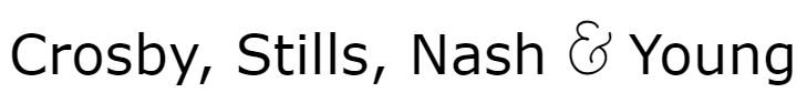
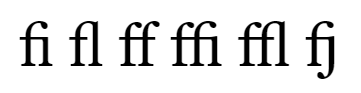
Ligaturas
p {
  font-family: 'Raleway', sans-serif;
  font-variant-ligatures: no-common-ligatures;
}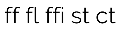
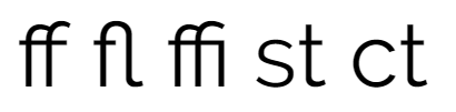
p {
  font-family: Verdana, sans-serif;
  font-variant-ligatures: discretionary-ligatures;
}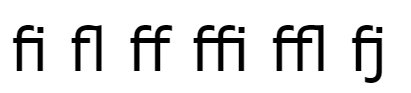
p {
  font-family: Georgia, serif;
  font-variant-ligatures: discretionary-ligatures;
}
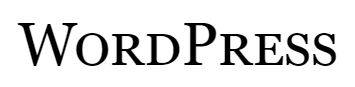
Versalete (small-caps)
body {
  font-family: 'Alegreya', serif;
  font-variant-caps: small-caps;
}
body {
font-family: 'Alegreya SC', serif;
}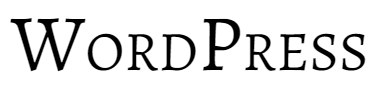
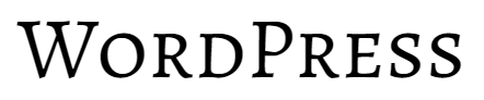
body {
  font-family: Verdana, sans-serif;
  font-variant-caps: small-caps;
}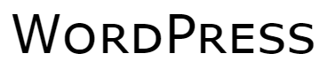
body {
  font-family: Georgia, serif;
  font-variant-caps: small-caps;
}
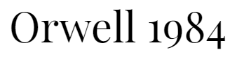
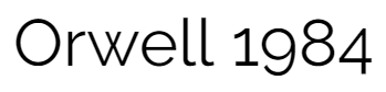
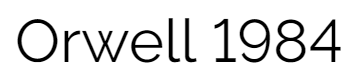
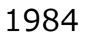
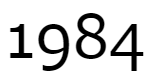
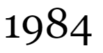
Números
body {
  font-family: 'Playfair Display', serif;
}
body {
font-family: 'Raleway', sans-serif;
font-variant-numeric: lining-nums;
}body {
font-family: Verdana, sans-serif;
font-variant-numeric: oldstyle-nums;
}body {
font-family: Georgia, serif;
font-variant-numeric: lining-nums;
}
Aspas
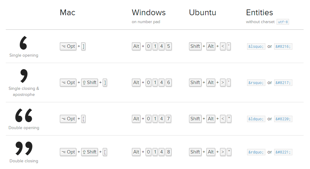
Aspas
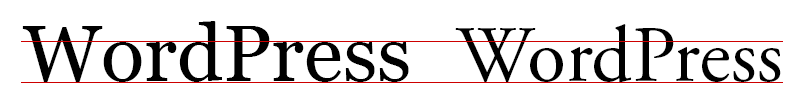
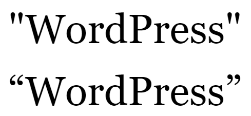
<p>"WordPress"</p>
<p>“WordPress”</p>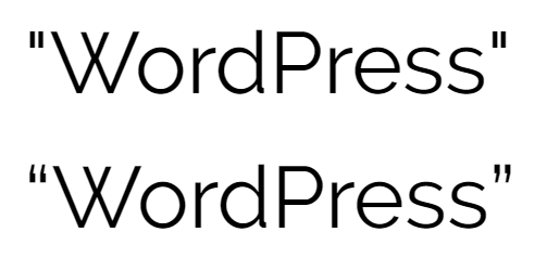
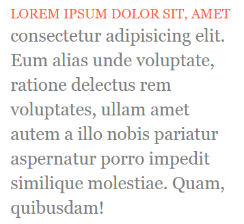
Seletores de texto
p {
  font-family: georgia, serif;
  font-size: 26px;
  line-height: 1.4;
  color: gray;
}

p:first-letter {
  color: tomato;
  font-size: 100px;
  float: left;
  margin-right: 15px;
}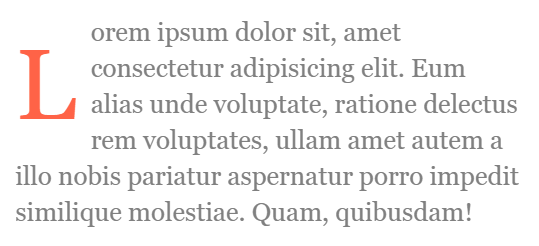
p:first-line {
  color: tomato;
  text-transform: uppercase;
  font-size: 20px;
}
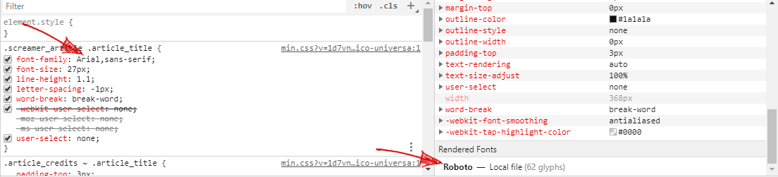
Testando fontes
Dicas finais
- Sistemas operacionais diferentes renderizam fontes de formas diferentes.
https://blog.typekit.com/2010/10/15/type-rendering-operating-systems/
- O projeto (Illustrator, Photoshop) deve ser uma referência, não uma meta.
- Sites são responsivos e seu projeto deve prever isto.
- Sempre organize as informações que você envia para o desenvolvedor.
Obrigado ;-)
CSS: entendendo como funciona a linguagem que transforma o seu layout em código
By marcelo2605