Heuristic Evaluation
HUMANITY WEB APP

Marko Aleksic
www.markiz.io
Heuristic Evaluation?
WHAT IS
Usability inspection method for computer software that helps to identify usability problems in the UI and UX design.
10 Heuristic Principles
A LIST OF
01 Visibility of system status
02 Match between system and the real world
03 User control and freedom
04 Consistency and standards
05 Error prevention
06 Recognition rather than recall
07 Flexibility and efficiency of use
08 Aesthetic and minimalist design
09 Help users recognize, diagnose, and recover from errors
10 Help and documentation
Humanity Modules
WHAT WAS EVALUATED
Humanity Modules
WHAT WAS EVALUATED
01 Sign Up/Log In
02 Onboarding
03 Dashboard
04 ShiftPlanning
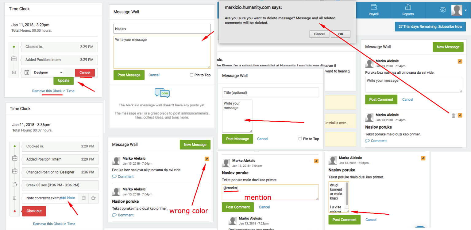
05 TimeClock
06 Leave
07 Training
08 Staff
09 Payroll
10 Reports
11 Message Inbox
12 Settings
13 Emails
14 User Qs
15 General
Report
HEURISTIC EVALUATION
268
Open
Issues
268
OPEN
Issues
60+
EVALUATION
Hours
60+
Hours
Spent
9
Critical
Issues
81
Major
Issues
178
Minor
Issues
Report
HEURISTIC EVALUATION
9
CRITICAL
Issues
81
MAJOR
Issues
178
MINOR
Issues
Issue Types
PERCENTAGE OF
58
%
User Interface
44
%
User Experience
5
%
Copy
1
%
Other
3
%
Improvement
Onboarding
PAIN POINTS · 13 TASKS
Poorly styled onboarding screens

Elements not as defined in Styleguide

Adding new employee should be consistent
Added employees vs placeholders, Things should not look disabled

Adding and Assigning Position issues
User should be able to assign new position right from creation screen
Add New Position
Scheduling ➡️ Add Employee ➡️ Choose Existing or Add New Position
Staff ➡️ Locations & Positions ➡️ Location (Add Position from here)
Assign Position
go back to Staff ➡️ Click Employee ➡️ Scroll and checkbox his new Position
Having Locations and Positions on the same page confuses even more
find a dropdown Employee Assignments ➡️ Check & assign new Position

Onboarding does not explain Employee Profile

Except from Assigning Position – Availability, Leave, Permissions, Payroll...
Taking Leave for the 1st time unintuitive
Adding Leave Type is not enough, should enable every employee, should be covered in Onboarding
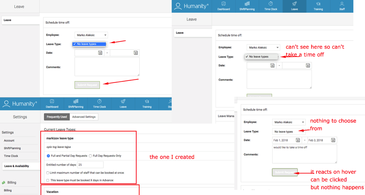
Nor it provides an unscripted path

It should also help user configure important settings

and prepare him for what's there 😀
Onboarding is not a replacement for clear UI

but is a huge plus
ShiftPlanning
PAIN POINTS · 42 TASKS
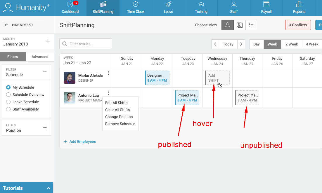
Shift screen looks complicated

8 Different entities, Elements disconnected, Action area should be highlighted
No formal "Create Shift" button

Requires intuitive calendar behaviour
Sidebar and filters should be improved


Design Proposal

Default Shift Color, Shift CTAs,
Published vs Unpublished Shifts

Design Proposal
Shift acceptance criteria

System is already "smart" but can be smarter and save more time
No more 20 hours shifts for "8-5"
Focus on majority of cases (1st & 2nd shift)
if 1st number is 12, 1, 2, 3, 4 put PM
if 1st number is 5, 6, 7, 8, 9, 10, 11 put AM
Shift Details too complicated
Too many screens in one popup, Delete Shift strange behaviour

Design Proposal

Conflicts poorly solved

Design Proposal

Enhance user action support
Always support UNDO, multiselect shifts, maybe right click actions

Various other UX and UI issues
Like Schedule a Sync example, browser popups, elements over elements, etc
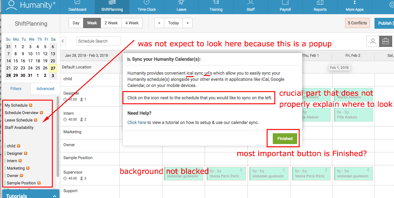

Which can be solved simple

Staff
PAIN POINTS · 56 TASKS
Logo section too big
It won't be changed too often

Employee Table Improvements
More details, bulk actions, statuses, avatars, let user be aware he can go deep

Design Proposal

Activating Employee Accounts should be simpler
Make it clear and easier, Fix bugs and funny issues, Promote it more

Positions and Locations should be separated
Clear structure, less actions, less clutter, info better presented

Positions can be better presented
No repetitive text, clear action states, more info can be added

Design Proposal

Assigning a Position various issues

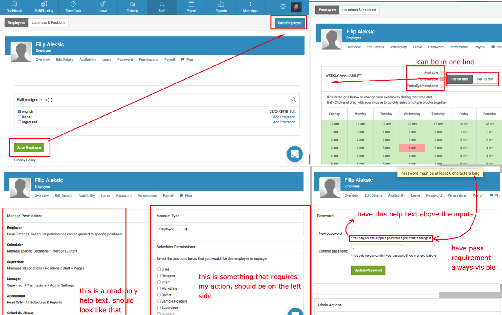
Employee Profile should look more like profile
Allow user to focus here on links and actions from Employee profile

Various Employee Profile issues

General
PAIN POINTS · 5 TASKS
Global search in navigation and breadcrumbs

Quick and easy finding pages and employees, Reducing number of clicks significantly, Helping users navigate from everywhere, Understanding the structure, Being aware where they are and how deep in the system
Notifications issues
Don't fully look and act like notifications, Dashboard has notifs but it's just a shortcut to other modules, Can be used to alert for shifts and changes

Activating Employee, Mobile number country issues and unfriendly default usernames

Page headline issues

Poor and inconsistent Error handling globally

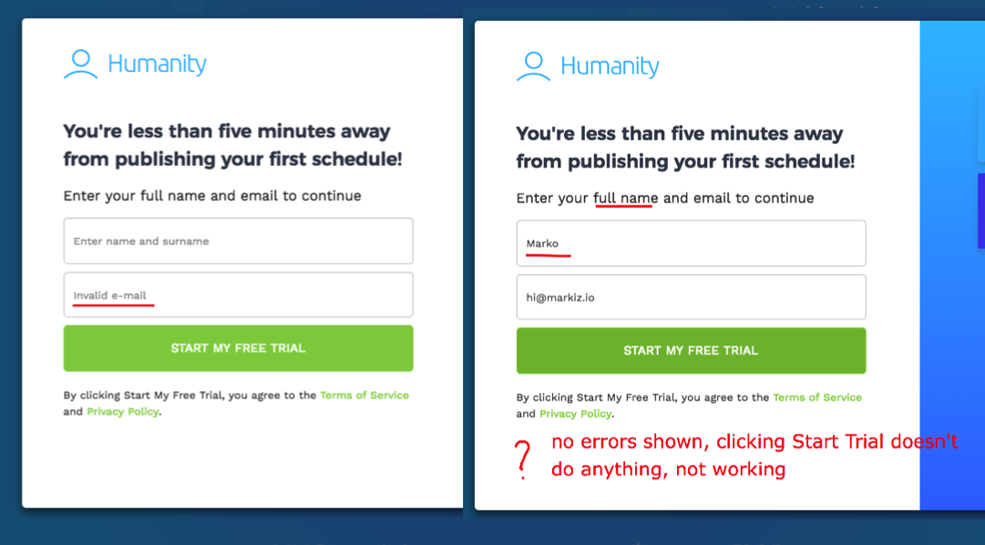

Which is easy to solve (just follow Styleguide)

In-app Billing different from the website Billing

Design Proposal

Dashboard
PAIN POINTS · 26 TASKS
Mostly Styling issues and Message Wall
Design Proposal

Various
PAIN POINTS
Timeclock looks like Settings

Fixing Settings

Design Proposals

Reports looks, sidebar lenght, headline, actions positions

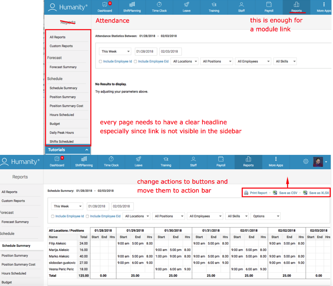
Design Proposal

(Illustrations not mine, just example)
Timeclock Manage Time Sheet
Statuses, Clear actions, Bulk actions, Live shifts vs Done shifts...

Design Proposal

Payroll various UX and UI issues
Actions positions, headline, filter states, date picker, new card autocreation...

Training UX and UI should be updated

Onboarding and help descriptions would help
Various Log In issues

Various Reset Password issues
Even managed to set 1 CHARACTER as a password

Questions
THE END
Marko Aleksic
www.markiz.io
Heuristic Evaluation
By Marko Aleksic
Heuristic Evaluation
Heuristic Evaluation of Humanity web app


