Better Web Typography for a Better Web
I fell in love with typography while working for a self-publishing company when I read all the books about typography I could get my hands on. With that, I realised how poor typography on the web is. I wondered what could be done to improve that.
At first I thought about launching a gallery website that would feature websites with good typography. I asked a couple of web designers and web developers if they'd be interested in that. They saw my idea as just another websites gallery. But through the interviews I had with them I learned that most of them didn't understand what exactly typography is and how to do it well.
That's where I got the idea for a "web typography course for web designers and web developers".
Do designers and developers want to learn about typography?
HYPOTHESIS & MVP
I had a few more chats (interviews) with designers and developers (at that stage mostly colleagues and past colleagues). Initial feedback for the idea was positive. But I wanted to be sure, so I decided to create an MVP that would help me answer the question: "do designers and developers want to learn about typography"? Do they feel they need to?
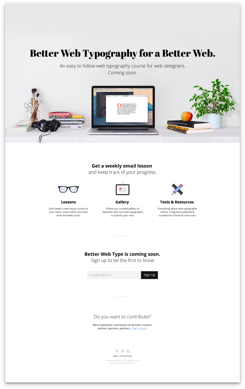
I was ready to write down my hypothesis and create an MVP that would help me answer those questions—a landing page describing the course and how it works (even though it hasn't been written yet).
More than 1,500 people signed up in a week and the conversion rate of the website was around 20%. I concluded that there is a demand for such product.
01
HYPOTHESIS
People:
Web designers and web developers
Problem:
want to learn about typography and how to do it well
Solution:
want a quick and concise way to learn about web typography
Success metric:
500 or more signups with a conversion rate of 10%
RESULTS
1,500+
20%
Signups
Conversion rate
Experiment passed
Do designers and developers want to learn about typography?
EMPATHY MAP & BUSINESS MODEL
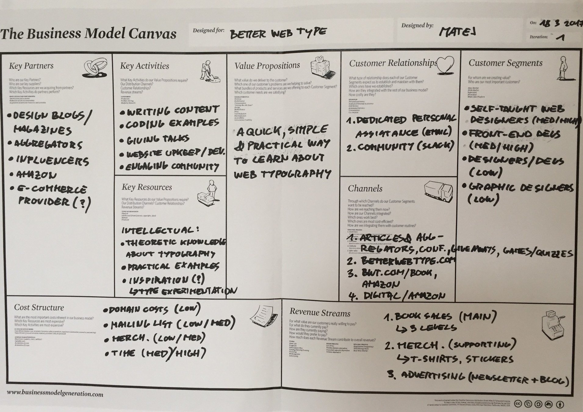
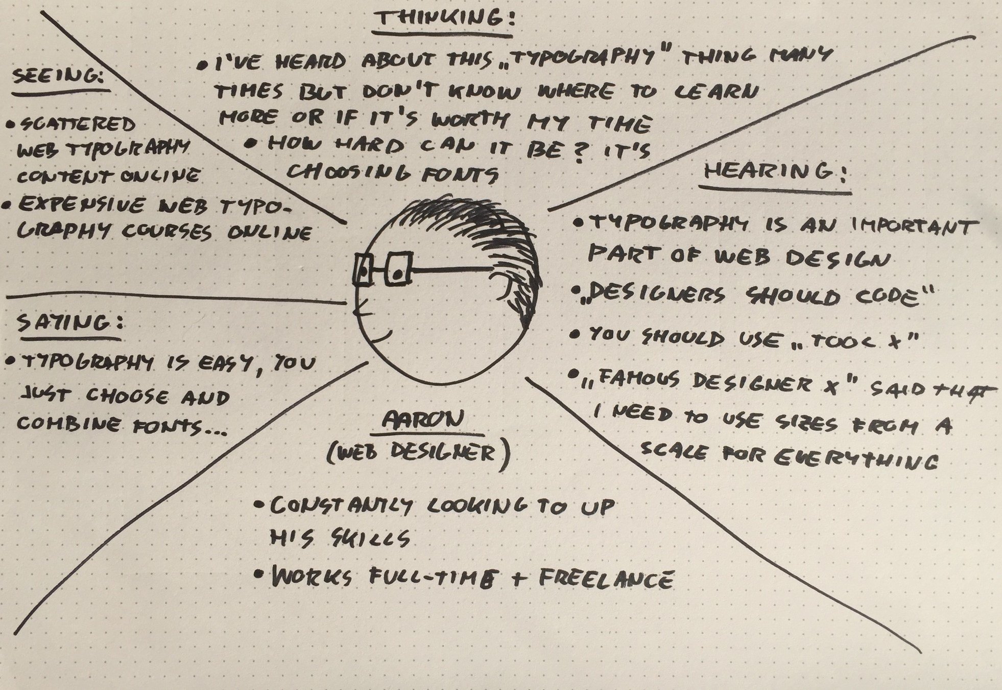
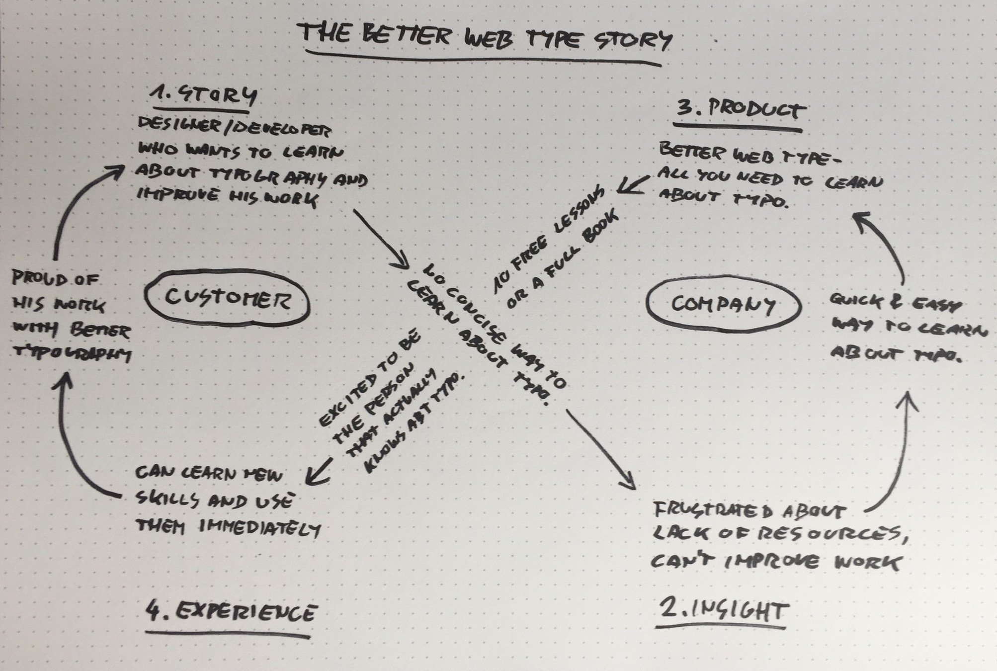
After the hypothesis was confidently validated, I moved on to draw my first empathy maps (one for web designers one for web developers), a business model and a story map.
This gave me a great overview over: what is the core value that Better Web Type will bring to users, what emotions will play a key role during the usage of the product (eliminating frustration, creating confidence), what would make the product profitable and helped understand the two types of users better.
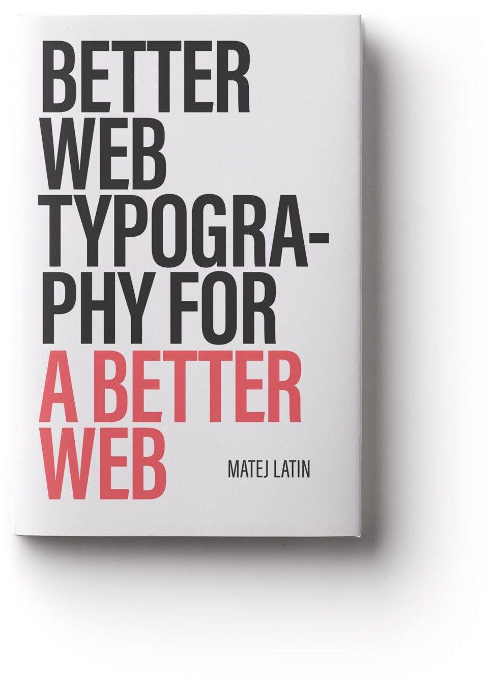
At this point I already knew that monetising this project would involve writing a book on this topic.
01
Launching the course
The course, consisting of 10 daily email lessons, went live on February 14. It had around 2,000 users at the time but shortly after launch, it got featured on popular web design websites and communities. The number of users quickly grew over 10,000 with a conversion rate of the signup page around 30%. Signups only slowed down at around 15,000 users.
I measured two key metrics at this time: the rating of the course (1-5) and the NPS score. The rating of the course is still at 4.7/5 after more than 800 reviews and the NPS score is at 69. I was really happy with these results but with the success of the project came more problems to solve.
The costs grew from £0 to around £160 per month. It was time to monetise the product. It was time to write the book.
02
2,000 → 15,000+
£0 → £160 per month
Users
Costs
4.7 / 5
User rating
69.2
NPS score
Launching the
book
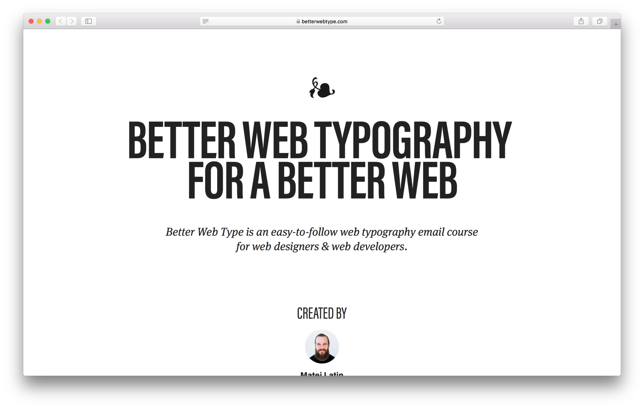
Before I wrote the book, I sent a one-question survey to all my users. The question was: which chapter / lesson of the course would you like me to expand the most in the book?
Around 800 users replied to the survey so I had a good idea of what I needed to focus on most. The book was finished two months later. A 15,000-words course grew into a 45,000-words book. I was in a hurry to launch it so I created a "temporary" presale and launch page.
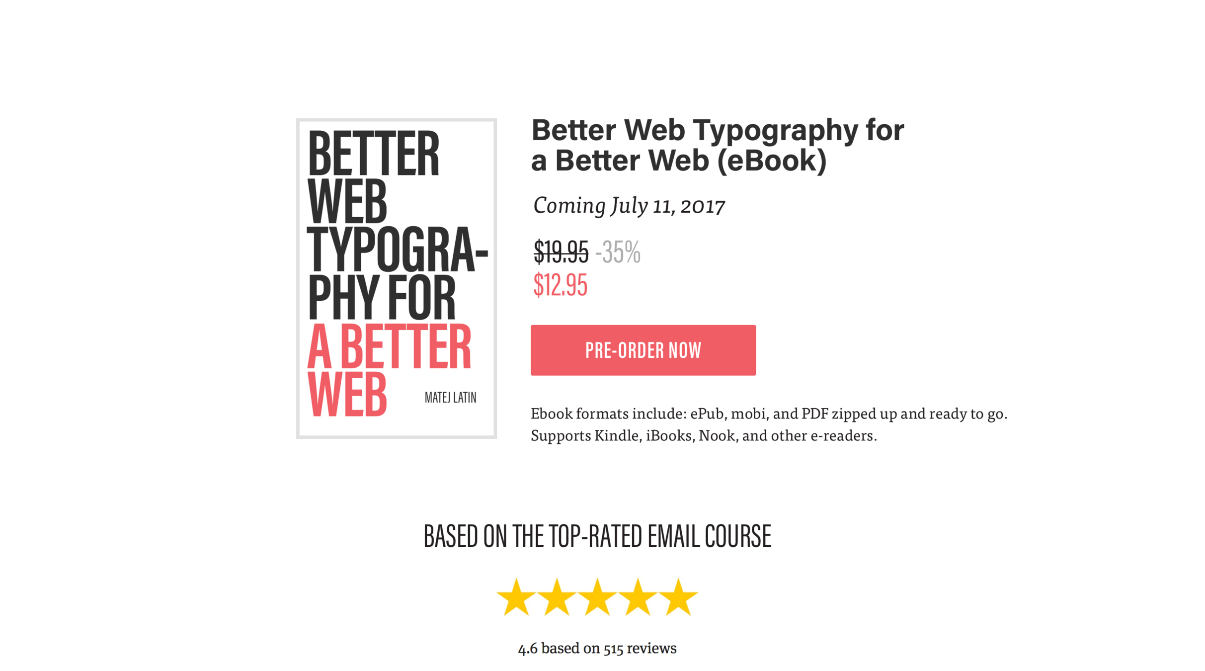
I first sent the release message to the 800 people that replied to my survey. They could get the book at a price discounted by 33%. But something went wrong. I was expecting most of those people to purchase but only a few actually did. I had to find out what was wrong. I sent a message to five of the people that visited the website but didn't purchase, asking them why not (and promising a free copy of the book in return). I received very valuable feedback which enabled me to improve the page before it went live to the other 14,000 users.
03

Launching the
book
MARKETING THE BOOK
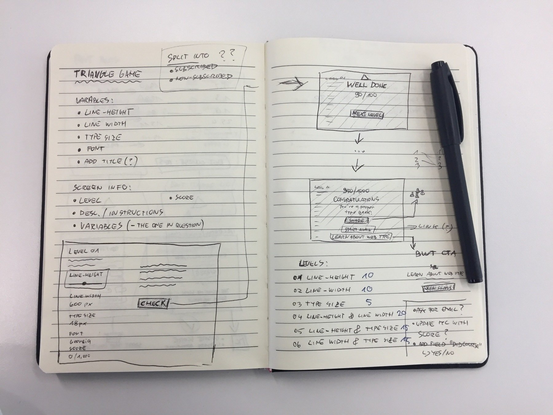
I designed and built a learning game based on a theory that I developed for the book: The Equilateral Triangle of a Perfect Paragraph. In that theory, I claimed that shaping a perfect paragraph requires three elements to be in perfect balance: font size, line height and line length. The equilateral triangle is a perfect representation of three things in perfect balance and that's where the idea for the theory came from.
After the release of the book I launched this learning game mostly as a way to advertise the book for free. as the game was featured on most popular web design websites and communities.
The game consists of 10 levels and the user gets a score out of 100 at the end of the game.
03


Finished game screen capture
Original sketch of the game
Launching the
book
PRINTED EDITION
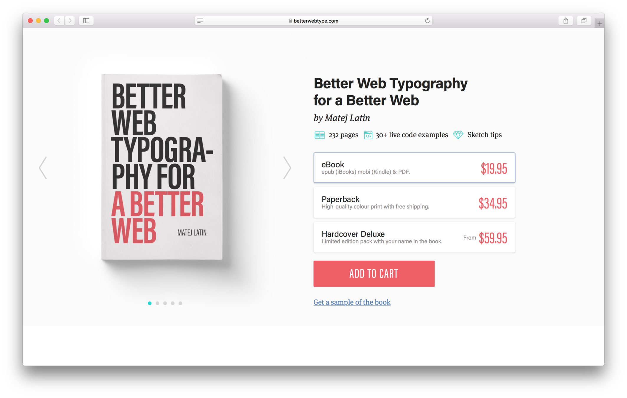
Releasing the book in a print edition was never on my mind but many Better Web Type users started asking about it. After a while, I decided to give it a try. I found a print-on-demand service, updated the book purchase page and launched it as another experiment. Two days later, I had to carry almost 100 books to the post office.
The experiment was successful but handling and shipping physical products takes a lot more time
and effort.
03
Where do I go
from here?
METRICS
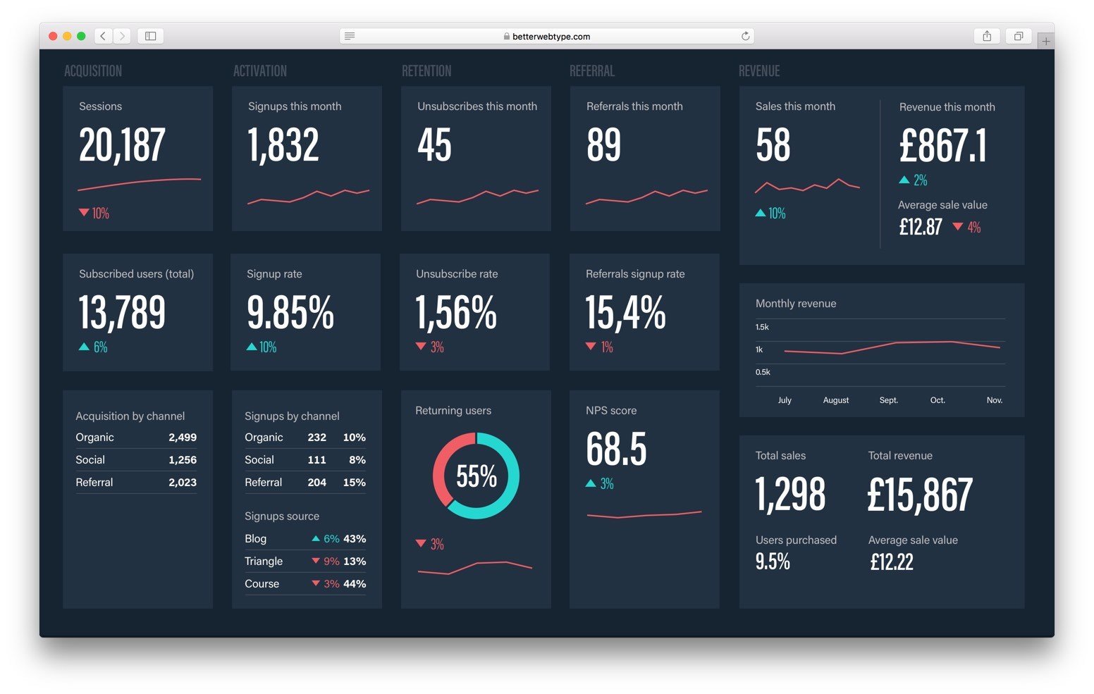
I adopted the AARRR metrics (acquisition, activation, retention, referral, revenue) at the very start of the project as indicators of success. I had been tracking these metrics throughout the project but at this point I felt I needed to have an overview. I designed and built the product dashboard which tells me what's going on with the product at a glance.
Analysing these metrics helped me identify the two goals I believe I need to focus on: stabilise sales and increase the average order value. It also helped me come up with 'the only metric that matters' (OMTM) for this stage of the product—monthly growth.
With the goals and OMTM set, I was ready to prioritise the ideas for future products/features based on user benefit, business opportunity and work required to build it.
04
Stabilise sales,
increase avg. order value
Goals
Only metric that matters
monthly growth = visitors × new visitors (%) × signup rate + new signups × k-factor - unsubs
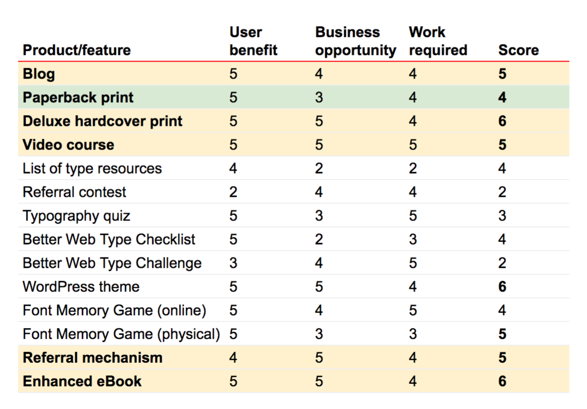
Score = user benefit + business opportunity - work required
Where do I go
from here?
FIXING THE FUNNEL
Better Web Type grew a lot. It grew more than I expected but it had a fundamental flaw. It didn't have a built-in mechanism to refer friends to the course. Considering the unbelievably high NPS score it was a wasted opportunity to grow even more.
Identifying the only metric that matters (OMTM) in the previous step helped me realise that. K-factor (indicator of viral growth) is an important part of that equation but it requires a built-in referral mechanism.
I'll change the free course in the coming weeks so that users only get 7 lessons and need to refer a friend to receive the other 3 (bonus) lessons. It will be a very important experiment that could tell me what the potential of natural viral growth of the project can be.
04
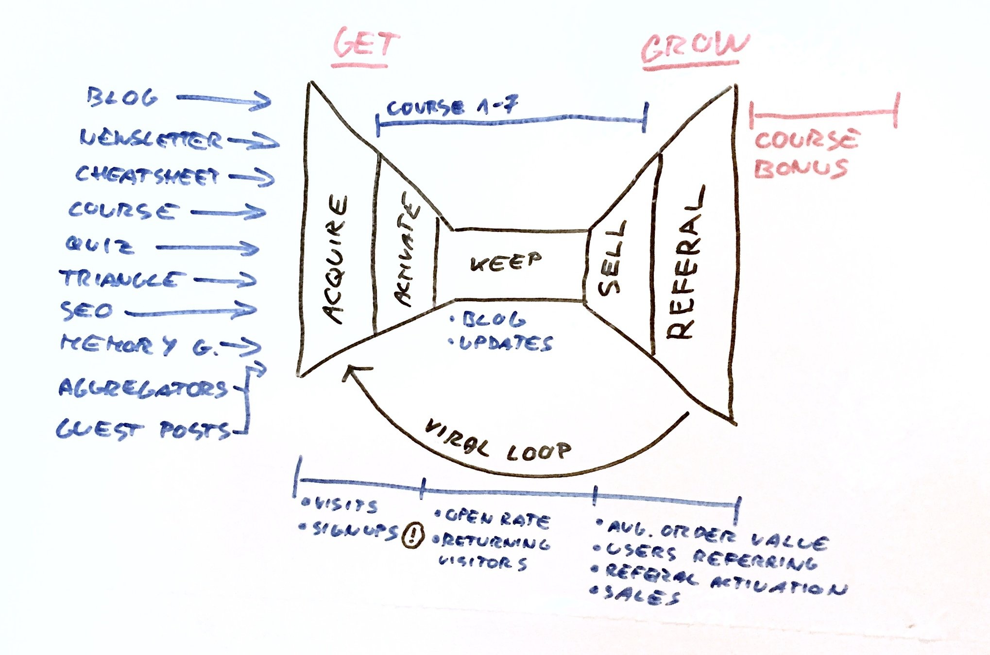
Overview of the Better Web Type course funnel
Where do I go
from here?
BLOG & ENHANCED EBOOK
Stabilising sales is one of the main two goals that I want to focus on in the future. That's why I decided to run an experiment where I launch a blog covering various web typography topic. It should bring new signups and with that more purchases. It will also bring more value to the users as they'll read even more practical examples about web typography.
Increasing the average order value is the second goal I'll focus on and to get there, I'll experiment with creating an enhanced eBook that includes all the source code from the examples. It will sell for a higher price than just the eBook. It may also include a decision on discontinuing the printed format.
04

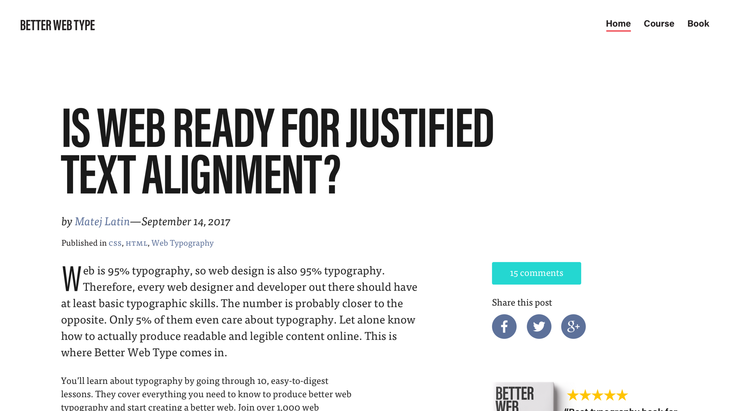
Design for the upcoming blog
Where do I go
from here?
SO FAR, SO GOOD...
Based on experiments so far I concluded that Better Web Type is product/market fit. Now is time to use the solid foundations it was built on and grow further.
04

Product / market fit, time to grow
Achievements + what I learned
The course has been featured in many popular web design websites and resources. It was also featured in the Net magazine as the main, cover feature and The Web Designer Magazine. This helped it grow the way it did.
The book was also very well received. It was adopted as a text book for the Web Design and Media course at the Oswego State University of
New York.
But I made mistakes in the process. Valuable mistakes that I learned from. I consider the two main mistakes to be:
- not having a built-in referral mechanism from the start,
- taking 5 months from launching the product to making it profitable (considering that a whole book had to be written, it's not that long, but still more than I felt comfortable with).
Fail fast, keep moving.
05

.jpg)
Featured in:
Better Web Type
By Matej Latin
Better Web Type
- 1,545


