Adventures in Accessibility

I recently spent some time with the Firebelly website to try to improve its accessibility. I learned a few things that I'd like to share with you.
Images
Aside from what we already know, which is that we should be including descriptive alt tags to images to help describe images to screen readers and search engines, strictly decorative images (which we don't use much these days) should include an empty alt tag, otherwise some screen readers may read the filename of the image and disrupt the flow of the site. (source)
<img src="decorative.png" alt="">Images
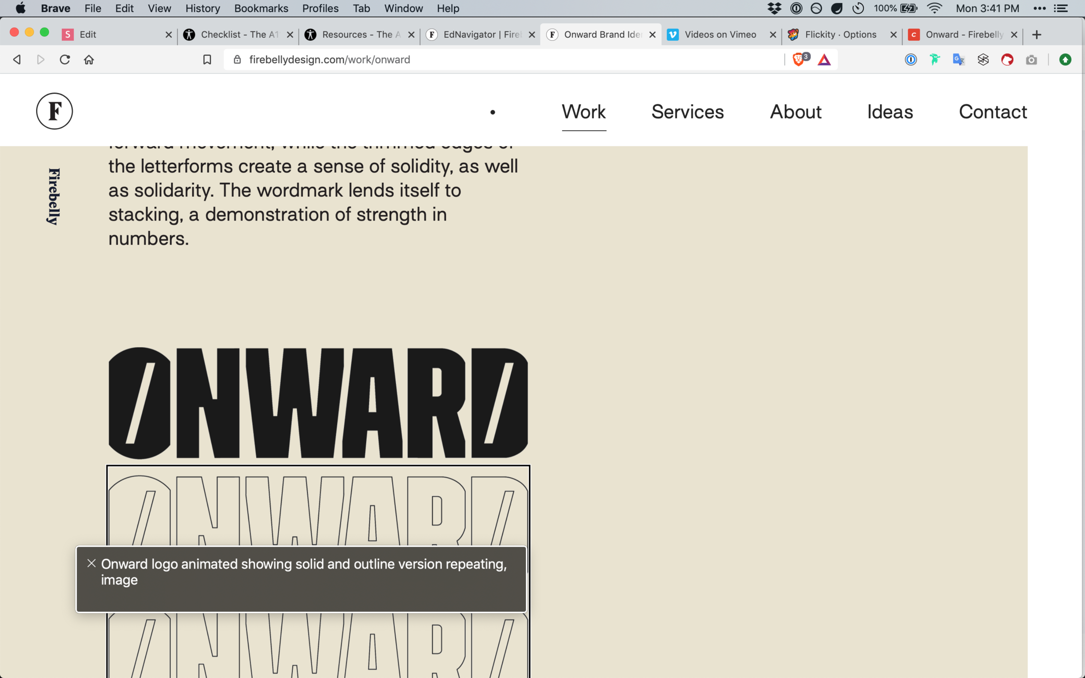
I also want to emphasize the importance of good alt tags once more. Consider the intention of the image — if it is an animated gif intended to illustrate change or motion, include that in the description. If it is a photo or rendering of print materials describe the nature of how they are presented, and why. The Onward case study does a wonderful job with this.

Videos
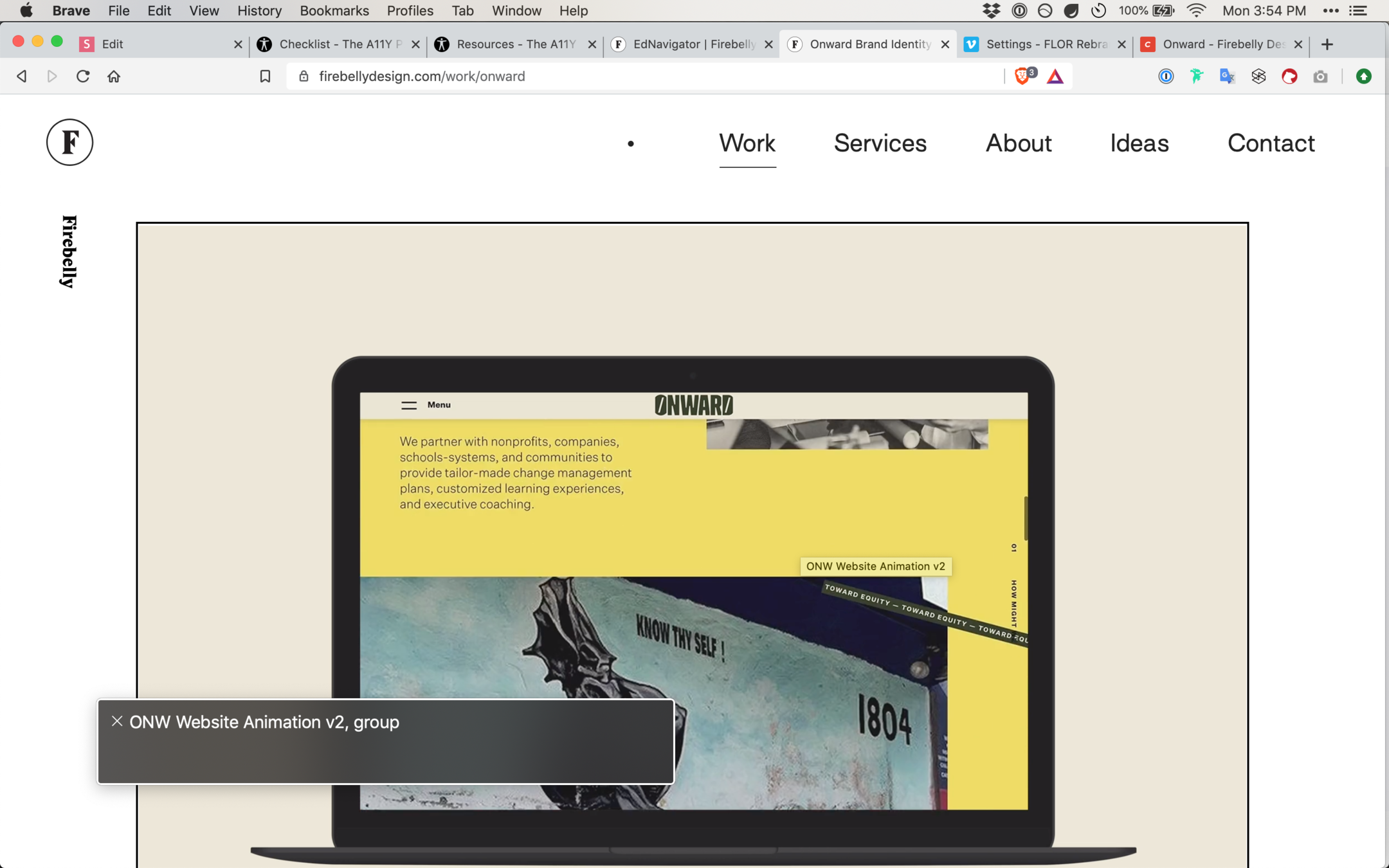
We use videos in our case studies all the time. Most often they are used as background videos to present animations, and occasionally they are used to display full videos with audio. In the case of background videos a screen reader will likely read the Title of the Vimeo video, so we should be naming the videos as if they were alt text for an image. Ideally in the case of videos with audio/speaking we would upload caption files that would be read by screen readers.
Forms
Whenever possible we should enable autocomplete on forms to make entry easier.
We often design inputs without a visual label, but even in these cases we need to code in a label for each input to allow for accessible readability.
<form action="/action_page.php" autocomplete="on"><label for="email">Email Address</label>
<input type="email" id="email"
placeholder="Enter your email for GoodNews">
Motion
Modern operating systems often provide a setting for reduced motion, and we can detect this setting in CSS and JavaScript, allowing us to reduce or remove animations and motion from our designs if a user prefers.

@media (prefers-reduced-motion: reduce) {
  .rollover-images.hover {
    img {
      animation: none!important;
    }
  }
}The impact of animation on people with vestibular disorders can be quite severe. Triggered reactions include nausea, migraine headaches, and potentially needing bed rest to recover.
Motion
This is a really easy opportunity for us to make the experience of some visitors to our sites more enjoyable or even less hazardous. Reducing motion is also usually a pretty straight-forward task that is easily adaptable code-wise. For example, for images that fade and slide into view, they can just appear as normal. A modal that slides into view can just be shown/hidden. Something less straight-forward is, for example, all of the animations we display in gifs or videos.
Modals
The TL;DR is that modals are hard to make completely accessible. Even more concisely, modals are hard.
In order to retain the logical tab index a user would expect you need to hijack the tab key and manually change focus to the focusable items within the modal, and then relinquish the tab key back to its native functionality and return focus to the last out-of-modal object that was focused before the modal was opened. It's a pain in the ass. This is even harder to make accessible for screen readers. I still have not figured out a good solution.

Swup/Dynamically-loaded Content
We have been making a lot of sites that transition smoothly between pages (Firebelly, DBC, R2, Madison Rose), and what is happening is the browser never actually fully reloads the page. The content from the page a user clicks on is just fetched and replaces the content in the current view. This is fine for people seeing the change happen before their eyes, but screen readers need to be informed that content in an area might be changed. For these areas we need to add the aria-live attribute:
<div id="page" class="transition-fade" aria-live="polite">Accordions
Typical markup for accordions is such that the content hidden in the accordion can't be read by a screen reader until it is expanded, and often the expand button comes after that content area, so even if they expand the content, they have to go backward in the flow to read that expanded content, and it will start them from the bottom of that content so they will be reading it in reverse order.
Like modals, this is difficult to make accessible for browsing by the tab key, and even more difficult to make completely accessible for screen readers, though definitely easier to work with than modals.
The Takeaway
Accessibility can be difficult, but it's worth our consideration and effort. Accessibility considerations ideally would be made consciously during the design stage, or in early collaboration with dev. If accessibility is especially important, consider alternative design solutions to some of the more problematic patterns:
Modals
Instead of a modal, can the content be displayed on the page in an alternate style, or on a separate page all together? If not can it be displayed as an accordion (slightly less difficult to work with)?
Accordions
Can the content simply be displayed inline with a style that sets it apart from the rest of the content? Is the content long enough to have its own page? Is the content short enough to not disrupt the flow if read by a screen reader regardless of user input?
Resources
Tools and guides to help you navigate accessibility.
VoiceOver (Mac)
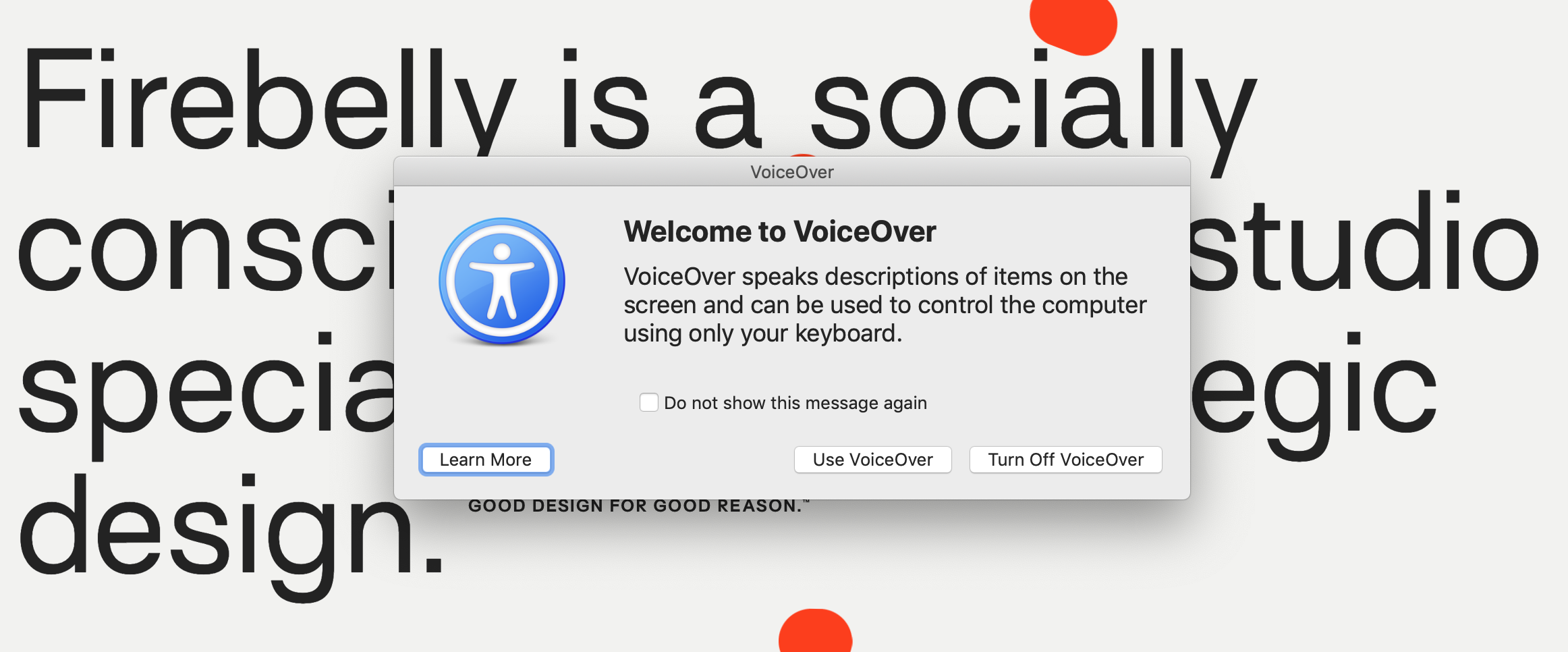
Just hit command + F5 to enable the Mac screen reader and head over to your browser and try it out. Use control + option + left/right arrow to navigate, and follow the instructions for interacting. Try closing your eyes to see what it's like without the visual context.
A11y Project
Browse the A11y Project website for tips, guides, and browse through the checklist to help gain an understanding of what patterns and concerns to be aware of when considering accessibility.

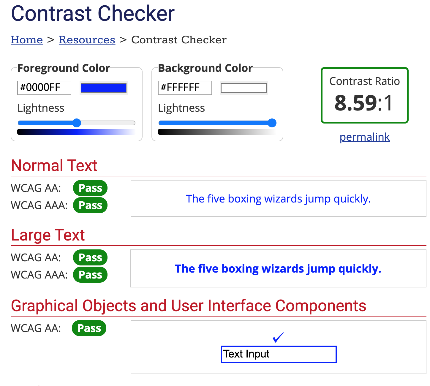
WebAIM Contrast Checker
I use this all the time to check the contrast between text and background in our web designs. Aim to pass AA standards, but AAA would be sick!
Lighthouse
Lighthouse generates an accessibility report for a web page, and while it is not a definitive measure of the accessibility of a page, it is a good benchmark and can give you a sense for areas that could be improved.
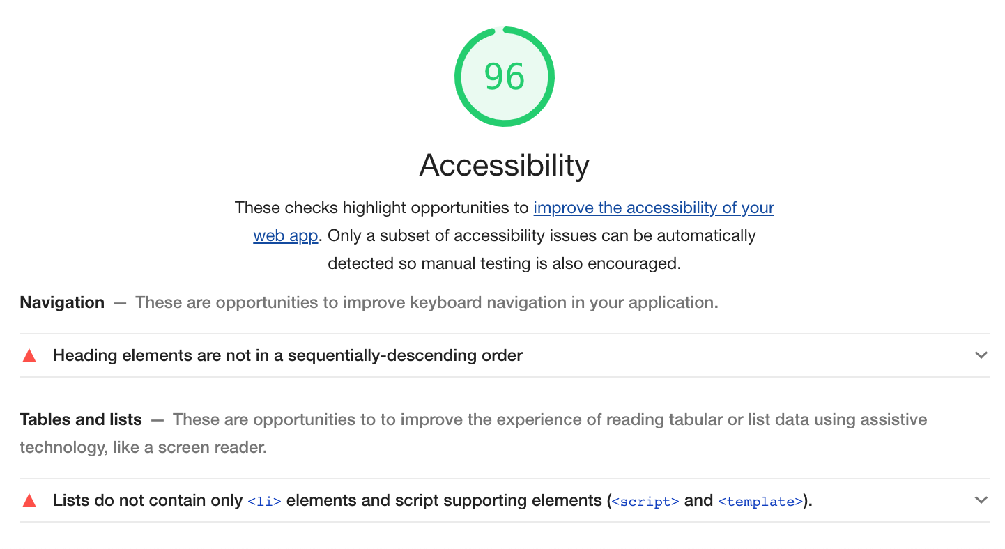
Lighthouse is accessed by opening the Chrome Dev Tools panel (cmd+option+i), clicking on the "Lighthouse" panel, selecting "Accessibility" and clicking "Generate report."
Thank you.
Go forth, and be accessible.
Adventures in Accessibility
By matt-soria
Adventures in Accessibility
A brief presentation of some of the takeaways from diving into the accessibility issues of the Firebelly site.
- 1,346


