
<!DOCTYPE html>
<html>

  <head>

  </head>

  <body>

  </body>

</html>
<head>
<meta charset="UTF-8">
<title>Page Title</title>
<link rel="stylesheet" href="mystyle.css">
<meta name="description" content="Beskrivelse til Google etc">
<meta name="keywords" content="HTML, CSS, XML, JavaScript">
<meta name="author" content="John Doe">
<meta name="viewport" content="width=device-width, initial-scale=1.0">
<script src="myscripts.js"></script>
<link rel="manifest" href="site.webmanifest">
<link rel="apple-touch-icon" href="icon.png">
<meta name="theme-color" content="#fafafa">
<meta property="og:title" content="The Rock" />
<meta property="og:type" content="video.movie" />
<meta property="og:url" content="http://www.imdb.com/title/tt0117500/" />
<meta property="og:image" content="http://ia.media-imdb.com/images/rock.jpg" />
<meta property="og:description" content="Sean Connery found fame and fortune as the
suave, sophisticated British agent, James Bond." />
</head>
{
  "short_name": "",
  "name": "",
  "icons": [{
    "src": "icon.png",
    "type": "image/png",
    "sizes": "192x192"
  }],
  "start_url": "/?utm_source=homescreen",
  "background_color": "#fafafa",
  "theme_color": "#fafafa"
}
<h1>Heading 1</h1>
<h2>Heading 2</h2>
<h3>Heading 3</h3>
<h4>Heading 4</h4>
<h5>Heading 5</h5>
<h6>Heading 6</h6>
<p>Paragraph</p>
<ul>
	<li>Item 1</li>
	<li>Item 2</li>
</ul>

<ol>
	<li>Item 1</li>
	<li>Item 2</li>
</ol>

<dl>
	<dt>First name:</dt>
	<dd>Marius</dd>

	<dt>Last name:</dt>
	<dd>Hauken</dd>
</dl>
<div>
  <input placeholder="Type in me!">
</div>

<div>
  <input type="range">
</div>
<div>
  <input type="number" min="1" max="10" value="3">
</div>
<div>
  <input type="date" value="2018-02-15" min="2018-02-10">
</div>
<div>
  <textarea>Hey</textarea>
</div>
<div>
  <input type="number" /> /* NO */
</div>

<div>
  <input type="text" pattern="\d*" autocomplete="tel-national"> /* Better */
</div>
<div>
	<input type="checkbox">
	<input type="checkbox" checked>
</div>
<div>
	<input type="radio" name="foo" checked>
	<input type="radio" name="foo">
</div>
<div>
	<select>
		<option>🥑</option>
		<option>🥩</option>
		<option>🥓</option>
		<option>🥥</option>
		<option>🍳</option>
	</select>
</div>
Semantic
<div>
<span>
<div id="header"></div>
<div class="section">
	<div class="article">
		<div class="figure">
			<img>
			<div class="figcaption"></div>
		</div>
	</div>
</div>
<div id="footer"></div>
<div id="header"></div>
<div class="section">
<div class="article">
<div class="figure">
<img>
<div class="figcaption"></div>
</div>
</div>
</div>
<div id="footer"></div>
<header></header>
<section>
<article>
<figure>
<img>
<figcaption></figcaption>
</figure>
</article>
</section>
<footer></footer> <article> Defines an article </article>
<aside> Defines content aside from the page content </aside>
<details> Defines additional details that the user can view or hide </details>
<figcaption> Defines a caption for a <figure> element</figcaption>
<figure> Specifies self-contained content, like illustrations, diagrams, photos, code listings, etc.</figure>
<footer> Defines a footer for a document or section </footer>
<header> Specifies a header for a document or section </header>
<main> Specifies the main content of a document </main>
<mark> Defines marked/highlighted text</mark>
<nav> Defines navigation links</nav>
<section> Defines a section in a document</section>
<summary> Defines a visible heading for a <details> element</details>
<time> Defines a date/time </time><section> or <article>?
The <section> and <article> elements are conceptually similar and interchangeable. To decide which of these you should choose, take note of the following:
- An article is intended to be independently distributable or reusable.
- A section is a thematic grouping of content.
<h1>
  Title for everything
</h1>

<section>
  <h1>A main title</h1>
  <p>text...</p>
</section>

<article>
  <h1>Another main title</h1>
  <h2>
    Subheading
  </h2>
  <p>More text...</p>
</article>
Multiple headings no problem
NOT:

<div>Play video</div>

USE CORRECT ELEMENT:

<button>Play video</button>
<img src="dinosaur.png">
<img src="dinosaur.png"
alt="A red Tyrannosaurus Rex: A two legged dinosaur standing upright like a human, with small arms, and a large head with lots of sharp teeth.">
<img src="dinosaur.png"
alt="A red Tyrannosaurus Rex: A two legged dinosaur standing upright like a human, with small arms, and a large head with lots of sharp teeth."
title="A red dinosaur">
<img src="dinosaur.png" aria-labelledby="dino-label">
<p id="dino-label">The Mozilla red Tyrannosaurus Rex: A two legged dinosaur standing upright like a human, with small arms, and a large head with lots of sharp teeth.</p>
<img src="logo.png" alt=""><form>
<div>
<label for="name">Fill in your name:</label>
<input type="text" id="name" name="name">
</div>
<div>
<label for="age">Enter your age:</label>
<input type="text" id="age" name="age">
</div>
<div>
<label for="mood">Choose your mood:</label>
<select id="mood" name="mood">
<option>Happy</option>
<option>Sad</option>
<option>Angry</option>
<option>Worried</option>
</select>
</div>
</form>
WAI-ARIA
<header>
  <h1>...</h1>
  <nav role="navigation">
    <ul>
    	<li tabindex="0">Example</li>
        <li tabindex="0">Example</li>
    </ul>
    <form role="search">
      <input type="search" name="q" placeholder="Search query" aria-label="Search through site content">
    </form>
  </nav>
</header>

<main>
  <article role="article">...</article>
  <aside role="complementary">...</aside>
</main>

<footer>...</footer>
<ul role="tablist">
<li class="active" role="tab" aria-selected="true" aria-setsize="3" aria-posinset="1" tabindex="0">Tab 1</li>
<li role="tab" aria-selected="false" aria-setsize="3" aria-posinset="2" tabindex="0">Tab 2</li>
<li role="tab" aria-selected="false" aria-setsize="3" aria-posinset="3" tabindex="0">Tab 3</li>
</ul>
<div class="panels">
<article class="active-panel" role="tabpanel" aria-hidden="false">
...
</article>
<article role="tabpanel" aria-hidden="true">
...
</article>
<article role="tabpanel" aria-hidden="true">
...
</article>
</div>

<!DOCTYPE html>
<html>
<head>
	<link rel="stylesheet" href="style.css">
	<style>
		a:not(:hover) {
			text-decoration: none;
		}
	</style>
</head>
<body>
	<h1 style="color: red">Title</h1>
</body>
</html>
align-content
align-items
align-self
alignment-baseline
all
animation
animation-delay
animation-direction
animation-duration
animation-fill-mode
animation-iteration-count
animation-name
animation-play-state
animation-timing-function
backdrop-filter
backface-visibility
background
background-attachment
background-blend-mode
background-clip
background-color
background-image
background-origin
background-position
background-position-x
background-position-y
background-repeat
background-repeat-x
background-repeat-y
background-size
baseline-shift
block-size
border
border-block
border-block-color
border-block-end
border-block-end-color
border-block-end-style
border-block-end-width
border-block-start
border-block-start-color
border-block-start-style
border-block-start-width
border-block-style
border-block-width
border-bottom
border-bottom-color
border-bottom-left-radius
border-bottom-right-radius
border-bottom-style
border-bottom-width
border-collapse
border-color
border-image
border-image-outset
border-image-repeat
border-image-slice
border-image-source
border-image-width
border-inline
border-inline-color
border-inline-end
border-inline-end-color
border-inline-end-style
border-inline-end-width
border-inline-start
border-inline-start-color
border-inline-start-style
border-inline-start-width
border-inline-style
border-inline-width
border-left
border-left-color
border-left-style
border-left-width
border-radius
border-right
border-right-color
border-right-style
border-right-width
border-spacing
border-style
border-top
border-top-color
border-top-left-radius
border-top-right-radius
border-top-style
border-top-width
border-width
bottom
box-shadow
box-sizing
break-after
break-before
break-inside
buffered-rendering
caption-side
caret-color
clear
clip
clip-path
clip-rule
color
color-interpolation
color-interpolation-filters
color-rendering
column-count
column-fill
column-gap
column-rule
column-rule-color
column-rule-style
column-rule-width
column-span
column-width
columns
contain
content
content-size
counter-increment
counter-reset
cursor
cx
cy
d
direction
display
dominant-baseline
empty-cells
fill
fill-opacity
fill-rule
filter
flex
flex-basis
flex-direction
flex-flow
flex-grow
flex-shrink
flex-wrap
float
flood-color
flood-opacity
font
font-display
font-family
font-feature-settings
font-kerning
font-optical-sizing
font-size
font-size-adjust
font-stretch
font-style
font-variant
font-variant-caps
font-variant-east-asian
font-variant-ligatures
font-variant-numeric
font-variation-settings
font-weight
gap
grid
grid-area
grid-auto-columns
grid-auto-flow
grid-auto-rows
grid-column
grid-column-end
grid-column-gap
grid-column-start
grid-gap
grid-row
grid-row-end
grid-row-gap
grid-row-start
grid-template
grid-template-areas
grid-template-columns
grid-template-rows
height
hyphens
image-rendering
inline-size
inset
inset-block
inset-block-end
inset-block-start
inset-inline
inset-inline-end
inset-inline-start
isolation
justify-content
justify-items
justify-self
left
letter-spacing
lighting-color
line-break
line-height
line-height-step
list-style
list-style-image
list-style-position
list-style-type
margin
margin-block
margin-block-end
margin-block-start
margin-bottom
margin-inline
margin-inline-end
margin-inline-start
margin-left
margin-right
margin-top
marker
marker-end
marker-mid
marker-start
mask
mask-source-type
mask-type
max-block-size
max-height
max-inline-size
max-width
max-zoom
min-block-size
min-height
min-inline-size
min-width
min-zoom
mix-blend-mode
object-fit
object-position
offset
offset-anchor
offset-distance
offset-path
offset-position
offset-rotate
opacity
order
orientation
orphans
outline
outline-color
outline-offset
outline-style
outline-width
overflow
overflow-anchor
overflow-wrap
overflow-x
overflow-y
overscroll-behavior
overscroll-behavior-block
overscroll-behavior-inline
overscroll-behavior-x
overscroll-behavior-y
padding
padding-block
padding-block-end
padding-block-start
padding-bottom
padding-inline
padding-inline-end
padding-inline-start
padding-left
padding-right
padding-top
page
page-break-after
page-break-before
page-break-inside
paint-order
perspective
perspective-origin
place-content
place-items
place-self
pointer-events
position
quotes
r
resize
right
rotate
row-gap
rx
ry
scale
scroll-behavior
scroll-margin
scroll-margin-block
scroll-margin-block-end
scroll-margin-block-start
scroll-margin-bottom
scroll-margin-inline
scroll-margin-inline-end
scroll-margin-inline-start
scroll-margin-left
scroll-margin-right
scroll-margin-top
scroll-padding
scroll-padding-block
scroll-padding-block-end
scroll-padding-block-start
scroll-padding-bottom
scroll-padding-inline
scroll-padding-inline-end
scroll-padding-inline-start
scroll-padding-left
scroll-padding-right
scroll-padding-top
scroll-snap-align
scroll-snap-stop
scroll-snap-type
shape-image-threshold
shape-margin
shape-outside
shape-rendering
size
speak
src
stop-color
stop-opacity
stroke
stroke-dasharray
stroke-dashoffset
stroke-linecap
stroke-linejoin
stroke-miterlimit
stroke-opacity
stroke-width
tab-size
table-layout
text-align
text-align-last
text-anchor
text-combine-upright
text-decoration
text-decoration-color
text-decoration-line
text-decoration-skip-ink
text-decoration-style
text-indent
text-justify
text-orientation
text-overflow
text-rendering
text-shadow
text-size-adjust
text-transform
text-underline-position
top
touch-action
transform
transform-box
transform-origin
transform-style
transition
transition-delay
transition-duration
transition-property
transition-timing-function
translate
unicode-bidi
unicode-range
user-select
user-zoom
vector-effect
vertical-align
visibility
white-space
widows
width
will-change
word-break
word-spacing
word-wrap
writing-mode
x
y
z-index
zoom
css-text
css-float
/*
 *
 * <div class="box"></div>
 *
 * */

.box {
  background-color: red;
}

div {
  background-color: orange;
}

div#box {
  background-color: purple;
}

div.box {
  background-color: yellow;
}

.box {
  background-color: blue !important;
}

.box {
  background-color: green;
}
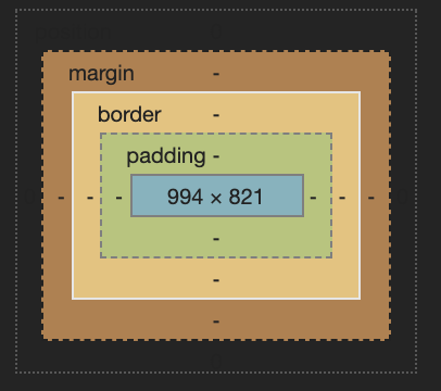
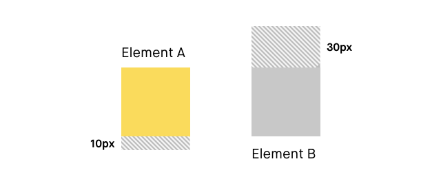
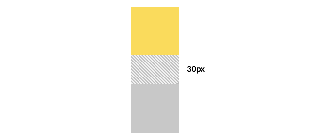
box-sizing
box-sizing: content-box;
width: 100%;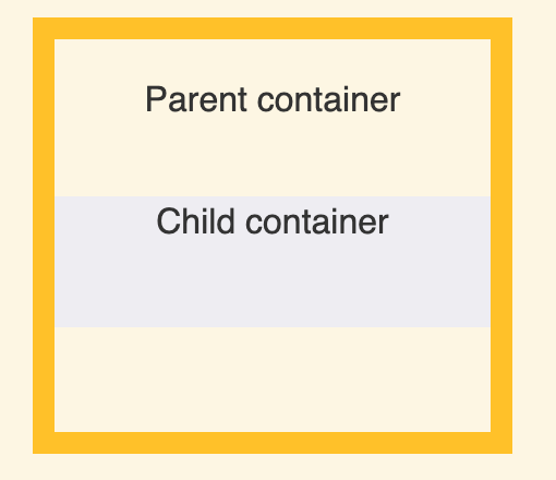
box-sizing: content-box;
width: 100%;
border: solid #5B6DCD 10px;
padding: 5px;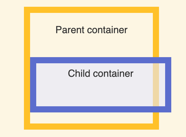
box-sizing: border-box;
width: 100%;
border: solid #5B6DCD 10px;
padding: 5px;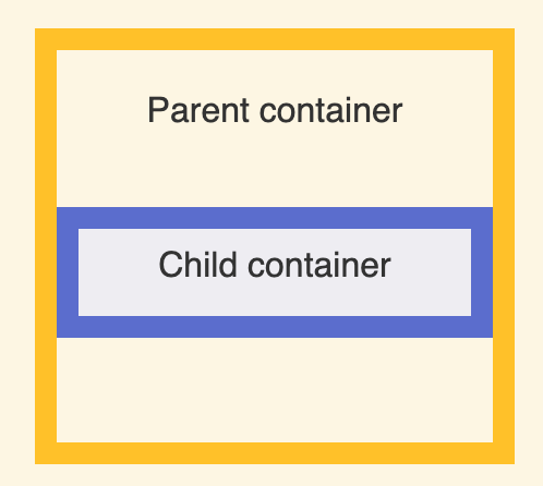
html {
  box-sizing: border-box;
}
*, *:before, *:after {
  box-sizing: inherit;
}
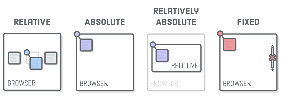
(and position: sticky)
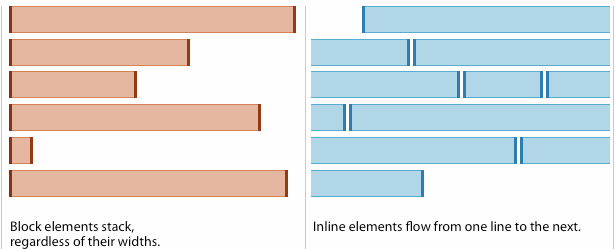
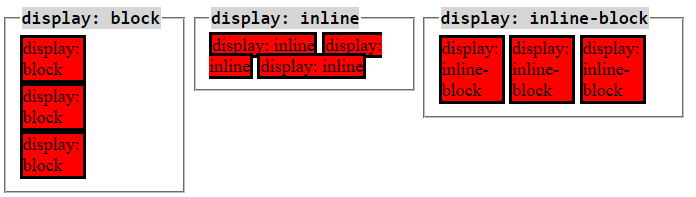
display:
block
inline
inline-block
flex
grid
Flexbox
Css Grids
12
enkle tips
for bedre CSS
1.
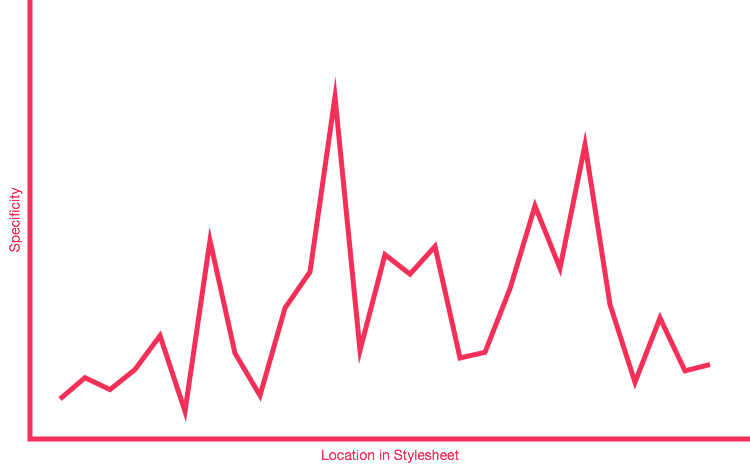
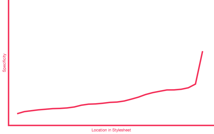
Hold spesifisiteten lav
2.
Bruk variabler
eller theming
// SCSS:

$color-primary: #00a190;
$color-white: #fff;

.button {
    background-color: $color-primary;
    color: $color-white;
}
// Styled-components
const theme = {
color: {
white: "#fff",
primary: "#00a190",
}
}
const Button = styled.button`
background-color: ${p => p.theme.color.primary};
color: ${p => p.theme.color.white};
`
3.
Klassenavn brukes
kun i én kontekst
4.
Tenk i
komponenter
✅
❌
5.
Tenk nøye
på navngiving

.btn--submit-form ==> .btn--primary

.btn--read-more ==> .btn--secondary

.box--green ==> .box--prominent

.card ==> .credit-card-image
6.
Ikke vær for overivrig med hjelpeklasser
<div class="box
            box--warning
            box--small
            box--previous
            hide
            formfield__input--error
            mb">
    Error-message
</div>
7.
Ikke vær overivrig med shorthand-syntax
.btn {
  background: red;
}

// Leses av browseren som:

.btn {
  background-image: initial;
  background-position-x: initial;
  background-position-y: initial;
  background-size: initial;
  background-repeat-x: initial;
  background-repeat-y: initial;
  background-attachment: initial;
  background-origin: initial;
  background-clip: initial;
  background-color: red;
}

// Gjør heller dette om det er det du mener:

.btn {
  background-color: red;
}
8.
Unngå resetting
av stiler
// bad news:

border-bottom: none;
padding: 0;
float: none;
margin-left: 0;
9.
Unngå magic numbers
.site-nav > li:hover .dropdown {
    position: absolute;
    top: 37px;
    left: 0;
}
🤮
10.
Unngå qualified selectors
// Unødvendig spesifikt

ul.nav {}
a.button {}
div.header {}

ul.nav li.active a {}
div.header a.logo img {}
.content ul.features a.button {}
11.
ALDRI bruk
#ID i CSS!
12.
Vær konsekvent med retning på marginer
display: grid;
grid-template-columns: 100%;
grid-row-gap: 2rem;
HTML + CSS 101
By Marius Hauken


