Web Accessibility
Michael Ball
CS169 Fall 2017
ball@berkeley.edu
Accessibility:
Users with Different Needs
- Sight
- Hearing
- Motor Control
- Cognitive
While some disabilities are permanent, many are fluid.
Why work on accessibility
- It's the right thing to do
- Access to more users
- Legal Compliance
Physical Accessibility

Digital Accessibility

Demo: Assertive Tech
Using Facebook:
Keyboards & Screen Readers
Detour: Settings
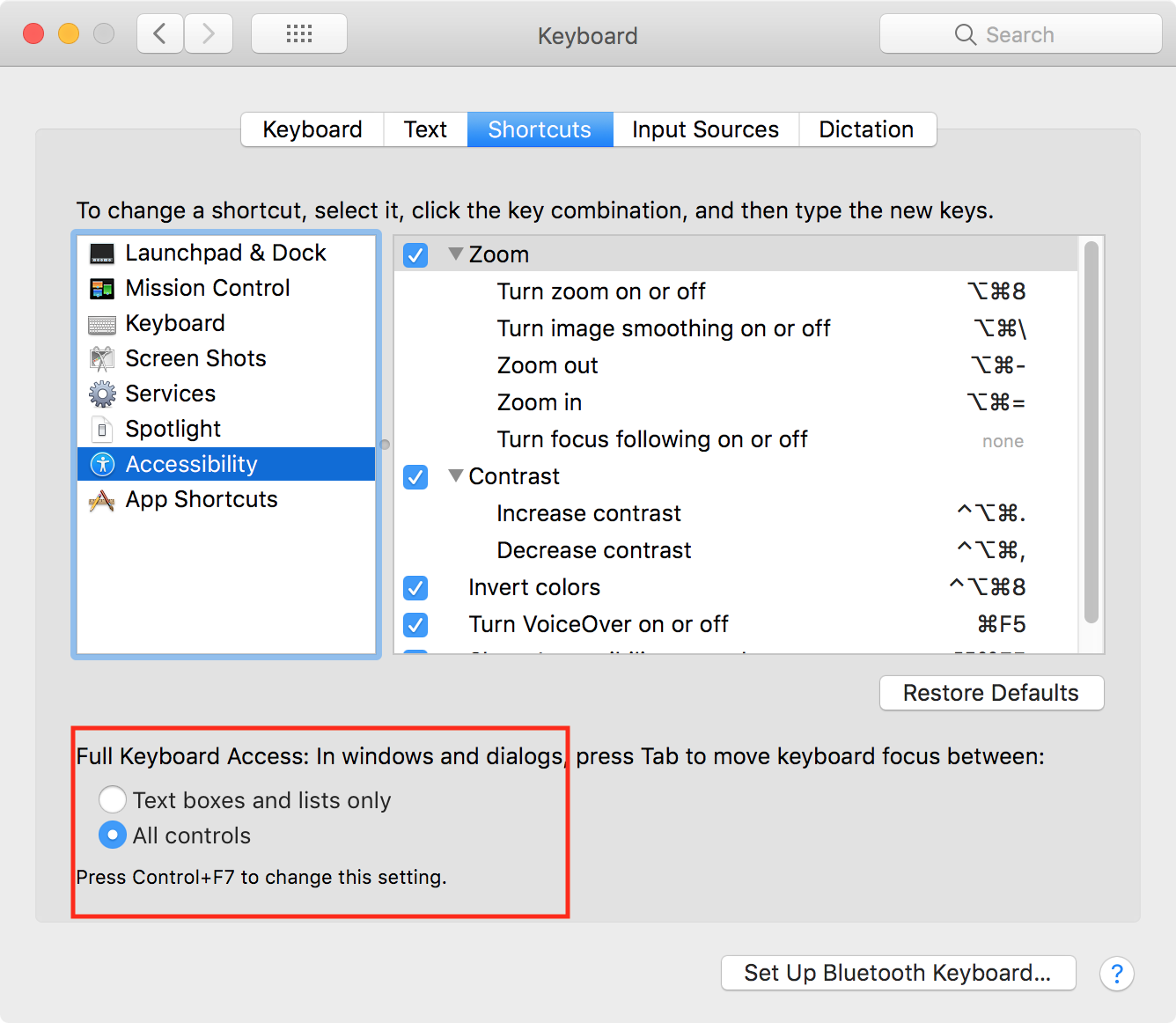
You will probably need to turn on some settings on your computer.
This option makes it easier to tab through elements on a web page.
On macOS: System Preferences → Keyboard

Detour: Settings
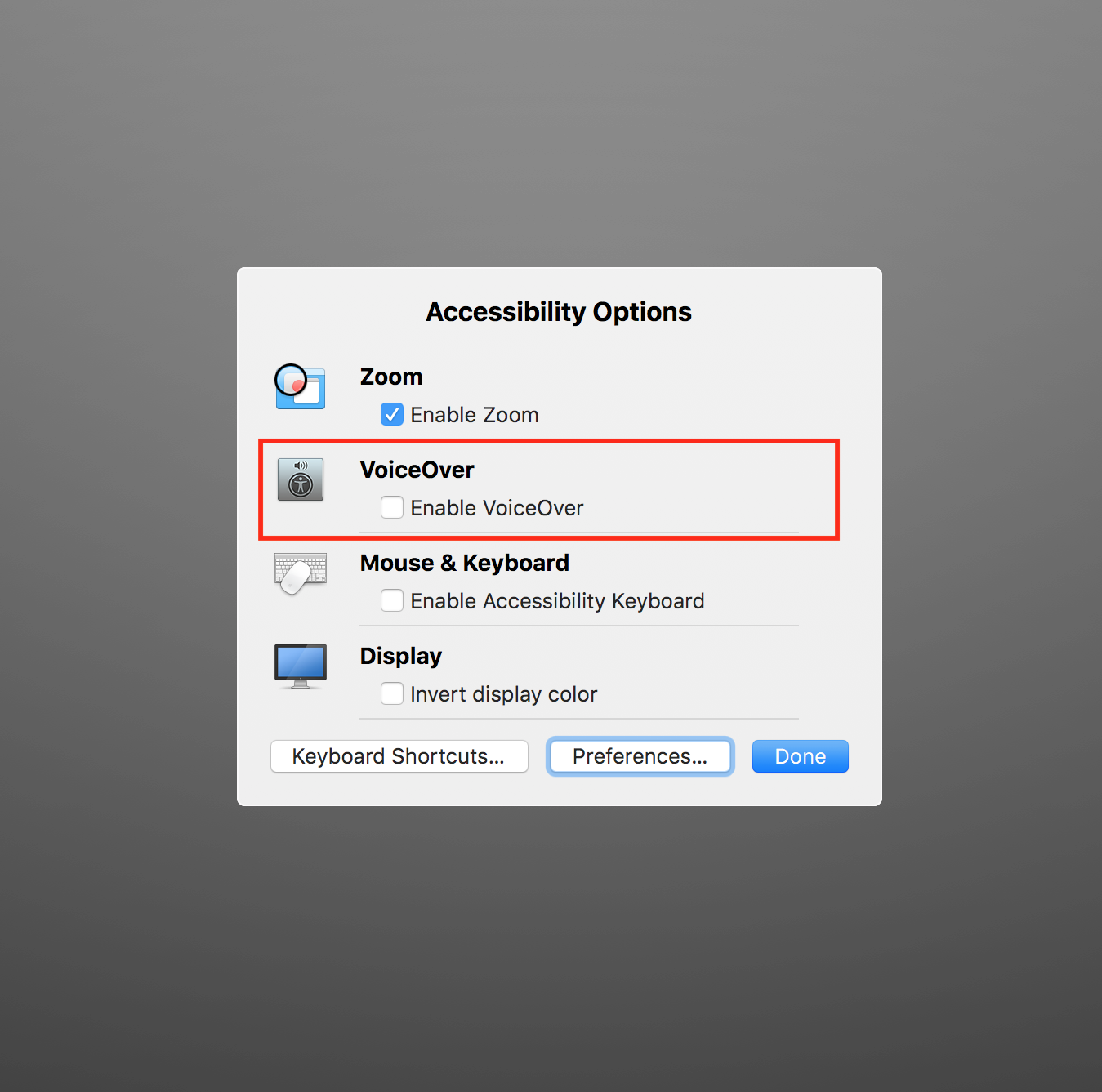
You will probably need to turn on some settings on your computer.
Turing on the screen reader.
On macOS (use a keyboard shortcut): Command+Option+F5

Guidelines
• WCAG -- Web Content Accessibility Guidelines
• Criteria to make a site accessible at a basic level
• Practical examples with working HTML and JS for common design patterns!
• The ARIA Spec
• A dry as a spec is, but very useful!
Tooling
• Use tools to automate the "easy" stuff and save you time!
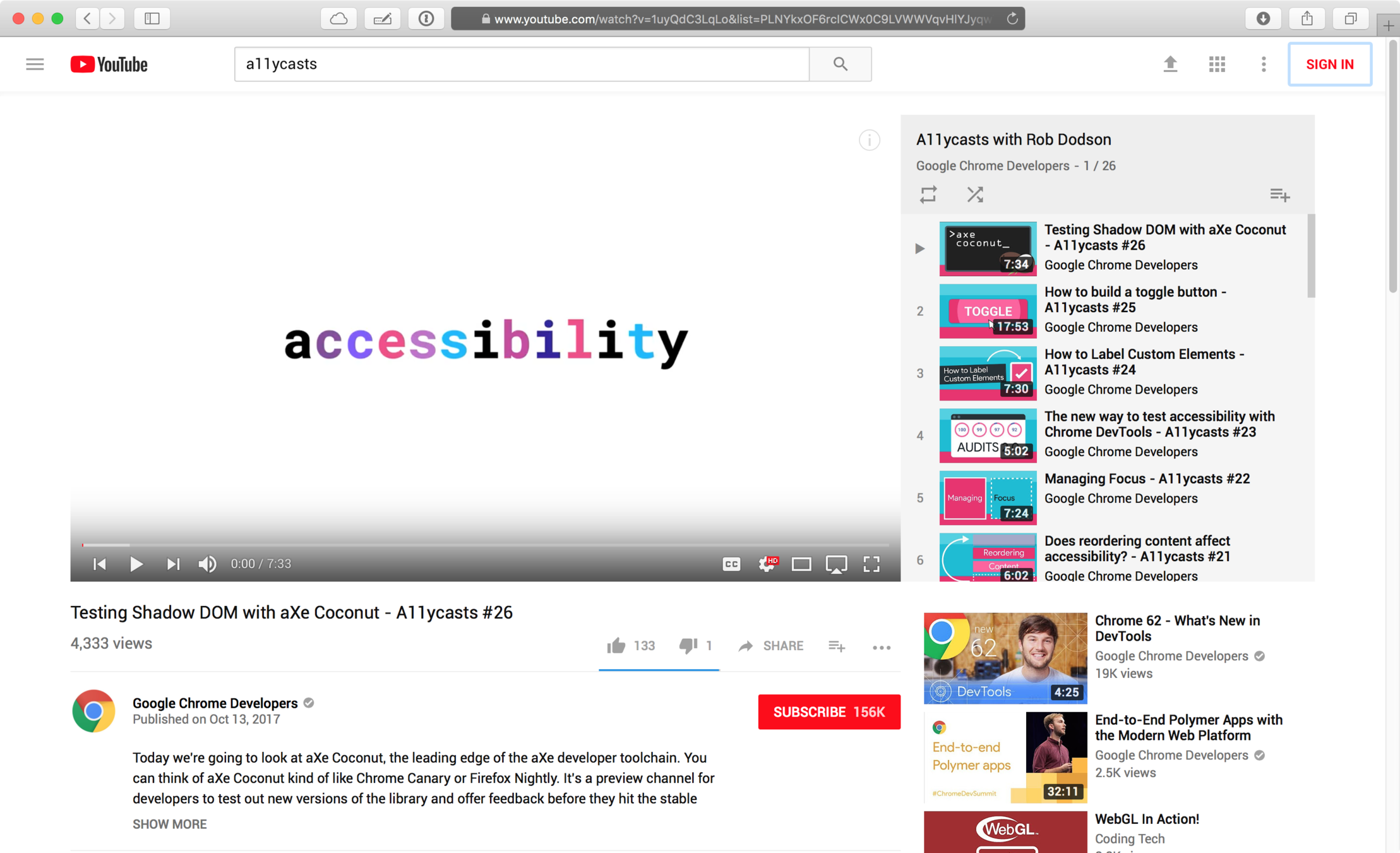
• Chrome Dev Tools:
• Inspector → Audits
• tota11y
• A JS bookmarklet
• CI tools
• axe-matchers:
expect(page).to be_accessibleThen the page should be accessibleMaking Sites Accessible
Simply put:
Following web standards helps make your work accessible.
However, there's more to HTML than you might expect!
ARIA: Accessible Rich Internet Applications
A collection of HTML attributes that let you describe your site to a screen reader or other assistive technology.
Example: You can declare an element has a "role" of menu, which gives a text description to match what is visually present.
Meta: Use and Inspect Libraries
If someone has built it, don't reinvent the wheel!
Bootstrap (especially v4!) has quite good documentation and examples for accessibility.
Caution! Watch out for old and unmaintained libraries.
When evaluating a library, search for 2 things in a repo:
• "accessibility" (or a11y) in the issue tracker and docs
• "aria" in the code.
#1: Buttons & Links
Basic Rule:
• Links (<a>) take you somewhere
• Buttons (<button>) perform some action.
Avoid using other elements for interactivity.
When you use a button:
• automatically get keyboard focusability
• automatically get keyboard triggering
• automatically described as a "button" to a screen reader.
#2: "Skip Links"
A really simple way to make a site more easily accessible!
A skip link only shows up when it is focused, and when pressed takes you straight to the content.


#3: Using JS to Control ARIA
ARIA lets us describe the roles and state of an element.
We're going to build a collapsible panel, and make it accessible by toggling 'aria-expanded' using Javascript.
We'll start with a simple, pretty much in accessible version and build up to a version which is usable by everyone.
While the examples are specific, the process can be applied to all interactions.
Bonus Content
#4: Screen-Reader Only Text
Text
#5: Color Contrast
Text
#6: Styling Focus States
Text
#7: Modals
Text
A Bunch of Links
- a11y Checklist
- Bullet Two
- Bullet Three
Intro to Web A11Y
By Michael Ball
Intro to Web A11Y
- 909
