Bootstrap
Mobile-first development
{review}
jQuery
JavaScript library
DOM Manipulation
Event handling
Animation
Ajax calls (getting data)

jQuery Basics
Select element
$('selector')Get attribute
$('#my-svg').attr('height') // height of svg
$('#my-p').css('font-size') // css properties
$('#my-div').text() // text in div
$('input').val() // value of input
Set attribute
$('#my-svg').attr('height', '400px')
$('p').css('font-size', '20px')
$('#my-input').val('input value')
$('#my-div').text('The new text')
{mobile-first}
What?
Why?
How?
{what}
{why?}

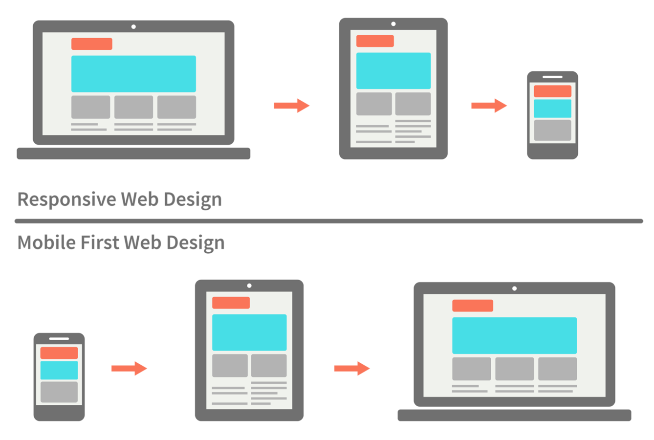
Why mobile?
Why first?
Graceful degradation v.s. progressive enhancement
Easier to add than remove
Do the hard work up front

{how?}

What can it do?

Set-up
<head>
    <meta charset="utf-8">
    <meta http-equiv="X-UA-Compatible" content="IE=edge">
    <meta name="viewport" content="width=device-width, initial-scale=1">
    <!-- The above 3 meta tags *must* come first in the head;-->
</head>
Set device width
    <!-- Latest compiled and minified CSS -->
    <link rel="stylesheet" href="https://.../bootstrap.min.css">

    <!-- Optional theme -->
    <link rel="stylesheet" href="https://.../bootstrap-theme.min.css">

    <!-- jquery library, required for bootstrap JS to run -->
    <script src="https://.../jquery.min.js"></script>

    <!-- Latest compiled and minified JavaScript -->
    <script src="https://.../bootstrap.min.js"></script>
Read in libraries
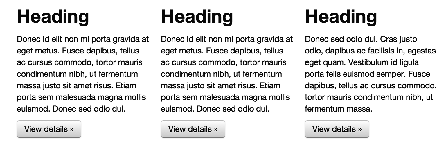
The Grid
Horizontal sections as rows
Vertical sections as columns

Column 1
Column 2
Column 3
Row 1
Row 2
Columns
There are 12 columns in the grid
Elements can take up many columns
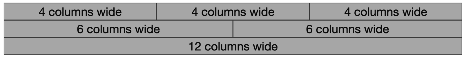
Row 1:

Row 2:
Row 3:
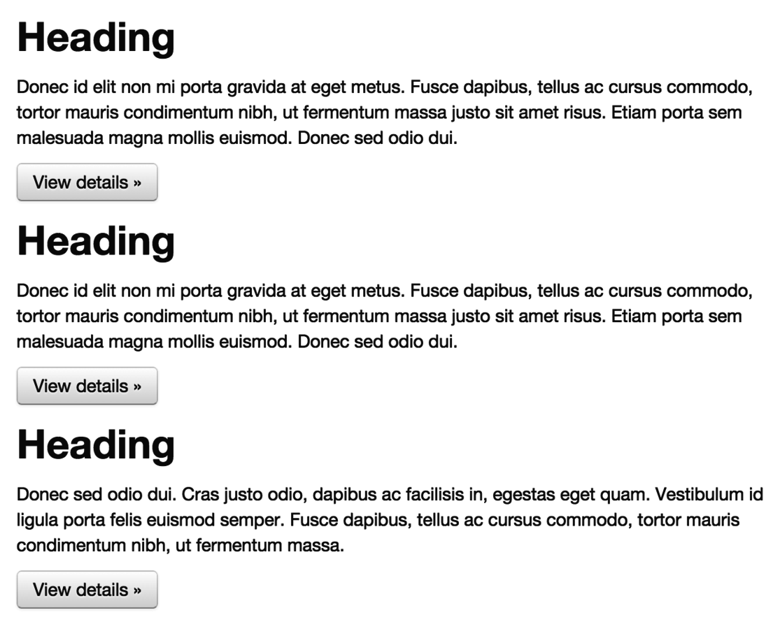
Specify columns based on screen-size

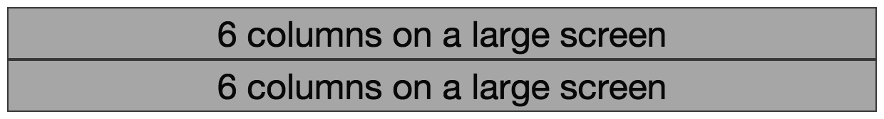
Syntax
<body>
    <div class="container">
        <div class="row">
            <div class="col-md-6">6 columns on a medium screen</div>
            <div class="col-md-6">6 columns on a medium screen</div>
        </div>
    </div>
</body>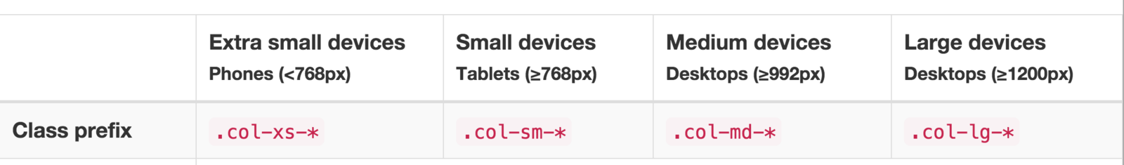
Set columns for desired device
Create elements
Under the hood
@media screen and (max-width: 300px) {
    body {
        background-color: lightblue;
    }
}
Media queries
Conditional styles
An aside
div[class^="col-"] {
    border:1px solid gray;
}
Cool trick
Apply to all divs with class col-*
Navigation
<nav class="navbar navbar-default">
    <div class="container">
        <!-- Header for mobile -->
        <div class="navbar-header">
            ....
        </div>
        <!-- Screen navigation elements -->
        <div id="navbar" class="navbar-collapse collapse">
            ...
        </div>
</nav>
Use bootstrap's built in navigation classes
Use lists to build controls
<ul class="nav navbar-nav">
    <li class="active"><a href="#">Home</a></li>
    <li><a href="#about">About</a></li>
    <li><a href="#contact">Contact</a></li>
</ul>
Actions
$(".nav li").on("click", function() {
     $(".nav li").removeClass("active");
     $(this).addClass("active");
});
Assign actions with jQuery
What does this do:
Button groups
This looks nice
<div class="btn-group" role="group" aria-label="...">
  <button type="button" class="btn btn-default">Left</button>
  <button type="button" class="btn btn-default">Middle</button>
  <button type="button" class="btn btn-default">Right</button>
</div>
Tooltips
Add title properties to elements
<button type="button" title="Hover info">Hover</button>Activate tooltips
$('selector').tooltip()
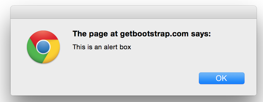
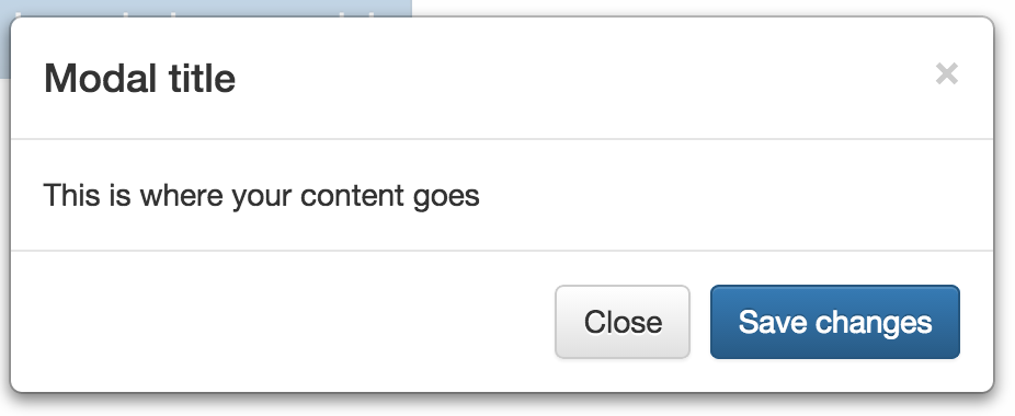
Modals
But not at all
Like alerts
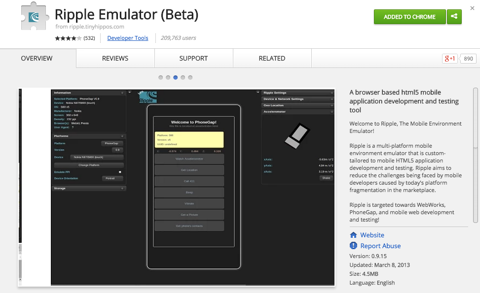
Emulator
Assignment
Bootstrap challenge (due Thursday before class)
info343_bootstrap
By Michael Freeman


