Getting Stylish
What makes a website "look good"?
{warm up}
Writing stylesheets
Arranging elements
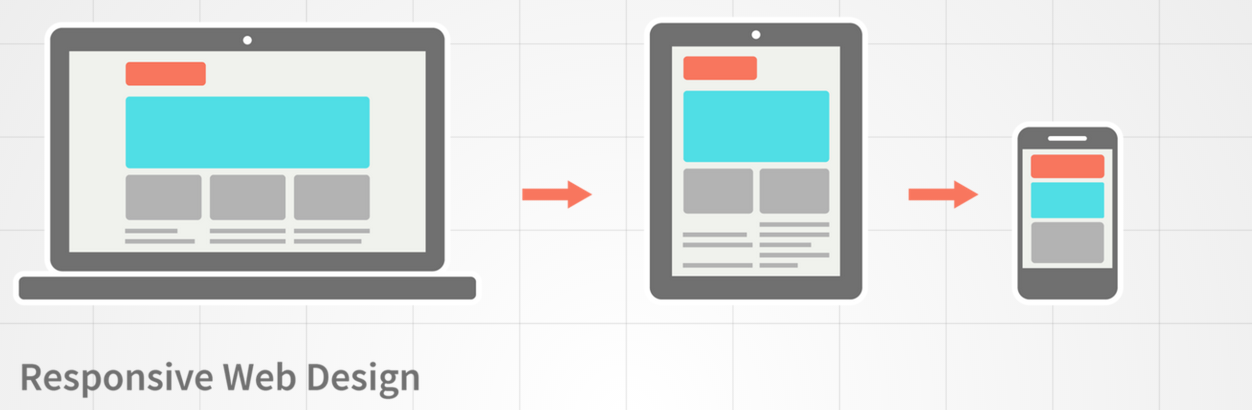
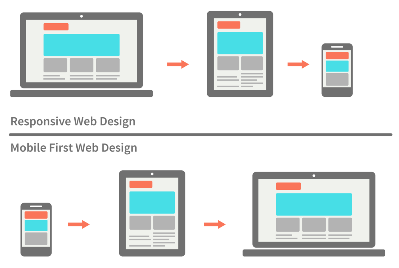
Mobile first
{writing stylesheets}
Cascading Style Sheets
Cascading Style Sheets
Styles applied in a cascade
<div id="container">
    <div id="sub-div"> // Has own styles + #container styles
        <p id="block"> // Own styles + #sub-div + #container
            <text>Text1</text> // styles + #block + #sub-div + #container
            <text>Text2</text>
            <text>Text3</text>
        </p>
    </div>
</div>
Defining styles
Inline with HTML elements
<div style="font-size:30px">Text goes here</div>Style section in HTML code
<html>
    <style>
        **** CSS syntax goes here ****
    </style>
</html>
Include from a separate file
<html>
    <link rel="stylesheet" href="css/my-css.css"/>
</html>
Applying styles
Recall HTML element attributes
<div id="my-div" class="container">...</div>In CSS, select by property or type
/* CSS pseudo-code */
selector {
    property:value;
}
Selectors
By ID
li { /* all <li> elements */
    property:value;
}
By class
.my-class { /* with the . symbol */
    property:value;
}
By element type
#my-id { /* with the # symbol */
    property:value;
}
Units in CSS
Absolute units
in (inches)
px (pixels, 1px = 1/96 in)
cm (centimeters)
mm (millimeters)
pt (point, 1pt = 1/72 in)
pc (picas, 1pc = 12 pt)
Relative units
% (percentage of parent width)
em (relative to font-size)
{arranging elements}
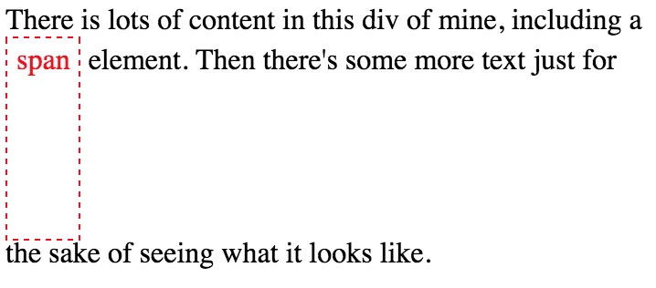
The box model
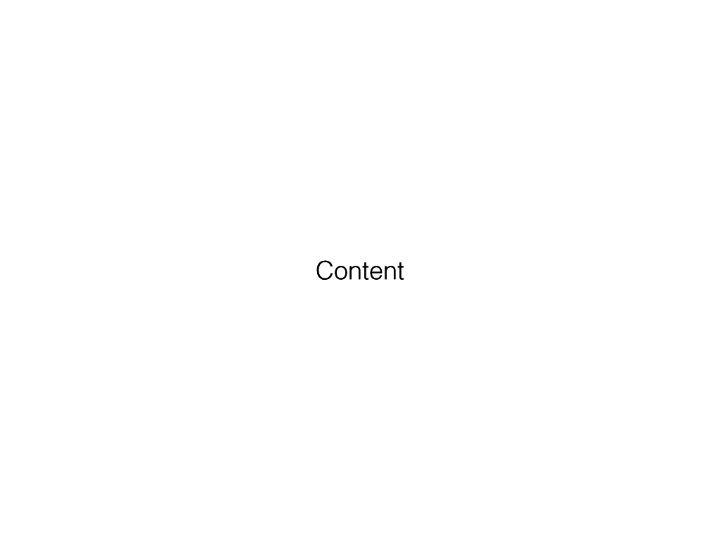
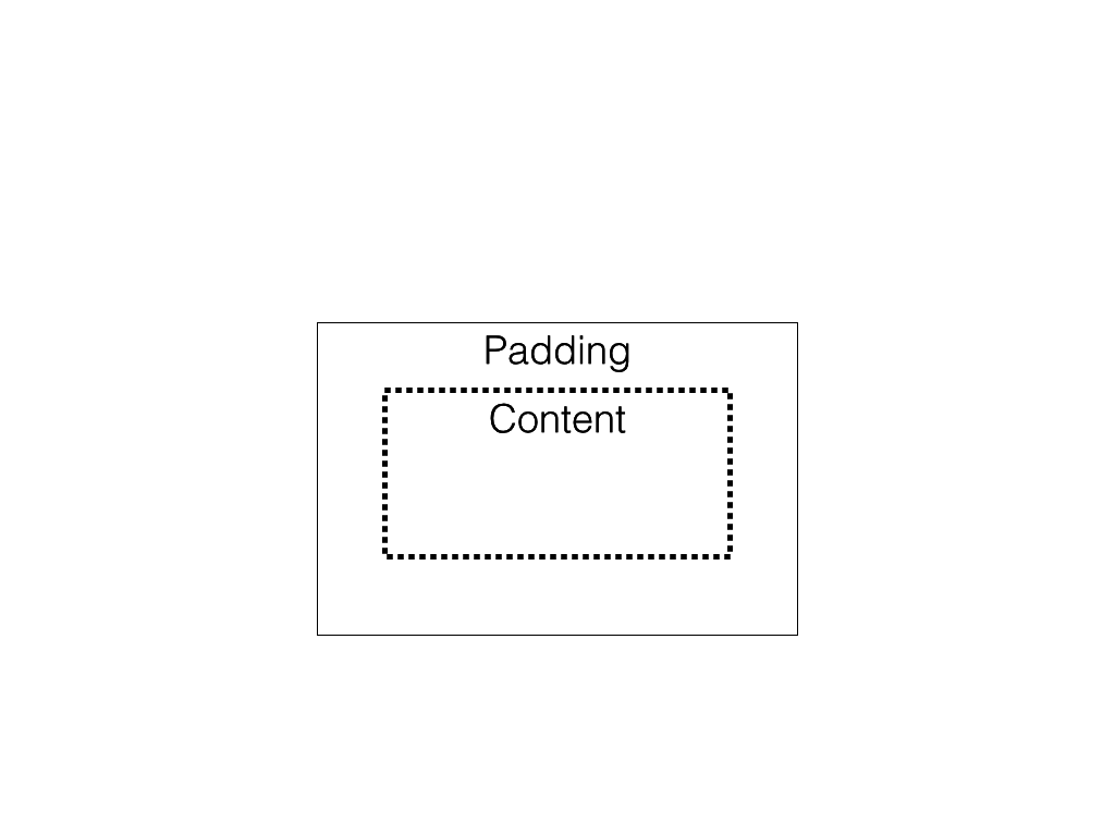
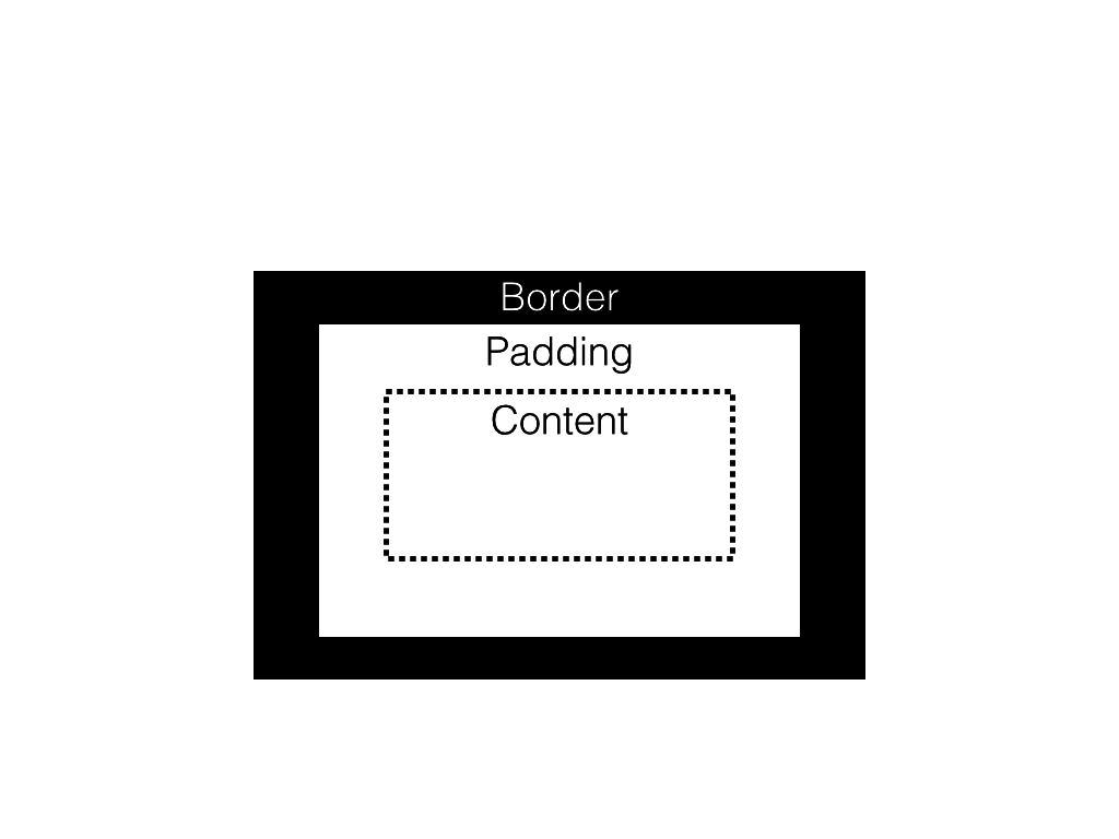
Every HTML element is a box with content
{even text!}
How to understand layout
Positioning is dictated by size of each box
The box model
The box model

The box model
The box model
The box model
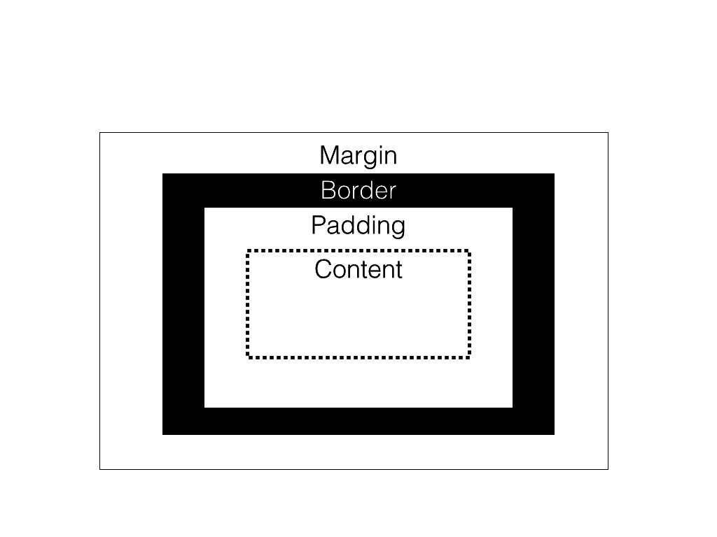
The box model: padding
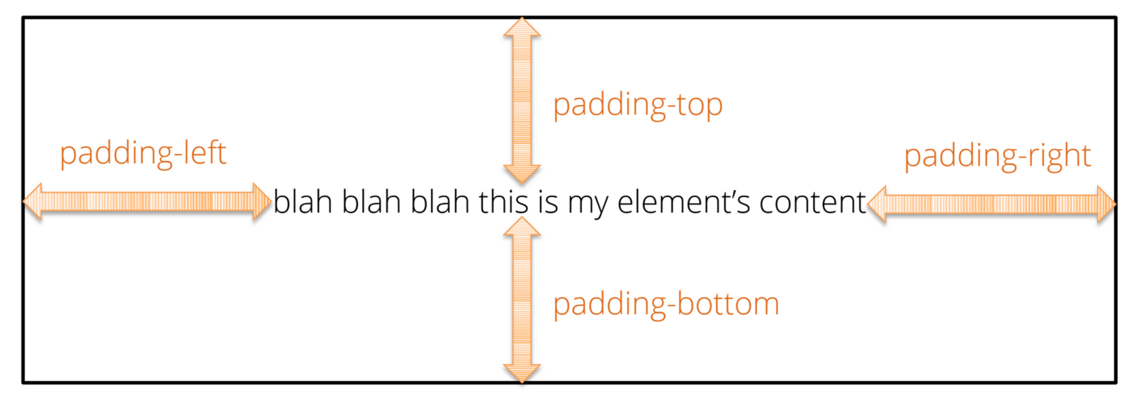
Space between content and border
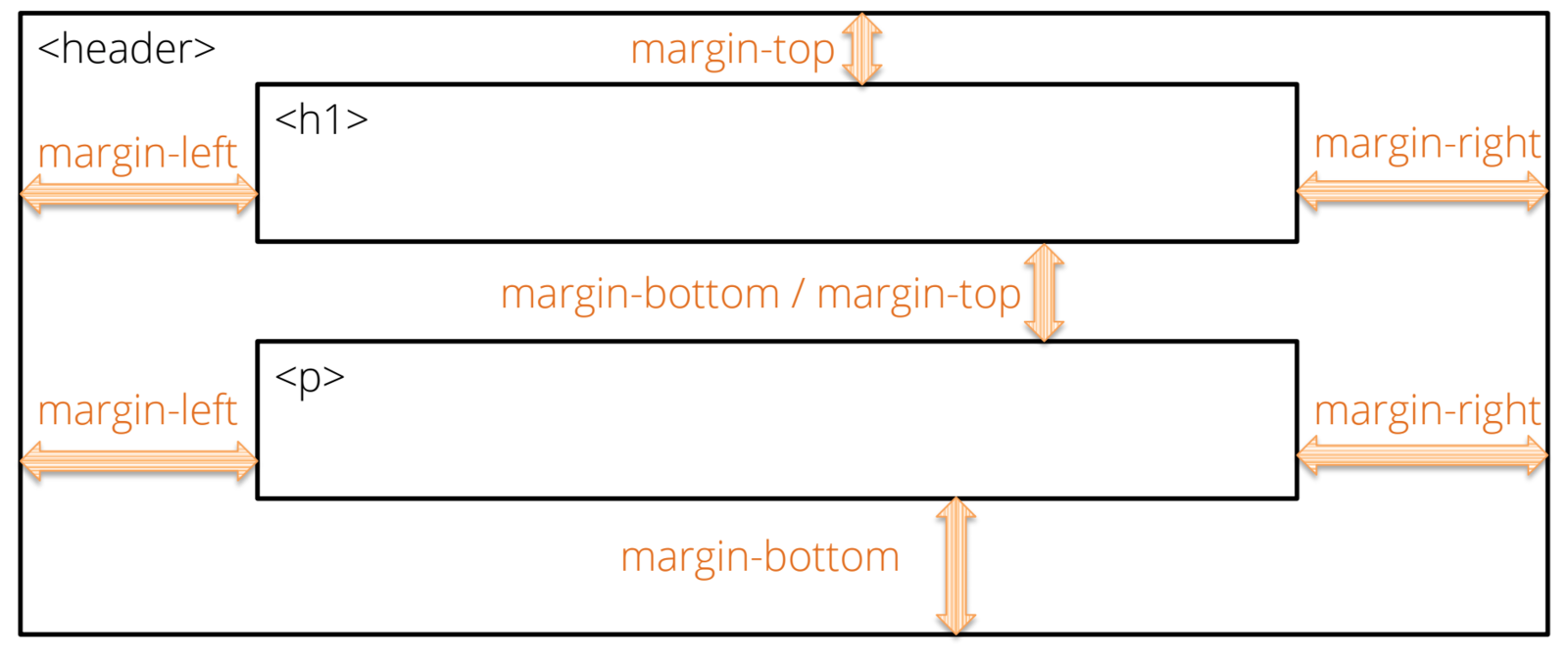
The box model: Margin
Space between boxes
Arranging elements
"Block" level elements (divs, by default)
<div>Block element</div>
<div>Block element</div>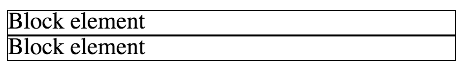
"In-line" level elements (spans)
<span>Inline element</span>
<span>Other inline element</span>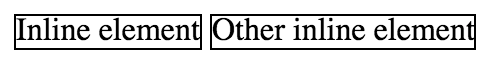
Arranging elements
Inline-block elements
Allow other elements on the same line (unlike block)
Can set width/height (unlike in-line)
Positioning elements
Fixed position
#element {
    position:fixed;
}
Keeps element fixed relative to browser window
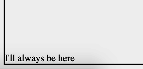
Positioning elements
Absolute position
#element {
    position:absolute;
}
Positioned an absolute number of pixels from parent
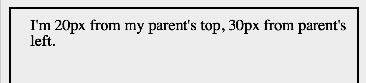
(removed from flow of other elements)
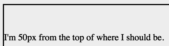
Positioning elements
Relative position
#element {
    position:relative;
}
Move element relative to where it should be
Specifying color
Too many options
english: 'blue'
Hue-saturation-lightness: hsl(255, 100, 50%)
red-green-blue: rgb(0,0,255)
Hex: #0000FF
{mobile-first}
What?
Why?
How?
{what}
{why?}

Why mobile?
Why first?
Graceful degradation v.s. progressive enhancement
Easier to add than remove
Do the hard work up front
{how?}

What can it do?

Set-up
<head>
    <meta charset="utf-8">
    <meta http-equiv="X-UA-Compatible" content="IE=edge">
    <meta name="viewport" content="width=device-width, initial-scale=1">
    <!-- The above 3 meta tags *must* come first in the head;-->
</head>
Set device width
/* In CSS stylesheet */
@import url(https://..../bootstrap.min.css);
Import css
The Grid
Horizontal sections as rows
Vertical sections as columns

Column 1
Column 2
Column 3
Row 1
Row 2
Columns
There are 12 columns in the grid
Elements can take up many columns
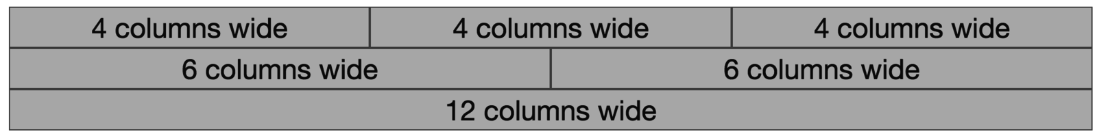
Row 1:

Row 2:
Row 3:
Specify columns based on screen-size

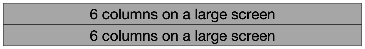
Syntax
<body>
    <div class="container">
        <div class="row">
            <div class="col-md-6">6 columns on a medium screen</div>
            <div class="col-md-6">6 columns on a medium screen</div>
        </div>
    </div>
</body>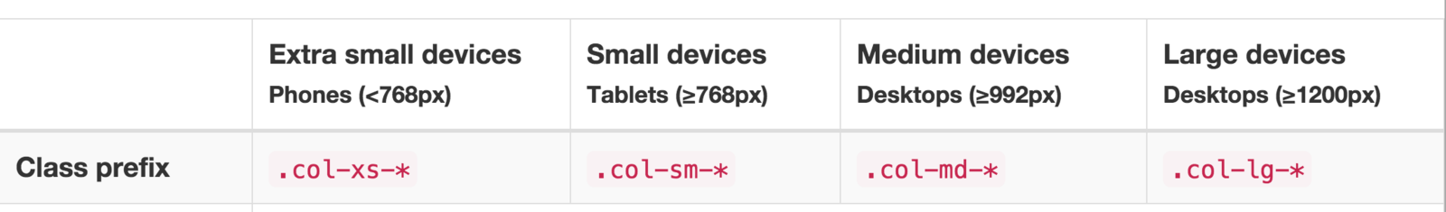
Set columns for desired device
Create elements
Under the hood
@media screen and (max-width: 300px) {
    body {
        background-color: lightblue;
    }
}
Media queries
Conditional styles
Navigation
<nav class="navbar navbar-default">
    <div class="container">
        <!-- Header for mobile -->
        <div class="navbar-header">
            ....
        </div>
        <!-- Screen navigation elements -->
        <div id="navbar" class="navbar-collapse collapse">
            ...
        </div>
</nav>
Use bootstrap's built in navigation classes
Use lists to build controls
<ul class="nav navbar-nav">
    <li class="active"><a href="#">Home</a></li>
    <li><a href="#about">About</a></li>
    <li><a href="#contact">Contact</a></li>
</ul>
Assignment
Map Challenge (due before next class)
style
By Michael Freeman


