UI Text
Simplicity is Difficult
CC-NA-3.0

https://slides.com/mike-1/denver/live
Thanks!


Skyline: CC BY-SA 4.0, Bryan Simmons
STC, Meetup.com
Links
Live: https://slides.com/mike-1/denver/live
Later: https://slides.com/mike-1/denver
Simplicity in UI Text
Microcopy
=
Inspiration


Audience
-
Writers
- UI Text Specialists
- UI Designers
- UI Developers
- Testers
- Others
Pixabay CC0
OSCON Audience
- Writers
- UI Designers
- UI Developers
- Testers
- Others
O'Reilly

Senior Staff Technical Writer
Identity Relationship Management
Mission
- Complete accurate documentation ...


Pixabay CC0
Background


My Bias

Why Graphical UIs

It sells

What do you prefer?

Vote

Both
My Answer
UIs:
The Holy
Grail


Mantra
Make Every Word
Earn Its Place
Credit: Torrey Podmajersky
Examples of Bad UI Text
- Billboards
- Street Signs
- Airplanes
- UIs

Fair use (I hope)
UI Text Can't Solve
Bad Design
- Close
- Open
- Lock
- Instructions?

Credit: Beth Aitman
What Floor?

Bad UI
Text
Extracted?
Text
Credit: Ryan Bigge

Useless UI Text

Credit: Gordon Hatton CC-SA-2.0
Overloaded
UI
Text
Nikki Sylianteng


Worst UI Text Ever
(IMO)
Worst
UI Text
Source: Hawaii Emergency Management Agency
@


Result:
Panic!
Better UI Text
10 Steps to Better UI Text
- Know your product
- "Don't Make Me Think"
- One easy breath
- Two thoughts
- Minimize need for docs
- Know your audience
- Know your stakeholders
- Start with the easy stuff
- Harder stuff: do your homework
- Use style guides (details)
Know Your Product
- Complete, Accurate Depiction of Functionality
Info Popup

Can you read that in one breath?

From the Docs

Complete, Accurate Depiction of Functionality
Who Would Read This?


Know Your Product
Complete, Accurate Depiction of Functionality- Help Users Do Their Jobs
Help Users Do Their Jobs
- Know your product
- "Don't Make Me Think"
- One easy breath
- Two thoughts
- Minimize need for docs
- Know your audience
- Know your stakeholders
- Start with the easy stuff
- Harder stuff: do your homework
- Use style guides (details)
Principles
of UI Design

Credit: Steve Krug
Making the User Think


Credit: Gordon Hatton CC-SA-2.0
Sometimes You Should Make Users Think

Good UIs
Prevent
Trouble

Simplicity is Zen
- Know your product
- "Don't Make Me Think"
- One easy breath
- Two thoughts
- Minimize need for docs
- Know your audience
- Know your stakeholders
- Start with the easy stuff
- Harder stuff: do your homework
- Use style guides (details)
One Easy Breath

Simplicity is Zen
Pixabay CC0
Is
This
Zen?


Cause and Effect
- Know your product
- "Don't Make Me Think"
- One easy breath
- Two thoughts
- Minimize need for docs
- Know your audience
- Know your stakeholders
- Start with the easy stuff
- Harder stuff: do your homework
- Use style guides (details)
Two Effective Thoughts

The New BSoD


Two Thoughts
Simplicity -> Docs
- Know your product
- "Don't Make Me Think"
- One easy breath
- Two thoughts
- Minimize need for docs
- Know your audience
- Know your stakeholders
- Start with the easy stuff
- Harder stuff: do your homework
- Use style guides (details)
Credit: @joaofnfernandes

UI
Text
Win

Credit: @joaofnfernandes

UIs That Require
Documentation

Pixabay CC0
New Role for Writers
User Experience Team
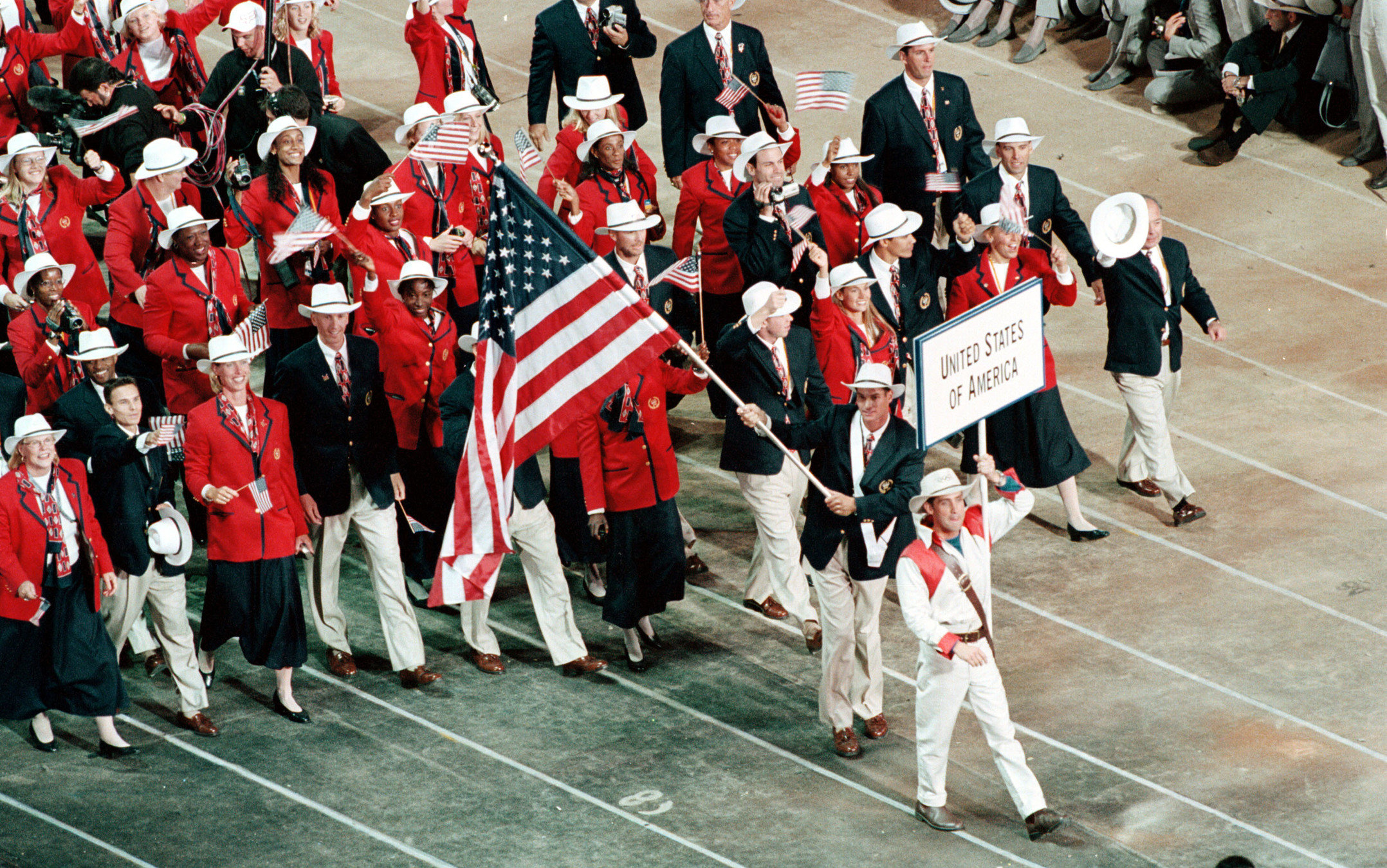
Public Domain
Simplicity Depends on Audience
- Know your product
- "Don't Make Me Think"
- One easy breath
- Two thoughts
- Minimize need for docs
- Know your audience
- Know your stakeholders
- Start with the easy stuff
- Harder stuff: do your homework
- Use style guides (details)
Audiences


End-user
Administrator
Sales Engineer
Manager
Depends on
Audience


The Stakeholder Challenge
- Know your product
- "Don't Make Me Think"
- One easy breath
- Two thoughts
- Minimize need for docs
- Know your audience
- Know your stakeholders
- Start with the easy stuff
- Harder stuff: do your homework
- Use style guides (details)
The Challenge
Know Your Stakeholders
Stakeholders
- Product Managers
- Designers
- Front-end Developers
- Back-end Developers
- Testers (QA)
- Writers
Product Manager
- Sales
- Customers
- Bandwidth

Pixabay CC0

Pixabay CC0
UI Style Guides and Mockups


UI Developers


Backend
Developers
Under the Hood

Pixabay CC0
Tester

- UI Text: measurable
- QA == Your Friend
Pixabay CC0
Writer
- Right words for your audience
- Hemingway, not Tolstoy

But Everyone Writes
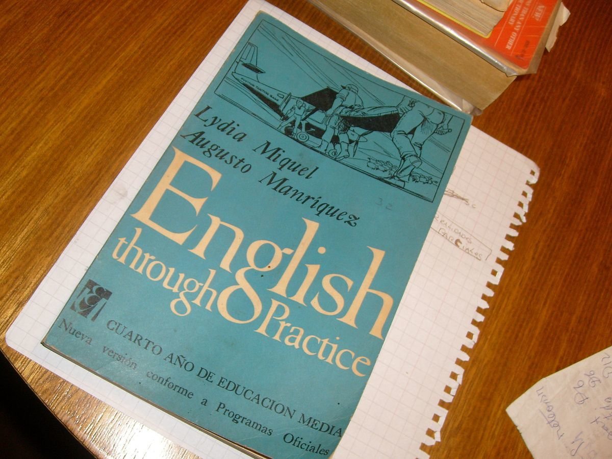
By Penarc - Own work, CC BY-SA 3.0
Implementation

Pixabay CC0
Getting to Simplicity
- Know your product
- "Don't Make Me Think"
- One easy breath
- Two thoughts
- Minimize need for docs
- Know your audience
- Know your stakeholders
- Start with the easy stuff
- Harder stuff: do your homework
- Use style guides (details)
"Easy Stuff"
-
Functional Text
-
Capitalization
-
Grammar
Start With The Easy Stuff


Exercise

What would you do?

Make Every Word Earn Its Place
My Change

Exercise

What would you do?

Make Every Word Earn Its Place
Option

My Change

Address Redundancies, Grammar


Comparisons
Examples
- Add a New Connector > Add Connector
- Setup Password Reset > Configure Password Reset
Lessons
- Remove Redundancies
- Review Functional Grammar (e.g. Setup v. Set Up v. Configure)
Not That Easy


Be Flexible
- Minimal viable text
- Incomplete sentences OK
- No periods OK
- Incorrect grammar OK (if it works)
- Don't apologize, don't say please (unless necessary)
Don't Be This Guy

OK to end a sentence with a Preposition
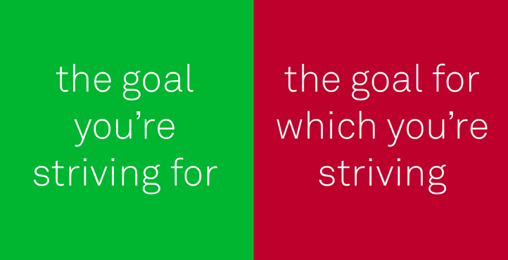
OK to Split Infinitives

To Boldly Go Where No One Has Gone Before

Pixabay CC0
Simplicity Requires Homework
- Know your product
- "Don't Make Me Think"
- One easy breath
- Two thoughts
- Minimize need for docs
- Know your audience
- Know your stakeholders
- Start with the easy stuff
- Harder stuff: do your homework
- Use style guides (details)
The Harder Stuff
More Than Grammar
Complete, Accurate, Wall of Text

Can you read that in one breath?

PR Excerpt
The target object qualifies and a link is found,
but the source object is missing
Before:
After:
Valid target found, link found
Objections


Answer = Context


Use Case
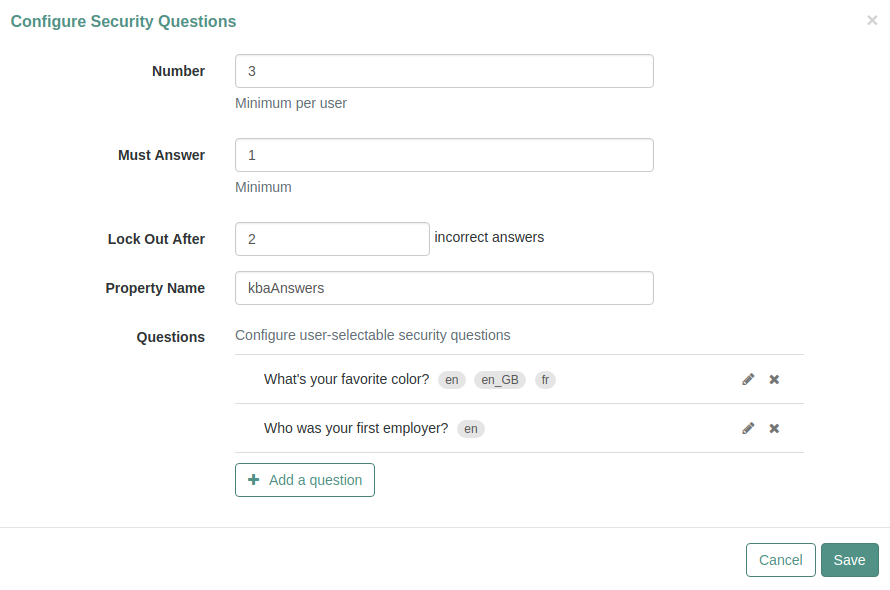
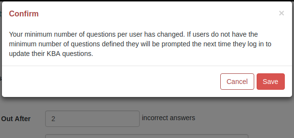

Use Case: Security Questions
What would you do?

Discussion
And then
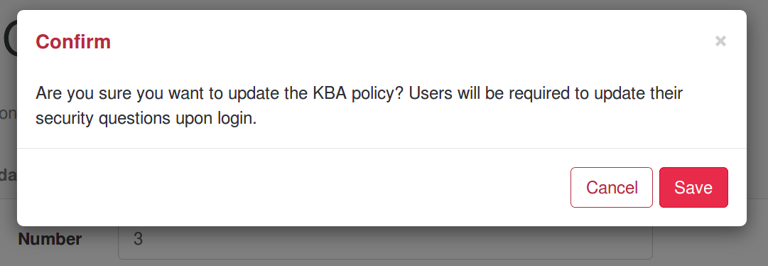
My Replacement

Don't Be This Guy
Replicating Simplicity
- Know your product
- "Don't Make Me Think"
- One easy breath
- Two thoughts
- Minimize need for docs
- Know your audience
- Know your stakeholders
- Start with the easy stuff
- Harder stuff: do your homework
- Scaling: use style guides
Implementation: Style Guide
- Audience
- Precedents
Audiences


End-user
Administrator
Sales Engineer
Manager
Precedents
Existing UI Text Style Guides
Recommendation
Create Your Own UI Text Style Guide
- Examples from your UI
- Customized for your audience
* Exceptions...

It's a Conversation
Accessibility
Suitable for screen readers
- Alternate Text (images)
- Shadow Text
- Error Message Icons (!)
- Pop-up Windows
-
Click,Press, Select
Basis:
UI Text Style Guide Components
- Style and Tone
- Buttons
- Labels
- Help
- Messages
- Design / Layout
- Terminology, Capitalization, Punctuation
Style and Tone
Make Every Word Earn Its Place
The New
BSoD

The New
BSoD

Buttons
Avoid RedundancySave
Changes


Labels, Dialog, Shadow
Human Readable Names
Not Self-Documenting


Messages
Don't Blame Users. Be Helpful.
Blame, Apologies = Waste

Credit: Designed for Use, Lukas Mathis
Exception?
Public Domain

Not
Helpful

One Last Exercise
(in compromises)
UI
Text
In Apps

Exercise
- Shorten this statement
- To speed up your app
Discussion
Options:
Speed
Your App
Improve
App Speed
Don't Be This Guy

Conclusions
Be Consistent
Terminology / Capitalization / Punctuation
Help Text
Avoid the BSoD
Complete, Accurate, Wall of Text

Can you read that in one breath?

Design / Layout
Adds Context
Context Adds Content


Credits
- Torrey Podmajersky (OfferUp)
- Beth Aitman (Writing can’t fix bad design)
- Steve Krug (“Don’t Make Me Think”)
- Ryan Bigge (Revenge of Nerdview)
- Joao Fernandes (Docker)
- Sarah Day (Pivotal)
- John Moore Williams (@webflowapp)
- Nicole Sylianteng (nikkisylianteng.com )
- Mark Craig (ForgeRock)
- Colin Dean (ForgeRock)
- The Write the Docs Community
Questions
CC-NA-3.0

The End
Thanks for Listening!
CC-NA-3.0

UI Text
Simplicity is Difficult
CC-NA-3.0

UI Text: Simplicity is Difficult (Denver)
By Mike
UI Text: Simplicity is Difficult (Denver)
Mike Jang's slides, Denver talk, 2018
- 2,066


