The Best Worst CSS Practices
.

Customer View
Developer View

"Oh non pas du CSS, c'est horrible"
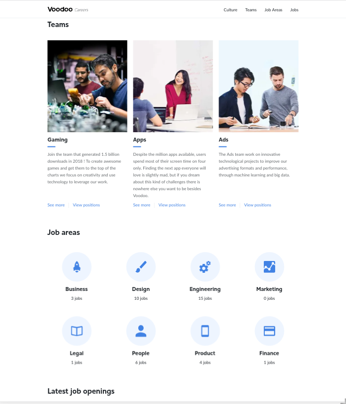
"Je teste toutes les propriétés avec les devtools jusqu'a ce que cela marche"
"C'est pas de la programmation"
"Ca marche jamais comme je le veux"


1
2
Kévin Jean


@KevinJean17

@kevinj_50886
The Best Worst CSS Practices
?

Jean-Michel, PO
"Et Kévin, il faudrait ajouter un bouton en haut à droite de cette page"
Kévin, Intrépide Développeur
"Ajouter un bouton, pas de problème je te fais pour la fin de la matinée"
6h plus tard ...
"Je comprend pas pourquoi on met autant de temps à faire un bouton, on a plein de boutons sur le site"
" J'arrive pas mettre le bouton à droite sans déplacer tout le reste de la page et je comprends pas d'ou vient les marges qui s'ajoutent à mon bouton "


La dette technique CSS/HTML
1
/* Button.css */
.button {
padding: 8px;
border-radius: 2px;
}
.button .text {
font-family: "Roboto";
font-size: 16px;
line-height: 18px;
}
/* MyComponent.css */
.button {
padding: 16px !important;
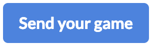
}<button class="button">
<p class="text">
Send you game
</p>
</button>CSS
HTML
Ne pas utiliser la propriété !important
.
CSS
HTML
🤔
/* Button.css */
.button {
   padding: 8px;
   border-radius: 2px;
}

.button .text {
    font-family: "Roboto";
    font-size: 16px;
    line-height: 18px;
}

/* MyComponent.css */
.button {
    padding: 16px !important;
}
<button class="button">
<p class="text">
Send you game
</p>
</button>CSS
HTML
/* Button.css */
.button {
padding: 8px;
border-radius: 2px;
}
.button .text {
font-family: "Roboto";
font-size: 16px;
line-height: 18px;
}
/* MyComponent.css */
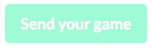
.button.my-theme {
padding: 16px;
}<button class="button mytheme">
<p class="text">
Send you game
</p>
</button>2
<p id="paragraph">
    I'm a bad practice
</p>
CSS
HTML
/* Button.css */
#paragraph {
   border-bottom: solid 2px;
   font-family: my-font-family;
   max-width: 120px;
}
Ne pas utiliser d'id
comme sélecteurs
.
<p id="paragraph">
    I'm a bad practice
</p>
CSS
HTML
🤔
/* Button.css */
#paragraph {
   border-bottom: solid 2px;
   font-family: my-font-family;
   max-width: 120px;
}
<p class="paragraph">
I'm a bad practice
</p>CSS
HTML
/* Button.css */
.paragraph {
   border-bottom: solid 2px;
   font-family: my-font-family;
   max-width: 120px;
}
3
.team-card {
  font-family: Lato;
  color: rgba(101, 105, 108, 1);
  text-align: left;
  margin-bottom: 16px;
  font-size: 14px;
  line-height: 28px;
}
SCSS
Pas de constante en dur
.
🤔
.team-card {
  font-family: Lato;
  color: rgba(101, 105, 108, 1);
  text-align: left;
  margin-bottom: 16px;
  font-size: 14px;
  line-height: 28px;
}
SCSS
.team-card {
  font-family: $voodoo-text-regular;
  color: $text-primary-light;
  text-align: left;
  margin-bottom: 4 * $desktop-margin-unit;
  font-size: $desktop-text-line-height;
  line-height: $desktop-text-line-height;
}
SCSS
// color scheme
$transparent: rgba(255, 255, 255, 0);
$white: rgba(255, 255, 255, 1);
$white-light-1: rgba(255, 255, 255, 0.8);
$white-light-2: rgba(255, 255, 255, 0.7);
...

// colors
$text-primary: $primary-color;
$text-primary-light: $primary-color-light-1;
$delimiter-blue: $secondary-color;
...

// Margin
$desktop-legal-title: 40px;
$mobile-legal-title: 24px;

// layout
$desktop-header-height: 72px;
...
$mobile-horizontal-content-padding: 32px;

// font-size
$desktop-font-small: 17px;
...
$mobile-font-large: 24px;

// line-height
$desktop-title-line-height: 55px;
...
$mobile-text-line-height: 28px;
_variables.scss
4
/* Card.css */
.card__items-list {
    list-style: none;
}

.card-item {
    margin: 0;
    padding: 0;
}
// Composant Card
<ul class="card__items-list">
<li class="card__item">Premier élément</li>
<li class="card__item">Second élément</li>
<li class="card__item">Troisième élément</li>
</ul>CSS
HTML
Ne pas reset les propriétés CSS plusieurs fois
.
🤔
/* Card.css */
.card__items-list {
    list-style: none;
}

.card-item {
    margin: 0;
    padding: 0;
}
// Composant Card
<ul class="card__items-list">
<li class="card__item">Premier élément</li>
<li class="card__item">Second élément</li>
<li class="card__item">Troisième élément</li>
</ul>CSS
HTML
html, body, div, span, applet, object, iframe,
h1, h2, h3, h4, h5, h6, p, blockquote, pre,
a, abbr, acronym, address, big, cite, code,
del, dfn, em, img, ins, kbd, q, s, samp,
small, strike, strong, sub, sup, tt, var,
b, u, i, center,
dl, dt, dd, ol, ul, li,...
time, mark, audio, video {
    margin: 0;
    padding: 0;
    border: 0;
    font-size: 100%;
    font: inherit;
    vertical-align: baseline;
}

html {
    text-size-adjust: 100%;
    -webkit-tap-highlight-color: rgba(0, 0, 0, 0);
}

a {
    text-decoration: none;
    display: flex;
}

*,
*:before,
*:after {
    box-sizing: border-box;
    margin: 0;
}

[...]
reset.css
5
  <div class="careers">
    ...

        <VoodooSectionTitle
          :title="teamTitle"
          class="teams-list__title"
        />

    ...

        <VoodooSectionTitle
          :title="areasTitle"
          class="job-areas-list__title"
        />

    ...

        <VoodooSectionTitle
          :title="openingsTitle"
          class="job-openings__title"
        />

    ...
  </div>
HTML
.careers {
  &__teams-list {
    .teams-list {
      &__title {
        padding: 0 16px;
        margin-bottom: 40px;
      }
    }
  }

  &__job-areas-list {
    .job-areas-list {
      &__title {
        padding: 0 16px;
        margin-bottom: 45px;
      }
    }
  }

  &__job-openings {
    .job-openings {
      &__title {
        padding: 0 16px;
        margin-bottom: 42px;
      }
    }
  }
}
SCSS
Ne pas dupliquer
du code commun
.
  <div class="careers">
    ...

        <VoodooSectionTitle
          :title="teamTitle"
          class="careers__title"
        />

    ...

        <VoodooSectionTitle
          :title="areasTitle"
          class="careers__title"
        />

    ...

        <VoodooSectionTitle
          :title="openingsTitle"
          class="careers__title"
        />

    ...
  </div>
HTML
SCSS
.careers {
  &__title {
    padding: 0 16px;
    margin-bottom: 10 * $dekstop-margin-unit;
  }
}
🤔
6
<button>
    Click on a bad practice
</button>
SCSS
HTML
/* Button.scss */

button {
   font-family: $text-regular;
   color: $text-primary;
   font-size: $desktop-font-medium;
   line-height: $desktop-text-line-height;
   border: solid 2px $button-primary;
}
Ne pas utiliser d'éléments HTML comme sélecteurs
.
🤔
/* Button.scss */

button {
   font-family: $text-regular;
   color: $text-primary;
   font-size: $desktop-font-medium;
   line-height: $desktop-text-line-height;
   border: solid 2px $button-primary;
}
<button>
Click on a bad practice
</button>SCSS
HTML
/* Button.scss */

.careers {
  &__cta {
    font-family: $text-regular;
    color: $text-primary;
    font-size: $desktop-font-medium;
    line-height: $desktop-text-line-height;
    border: solid 2px $button-primary;
  }
}
<button class="careers__cta">
Click on a bad practice
</button>SCSS
HTML
7

.icon {
    font-family: "Icon font";
    font-size: var(--icon-font-size);
    color: var(--icon-color);
    margin-bottom : 20px;
}

.title {
    font-family: "Title font";
    font-size: var(--title-font-size);
    color: var(--text-primary-color);
    margin-top : 10px;
    margin-bottom : 10px;
}

.subtitle {
    font-family: "Title font";
    font-size: var(--subtitle-title-font-size);
    color: var(--text-primary-color);
    margin-top : 10px;
}
Ne pas écrire les marges dans plusieurs directions
.
.icon {
    font-family: "Icon font";
    font-size: var(--icon-font-size);
    color: var(--icon-color);
    margin-bottom : 20px;
}

.title {
    font-family: "Title font";
    font-size: var(--title-font-size);
    color: var(--text-primary-color);
    margin-top : 10px;
    margin-bottom : 10px;
}

.subtitle {
    font-family: "Title font";
    font-size: var(--subtitle-title-font-size);
    color: var(--text-primary-color);
    margin-top : 10px;
}
🤔
.icon {
    font-family: "Icon font";
    font-size: var(--icon-font-size);
    color: var(--icon-color);
    margin-bottom : 30px;
}

.title {
    font-family: "Title font";
    font-size: var(--title-font-size);
    color: var(--text-primary-color);
    margin-bottom : 20px;
}

.subtitle {
    font-family: "Title font";
    font-size: var(--subtitle-title-font-size);
    color: var(--text-primary-color);
}
Les directions des marges ?
margin-top
margin-left
Margin ou padding ?
margin : Décrit l'espace entre deux éléments frères dans le DOM
padding : Décrit l'espace entre un élément et ses fils dans le DOM
Margin ou padding ?

1
2
8
/* Card-list.html */
<div class="card-list">
    <card />
    <card />
    <card />
</div>

/* Card.html */
<div class="card">
    <icon />
    <title />
    <subtitle />
    <description />
</div>
/* Card.css */
.card {
margin-right: 10px;
border: 1px solid --var(black);
padding: 20px;
}
/* Card-list.css */
.card-list {
display: flex;
background-color: --var(white);
}Ne pas utiliser des marges dans les composants
.
🤔
/* Card.html */
<div class="card">
    <icon />
    <title />
    <subtitle />
    <description />
</div>

/* Card-list.html */
<div class="card-list">
    <card />
    <card />
    <card />
</div>
/* Card.css */
.card {
margin-right: 10px;
border: 1px solid --var(black);
padding: 20px;
}
/* Card-list.css */
.card-list {
display: flex;
background-color: --var(white);
}/* Card.html */
<div class="card-container">
<icon />
<title />
<subtitle />
<description />
</div>
/* Card-list.html */
<div class="card-list">
<card class="card" />
<card class="card" />
<card class="card" />
</div>/* Card.css */
.card-container {
border: 1px solid --var(black);
padding: 20px;
}
/* Card-list.css */
.card-list {
display: flex;
background-color: --var(white);
}
.card-list .card {
margin-right: 10px;
}9
.team-card {
  &__description {
    font-family: voodoo-text-regular;
    color: $text-primary-light;
    text-align: left;
    margin-bottom: 16px;
    font-size: $desktop-font-small;
    line-height: $desktop-text-line-height;

    & @media only screen and (min-width: 1024px) {
      height: 194px;
      width: 308px;
      margin-bottom: 24px;
    }

    & @media only screen and (max-width: 1023px) {
      text-align: center;
      font-size: $mobile-font-medium;
      line-height: $mobile-text-line-height;
      margin-bottom: 8px;
    }
  }
}
SCSS
Pas d'override dans les media queries
.
🤔
.team-card {
  &__description {
    font-family: voodoo-text-regular;
    color: $text-primary-light;
    text-align: left;
    margin-bottom: 16px;
    font-size: $desktop-font-small;
    line-height: $desktop-text-line-height;

    & @media only screen and (min-width: 1024px) {
      height: 194px;
      width: 308px;
      margin-bottom: 24px;
    }

    & @media only screen and (max-width: 1023px) {
      text-align: center;
      font-size: $mobile-font-medium;
      line-height: $mobile-text-line-height;
      margin-bottom: 8px;
    }
  }
}
SCSS
.team-card {
  &__description {
    font-family: voodoo-text-regular;
    color: $text-primary-light;

    & @media only screen and (min-width: 1024px) {
      text-align: left;
      font-size: $desktop-font-small;
      line-height: $desktop-text-line-height;
      height: 194px;
      width: 308px;
      margin-bottom: 24px;
    }

    & @media only screen and (max-width: 1023px) {
      text-align: center;
      font-size: $mobile-font-medium;
      line-height: $mobile-text-line-height;
      margin-bottom: 8px;
    }
  }
}
Les bonnes pratiques bonus
Les mixins de typographie
@mixin title {
  font-family: $font-family-title;
  font-size: $font-size-title;
  line-height: $line-height-title;
}
.graphTitle {
margin-top: 10px;
@include title;
}Les mixins de media queries
@mixin isMobile() {
  @media only screen and (max-width: 1023px) {
    @content;
  }
}

@mixin isDesktop() {
  @media only screen and (min-width: 1024px) {
    @content;
  }
}
.ratio {
  height: 100%;
  padding: 16px;
  @include box;

  @include isDesktop() {
    flex: 4;
  }

  @include isMobile() {
    flex: 1;
    min-height: 300px;
  }
}
Merci
.container :not(:last-child) {
  margin-right: 10px;
}
.page-container {
padding-top: 50px;
position: relative;
}
.header {
position: fixed;
top: 0;
width: 100%;
height: 50px;
}// html
<input type="text" class="primary" />
// css
.primary {
background-color: blue;
}
...
input {
background-color: red !important;
}The best worst CSS practices : Meetup CSS
By miniplop


