Flexbox로 만들 수 있는 10가지 레이아웃
UI개발2팀 이민영
목차
1. 개요
- Flexbox 란?
2. 본문
- Flexbox로 만들 수 있는 10가지 레이아웃
3. 결론
- Flexbox를 사용하면 뭐가 좋을까?
뷰 포트 및 엘리먼트의
크기가 불명확하거나 동적인 경우에도
공간을 배치, 정렬 및 분산하는
효율적인 방법을 제공하는 CSS3의 새로운 레이아웃 방식
1-1. Flexbox 란?
1-2. Can I use Flexbox ?
지원범위 PC
IE10 이상
1-2. Can I use Flexbox?
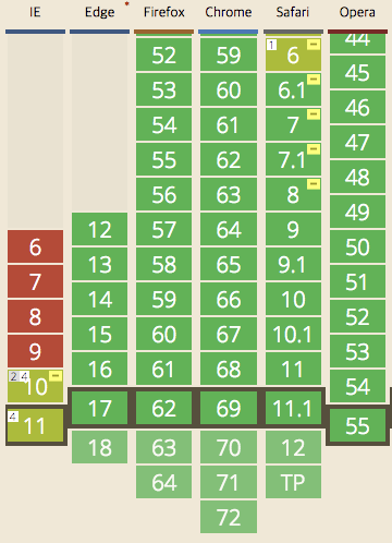
PC 작업에 적용하기에는 아직 이른 감이 있다.
지원범위 Moblie
1-2. Can I use Flexbox?
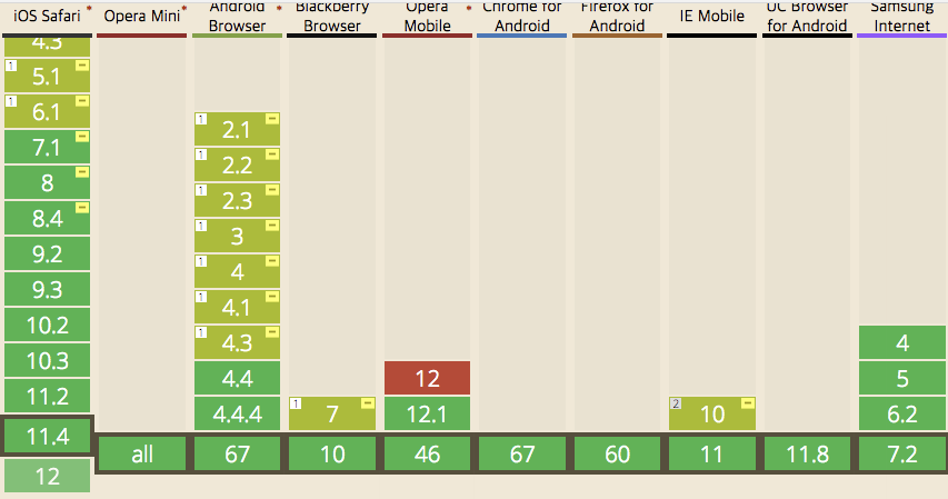
Android, IOS
거의 모든 버전에서 적용이 가능
모바일 지원율은 매우 좋음, 지금 당장 적용하자!
1-3. Flex 사용방법
1-3. Flex 사용방법
.container{
    display: flex;
}

1-3. Flex 사용방법
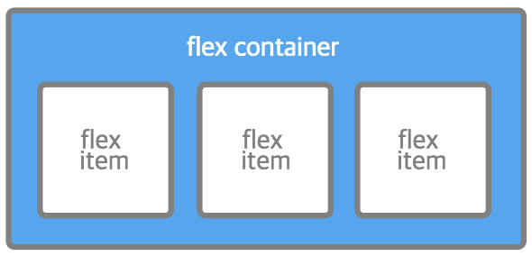
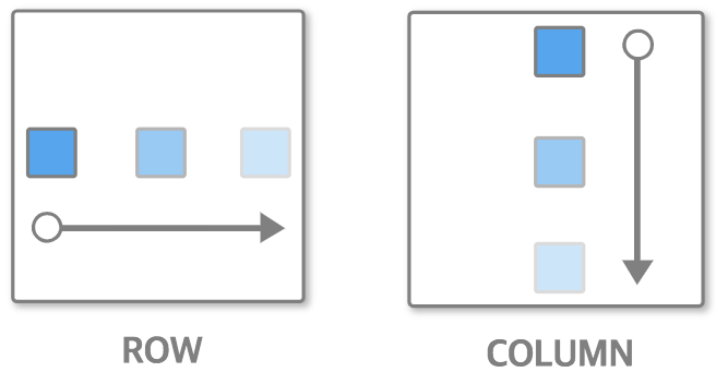
Flex Container
flex-direction
flex-wrap
justify-content
align-items
Flex Item
flex-grow
flex-shrink
flex-basis
order
1-3. Flex 사용방법
2. Flexbox로 만들 수 있는 10가지 레이아웃


2-1. 스크롤 없는 100% 레이아웃
2-1. 스크롤 없는 100% 레이아웃
.header
.filter
.container
.wrap
.wrap
.header
.filter
.container

기존 레이아웃
html,
body{
    height: 100%;
}

.wrap{
    height: 100%;
}
.header{
    height: 65px;
}
.filter{
    height: 70px;
}
.container{
    height:
    calc(100% - 135px);
}
.header와 .filter의 크기가 변경 될 때마다 .container의 height를 재선언 해야 한다.
2-1. 스크롤 없는 100% 레이아웃
기존 레이아웃
✔︎ flex-direction
✔︎ flex : 1
flex


flex-direction
row (기본 값)
column
<flex-grow> <flex-shrink> <flex-basis>
확장 축소 기본 값
flex :
0 (기본값)
원래 크기 유지
flex-grow :
0
1
확장
1
1
1
0
원래 크기 유지
flex-shrink:
0
1 (기본 값)
축소
1
1
flex: 1 = flex: 1 1 0
: 공간을 일정한 비율로 나눠가지면서 늘어나고 줄어드는 상태

flex-grow : 1;
flex-shrink : 1;
flex-basis : 0;
flex: 1 1 0
flex: 2 = flex: 2 1 0

.wrap{
        ?
    height: 100%;
}


/* 영역 확인용 임시 사이즈*/
.header,
.filter,
.container{
    width: 33.3%
    height: 100%;
}
display: flex;

.wrap{
    display: flex;
    height: 100%;
}
flex 레이아웃
한 줄의 코드 추가로 수평정렬이 가능하다.
2-1. 스크롤 없는 100% 레이아웃
.wrap{
    display: flex;
        ?
    height: 100%;
}


/* 영역 확인용 임시 사이즈*/
.header,
.filter,
.container{
    height: 33.3%;
}
flex-direction: column;
.wrap{
    display: flex;
    flex-direction: column;
    height: 100%;
}
flex 레이아웃
2-1. 스크롤 없는 100% 레이아웃
.wrap{
    display: flex;
    flex-direction: column;
    height: 100%;
}


.header{
    height: 65px;
}
.filter{
    height: 70px;
}
.container{
    ?
}
flex: 1;
빈 공간
.container
flex: 1;flex 레이아웃
2-1. 스크롤 없는 100% 레이아웃
.aside
.main
.aside
.main
flex 레이아웃
2-1. 스크롤 없는 100% 레이아웃
.container{
        ?
    flex: 1;
}

.aside{
        ?
}

.main{
        ?
}
.container{
display: flex;
flex: 1;
}
.aside{
width: 400px
}
.main{
flex: 1;
}

flex 레이아웃
2-1. 스크롤 없는 100% 레이아웃
2-2. 네비게이션
2-2. 네비게이션

기존 레이아웃
.logo
.search
.gnb
.header
.header
.logo
.search
.gnb

.gnb{
    float: right;
}
.gnb{
    position: absolute;
    right: 0;
    top: 0;
}
.header:after{
    display: block;
    clear: both;
    content: '';
}
.header{
    position: relative;
}
부모 계층에서 추가 작업이 필요하다.
2-2. 네비게이션
기존 레이아웃
✔︎ flex : none
✔︎ margin-left : auto
flex
flex: none(0 0 auto)
: 확장 되지도 축소 되지도 않는다.
공간에 영향을 받지 않고, 원래의 크기를 유지한다.

flex에서 margin : auto
.flex-container{
     display: flex;
}

.flex-item{
    margin-left: auto;
}
margin-left: auto;
flex에서 margin : auto

margin: auto는 핵이 아니라, 스펙에서 권장하는 방법 중 하나이다.

.header{
    display: flex;
}
.logo,
.search,
.gnb{
flex: none;
/* flex: 0 0 auto */
}
.search{
width: 400px;
}2-2. 네비게이션
flex 레이아웃
.gnb만 오른쪽으로 정렬시키는 방법

.search{
    flex: 1;
}
1. flex: 1을 활용
2. margin: auto 활용
.gnb{
    margin-left: auto;
}
.search를 확장하여 .gnb가 오른쪽으로 밀리도록 한다.
.gnb만 오른쪽으로 민다.
2-2. 네비게이션
flex 레이아웃
.search
.search
input
button
input
button
2-2. 네비게이션
flex 레이아웃
.search{
    display: flex;
    width: 400px;
}
input{
flex: 1;
/* flex: 1 1 0; */
}

2-2. 네비게이션
flex 레이아웃
2-3. 바닥에 붙는 푸터
2-3. 바닥에 붙는 푸터
기존 레이아웃
.main
.footer
.main
.footer
기대하는 결과
컨텐츠의 높이가 짧을 때
컨텐츠 높이가 짧을 때, 기대하는 결과를 얻지 못할 수도 있다.
2-3. 바닥에 붙는 푸터
기존 레이아웃
✔︎ margin-top : auto
flex
flex에서 margin : auto
.main{
     display: flex;
}

.footer{
    margin-top: auto;
}
정~말 까다로운 수직 정렬도 margin으로 간단하게 할 수 있다.
flex에서 margin : auto

.main{
    display: flex;
}

.footer{
    ?
}
margin-top: auto;
.footer{
    margin-top: auto;
} 
2-3. 바닥에 붙는 푸터
flex 레이아웃
2-4. 정렬이 다른 메뉴
.tablist
.tablist
.list
.list
2-4. 정렬이 다른 메뉴
기존 레이아웃
.list{
    text-align: center;
}
.list{
    text-align: center;
}

.tablist .list:first-child{
    text-align: left;
}
.container{
    text-align: center;
}
.container .item:first-child{
    float: left;
}
.container .item:last-child{
    float: right;
}
각각의 메뉴마다 text-align 속성 값을 다르게 선언해야 한다.
2-4. 정렬이 다른 메뉴
기존 레이아웃
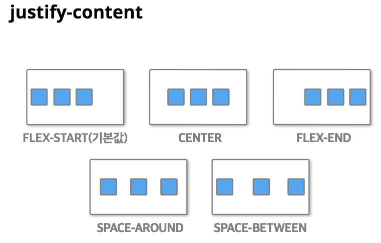
✔︎ justify-content
flex
justify-content

.tablist{
    display: flex;
    ?
}
justify-content: space-between;.tablist{
display: flex;
justify-content: space-between;
}

간격 조정과 정렬을 간단하게 할 수 있다.

.tablist{
    display: flex;
    justify-content: space-around;
}
justify-content: space-around;.tablist{
display: flex;
justify-content: center;
}
justify-content: center;2-4. 정렬이 다른 메뉴
flex 레이아웃
2-5. 폼 타이틀 수직 중앙정렬
2-5. 폼 타이틀 수직 중앙정렬
.title
.title
th
td
기존 레이아웃
✔︎ align-itemS
flex
align-itemS

.title{
    display: flex;
    ?
}
align-items: center;.title{
display: flex;
align-items: center;
}싱글 라인뿐만 아니라 멀티라인도 수직 중앙정렬을 할 수 있다.
2-5. 폼 타이틀 수직 중앙정렬
flex 레이아웃
2-6. 중앙정렬 아이콘
기존 레이아웃
2-6. 중앙정렬 아이콘
.box
.box
.icon
.icon
.box{
    display: table;
}

.icon{
    display: table-cell;
    vertical-align: middle;
    text-align: center;
}
.box{
position: relative;
}
.icon{
position: absolute;
top: 0;
left: 0;
right: 0;
bottom: 0;
margin: auto;
width,height: 고정 값
}.box{
position: relative;
}
.icon{
position: absolute;
top: 50%;
left: 50%;
transform:
translate(-50%,-50%);
}중앙정렬을 하는 다양한 방법들
기존 레이아웃
2-6. 중앙정렬 아이콘
✔︎ margin: auto
✔︎ align-items
✔︎ justify-content
flex
.box{
    ?
}
.box{
   display: flex;
}
.box{
    display: flex;
    justify-content: center;
    align-items: center;
}
justify-content와 aligin-items을 통해 직관적인 코드로 작성할 수 있다.
flex 레이아웃
2-6. 중앙정렬 아이콘
.box{
    display: flex;
}

.icon{
    ?
}
.box{
display: flex;
}
.icon{
margin: auto;
}
margin: auto로 간결한 코드를 작성할 수 있다.
flex 레이아웃
2-6. 중앙정렬 아이콘
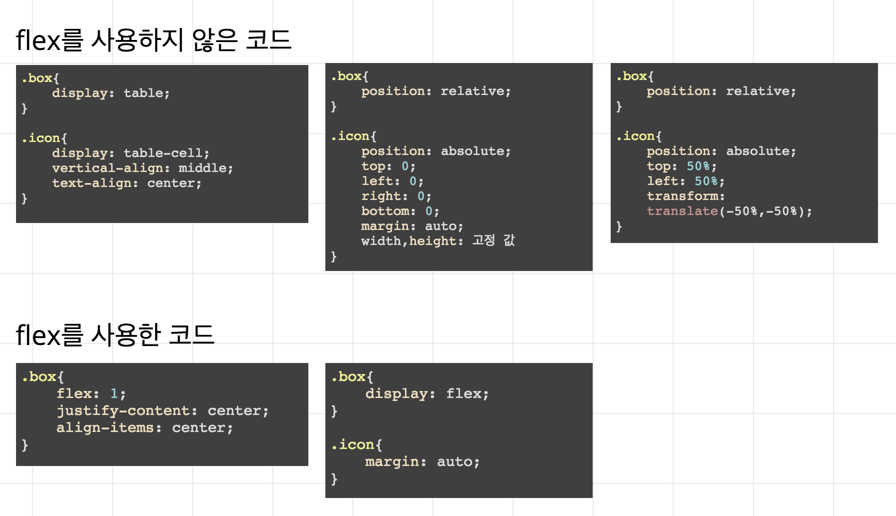
flex를 사용하지 않은 코드
.box{
    display: table;
}

.icon{
    display: table-cell;
    vertical-align: middle;
    text-align: center;
}
.box{
position: relative;
}
.icon{
position: absolute;
top: 0;
left: 0;
right: 0;
bottom: 0;
margin: auto;
width,height: 고정 값
}.box{
position: relative;
}
.icon{
position: absolute;
top: 50%;
left: 50%;
transform:
translate(-50%,-50%);
}.box{
display: flex;
}
.icon{
margin: auto;
}
.box{
    flex: 1;
    justify-content: center;
    align-items: center;
}
flex를 사용한 코드
flex 레이아웃
2-6. 중앙정렬 아이콘
2-7. 유동 너비 박스
2-7. 유동 너비 박스
기존 레이아웃
1. 공간이 충분 할 때는 컨텐츠 길이에 맞게 배치
2. 공간이 충분하지 않을 때는 컨텐츠 길이가 줄어듦


.filter
.filter_box
.filter_box
.filter
2-7. 유동 너비 박스
기존 레이아웃
2-7. 유동 너비 박스
기존 레이아웃
.filter_box {
   max-width: 90px;
}

@media (max-width: 1300px) {
	.filter_box {
		max-width: 100px;
	}
}

@media (min-width: 1401px) and (max-width: 1500px) {
	.filter_box {
		max-width: 150px;
	}
}
브라우저 사이즈에 따라 박스의 max-width를 재지정 해줘야 한다.
✔︎ flex : 0 1 auto
✔︎ order
flex
flex: 0 1 auto (기본 값)
: 확장 되지는 않고 공간이 작아지면 축소 된다.

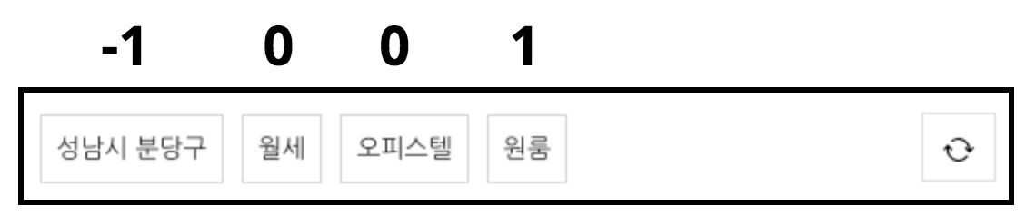
order

-1 0 1
: order 속성 값이 낮을수록 왼쪽에 높을 수록 오른쪽에 위치한다.
.filter{
    ?
}

.filter_box{
    ?
}
.filter{
display: flex;
}
.filter_box{
?
}.filter{
display: flex;
}
.filter_box{
max-width: 300px;
}.filter{
display: flex;
}
.filter_box{
max-width: 300px;
?
}.filter{
display: flex;
}
.filter_box{
max-width: 300px;
}2-7. 유동 너비 박스
flex 레이아웃

filter .filter_box:first-child{
    order: 1;
}
이전
이후
filter .filter_box:last-child{
    order: -1;
}
-1 0 0 1
마크업 구조 변경없이 유연하게 순서변경이 가능하다.
2-7. 유동 너비 박스
flex 레이아웃
2-8. 말줄임 + 아이콘
2-8. 말줄임 + 아이콘
1. 타이틀이 짧을 때
2. 타이틀이 넘칠 때

기존 레이아웃

.title
.title_container
.option
.title_container
.title
.option
2-8. 말줄임 + 아이콘
기존 레이아웃
.title{
    overflow: hidden;
}

.option{
    float: right;
}
마크업 순서를 변경해야 한다.
2-8. 말줄임 + 아이콘
기존 레이아웃
✔︎ display: flex
✔︎ display: inline-flex
flex
flex & inline-flex

.title_container{
    ?
}
.title_container{
    display: inline-flex;
    max-width:100%;
}

.option{
    flex: none;
}
display: inline-flex;
.title_container{
    display: inline-flex;
    max-width:100%;
}
.title_container{
    display: flex;
}

.option{
    flex: none;
}
2-8. 말줄임 + 아이콘
flex 레이아웃
2-9. 상하 정렬 롤링리스트
1
2
3
4
5
6
7
8
Normal flow의 우선 순위는 좌우이고,
좌우의 흐름을 따를 수 없을 때 상하의 흐름을 따른다.
2-9. 상하 정렬 롤링리스트
기존 레이아웃
1
2
3
4
1
2
3
4
5
6
7
8
depth가 깊어지게 되고, UI 변경시 마크업 구조 수정이 필요하다.
2-9. 상하 정렬 롤링리스트
기존 레이아웃
.container
.item
.container
.item
2-9. 상하 정렬 롤링리스트
기존 레이아웃
✔︎ flex-direction
✔︎ flex-wrap
✔︎ align-content
✔︎ justify-content
flex
flex-wrap


nowrap (기본 값)
wrap
.cotainer{
    display: flex;
    overflow: hidden;
    width: 400px;
    height: 450px;
}

.item{
    display: flex;
    flex-direction: column;
    width: 200px;
}
1
2
3
4
2-9. 상하 정렬 롤링리스트
flex 레이아웃
.cotainer{
    display: flex;
    ?
}

.item{
    ?
}
1
2
3
4
1
2
3
4
.cotainer{
    display: flex;
    flex-direction: column;
}

.item{
    ?
}
1
2
1
2
3
4
.cotainer{
    display: flex;
    flex-direction: column;
}

.item{
    flex: none;
    height: 180px;
}
.cotainer{
display: flex;
flex-direction: column;
flex-wrap: wrap;
}
.item{
flex: none;
height: 180px;
}.cotainer{
display: flex;
flex-flow: column wrap;
}
.item{
flex: none;
height: 180px;
}flex-direction: column;flex-wrap: wrap;flex-flow: column wrap;상하 흐름을 우선 순위로 만들 수 있다.
2-9. 상하 정렬 롤링리스트
flex 레이아웃
1
2
3
4
.cotainer{
    display: flex;
    flex-flow: column wrap;
    justify-content: space-around;
}

.item{
    flex: none;
    height: 180px;
}
justify-content: space-around;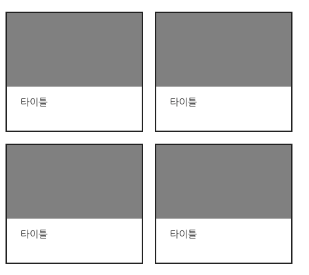
.cotainer{
    display: flex;
    flex-flow: column wrap;
    ?
}

.item{
    flex: none;
    height: 180px;
}
.cotainer{
display: flex;
flex-flow: column wrap;
justify-content: space-around;
align-content: space-around;
}
.item{
flex: none;
height: 180px;
}align-content: space-around;1
2
3
4
1
2
3
4
margin, padding으로 여백을 주지않아도 된다.
2-9. 상하 정렬 롤링리스트
flex 레이아웃
상하 흐름을 우선 순위로 만들 수 있다.
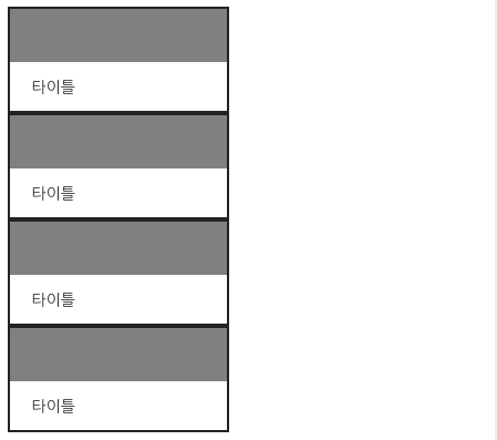
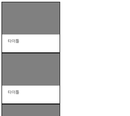
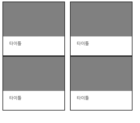
2-10. 가로세로 비율을 유지하는
반응형 박스
2-10. 가로세로 비율을 유지하는 반응형박스
기존 레이아웃

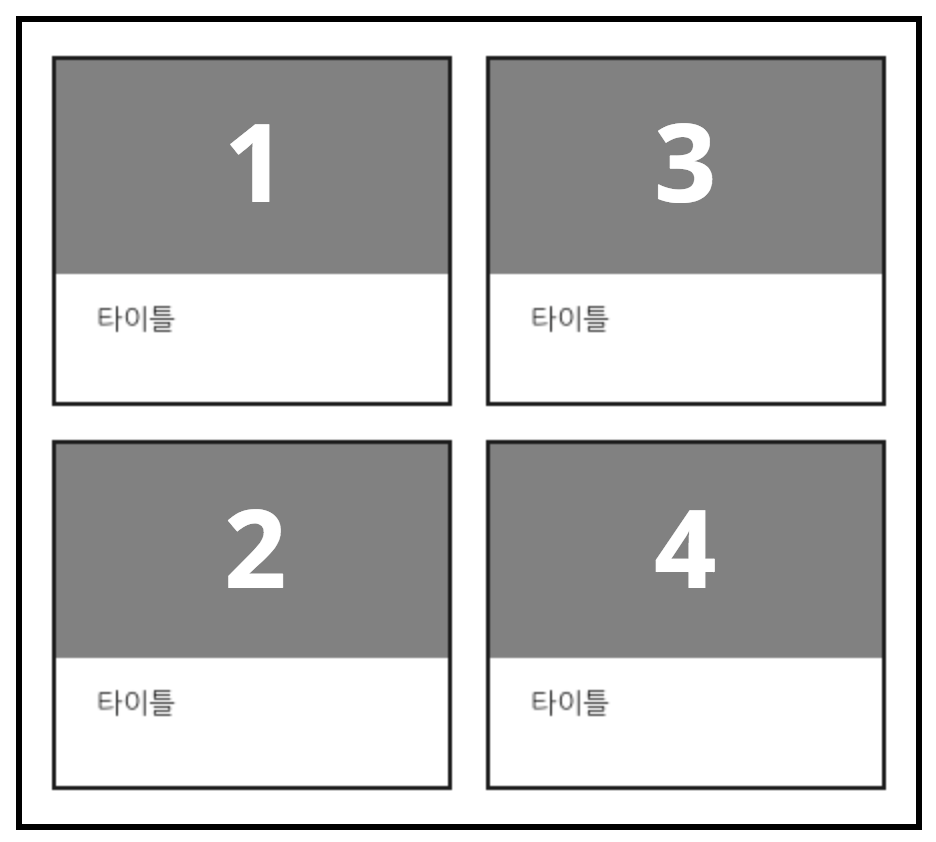
.container
.item
.thumb
.title
.thumb
.title
.item
.container
2-10. 가로세로 비율을 유지하는 반응형박스
기존 레이아웃
.item{
    width: 33.3%;
}
img{
    width: 100%;
    height: 100%;
}
이미지가 없을 때, height는 0이 된다.
2-10. 가로세로 비율을 유지하는 반응형박스
기존 레이아웃
.thumb{
    position: relative;
}
.thumb:before{
    display: block;
    padding-top: 148.96%
    content:'';
}

img{
    position: absolute;
    top: 0;
    right: 0;
    left: 0;
    bottom: 0;
    width: 100%;
    height: 100%;
}
100%
? %
padding-top: 148.96%;
이미지 크기가 변경되면 가로세로 비율을 재계산하여
padding-top 속성값을 바꿔줘야한다.
2-10. 가로세로 비율을 유지하는 반응형박스
기존 레이아웃
✔︎ flex : auto
✔︎ flex : none
flex
flex: auto(1 1 auto)
: 공간에 맞추어 확장되고 공간이 작아지면 줄어든다.

.cotainer{
    display: flex;
    flex-wrap: wrap;
}
.cotainer{
    display: flex;
    flex-wrap: wrap;
}

.item{
    flex: none;
    flex-basis: 33.3%;
}
.cotainer{
display: flex;
flex-wrap: wrap;
}
.item{
flex: auto;
flex-basis: 33.3%;
}
flex: none;
flex-basis: 33.3%;
flex: auto;flex 레이아웃
2-10. 가로세로 비율을 유지하는 반응형박스
display: flex;
flex-direction: column;
flex: none;
.item{
    display: flex;
    flex-dirextion: column;
}
.item{
    display: flex;
    flex-dirextion: column;
}

.thumb{
    flex: auto;
    background: gray;
}
.item{
display: flex;
flex-dirextion: column;
}
.thumb{
flex: auto;
background: gray;
}
.title{
flex: none;
flex-basis: 40px;
}flex: auto;flex 레이아웃
2-10. 가로세로 비율을 유지하는 반응형박스
3. Flexbox를 사용하면
왜 좋을까?
구조가 간단하다.
반응형 레이아웃에 효과적이다.
유연한 레이아웃 표현이 가능하다.
작업 과정에서 실수비율이 줄어든다.
코드가 간단하고 직관적이다.
3-1. flex 레이아웃을 사용하면 왜 좋을까?
협업자들의 편의성을 높여준다.
초보자는 보다 쉽게,
3-1. flex 레이아웃을 사용하면 왜 좋을까?
전문가는 불가능했던 레이아웃을 구현할 수 있다.
flex를 당장 사용하자!
3-1. flex 레이아웃을 사용하면 왜 좋을까?
감사합니다.
Q & A

minyoung
By Min Young Lee
minyoung
2018 UIT MITUP


