React ♥️ BEM
Using BEM in React ecosystem
React makes
UI-development a breeze
React makes
UI-development a breeze
React makes
UI-development a breeze
React makes
UI-development a breeze
React makes
UI-development a breeze
But styling is just a mess
Problems with styling
naming inconsistency
hard to read
hard to maintain
hard to add functionality
styles are not isolated
unpredictable side-effects
easy to break something
hard to scale
Solutions
The Easy
The Hard
The Ugly


BEM
CSS modules
CSS in JS

CSS in JS: inline styles
CSS in JS: inline styles
import Radium from 'radium';
import React from 'react';
import color from 'color';
const styles = {
base: {
color: '#fff',
':hover': {
background: color('#0074d9').lighten(0.2).hexString()
}
},
warning: {
background: '#FF4136'
}
};@Radium
class Button extends React.Component {
render() {
return (
<button
style={[
styles.base,
styles[this.props.kind]
]}>
{this.props.children}
</button>
);
}
}
CSS in JS: inline styles
import Radium from 'radium';
import React from 'react';
import styles from './styles';
@Radium
class Button extends React.Component {
  render() {
    return (
      <button
        style={[
          styles.base,
          styles[this.props.kind]
        ]}>
        {this.props.children}
      </button>
    );
  }
}CSS in JS: inline styles
import Radium from 'radium';
import React from 'react';

@Radium
class Button extends React.Component {
  render() {
    const styles = { this.props };

    return (
      <button
        style={[
          styles.base,
          styles[this.props.kind]
        ]}>
        {this.props.children}
      </button>
    );
  }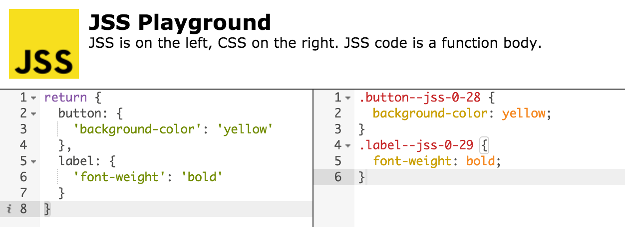
}CSS in JS: stylesheets generation
import useSheet from 'react-jss'
import React from 'react';
import jss from 'jss';
import vendorPrefixer from 'jss-vendor-prefixer';
jss.use(vendorPrefixer);
const styles = {
button: {
'background-color': 'yellow'
},
label: {
'font-weight': 'bold'
}
};@useSheet(styles)
class Button extends React.Component {
render() {
const { classes } = this.props.sheet;
return (
<div className={classes.button}>
<span className={classes.label}>
{this.props.children}
</span>
</div>
);
}
}
CSS in JS: stylesheets generation
REPL: jsstyles.github.io/repl
CSS in JS: pros and cons
js is the most powerful “preprocessor”
absolute isolation
using style attribute is crazy and unperformant*
inline stylesheets are not cacheable*
not flexible like traditional css (no cascade, etc.)
no autocomplete, Emmet, post-css, autoprefixer, etc.
mixing concerns
styling becomes... hard
CSS modules
/* styles.css */
.table {
  width: 100%;
}
.row {
  font-size: 10px;
}
.cell {
  background: url('cell.png');
}
/* index.js */
import React from 'react';
import styles from './styles.css';
class extends React.Component {
render () {
return (
<div className={styles.table}>
<div className={styles.row}>
<div className={styles.cell}>A0</div>
<div className={styles.cell}>B0</div>
</div>
</div>
);
}
}
CSS modules
/* styles.css */
.Table__table___sVK0p {
  width: 100%;
}
.Table__row___Tz7_C {
  font-size: 10px;
}
.Table__cell___3b3O_ {
  background: url('cell.png');
}
<!-- index.html -->
...
<div class="Table__table___sVK0p">
<div class="Table__row___Tz7_C">
<div class="Table__cell___3b3O_">A0</div>
<div class="Table__cell___3b3O_">B0</div>
</div>
</div>
...CSS modules: pros and cons
absolute isolation
it's good old css
cacheable
not flexible like traditional css (no cascade, etc.)
debugging is hard
theming is hard (my modest attempt to solve it)
BEM is a methodology, that makes your front-end code reusable, scalable,
more strict and explicit
BEM
BEM: pros and cons
BEM compliments React: Block ≈ Component
it's good old css
intuitive and familiar abstraction — easy to read/debug
theming is much easier (more on this later)
isolation through strict code convention
isolation is not bullet-proof — requires some discipline
cacheable
cascade is possible
BEM in React: straightforward way
import React from 'react';

class Popup extends React.Component {
  render() {
    return (
      <div className={'popup' + (this.props.visible ? ' popup_visible' : '')}>
        <div className="popup__overlay"></div>
        <div className="popup__content">{this.props.children}</div>
      </div>
    );
  }
}
BEM in React: composable classNames
import React from 'react';
import b from 'b_';

const block = b.with('popup');

class Popup extends React.Component {
  render() {
    return (
      <div className={b({ visible: this.props.visible })}>
        <div className={b('overlay')}></div>
        <div className={b('content')}>{this.props.children}</div>
      </div>
    );
  }
}
BEM in React: some weird stuff...
import React from 'react';
import BEMHelper from 'react-bem-helper';

const classes = new BEMHelper({ name: 'popup' });


class Popup extends React.Component {
  render() {
    let block = classes();

    if (this.props.visible) {
        block = classes({ modifiers: 'visible' });
    }

    return (
      <div {...block}>
        <div {...classes('overlay')}></div>
        <div {...classes('content')}>{this.props.children}</div>
      </div>
    );
  }
}
BEM in React: BEMJSON
import BemReact from 'bem-react';

const Popup = BemReact.createClass({
  render() {
    return {
      block: 'popup',
      mods: {
        visible: this.props.visible
      },
      content: [
        {
          block: 'popup',
          elem: 'overlay'
        },
        {
          block: 'popup',
          elem: 'content',
          content: this.props.children
        }
      ]
    };
  }
});
Yummies

Yummies
import Yummies from '@yummies/yummies';

class Popup extends Yummies.Component {
  render() {
    return {
      block: 'popup',
      mods: {
        visible: this.props.visible
      },
      content: [
        {
          elem: 'overlay'
        },
        {
          elem: 'content',
          content: this.props.children
        }
      ]
    };
  }
}Look ma, I can do inheritance!
import Yummies from '@yummies/yummies';
import Input from '../input';

class Checkbox extends Input {

  // ...

  render() {
    const template = super.render();

    template.block = 'checkbox';

    template.mods = {
      ...template.mods,
      checked: this.state.checked
    };

    return template;
  }
}Why it didn't quite work out
- patching React leads to a whole bunch of problems
- maintainability hell
- performance issues
- legacy-browsers support
- using external solutions was challenging
(react-router, react-dnd, components from npm, etc.)
- inheritance is not such a good idea after all
- harder to maintain with the growing codebase
- some unpredictable side-effects
reBEM

reBEM
import React from 'react';
import { BEM as B } from 'rebem';

class Popup extends React.Component {
  render() {
    return B(
      {
        block: 'popup',
        mods: { visible: this.props.visible }
      },
      B({ block: 'popup', elem: 'overlay' }),
      B({ block: 'popup', elem: 'content' }, this.props.children)
    );
  }
}reBEM: blockFactory
import React from 'react';
import { blockFactory } from 'rebem';

const B = blockFactory('popup');

class Popup extends React.Component {
  render() {
    return B(
      {
        mods: { visible: this.props.visible }
      },
      B({ elem: 'overlay' }),
      B({ elem: 'content' }, this.props.children)
    );
  }
}reBEM: jsx
import React from 'react';

class Popup extends React.Component {
  render() {
    return (
      <div block="popup" mods={{visible: this.props.visible}}>
        <div block="popup" elem="overlay" />
        <div block="popup" elem="content">{this.props.children}</div>
      </div>
    );
  }
}Composition over inheritance
import Button from '../button';

class DeleteButton extends Button {
  onClick = e => {
    // some custom stuff
  };

  render() {
    const template = super.render();

    template.mods = { type: 'delete' };
    template.content[0].props = {
      ...template.content[0].props,
      onClick: this.onClick
    };

    return template;
  }
}
Composition over inheritance
import React from 'react';
import Button from '../button';

class DeleteButton extends React.Component {
  onClick = e => {
    // some custom stuff
  };

  render() {
    return (
      <Button {...this.props} mods={{ type: 'delete' }} onClick={this.onClick}>
    	{this.props.children}
      </Button>
    );
  }
}
Why not just compose classNames?

className is just an implementation detail
<div className='popup popup_visible'></div>visible popup
div with classnames “popup” and “popup_visible”
“popup” block with modifier “visible”
reBEM reduces cognitive load
visible popup
div with classnames “popup” and “popup_visible”
“popup” block with modifier “visible”
<div block="popup" mods={{visible: true}}></div>Benefits of a good abstraction illustrated
time + effort
human level
machine level
reBEM
classNames
visible popup
block with modifier
div with className
Extra cognitive load at scale
time + effort
human level
machine level
One iteration with reBEM
One iteration with classNames
x2
BEMify external components
import React from 'react';
import Modal from 'react-modal2';
import { stringify as b } from 'rebem-classname';

const block = 'popup';

class Popup extends React.Component {
  render() {
    return (
      <Modal
        backdropClassName={b({ block, elem: 'overlay' })}
        modalClassName={b({ block, mods: { visible: this.props.visible } })}>
        {this.props.children}
      </Modal>
    );
  }
}
Testing: the same abstractions
+
const component = shallow(
    <Popup visible={true} />
);

it('should be popup block', function() {
    expect(component).to.be.a.block('popup');
});

it('should have visible modifier', function() {
    expect(component).to.have.mods({ visible: true });
});


it('should have overlay element', function() {
    expect(component.findBEM({ block: 'popup', elem: 'overlay' })).to.have.length(1);
});

it('should have content element', function() {
    expect(component.findBEM({ block: 'popup', elem: 'content' })).to.have.length(1);
});
+
Even in... CSS
// example is in less, but you can use any preprocessor or just vanilla CSS
:block(popup) {
  position: fixed;
  top: 0;
  right: 0;
  bottom: 0;
  left: 0;
  opacity: 0;

  &:mod(visible) {
    opacity: 1;
  }

  &:elem(overlay) {
    background: rgba(0, 0, 0, 0.5);
  }

  &:elem(content) {
    position: absolute;
    left: 50%;
    top: 50%;
    transform: translate(-50%, -50%);
  }
}
one more thing...

BEM redefinition levels
// common.blocks
modules.define('button',
  // ...
  onSetMod: {
    'disabled': {
      'true': function() {
        this.elem('control').attr('disabled', true);
        this.delMod('focused');
      }
    }
  }
  // ...
);
// desktop.blocks
modules.define('button',
// ...
onSetMod: {
'disabled': {
'true': function() {
this.__base.apply(this, arguments); // basically super() call
this.delMod('hovered'); // hover-related stuff
}
}
}
// ...
);reBEM layers
reBEM layers
Shareable and composable sets of components allowing to:
- easily create themes
- share and compose entire component libraries
- simplify your apps
- concentrate on app functionality, not components
reBEM layers example: products
core components

reset theme
product theme
app layer


most frequently used
(Button, Input, Select, Link, Popup, Tabs, ...)
reducing browser inconsistencies
(normalize.css, Reset CSS, ...)
company/product theme
(company colors, logos, icons, fonts, ...)
app specific stuff
(components, sub-theme, modifiers, ...)
custom components

shared between your apps
(Calendar, Notifications,
core components modifications, ...)
less specific
more specific
reBEM layers example: platforms
common components
touch interfaces
mobile phones
tablets
desktop browsers
less specific
more specific
A history of a button.
/*
.
└──/core-components
   └── /button
       └── /index.js
*/
export default function Button({ mods, mix, children, ...props }) {
  return (
    <label block="button" mods={mods} mix={mix}>
      <input block="button" elem="control" type="button" {...props} />
      {children}
    </label>
  );
}
Chapter 1: core
Chapter 2: reset
/*
.
└──/theme-reset
   └── /button
       └── /styles.less
*/
.button {
  display: inline-block;
  box-sizing: border-box;

  &__control {
    box-sizing: border-box;
    background: none;
    appearance: none;
    outline: 0;
    border: 0;
    padding: 0;
    color: inherit;
    font: inherit;
    text-transform: none;
    line-height: normal;

    &::-moz-focus-inner {
      border: 0;
      padding: 0;
    }
  }
}
A history of a button.

Chapter 3: custom
/*
.
└──/custom-components
   └── /button
      └── /index.js
*/
import Button from '#button';

export default class extends React.Component {
  renderIcon(icon) {
    if (icon) {
      return <span block="button" elem="icon" style={{ backgroundImage: icon }} />;
    }

    return null;
  },

  render() {
    return (
      <Button {...props}>
        {children}
        {this.renderIcon(this.props.icon)}
      </Button>
    );
  }
}
import Button from 'core-components/button/index.js';
import from 'theme-reset/styles.less';
// js from the last layer, styles from all previous layers
A history of a button.
Chapter 4: product
/*
.
└──/product-theme
   └── /button
      └── /index.js
      └── /styles.less
*/
import Button from '#button';

export default function Button({ children, ...props }) {
    return (
      <Button {...props}>
        {children}
        <div block="button" elem="mask" />
      </Button>
    );
}
import Button from 'custom-components/button/index.js';
import from 'theme-reset/styles.less';
import from './styles.less';
// js from the last layer, styles from all previous layers
.button {
  // ...

  &__mask {
    position: absolute;
    background: #f00;
    border: 2px solid #000;
  }
}
A history of a button.

Final chapter: app
/*
.
└──/app
└── /somewhere.js
*/
import Button from '#button';
class SomeAppComponent extends React.Component {
// ...
return (
//...
<Button
mix={{ block: 'my-app', elem: 'button' }}
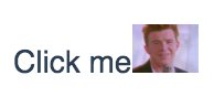
icon="never-gonna-give-you-up.png"
onClick={doStuff}>
{'Click me'}
</Button>
//...
);
}import Button from 'product-theme/button/index.js';
import from 'theme-reset/styles.less';
import from 'product-theme/styles.less';
// js from the last layer, styles from all previous layers
A history of a button.
Config
  // ...
  preLoaders: [
    {
      test: /\.js$/,
      loader: 'rebem-layers',
      query: {
        layers: [
          // shared layers
          require('core-components'),
          require('theme-reset'),
          require('custom-components'),
          require('product-theme'),

          // app components
          {
            path: path.resolve('src/components/'),
            files: {
              main: 'index.js',
              styles: 'styles.less'
            }
          }
        ],
        // list of places where you will require components from layers
        consumers: [
          path.resolve('src/')
        ]
      }
    }
  ],
// ...reBEM is decoupled
- reBEM itself
- classname helpers
- CSS
- test utilities
- layers
...but better together

reBEM packages are not coupled and can be used independently:
Links
BEM methodology:
Official website + Community website
Thanks!
Github: https://github.com/mistadikay
Twitter: https://twitter.com/mistadikay

E-mail: iam@mistadikay.com
React ♥️ BEM
By Denis Koltsov
React ♥️ BEM
Using BEM in React ecosystem