Music Video Magazine Advertisements Analysis
Digipaks are often advertised in music magazines prior to their release. An advert would normally be A4 in shape. I will be analysing 3 adverts for albums/singles in a similar genre to the video I will be making.
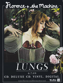
Florence and the Machine / LUNGS
Florence and the Machine / LUNGS
Florence and the Machine are an Indie rock band. They released their first album Lungs in 2009. I will be analysing the advertisement poster, suggesting how the poster fits to the typical conventions or whether the oster subverts the traditional ideas of a advertisement poster.
The artist is presented in the middle of the advert suggesting her significance to the audience. Straight away the audience will understand the the artist is advertising their music, they will also understand this by the use of the logo at the top of the advert. The artists/bands logo is presented in black and white at the top of the poster, the audience will make immediate eye contact with the logo at the top of the poster and understand what is being advertised. The name of the album, 'Lungs' is placed below the image of the artist, it is the largest font of the advert, suggesting is importance, the audience will then be aware of the album title. Other informative text including dates, format information, web addresses and copyright information is situated in the bottom third of the poster. This design of the advert is designed to fit how the audience will view the advert. With in the media, audiences are likely to view images from top to bottom, and are drawn to larger text and a variety of fonts.
The image of the artist reflects the name of the album in a clever way. The artist, 'Florence', is shown wearing an extravagant piece of jewellry. The artist is wearing a graphic necklace of a pair of lungs, this relates to the name of the album, 'LUNGS', this shows that the text of the poster relates to the main image. The image has connotations of misery and depression,
deck
By msharrattmedia