Rapid prototyping
with
Laravel and Bootstrap
Talk by Maks (@msurguy)
Follow at slid.es/msurguy/rapid-prototyping
Seattle PHP Meetup - July 2015
Meet Maks Surguy
B-boy from Ukraine turned FT web developer

Currently working at NBC News as Front End developer
Creator of :
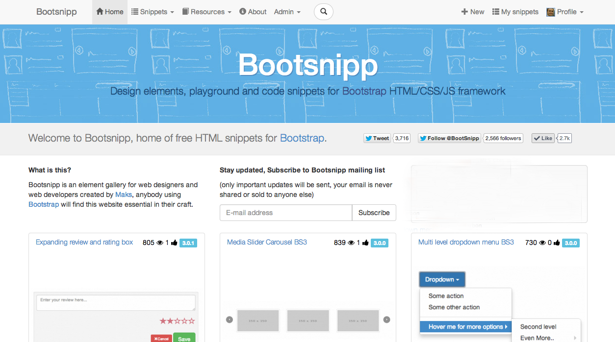
Bootsnipp.com
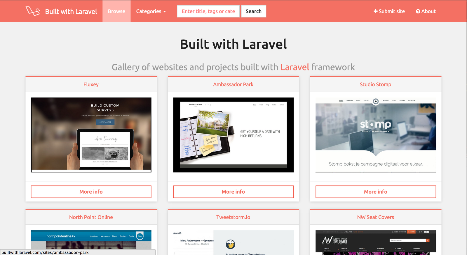
BuiltWithLaravel.com
Laravel-Tricks.com

Other Sites I built,
using Bootstrap as the frontend framework:
cheatsheetr.com
mymaplist.com
PanoPanda.co
and more
Rapid Prototyping
"From zero to MVP, in one sitting" - Maks
Have an idea? Ship it!
- Plan (sketch/wireframe)
- Build UI (HTML)
- Build backend (routes, DB, services)
- Marry UI and the backend
- Keep momentum going (Red Bull)
- Launch
- Get feedback
- Iterate
- Make $$$ (ads, affiliate sales, sell out, ...)
1) Make wireframes
Ever heard of battery-free, note-storing device called "Paper" ?

2) Build UI with
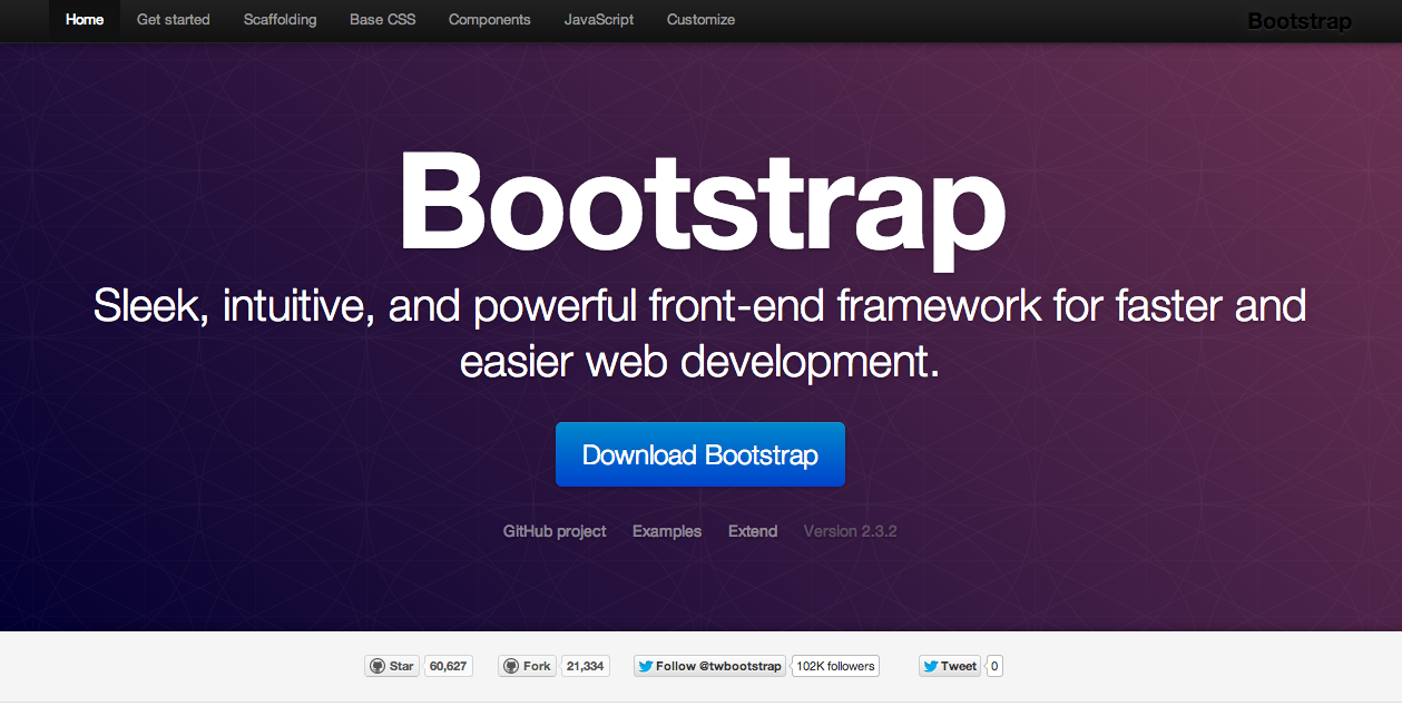
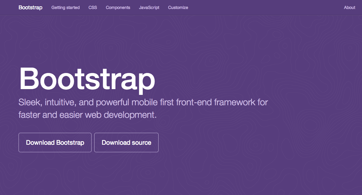
BOOTSTRAP
"SLEEK, POWERFUL MOBILE-FIRST FRONT-END
FRAMEWORK
FOR FASTER AND EASIER
WEB DEVELOPMENT"
- @mdo (creator of Bootstrap)
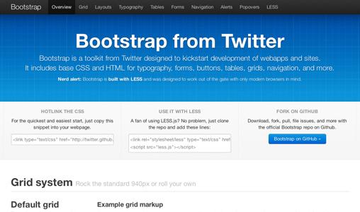
History
Started as Twitter's internal project
by @mdo and @fat in 2010,
released as Open Source in August 2011:
Quickly gained traction,
in 7 months most popular repo on Github
Version 2.0
released in January 2011
responsive, mobile friendly, tons of new components
Version 3.0
Mobile-first, refined and rebuilt
Released in August 2013
What problems
does Bootstrap solve?
1) Responsive Layout.
Grid system
Columns
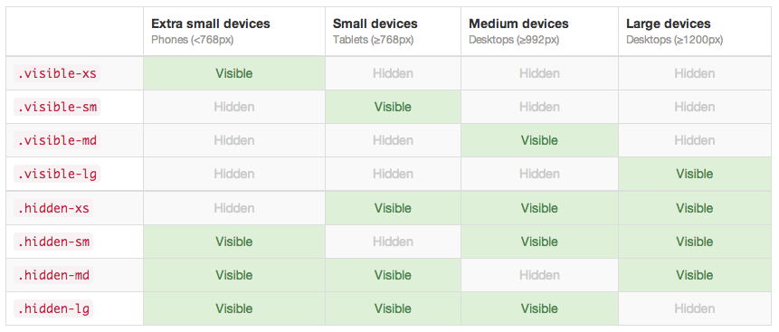
Responsive Utilities
Grid - 12 columns
http://getbootstrap.com/examples/grid/

Same grid on mobile:
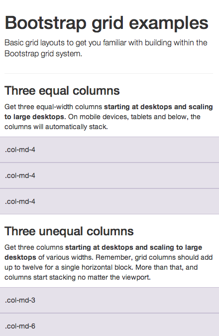
Grid options
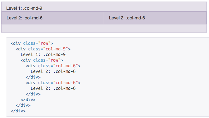
Nesting columns
Offsetting columns
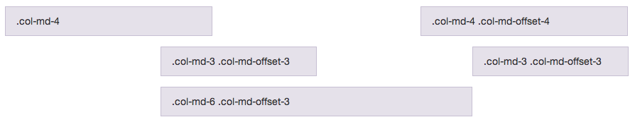
<div class="row">
  <div class="col-md-4">.col-md-4</div>
  <div class="col-md-4 col-md-offset-4">.col-md-4 .col-md-offset-4</div>
</div>
<div class="row">
  <div class="col-md-3 col-md-offset-3">.col-md-3 .col-md-offset-3</div>
  <div class="col-md-3 col-md-offset-3">.col-md-3 .col-md-offset-3</div>
</div>
<div class="row">
  <div class="col-md-6 col-md-offset-3">.col-md-6 .col-md-offset-3</div>
</div>
Selectively hiding elements
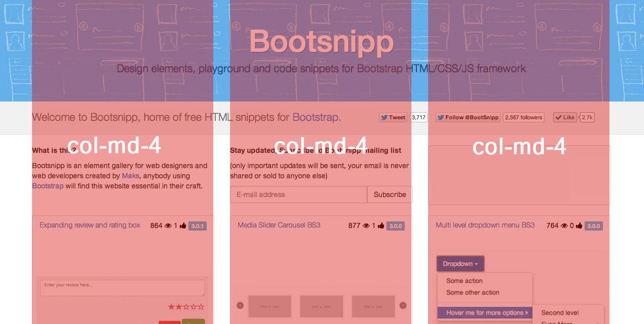
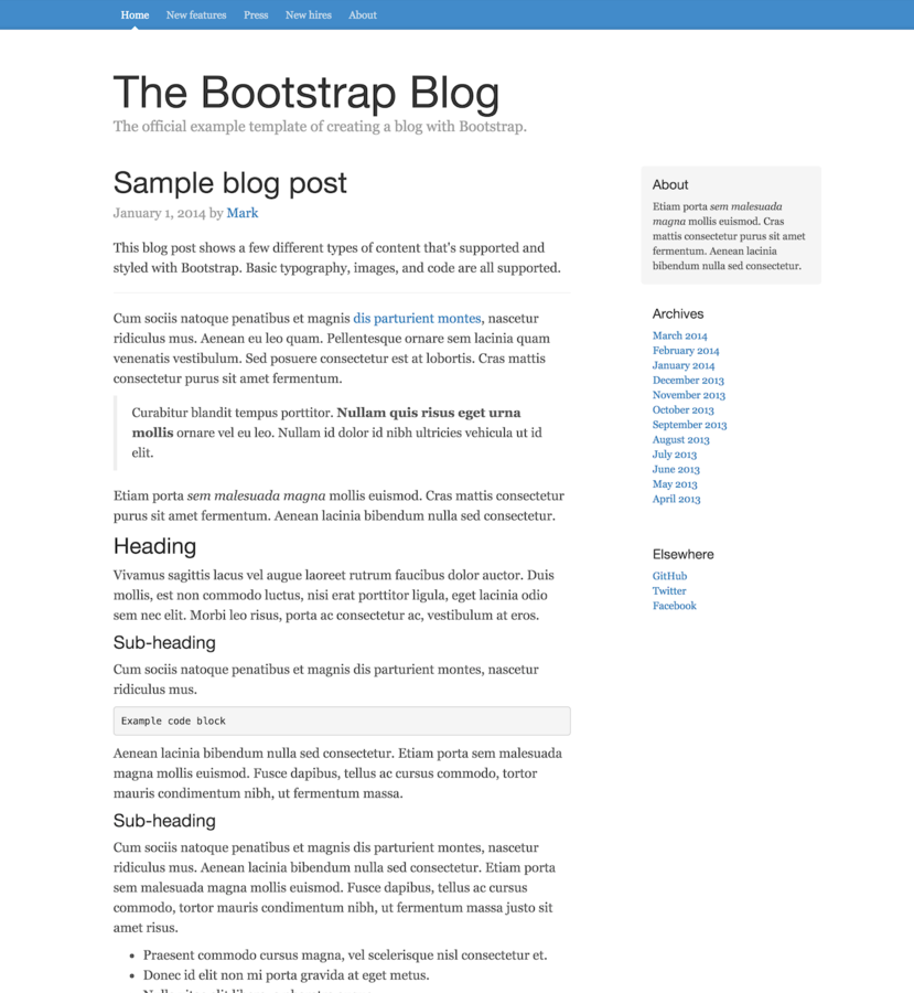
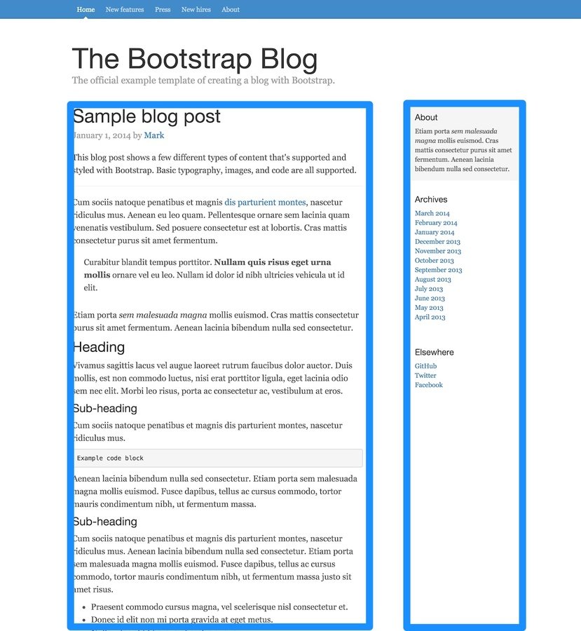
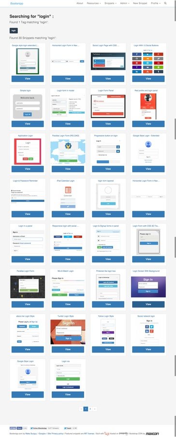
Bootsnipp Homepage as an
Example of 3 column layout
Each column 4 units wide, either md or lg is fine
2) Consistency
2) Consistency
2) Consistency
-
Typography
- Borders (rounding)
- Colors
- Form elements
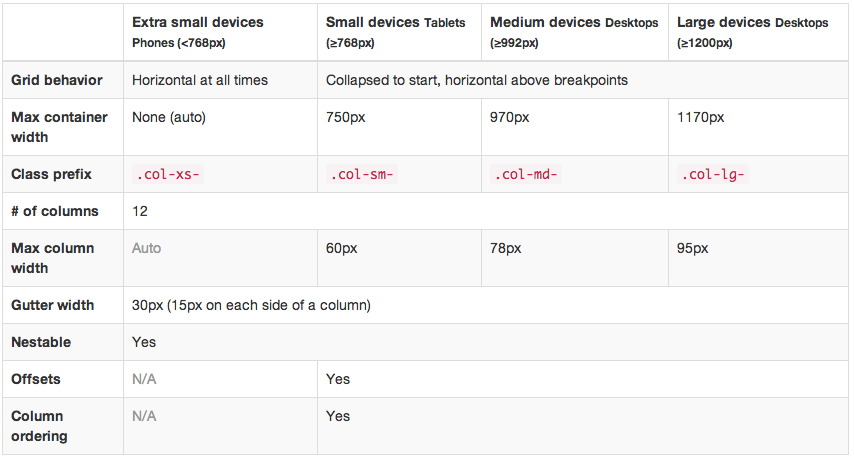
Sizing prefixes:
-
xs - extra small (phone)
-
sm - small (tablet)
-
md - medium (desktop)
-
lg - large (wide desktop)
Feedback classes:
- *-success
- *-info
- *-warning
- *-danger
Ex. alert alert-success:

(The magic word)
3) Design
Buttons
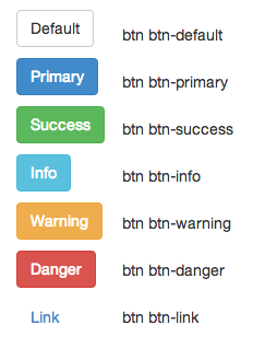
Button sizes

and "btn-block" - 100% width button
Forms
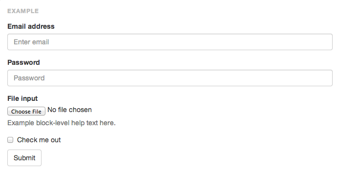
<form role="form">
<div class="form-group">
<label for="exampleInputEmail1">Email address</label>
<input type="email" class="form-control" id="exampleInputEmail1" placeholder="Enter email">
</div>
<div class="form-group">
<label for="exampleInputPassword1">Password</label>
<input type="password" class="form-control" id="exampleInputPassword1" placeholder="Password">
</div>
<div class="form-group">
<label for="exampleInputFile">File input</label>
<input type="file" id="exampleInputFile">
<p class="help-block">Example block-level help text here.</p>
</div>
<div class="checkbox">
<label>
<input type="checkbox"> Check me out
</label>
</div>
<button type="submit" class="btn btn-default">Submit</button>
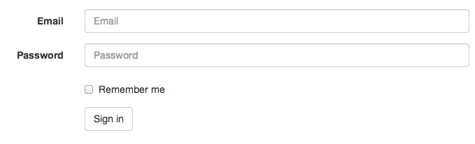
</form>Inline forms

 <form class="form-inline" role="form">
  <div class="form-group">
    <label class="sr-only" for="exampleInputEmail2">Email address</label>
    <input type="email" class="form-control" id="exampleInputEmail2" placeholder="Enter email">
  </div>
  <div class="form-group">
    <label class="sr-only" for="exampleInputPassword2">Password</label>
    <input type="password" class="form-control" id="exampleInputPassword2" placeholder="Password">
  </div>
  <div class="checkbox">
    <label>
      <input type="checkbox"> Remember me
    </label>
  </div>
  <button type="submit" class="btn btn-default">Sign in</button>
</form>
Horizontal forms
<form class="form-horizontal" role="form">
...
</form>
Navbars

<nav class="navbar navbar-default" role="navigation">
  ...
</nav>
Inverted variation

<nav class="navbar navbar-inverse" role="navigation">
...
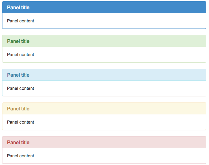
</nav>Panels
guess the syntax
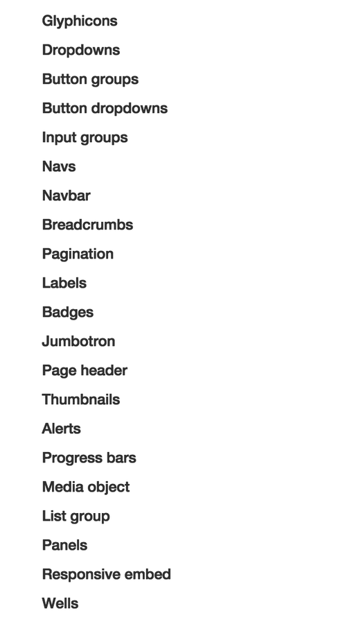
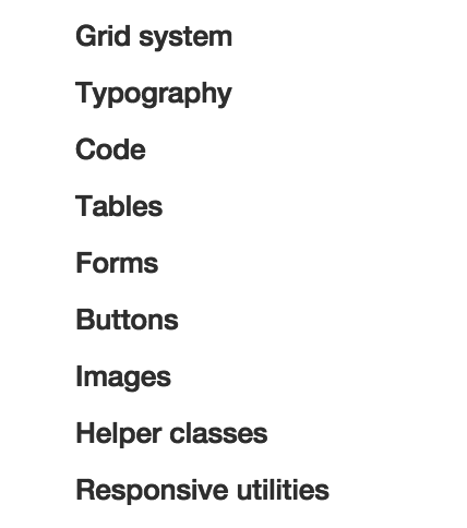
Many other components:
- button groups
- dropdowns
- breadcrumbs
- navs
- labels
- badges
- pagination
- progress bars
- list groups
- media object
Javascript-ish components
- Modal windows (popups)
- Tabs
- Tooltips
- Popovers
- Collapsible elements
- Carousel
Bootstrap in the wild:
- Spotify.com
- CSS Awards
- TurboTax
- Laracasts.com
- Laravel.com
- many many more at http://expo.getbootstrap.com/
Unicorns, get your horns on

Bring Bootstrap
into your project
Either way:
-
Download ZIP at getbootstrap.com
- bower install bootstrap
- npm install bootstrap
- Or use BootstrapCDN (even better)
From a Wireframe to HTML
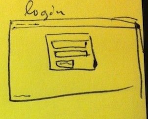
.
.
Identify components
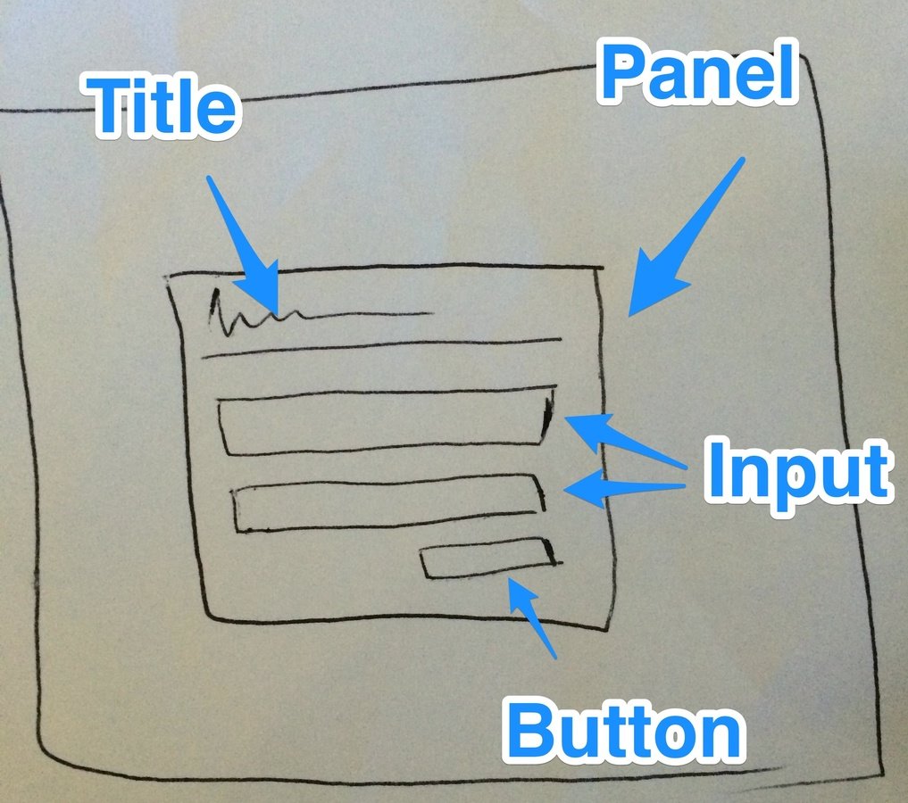
Match components
with Bootstrap elements
Create HTML
Using Bootstrap syntax
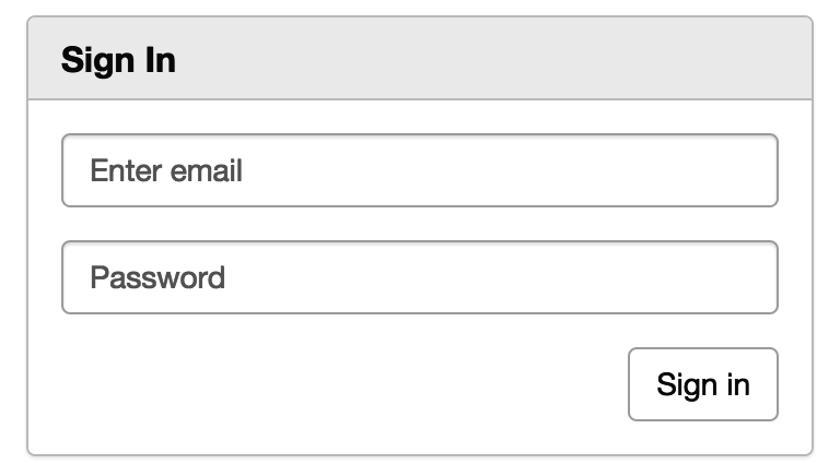
Panel:
<div class="panel panel-default">
  <div class="panel-heading">
    <h3 class="panel-title"><strong>Sign In </strong></h3>
  </div>
</div>
<form role="form">
  <div class="form-group">
   <input type="email" class="form-control" placeholder="Enter email">
  </div>
  <div class="form-group">
   <input type="password" class="form-control" placeholder="Password">
  </div>
  <button type="submit" class="btn btn-sm btn-default">Sign in</button>
</form>
All together now:
<div class="col-md-4">
  <div class="panel panel-default">
    <div class="panel-heading">
      <h3 class="panel-title"><strong>Sign In </strong></h3>
    </div>
    <div class="panel-body">
      <form role="form">
        <div class="form-group">
          <input type="email" class="form-control" placeholder="Enter email">
        </div>
        <div class="form-group">
          <input type="password" class="form-control" placeholder="Password">
        </div>
        <button type="submit" class="btn btn-default pull-right">Sign in</button>
      </form>
     </div>
  </div></div>
Result
Become friends with the GRID
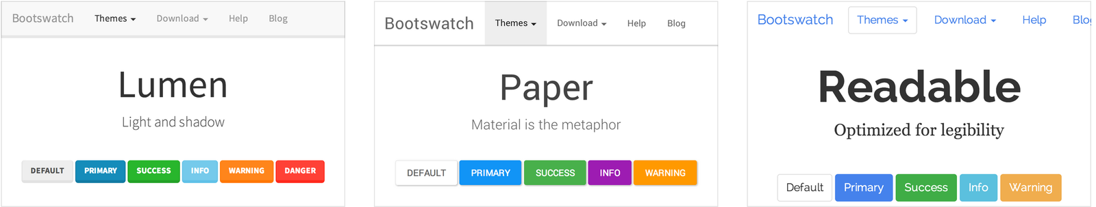
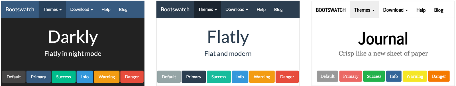
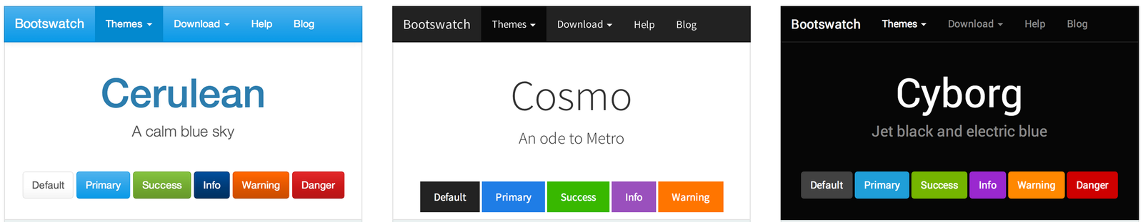
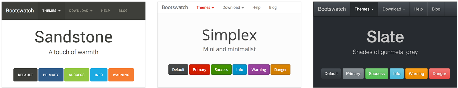
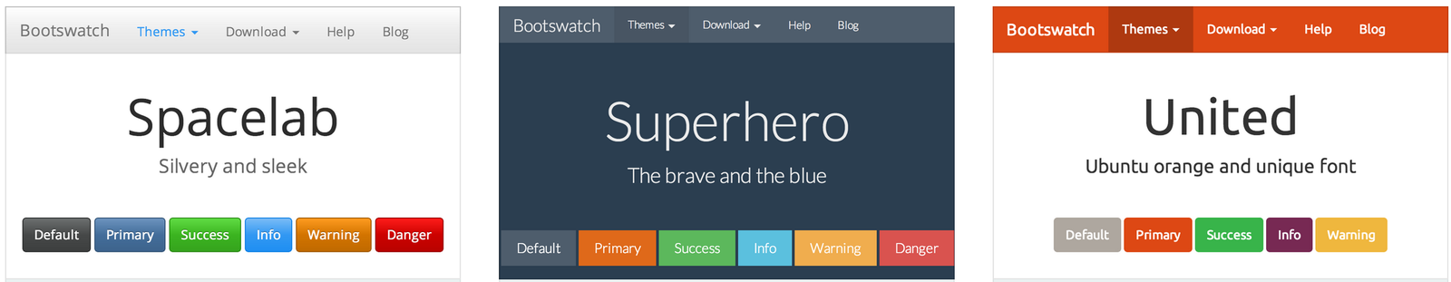
Choose a theme
(or build your own)
Use this to create your own:
Use existing code
Bootstrap snippets for editors
Sublime:
PHPStorm:
Laravel + Bootstrap snippets:
(Almost live) Example:
Resources:
Thanks!
Rapid prototyping with Bootstrap and Laravel
By msurguy
Rapid prototyping with Bootstrap and Laravel
Introduction to Rapid Prototyping with Bootstrap and Laravel


