CSS Architecture 101
Why?
- Brand consistency
- Maintainability
- Predictability
- Ease of development
What's bad CSS?
Anatomy of a CSS rule
CSS Rule
article p
{
color: red;
background: green;
}
Selector
article p
{
color: red;
background: green;
}
Declarations
article p
{
color: red;
background: green;
}
Properties
article p
{
color: red;
background: green;
}
Values
article p
{
color: red;
background: green;
}
Element Selector
h1 { ... }
div { ... }
muse-timeline { ... }
ID Selector
<button id="my-button">
    Click me!
</button>

#my-button { ... }
Class Selector
<button class="primary-button">
    Click me!
</button>

.primary-button { ... }
Attribute Selector
<button disabled>
    Don't click me!
</button>

[disabled] { ... }
Attribute Selector
<button disabled="true">
    Don't click me!
</button>

[disabled="true"] { ... }
Attribute Selector
<article data-tags="politics featured popular">
    A random article
</article>
[data-tags="politics featured popular"] { ... }
[data-tags~="featured"] { ... }
[data-tags^="poli"] { ... }
[data-tags$="ular"] { ... }
[data-tags*="cs feat"] { ... }Universal Selector
* { ... }Descendant Combinator
<header>
    <ul class="navigation"></ul>
</header>
<footer>
    <ul class="navigation"></ul>
</footer>
header .navigation {
    color: red;
}
Child Combinator
<article>
    <section class="summary">
        <p>...</p>
    </section>
    <p>...</p>
</article>
article > p {
color: red;
}
.summary p {
color: green;
}Sequence Combinator
<div class="alert success">YES</div>
<div class="alert error">NO</div>
div.alert.success {
color: green;
}
div.alert.error {
color: red;
}Subsequent-Sibling Combinator
<h1>My title</h1>
<p>My summary</p>
<p>Main text</p>
h1 ~ p {
color: red;
}Next-Sibling Combinator
<h1>My title</h1>
<p>My summary</p>
<p>Main text</p>
h1 + p {
color: red;
}Let's set you up

Yeoman
Bower

Gulp
Sass
npm install -g yo bower generator-webappyo webappgulp serveNaming Things
There are only two hard things in Computer Science: cache invalidation and naming things.
<button class="blue-button">Click me!</div>.blue-button {
background: #005cb9;
}<button class="primary-button">Click me!</div>.primary-button {
background: #005cb9;
}<button class="primary-button">Click me!</div>$blue: #005cb9;
.primary-button {
background: $blue;
}<button class="primary-button">Click me!</div>$blue: #005cb9;
$primary-color: $blue;
.primary-button {
background: $primary-color;
}Semantics
Semantic HTML is the use of HTML to reinforce the semantics, or meaning, of the information in webpages and web applications rather than merely to define its presentation or look. Semantic HTML is processed by traditional web browsers as well as by many other user agents. CSS is used to suggest its presentation to human users.
Using a class name to describe content is redundant because content describes itself.
<footer>
    <h3>Products</h3>
    <ul class="footer-product-list">
        <li>
            <a href="" class="footer-link">Business Planning</a>
        </li>
        <li>
            <a href="" class="footer-link">Financial Management</a>
        </li>
        <li>
            <a href="" class="footer-link">Human Capital Management</a>
        </li>
        <li>
            <a href="" class="footer-link">Prism Analytics</a>
        </li>
        <li>
            <a href="" class="footer-link">Cloud Platform</a>
        </li>
    </ul>
</footer>
<footer>
<h3>Products</h3>
<ul class="list">
<li>
<a href="" class="secondary-link">Business Planning</a>
</li>
<li>
<a href="" class="secondary-link">Financial Management</a>
</li>
<li>
<a href="" class="secondary-link">Human Capital Management</a>
</li>
<li>
<a href="" class="secondary-link">Prism Analytics</a>
</li>
<li>
<a href="" class="secondary-link">Cloud Platform</a>
</li>
</ul>
</footer>Do not literally describe the style
Do not explicitly describe specific use cases
Strive for reusable, recyclable classes
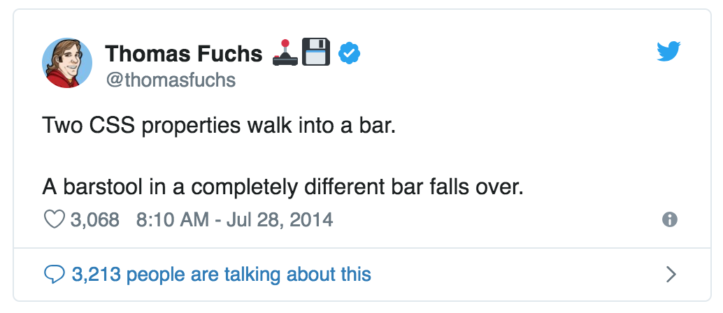
Specificity
Specificity is the means by which browsers decide which CSS property values are the most relevant to an element and, therefore, will be applied. Specificity is based on the matching rules which are composed of different sorts of CSS selectors.

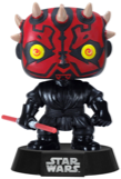

Specificity Wars
Element
Class
ID
Inline
Sith Power
0,0,0,1
Sith Power
0,0,1,0
Sith Power
0,1,0,0
Sith Power
1,0,0,0
Optimal Specificity
0, 0, 1, 0
0, 0, 2, 0
0, 0, 1, 1
0, 0, 2, 1
Practice Time
Selector Performance
<html>
    <body>
        <nav>
            <a class="main-btn">Home</a>
            <a class="main-btn">About us</a>
        </nav>
        <form>
            <button class="main-btn form-btn">
                Submit
            </button>
            <a class="secondary-btn">Cancel</a>
        </form>
    </body>
</html>
html
body
nav
form
a
a
a
button
main-btn
main-btn
main-btn
secondary-btn
.form-btn { ... }

form .main-btn { ... }

form > .main-btn { ... }
form-btn
Specificity Hacks
#my-element { ... }[id="my-element"] { ... }.parent .my-element { ... }
div.my-element { ... }
.my-element.my-element { ... }B E M
Block - Element - Modifier
Block
A reusable component
Element
One piece of the component
Modifier
Different state for a block or an element
// Block
.menu { ... }

// Elements
.menu__item { ... }
.menu__link { ... }

// Modifiers
.menu--horizontal { ... }
.menu__item--expanded { ... }
Practice Time (continued)
Programming Principles
Code Styling
- all selectors on new lines
- a space before our opening brace ({)
- properties and values on the same line
- a space after our property–value delimiting colon (:)
- each declaration on its own new line
- the opening brace ({) on the same line as our last selector
- our first declaration on a new line after our opening brace ({)
- our closing brace (}) on its own new line
- a trailing semi-colon (;) on every declaration
- use hyphens (-) to separate words
Object Oriented Programming
Object-oriented programming (OOP) is a programming paradigm that represents the concept of ‘objects’ […] which are usually instances of classes, [and] are used to interact with one another to design applications and computer programs.
/**
 * A simple, design-free button object. Extend this object with a `.btn--*` skin
 * class.
 */
.btn {
  display: inline-block;
  padding: 1em 2em;
  vertical-align: middle;
}


/**
 * Positive buttons’ skin. Extends `.btn`.
 */
.btn--positive {
  background-color: green;
  color: white;
}

/**
 * Negative buttons’ skin. Extends `.btn`.
 */
.btn--negative {
  background-color: red;
  color: white;
}
<button class="btn btn--negative">Delete</button>Single Responsibility Principle
The single responsibility principle states that every context (class, function, variable, etc.) should have a single responsibility, and that responsibility should be entirely encapsulated by the context.
.error-message {
  display: block;
  padding: 10px;
  border-top: 1px solid #f00;
  border-bottom: 1px solid #f00;
  background-color: #fee;
  color: #f00;
  font-weight: bold;
}

.success-message {
  display: block;
  padding: 10px;
  border-top: 1px solid #0f0;
  border-bottom: 1px solid #0f0;
  background-color: #efe;
  color: #0f0;
  font-weight: bold;
}
.box {
display: block;
padding: 10px;
}
.message {
border-style: solid;
border-width: 1px 0;
font-weight: bold;
}
.message--error {
background-color: #fee;
color: #f00;
}
.message--success {
background-color: #efe;
color: #0f0;
}Open/Closed Principle
Software entities (classes, modules, functions, etc.) should be open for extension, but closed for modification.
.box {
display: block;
padding: 10px;
}
.content .box {
padding: 20px;
}.box {
display: block;
padding: 10px;
}
.box--large {
padding: 20px;
}Don't Repeat Yourself (DRY)
Every piece of knowledge must have a single, unambiguous, authoritative representation within a system.
.btn {
display: inline-block;
padding: 1em 2em;
font-weight: bold;
}
[...]
.page-title {
font-size: 3rem;
line-height: 1.4;
font-weight: bold;
}
[...]
.user-profile__title {
font-size: 1.2rem;
line-height: 1.5;
font-weight: bold;
}.btn {
display: inline-block;
padding: 1em 2em;
font-family: "My Web Font", sans-serif;
font-weight: bold;
}
[...]
.page-title {
font-size: 3rem;
line-height: 1.4;
font-family: "My Web Font", sans-serif;
font-weight: bold;
}
[...]
.user-profile__title {
font-size: 1.2rem;
line-height: 1.5;
font-family: "My Web Font", sans-serif;
font-weight: bold;
}@mixin my-web-font() {
font-family: "My Web Font", sans-serif;
font-weight: bold;
}
.btn {
display: inline-block;
padding: 1em 2em;
@include my-web-font();
}
[...]
.page-title {
font-size: 3rem;
line-height: 1.4;
@include my-web-font();
}
[...]
.user-profile__title {
font-size: 1.2rem;
line-height: 1.5;
@include my-web-font();
}Composition over Inheritance
Classes should achieve polymorphic behavior and code reuse by their composition (by containing instances of other classes that implement the desired functionality) rather than inheritance from a base or parent class.
.box {
  display: block;
  padding: 10px;
}


.message {
  border-style: solid;
  border-width: 1px 0;
  font-weight: bold;
}

.message--error {
  background-color: #fee;
  color: #f00;
}

.message--success {
  background-color: #efe;
  color: #0f0;
}<div class="box message message--error">
Oooops, something went wrong
</div>Separation of Concerns
Code should be broken up
into distinct sections, such that each section addresses a separate concern. A concern is a set of information that affects the code of a computer program. A program that embodies SoC well is called a modular program.
<div class="layout">

  <div class="layout__column layout__column--one-fourth">

  </div>

  <div class="layout__column  layount__column--two-fourths">

  </div>

  <div class="layout__column  layout__column--one-fourth">

  </div>

</div>
<div class="layout">
<button class="layout__column layout__column--one-third btn btn--primary">
</button>
<button class="layout__column layout__column--one-third btn btn--secondary">
</button>
<button class="layout__column layout__column--one-third btn btn--secondary">
</button>
</div><div class="layout">
<div class="layout__column layout__column--one-third">
<button class="btn btn--primary"></button>
</div>
<div class="layout__column layout__column--one-third">
<button class="btn btn--secondary"></button>
</div>
<div class="layout__column layout__column--one-third">
<button class="btn btn--secondary"></button>
</div>
</div>Practice Time
Organizing your code
Inverted Triangle CSS
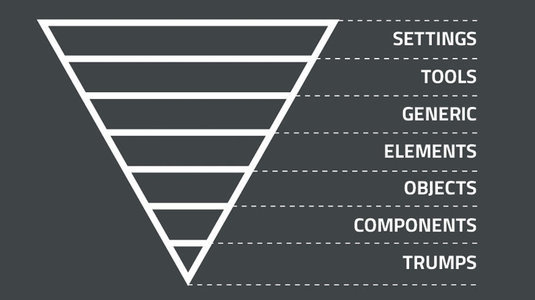
01-settings/
$blue: #0000ff;
$red: #ff0000;

$primary-color: $blue;
$error-color: $red;
colors.scss
$font-face: 'Roboto', sans-serif;

$font-size-sm: 11px;
$font-size-md: 13px;
$font-size-lg: 15px;
fonts.scss
$spacing: 4px;spacing.scss
02-tools/
@mixin clearfix() {

  &:after {
    content: "" !important;
    display: block !important;
    clear: both !important;
  }

}
clearfix.scss
@mixin ellipsis() {
	overflow: hidden;
	white-space: nowrap;
	text-overflow: ellipsis;
}
ellipsis.scss
03-generic/
html {
  line-height: 1.15;
  -ms-text-size-adjust: 100%;
  -webkit-text-size-adjust: 100%;
}

body {
  margin: 0;
}

article,
aside,
footer,
header,
nav,
section {
  display: block;
}
normalize.scss
* {
  box-sizing: border-box;
}
box-sizing.scss
04-elements/
img {
    max-width: 100%;
    font-style: italic;
    vertical-align: middle;
}

img[width],
img[height] {
    max-width: none;
}
images.scss
table {
  width: 100%;
}
tables.scss
05-objects/
.o-box {
  @include clearfix();
  display: block;
}

.o-box--xs {
  padding: $spacing-xs;
}

.o-box--sm {
  padding: $spacing-sm;
}
box.scss
.o-wrapper {
  @include clearfix();
  padding-right: $spacing;
  padding-left:  $spacing;
  margin-right: auto;
  margin-left:  auto;
}
wrapper.scss
06-components/
.c-btn {
    [...]
}

.c-btn--primary {
    [...]
}

.c-btn--secondary {
    [...]
}

.c-btn--sm {
    [...]
}

.c-btn--lg {
    [...]
}
button.scss
07-utilities/
.u-clearfix {
  @include clearfix();
}
clearfix.scss
.u-hidden {
  display: none !important;
}

.u-hidden-visually {
  position: absolute;
  overflow: hidden;
  clip: rect(0 0 0 0);
  height: 1px; width: 1px;
  margin: -1px; padding: 0; border: 0;
}
hide.scss
.u-ellipsis {
  @include ellipsis();
}
ellipsis.scss
Final Exercise
Resources and acknowledgments
Heavily influenced by the work of Harry Roberts
CSS Architecture 101
By Nikos Zinas


