Evaluated
Asa Blevins
Leslie Filko
Alita Pinto
2
Overview
UX Expert Review of the Indiana State Museum website
Methods
- Cognitive walkthrough based on the scenario of a family visiting the museum
- Heuristic evaluation based off of Nielsen’s 10 usability heuristics.
Global Findings

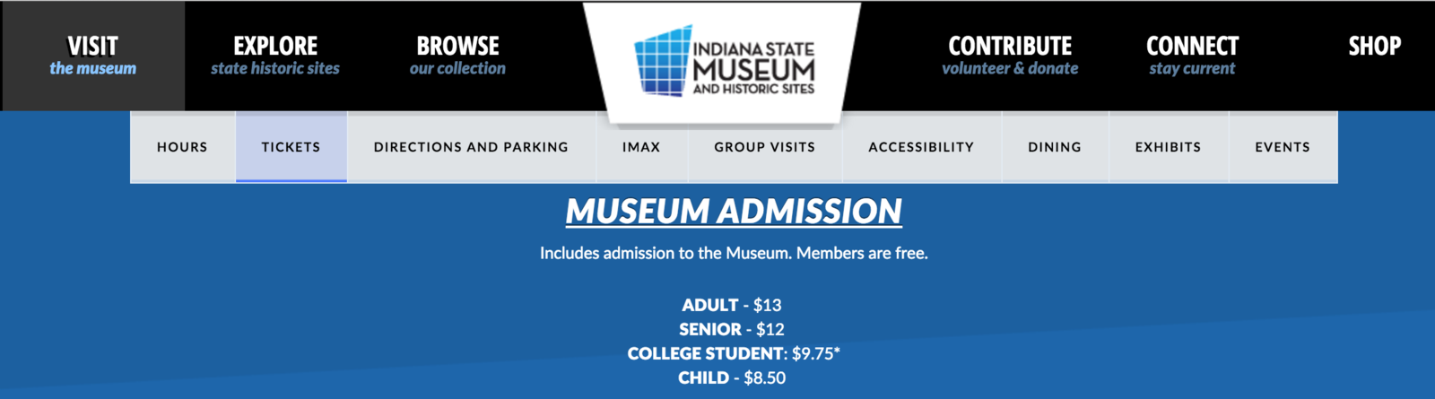
Navigation

Great high-level navigation

Second-level navigation
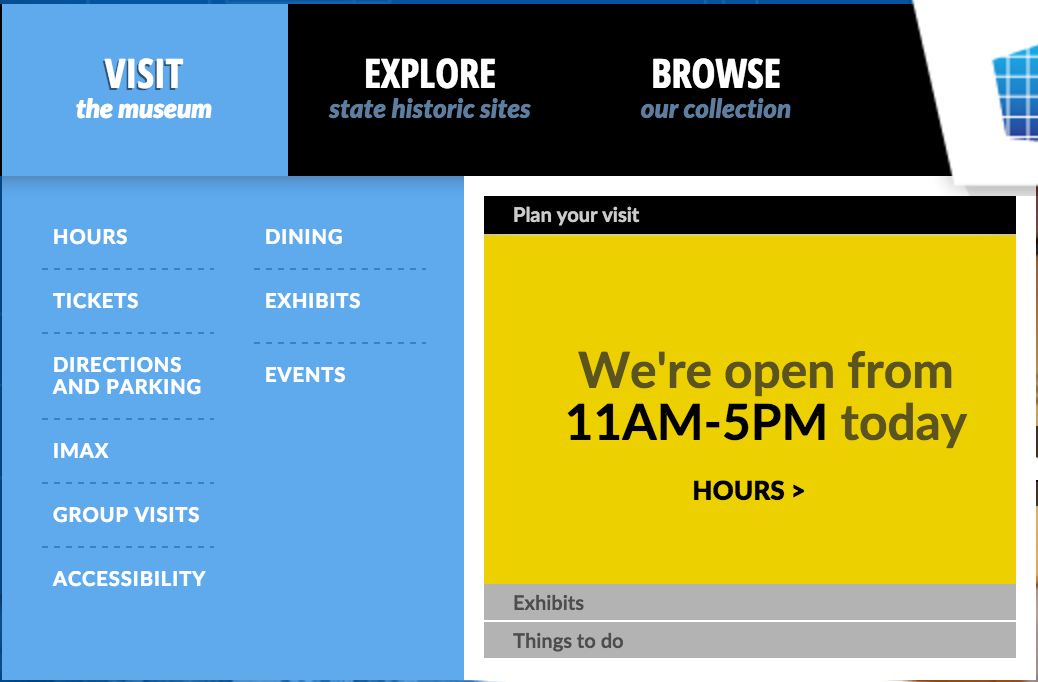
interactive menues inside a navigation box
not as great!
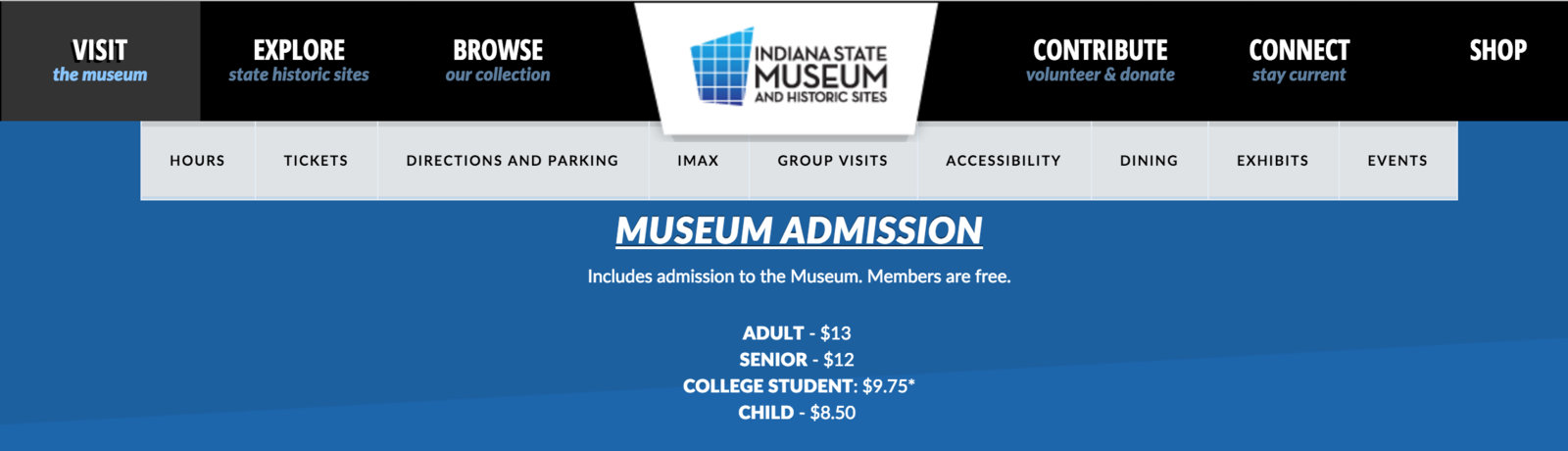
Where am I?
- No indicator for “current page”
- Difficult to notice the scrollbar. Excess white space in layout makes it appear to be any additional content on that page
Recommendation
- Add page indicator to secondary navigation bar
W h i t e S p a c e
1

credit: geek and poke
- Remove excessive white space
Recommendation
- Error message when purchasing tickets and memberships
Issue

Recommendation
- Indicate if the issue is user related or system related
- MAKE IT WORK!!

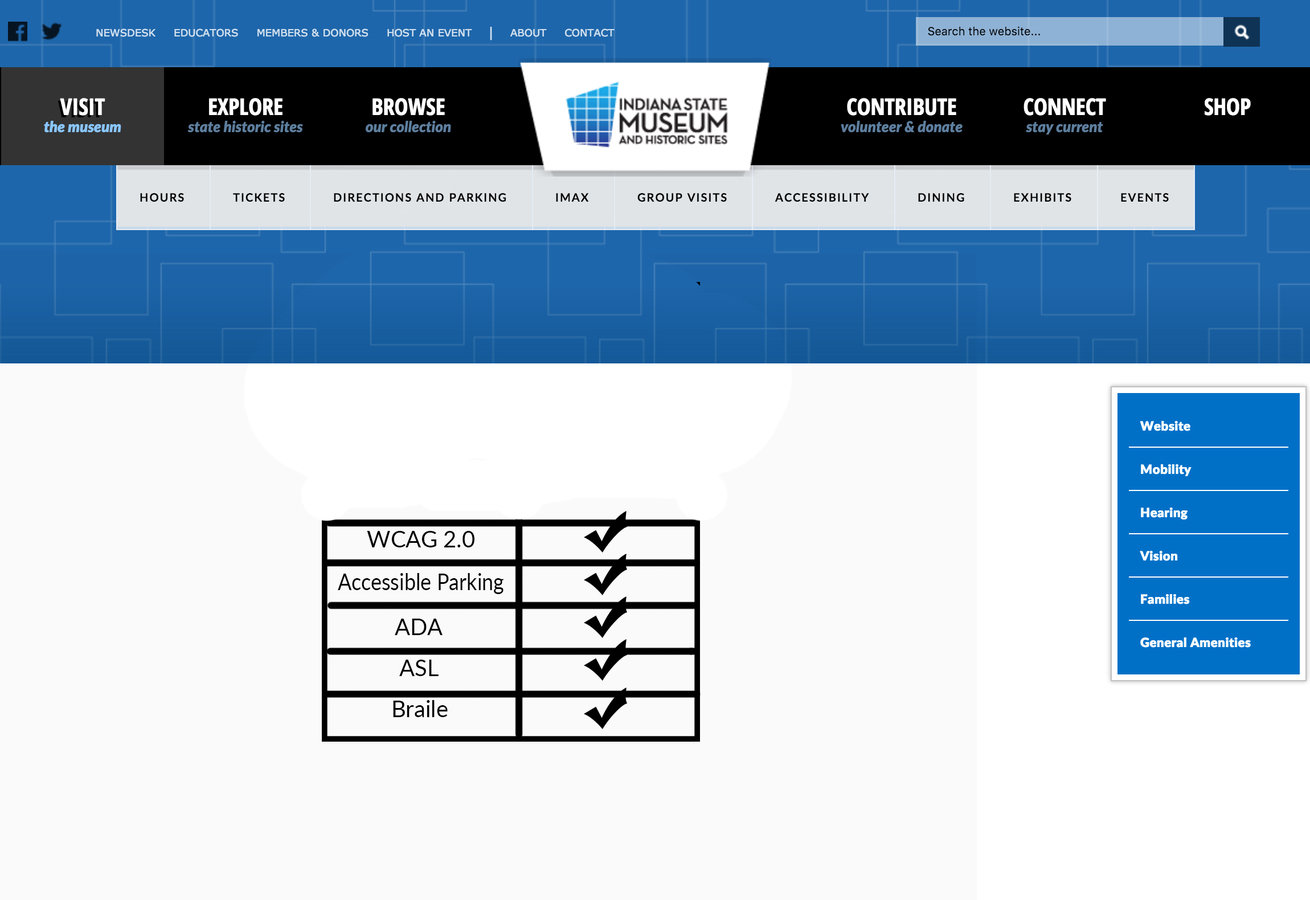
Accessibility
Issues
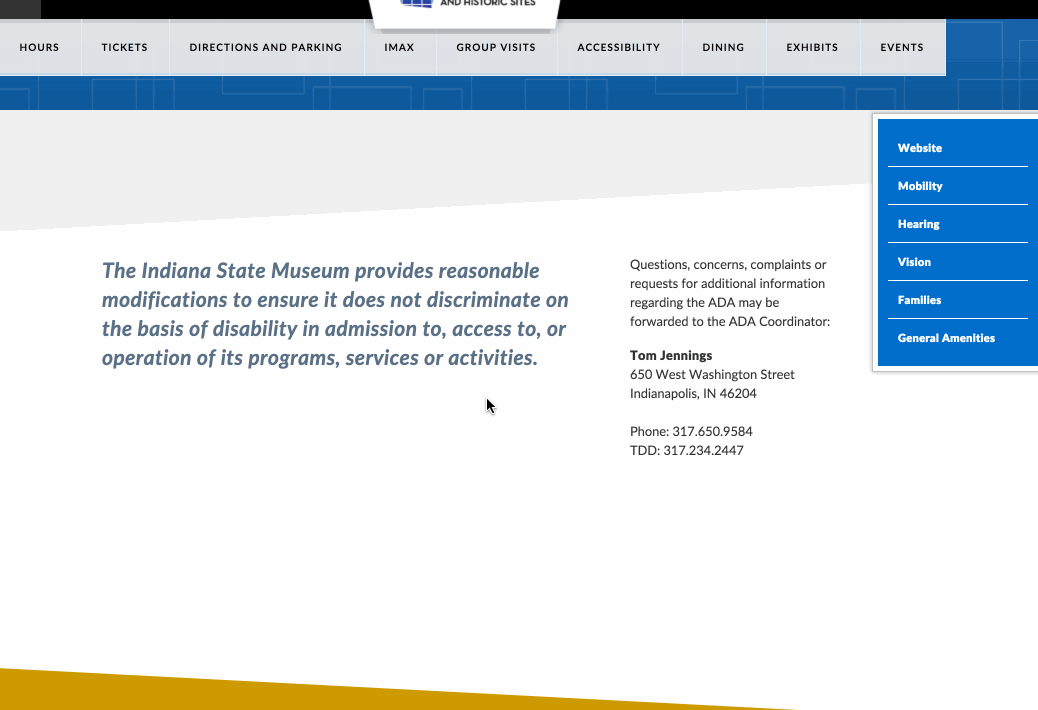
- “Accessibility” page: unnecessary extra pages, unclear language, & text clipping
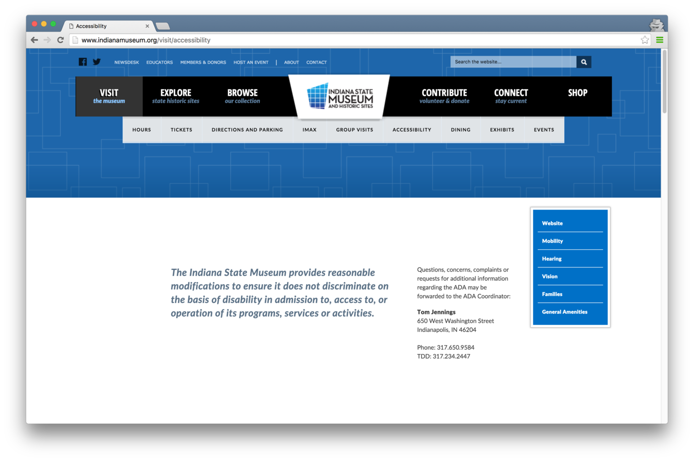
Recommendation
- Add a table of accessibility friendly features
Dining

Issues
- Navigates outside of the main website
- No clear indication of food allergies

Allergy friendly?
Recommendation
- Add the menu information to the dining page so the user does not need a PDF reader.
- Add more detailed information (allergy friendly).

| Includes nuts
Directions

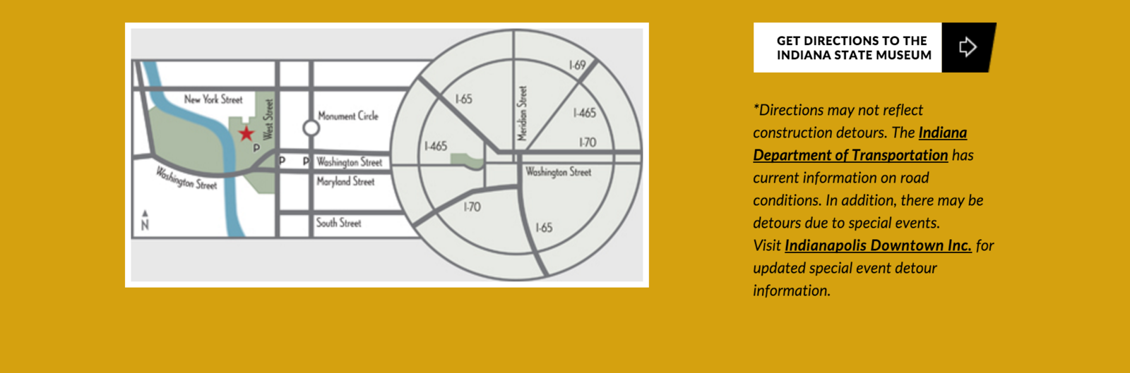
How do I get there?
- Confusing map of downtown Indianapolis
- No indication of parking spots
- Redirects user to another webpage
Recommendation
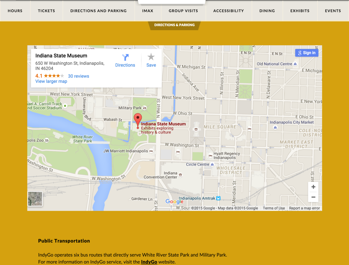
- Integrate Google Maps in direction page
Questions?
No time for that!
Thanks to:
https://thenounproject.com for their beautiful icons
Indiana State Museum
By Nomaan Ahgharian
Indiana State Museum
A cognitive walkthrough and heuristic evaluation done by a team of HCI master students


