22bet Website Case Study
In this deck we will reveal how to:
1. Use _____________ to keep visitors focused
2. Add ___________ to increase registration conversion rate
3. Use instant feedback to __________
4. Avoid ___________ to empower your users
5. Apply __________ to increase user satisfaction score
...and 6 more lessons from 22bet website

I was reading about an upcoming game of Chelsea vs Liverpool on my favourite news site when I decided I'm so sure about the result I could bet my money on it.
I remembered the name 22BET from seeing it on the shirt of one of my favourite players Ronaldinho. I took my laptop and headed to their website.


Psst! Just keep on clicking right!
You can use your keyboard
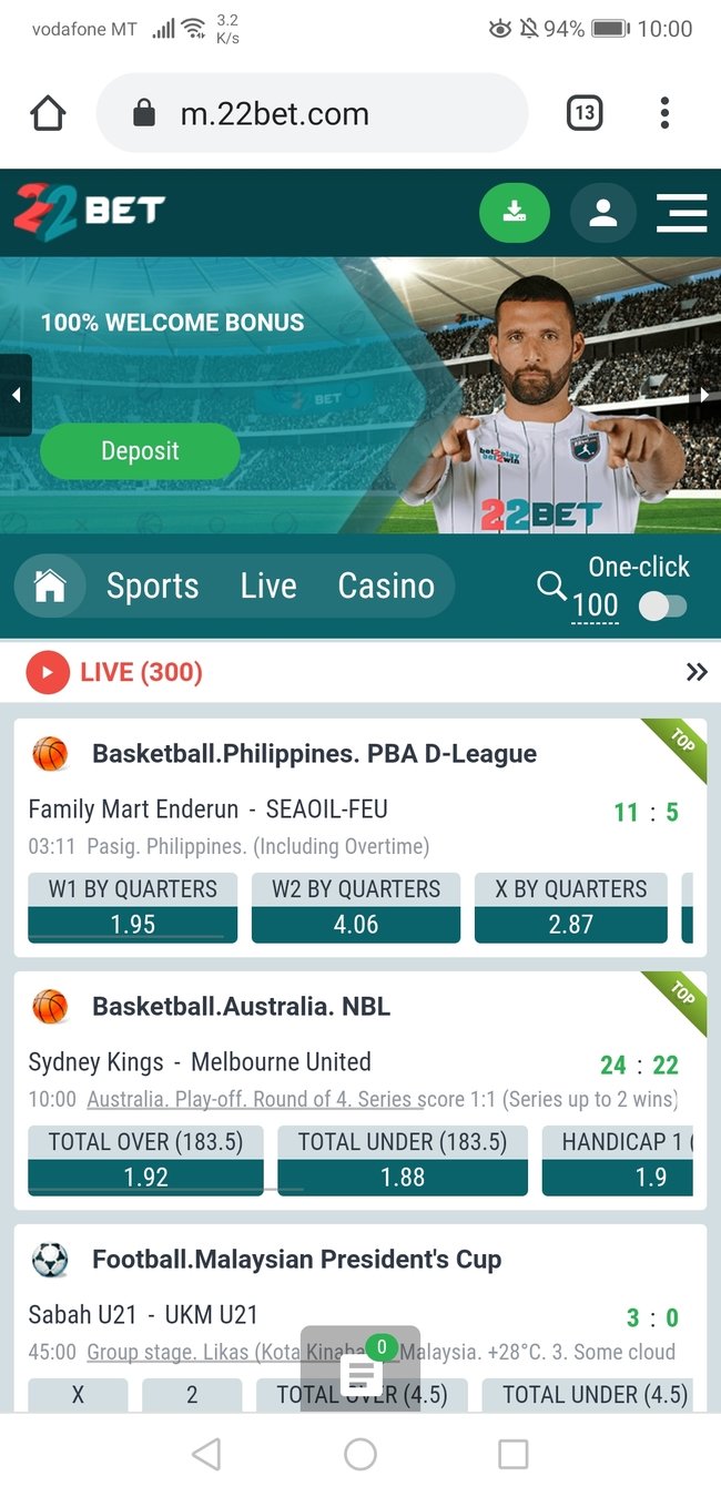
Wow! There is a lot going on here.
I'm not even sure where to point my eyes to...
Slide down to see an example of sports betting operator using visual salience to their advantage
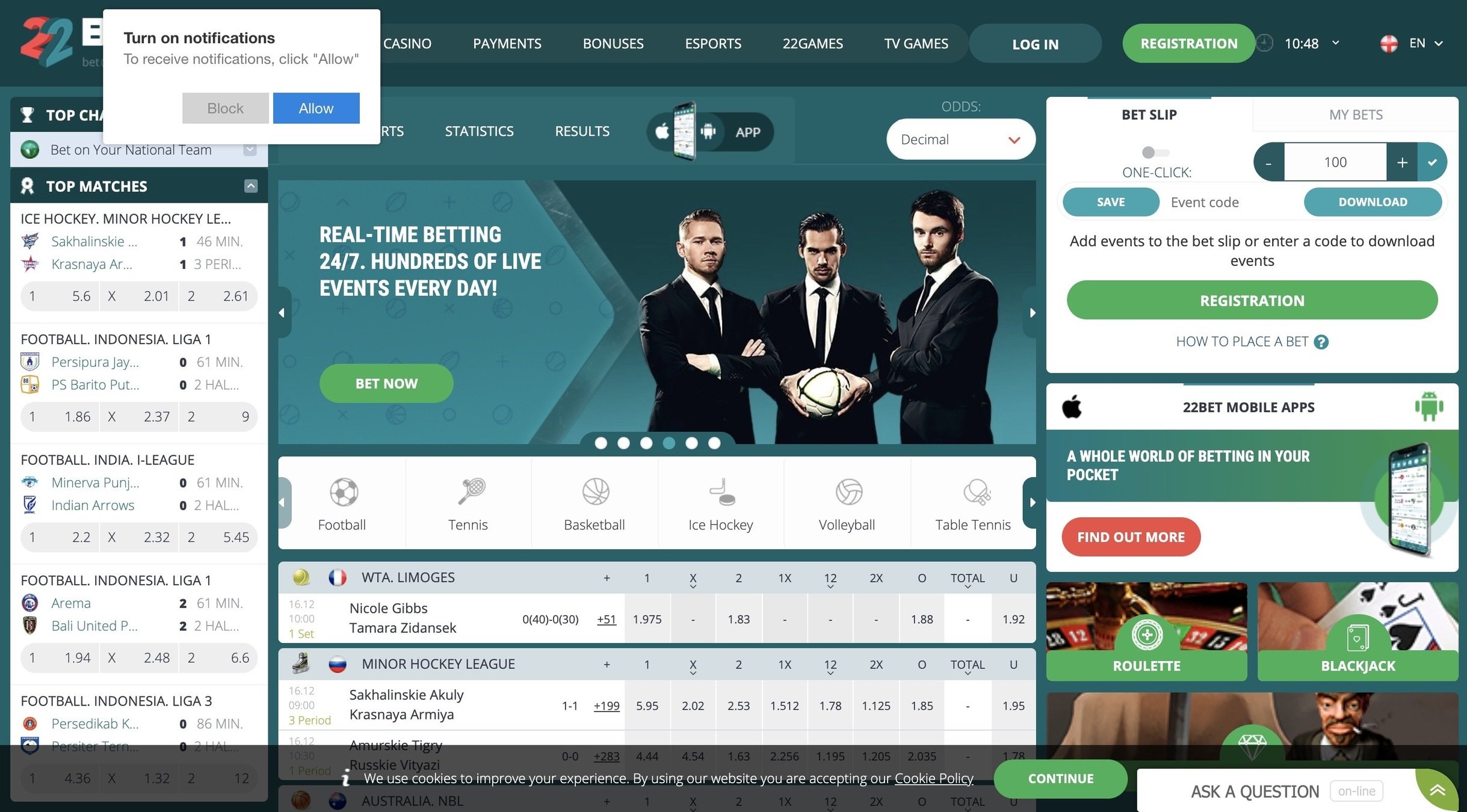
#1 Visual Salience
Our attention is attracted to elements that visually stand out. Our brains are wired that way to easily detect potential prey, predators, or mates in a cluttered visual world.
Make your main CTA distinctively different from neighbouring elements to point the user toward desired action.

Text
bwin highlights in yellow CTAs pointing towards making your first bet. They clearly stand out from dark background.
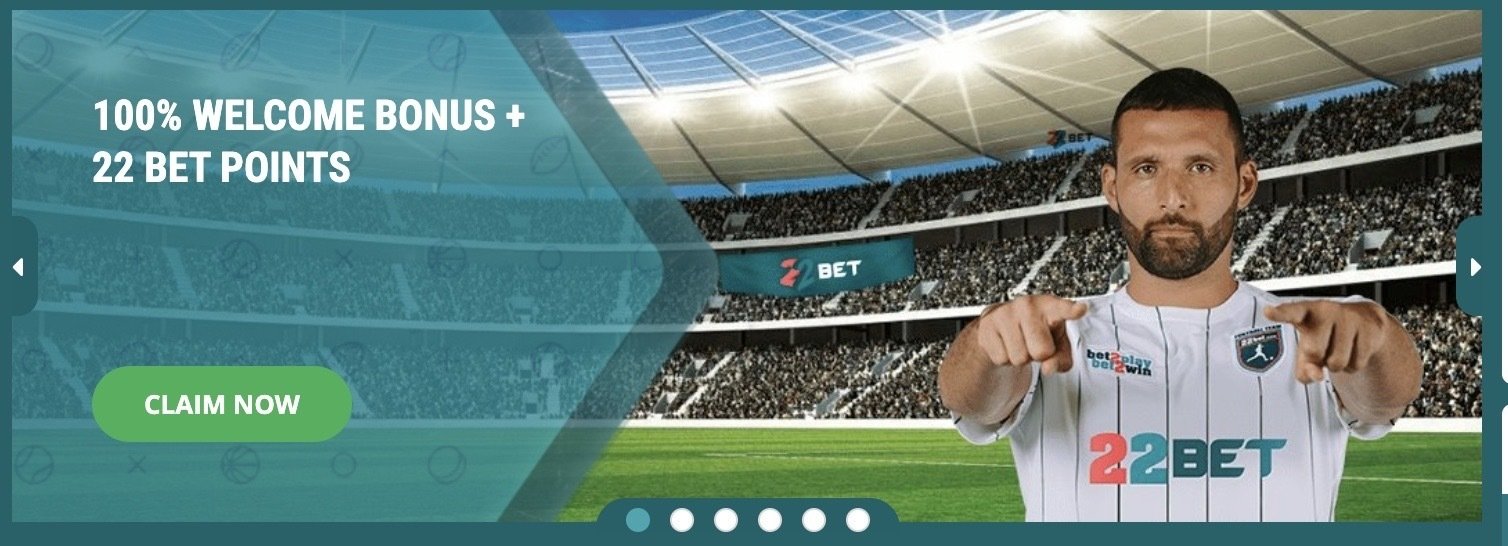
#2 Directional Cues
Humans have a natural tendency to follow the gaze of others and to comply with directions given by arrows and post-signs.
Use that behaviour to your advantage by pointing towards your main CTA or your crucial content.
Before we proceed to the signup page let's have a look at some of the elements on the homepage...
Have you noticed how the design of this banner is pulling your attention away from the bonus offer and the main CTA?
Arrow points you away from the content and the brand ambassador points directly at you. If you follow the cues you will take your eyes off the screen...
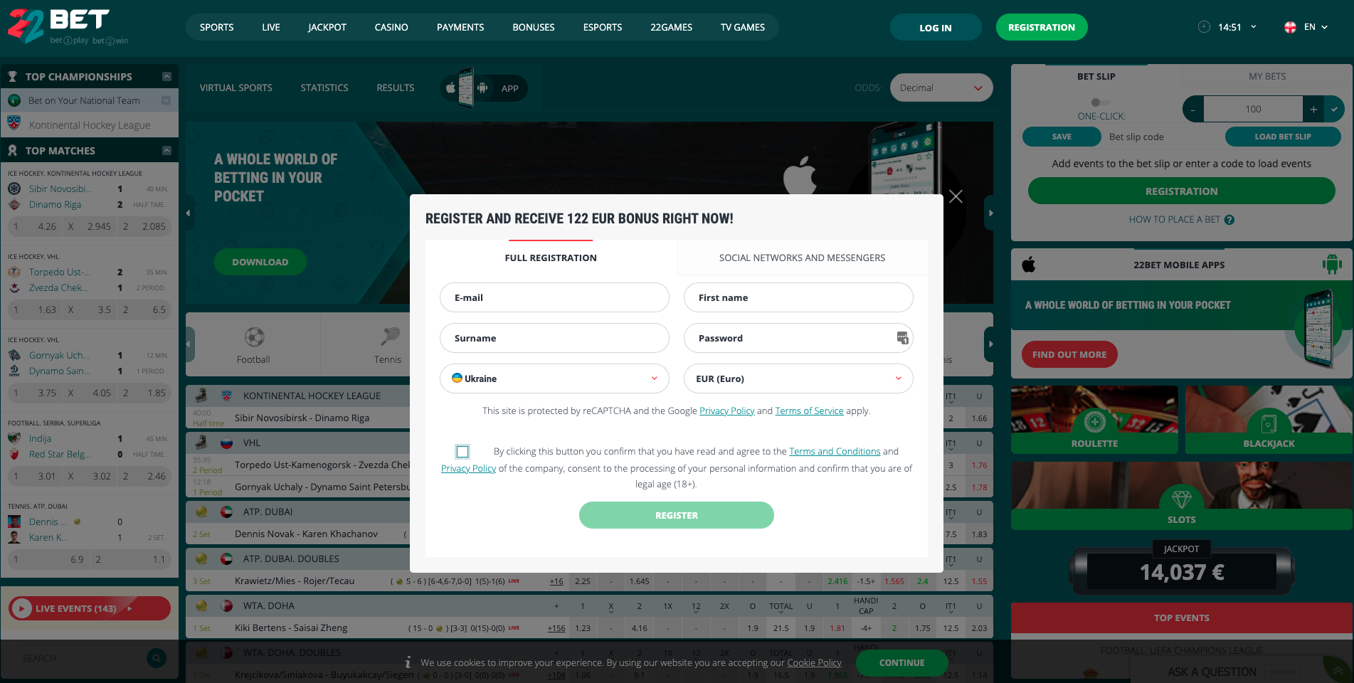
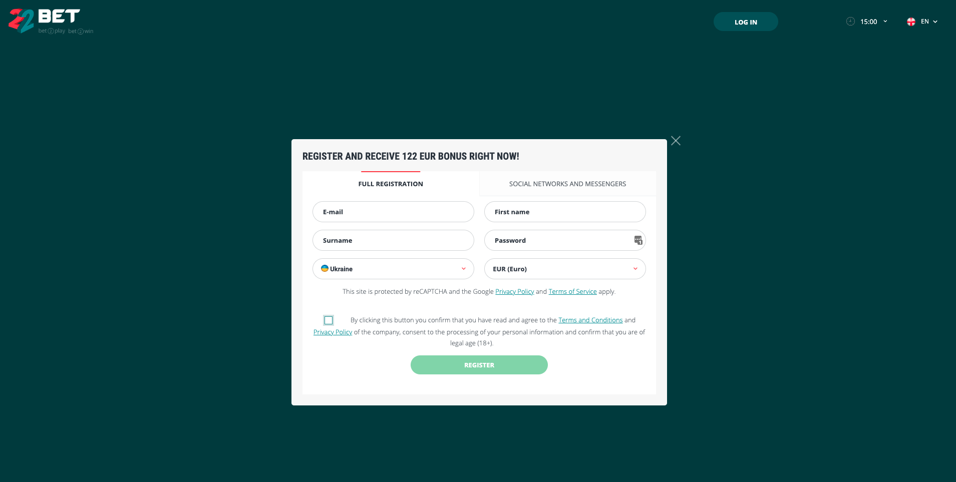
Registration form opens up in an overlay box but I'm still pretty distracted by all the moving elements in the background
#3 Tunneling
In crucial steps of the funnel you should remove all possible distraction and leave the user with only one possible way forward.
Lets see how an easy CSS change could remove all the distractions from the registration process by sliding to the slide below
Hiding top menu and increasing background opacity makes it a lot easier to focus on creating a new account
Let's see how easy it its to fill in your data though...
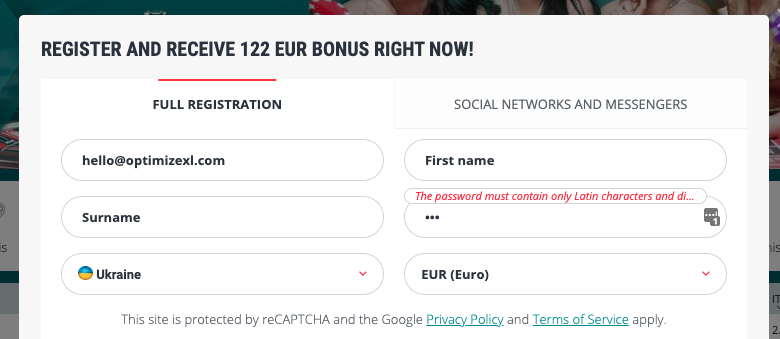
I've started filling in the registration form. I think I filled in my email correctly but it looks like there is a problem with my password...
By the way, that error message doesn't expand on hover. You're left with half of a sentence you can never see in full.
🤷
#4 Instant Feedback
Every action should have an instant feedback to reassure the user he is on the right path to complete the task.
In that case 22bet gives us feedback when there is an error but doesn't validate fields filled in correctly.
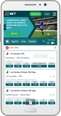
Ok, gotta run! I will finish the registration process on my phone though.
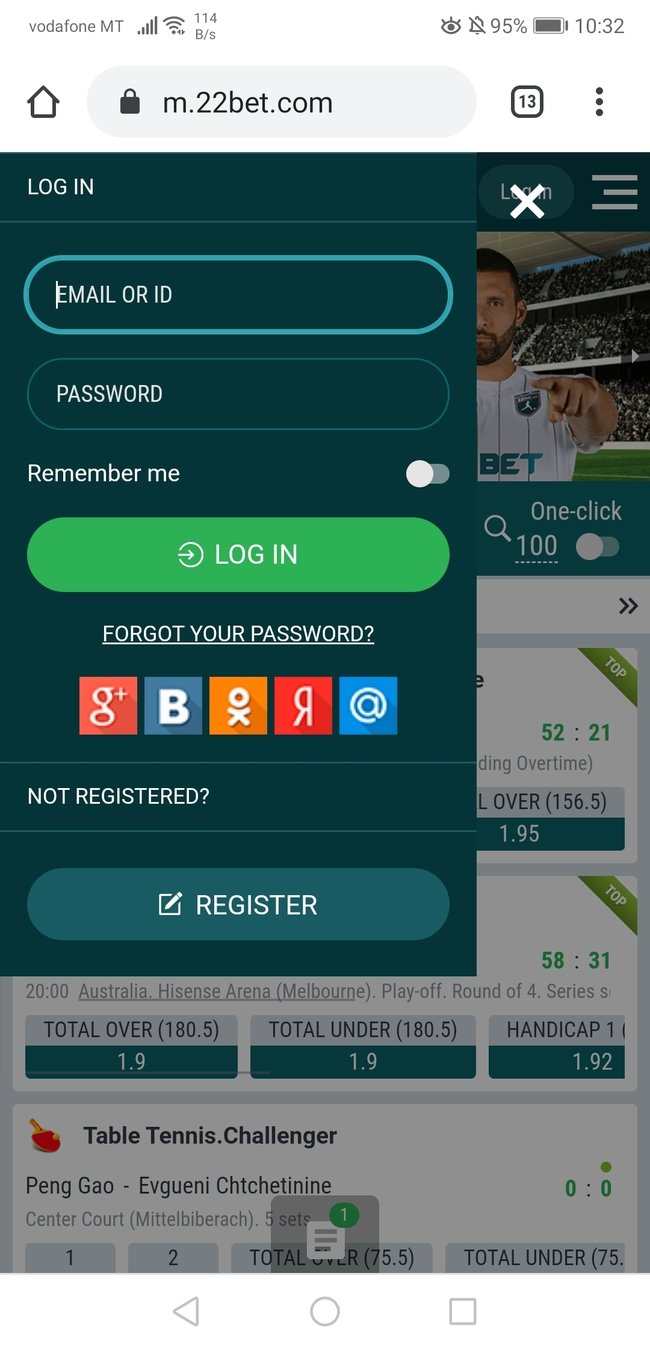
Let's find the login form..
It looks alright but when I was filling it in I had to use my left hand to be able to reach the form fields.
Not a big deal but it definitely didn't feel comfortable.

#5 The Thumb Zone
Most people operate a smartphone with their thumb.
Consider putting key elements in an easy to reach zone to remove any UX friction.
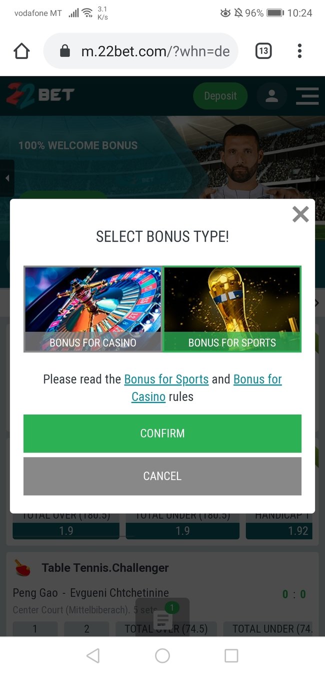
Right after my first login I see a popup saying I can get a bonus. Great!
But wait.. what is the bonus I'd be getting? Did I miss it before?
#6 Avoid Uncertainty
Uncertainty will make your users feel stupid. In a lot of cases the user will blame himself for missing something in the process.
Those negative feelings will transfer further down the funnel and ultimately reduce you conversion rate.
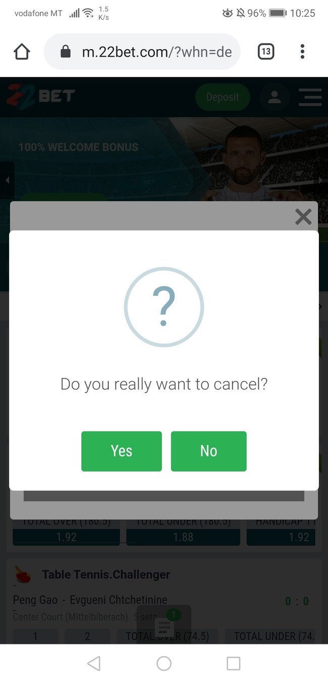
I decided not to take a bonus without even thinking about it.
This confirmation box stopped me in my tracks to reconsider my decision.
#7 Confirmation Dialog
Use a double confirmation dialog whenever you want to make sure the user doesn't automatically continues with a less desirable action.
Make sure not to overuse it, users can develop banner blindness very quickly.
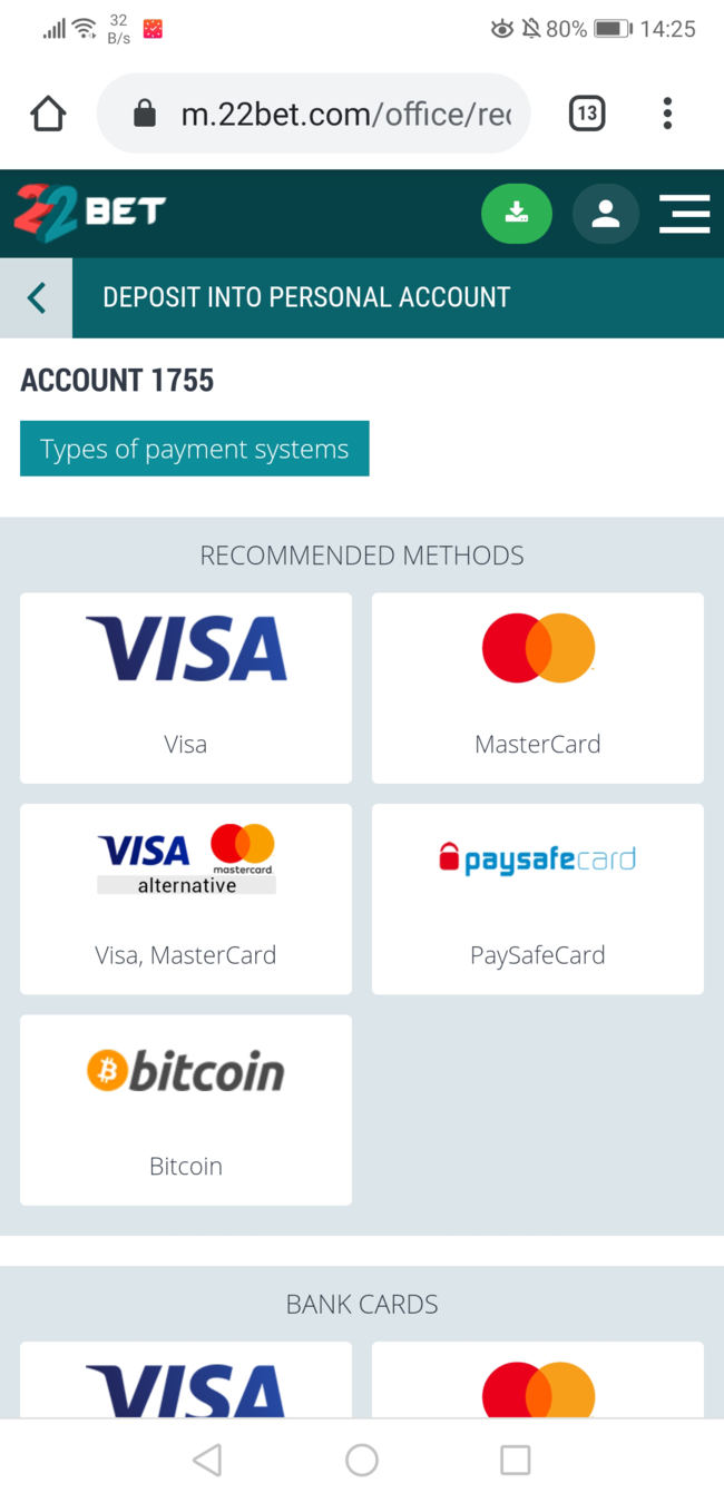
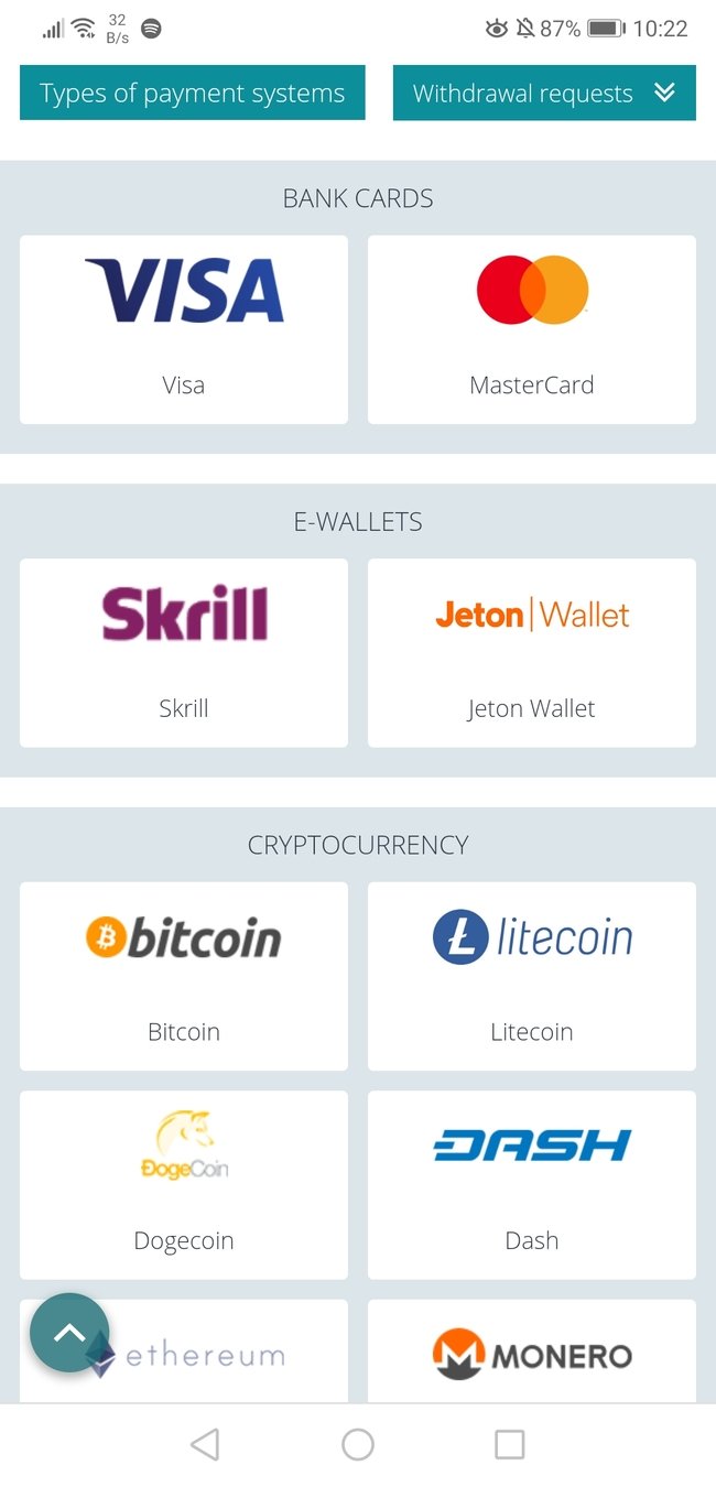
The deposit page is simple and straightforward. All I need from a deposit page to be completely honest.
I choose my favorite method and go ahead.
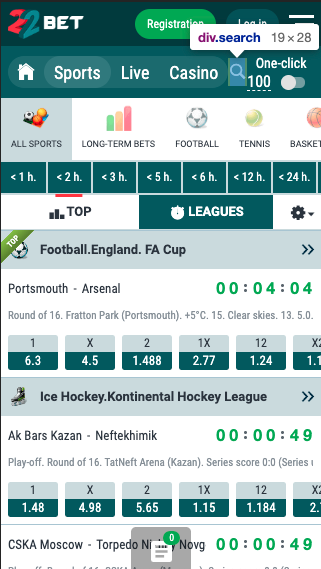
I went ahead to the 'sports' tab and tried to find the game I wanted to bet on.
List was neverending so I decided to use the search function.
When I tried to click the search icon I accidentally clicked the 'Casino' tab, on the second try I finally managed to open the search box.
#8 Web Accessibility
Before you even start your first AB test make sure your product is usable.
Click targets should be at least 44px by 44px to be easily clickable.
You can find out more about web accessibility at w3.org/wai/
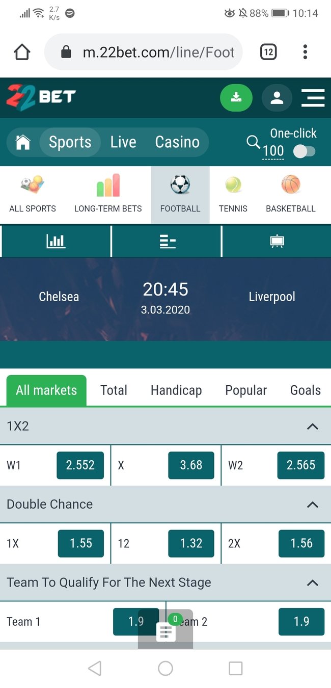
I'm finally on the the page I was looking for!
I can clearly see when the game is happening and after browsing a while I can understand different types of bets I can make.
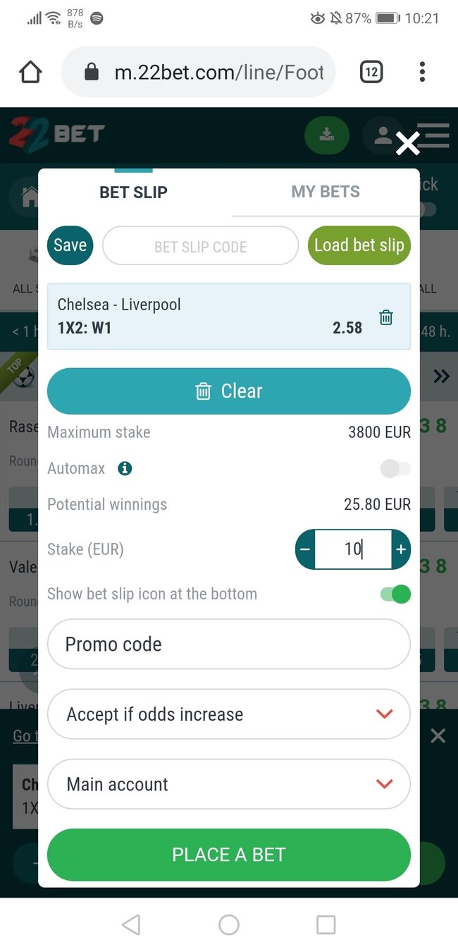
After I choose my first bet, bet-slip opens up as an overlay.
Design is coherent with the rest of the site so I already know what to click.
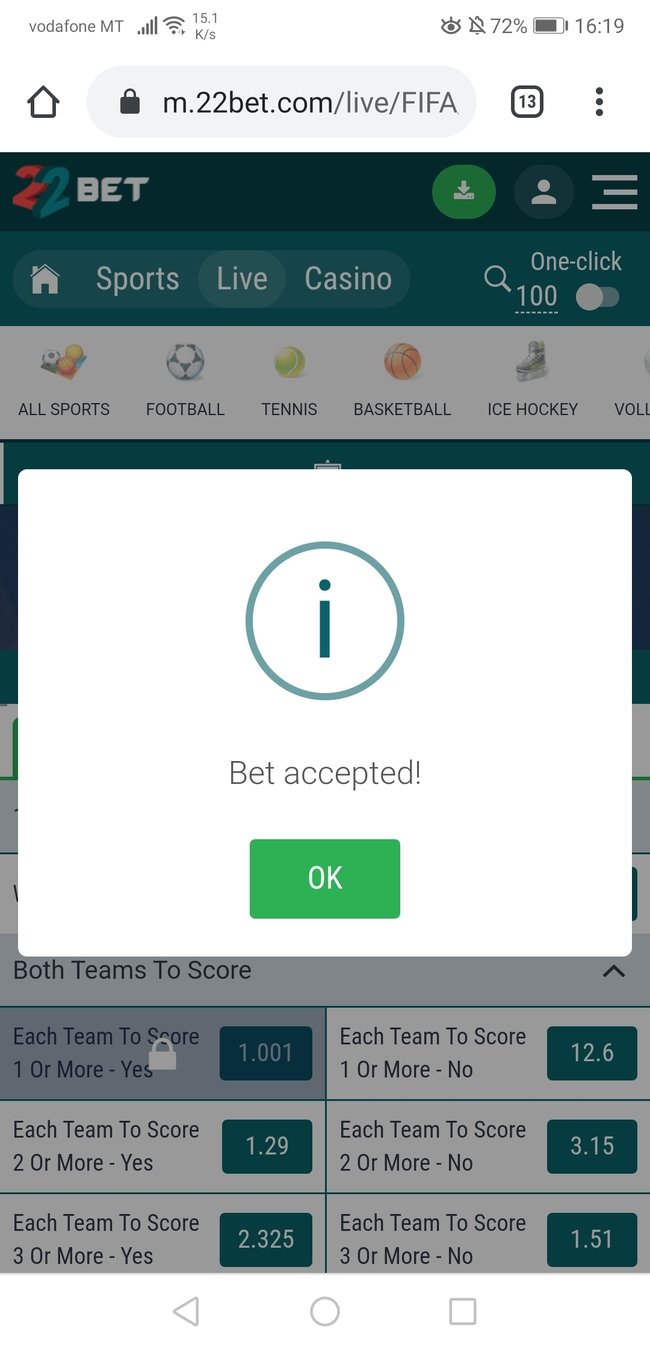
Done! My bet was accepted, there is nothing else to do but wait.
Although.. maybe I will play some of those casino games I've seen before
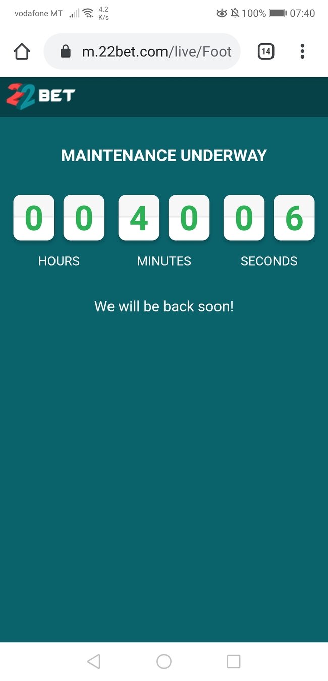
Ups! It looks like I won't be playing any games today.
At least I know when to comeback, this reassures me that this maintenance was a planned event.
#9 Error Pages
Make sure your error pages answer those four questions:
- What happened?
- Why it happened?
- When it will be resolved?
- What to do next?
No need for fancy graphics or clever jokes, all the user needs is to be in the know.
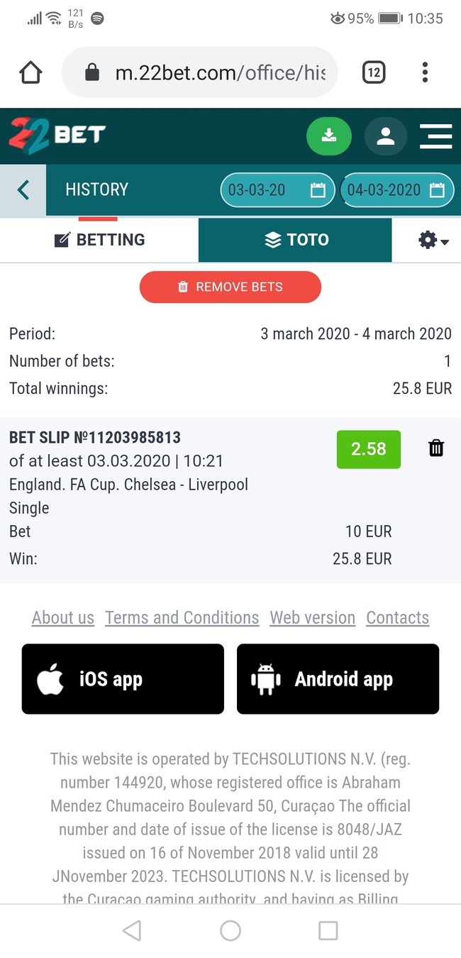
Next morning I've logged into my account to check the outcome of my bet.
There are no notifications on the homepage, where do I find my previous bets..?
Oh, there it is.. 'Betting History' tab.
Looks like I've won! Time to celebrate! 🎉
#10 Anticipatory Design
Delight your users by creating experiences that demand least effort and eliminate needles choices.
If a users logs in to the account after making just one bet show him the results on next login, if he bets on every single game of Liverpool suggest that bet to him when the next game comes.
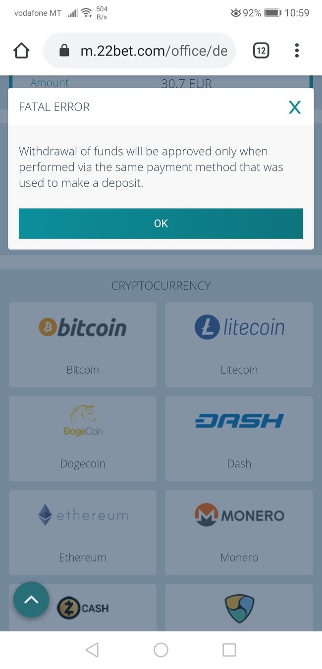
I had my fun it's time to withdraw my winnings now.
Withdrawal screen is very similar to deposit page so it's easy to navigate for me.
Oh no! A FATAL ERROR 😱
Uff, actually it's not that serious. I just need to choose a different withdrawal method.
#11 Error Messages
Error messages should not be scary. Avoid negative wording, never blame the user and skip the technical jargon.
Good error message will give clear reasons for the issue and directions on how to fix the problem.
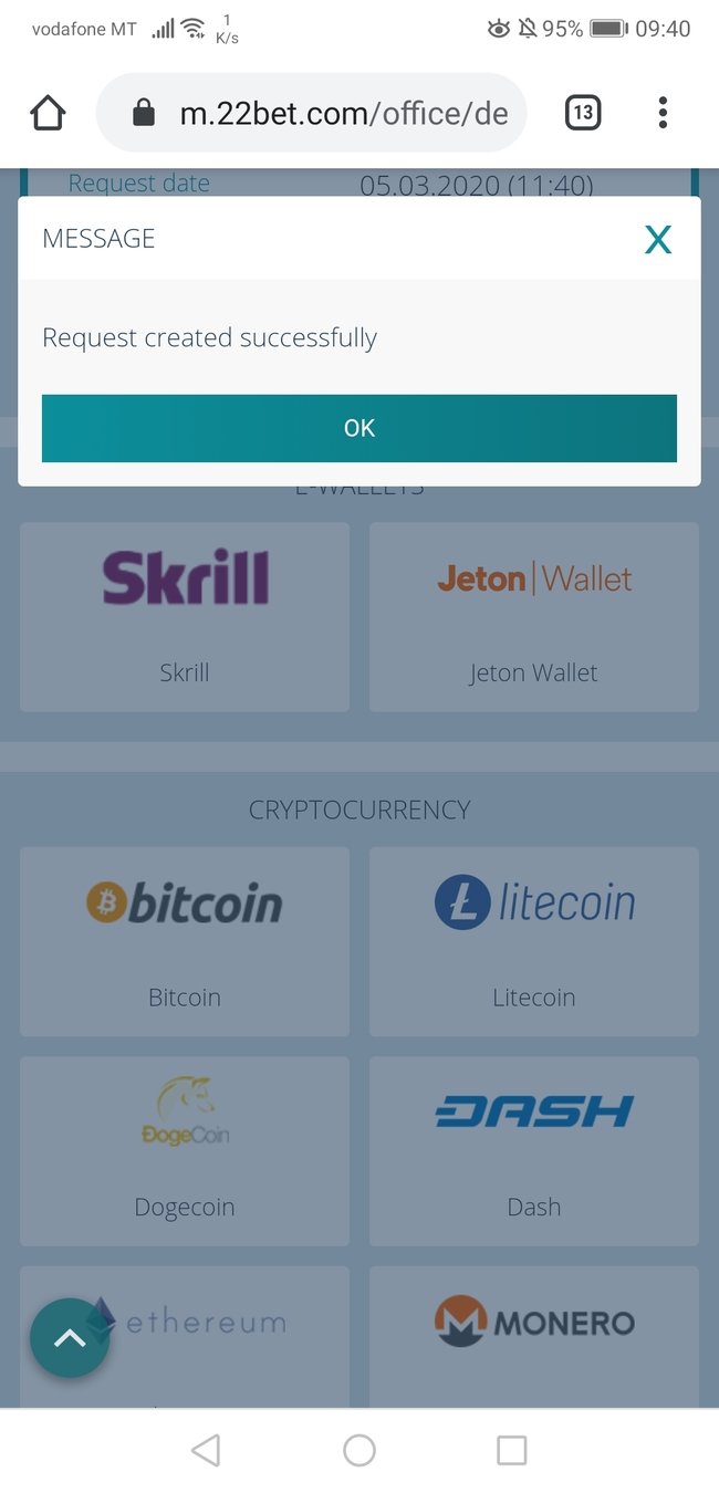
My withdrawal request was successfully created.
That will end my experience with 22bet.
Lets have a look at the summary of the whole 22bet funnel starting from the homepage and ending on the withdrawal process

Homepage was lacking visual salience and it took me a while to even find the registration button.
Registration page had provided me with some confusing feedback when I made a mistake in one of the fields.
Next, I was presented with a bonus of an unknown value which made me feel like I missed something on the previous step.
Deposit page was simple and straight to the point.
Well done!
Finding the game I wanted to bet on was hard because of accessibility issues and no tap friendly icons.
Finding my last bet results was not very intuitive and I felt like 22bet didn't celebrate the win with me 😞
Withdrawal could have been a pleasant experience if not the FATAL ERROR prompt which for a second made me think I won't be able to make a withdrawal at all!
What have we learned?
1. Use ___________________ to keep visitors focused
2. Add _____________ to increase registration conversion rate
3. Use instant feedback to ______________________
____________________
4. Avoid _______________ to empower your users
5. Apply _________________________ to increase user satisfaction score
visual salience
tunneling
increase forms
conversion rate
uncertainty
anticipatory design
Want to learn more?
Join our newsletter to receive bite-sized CRO & UX tips tailored to igaming industry.
In our newsletter group we regularly share:
- actionable CRO insights
- private case studies
- industry research
High Five - You Made it!
22bet Case Study
By Artur
22bet Case Study
22bet conversion and UX case study by optimizeXL.
