Grid is fun!
Your layouts will never be the same again
I am Praveen

@praveenpuglia


" Your layouts will never be the same again! "
- That's a bold claim, isn't it?
- The pain of building layouts on Web
- Look at the print media!
The web was simple

...and it had to be!
Table Layouts!


People wanted to port layouts from magazines to the web.
Tables weren't good enough!
- Slow
- Hard to change
- Did you say semantics?
- Let's add another column!
Let's Float!

Floats were amazing!
- Became CSS Expert
- Cracked the coding interview...
- Got the job!
🤑🤑🤑
Trial - 1 : Code
<header class="page-header"></header>

<article class="main">
    <h1>Hello World!</h1>
</article>

<aside class="sidebar">
    Ads! 🎉
</aside>

<footer class="page-footer"></footer>
body {
width: 960px;
margin: auto;
}
.main {
float: left;
width: 600px;
}
.sidebar {
float: left;
width: 360px
}Trial - 1

- We have the content overlapping with the footer
- The height of main and sidebar aren't in sync.
- What if we need gutter?
Trial - 2 : Code
.page-footer {
  clear: both;
}
.sidebar {
margin-left: 20px;
width: 340px;
min-height: 400px;
}
.main {
min-height: 400px;
}Trial - 2
Now we need some padding and borders!

Trial -3 : Code
.main {
  width: 572px; /* 600 - (4+4) - 20 */
  border: 4px solid;
  padding: 10px;
}

.sidebar {
  width: 312px; /* 360 - 20 - (4+4) - 20*/
  margin-left: 20px;
  border: 4px solid;
  padding: 10px;
}
Trial -3
We need "tiny" adjustments
The border is too thick. Let's make it 2px.
We gotta add more padding. 20px.
Hey! The sidebar and the main content still don't match.
F**k 😡
ooh! Responsive!

http://brolik.com/blog/wp-content/uploads/2013/05/BRO_ResponsiveDesign_Main2.png


Problem?
- We still leverage markup to describe layout.
- Made us less creative.
- Still no CSS way!

The Evolution
http://jensimmons.com/presentation/designing-grid

Flexbox - Layout : Code
<header class="page-header"></header>
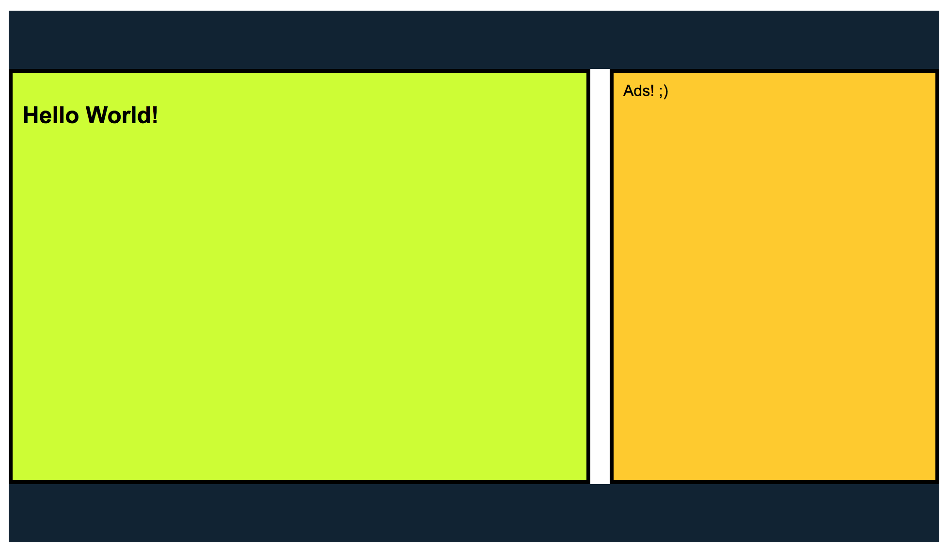
<div class="wrapper">
<article class="main">
<h1>Hello World!</h1>
...
</article>
<aside class="sidebar">
Ads! ;)
</aside>
</div>
<footer class="page-footer"></footer>.wrapper {
display: flex;
}
.main {
flex: 1;
}
.sidebar {
width: 360px;
}Flexbox - Layout

Neat! Right? Wait!
- One dimensional
- Flexbugs
- Gutters?
- Spanning rows?
- Specs & Implementation Fragmentation
deck
By Praveen Puglia


