


Fanis Prodromou
I am a Senior Software Engineer with a passion for Front End development with Angular. I have developed vast experience in code quality, application architecture, and application performance.
The Angularians
@prodromouf
https://blog.profanis.me
/prodromouf
Fanis Prodromou
aka profanis
"In computer science, a library is a collection of non-volatile resources"
Every component should have responsibility for ONE and ONLY one part of the application
<div class="select-field" (click)="isOpen = true">
{{selectedItem}} <span class="select-arrow">⌄</span>
</div>
<div class="select-list-wrapper" *ngIf="isOpen">
<ul class="select-list">
<li
*ngFor="let country of countries; let idx = index"
class="select-item"
[class.is-selected]="selectedItem === country.value"
(click)="selectedItem = country.value; isOpen = false"
>
{{ country.value }}
</li>
</ul>
</div><div class="select-field" (click)="isOpen = true">
<ng-container *ngIf="!selectedItem">
Select
</ng-container>
<ng-container *ngIf="selectedItem">
{{selectedItem.value}}
</ng-container>
<span class="select-arrow">⌄</span>
</div>
<div class="select-list-wrapper" *ngIf="isOpen">
<ul class="select-list">
<li
*ngFor="let item of items;"
class="select-item"
[class.is-selected]="selectedItem === item"
(click)="selectItem(item)"
>
{{ item.value }}
</li>
</ul>
</div>@Component({
selector: 'app-select',
templateUrl: './select.component.html',
styleUrls: ['./select.component.scss'],
changeDetection: ChangeDetectionStrategy.OnPush
})
export class SelectComponent {
@Input() items: {[key:string]: string}[]
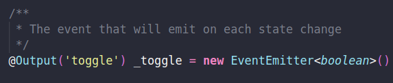
@Output() select = new EventEmitter<{[key:string]: string}>()
isOpen = false
selectedItem: any
constructor(private elementRef: ElementRef) { }
selectItem(item: {[key:string]: string}) {
this.selectedItem = item;
this.isOpen = false
this.select.emit(item)
}
@HostListener('document:click', ['$event'])
private closeOnDocumentClick(event: MouseEvent) {
if (!this.elementRef.nativeElement.contains(event.target)) {
this.isOpen = false
}
}
}Bootstrap
Material
Custom Library
Maintenability
Extensibility
Tailor-made
It sparks joy
Rapid Development*
Time consuming
Management do not get it
Ready Library
Plug and Play (?)
Rapid development
Learning curve
Hard to extend
It doesn't spark joy
Focus on business
it's up to you
it's up to you
it's up to you
it's up to you
it's up to you
custom library
custom library
custom library
custom library
custom library
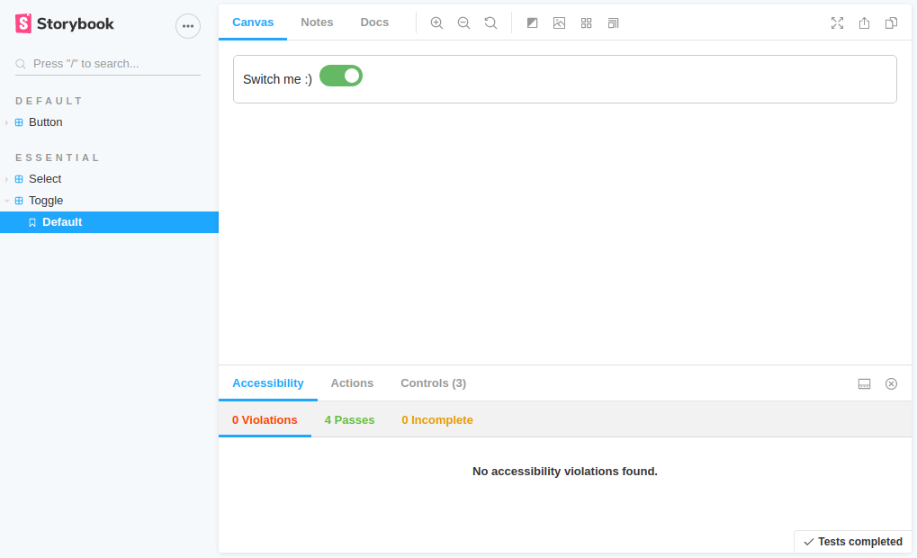
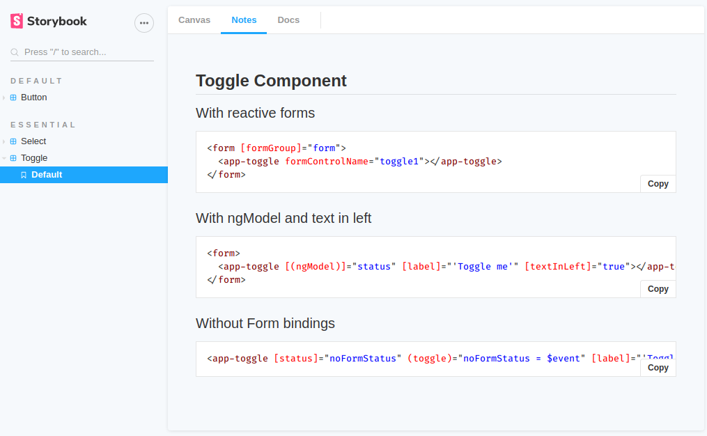
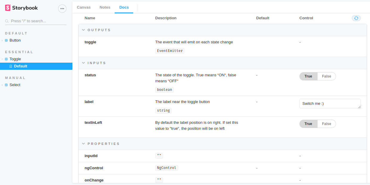
UI Component explorer
library
projects
src
storybook
components
directives
pipes
styles
...
src
your root dir of your main App
ng new yourAppNamesrc
projects
the workspace directory of your App
src
projects
library
Your components, directives, etc live here
library
ng generate library my-libsrc
projects
library
storybook
UI component explorer
storybook
ng generate application ui-explorer
npx sb init
# move the stories directory in ui-explorer/src
# the .storybook/main.js have to point to projects/ui-explorer

npm i -D @storybook/addon-notes

# and then add in .storybook/main.js

'addons': [
    '@storybook/addon-links',
    '@storybook/addon-essentials',
    '@storybook/addon-controls',
    '@storybook/addon-notes/register'
  ]
src
projects
library
storybook
components
Move all the components from src/shared
src
projects
library
storybook
components
All new shared components belong here from now on. Just ng g c name
Components' menu
Details of a selected component
Interact with the selected component
Text
* markdown syntax
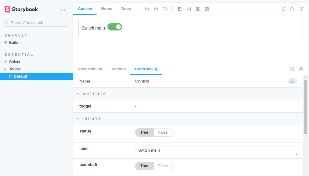
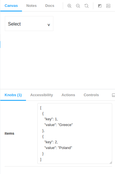
@Input() & the knobs
import {
  Component, EventEmitter, Input, Output
} from '@angular/core';

@Component({...})
export class SelectComponent {

  @Input() items: {[key:string]: string}[]
  @Output() select = new EventEmitter()

  isOpen: boolean = false
  selectedItem: {[key:string]: string}

}
Build UI components in isolation
Create components independently
Open-source product
- without app deps
¡ A Great Way To Document
Your Components !
Do I Really Need This?
Junior developer
now
6 months later...
Thank you !!
The Angularians
@prodromouf
https://blog.profanis.me
/prodromouf
By Fanis Prodromou


