UI and Interactions
Audi Vision's experience is strongly based on the the use of augmented reality through the use of the camera.
In a typical scenario, when using a mobile phone, the user will hold with one hand the device while browsing the brochure with the other hand.
The scenario
changes
when using a tablet
: Even with a light / small device (tested on iPad Air) the user will support the weight with 2 hands.
The most common use, however, is on mobile phone (one hand typical), and my suggestion is to design a menu that can be used without loosing grip and with one hand only.
Current UI
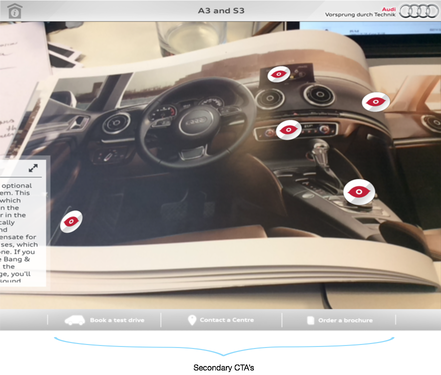
In the current Audi-vision UI, the menu has been designed to accomodate:
navigation, branding
and
secondary functions.
The design also relies on the use of an
header
and
a footer/menu, that take away ~15% of the viewport. The idea is to remove clutter and maximise the viewing area.

Branding and navigation
If the augmented-reality experience, from the UI perspective, can be maximised by removing clutter and maximising the camera view, two challenges remain: Keep the branding and design a good navigation.
I tested the app with a limited number of "users" (some friends and a random person on a bus :) ) and I noticed a continuos pattern: They where tapping the logo expecting something.
So, we get the idea that they perceive the branding, they familiarise with the AUDI logo and we can assume that they have some expectations after tapping. The idea for a re-designed menu came after noticing this pattern.
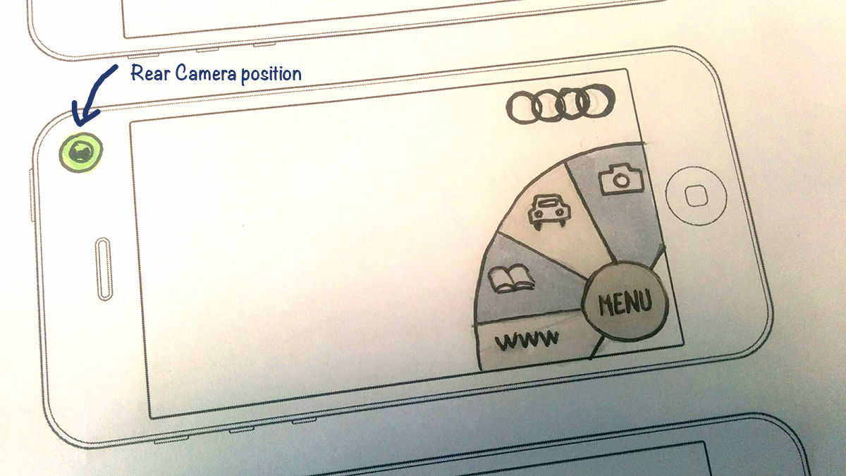
Take a "path-style" menu, blend it with the logo. You will probably obtain a flyout menu around the logo:
flyout (concept)
 Works well with one hand.
Motion provides feedback and gains attention of the user.
Hides secondary (un-frequent) actions behind one tap.

Alternatives
Alternatives can be designed outside the logo-area.
An explicit "menu" button can be used and can be placed in various locations (middle, bottom-right, bottom-left).
Top-left, middle-left, position should be avoided because the hands can interfere with the built-in camera that is placed on the rear top-left area (iOS) and on the middle-left area of most android devices.

Progress
Further improvements on the user experience will be made on the basic interactions mainly defined as: locating, opening and dismissing trigger-points as well as the interaction with the forms.
Thank you
Robert
audi-vision-ux
By rdpi
audi-vision-ux
- 480


