Ria Carmin
Portfolio
Looking at work in UX Engineering and Design Systems

Design Thinking
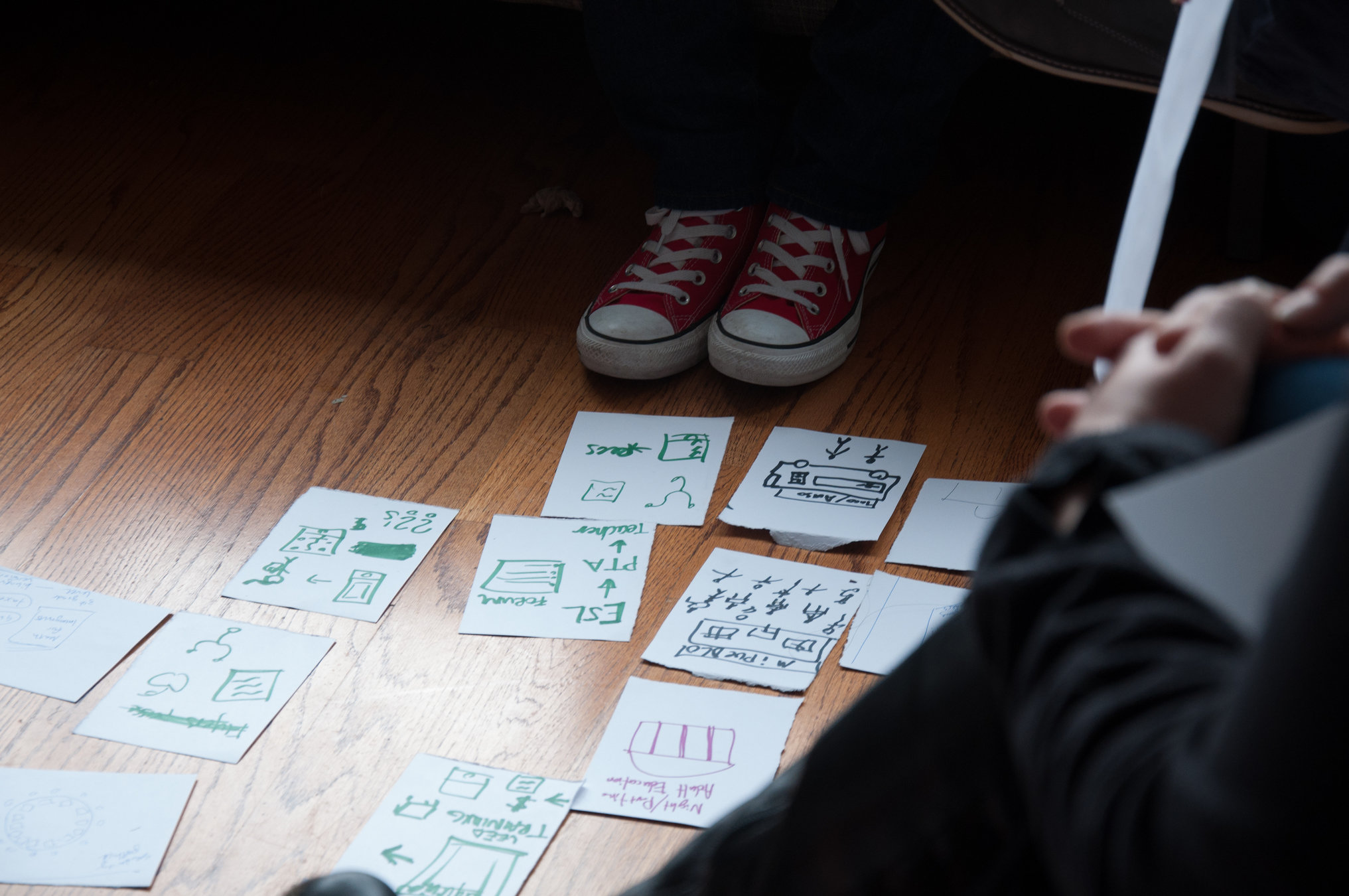
Finding focus though collaborative exploration.
1
Visual Design
Introducing graphic design rules to UI code.
2
3
Design Systems
Architecting scalable user interfaces.


Timeline
2013
DESIGN THINKING
VISUAL DESIGN
DESIGN SYSTEMS
2018
EquitySim
2020

Hopin
now
2015

FWD.us
Design Thinking
01
Finding focus though collaborative exploration.


Designing for social change.
Objective
Facilitate a creative space for people from different expert areas to identify problem areas and find solutions .
Leading design thinking workshops.
Methodology
Warm up
Explore
Diverge
Converge
Prototype
00
01
02
03
04
resource
Designing for learning.
Metric
What does it take to bring someone to be confident to invest their own money? Time to confidence.
Maximizing impact by finding the path to our users’ success.
Problem
Novice to Pro:
Build skill and confidence.
Deconstructing trading experience for beginners.
Game design and testing. Adding real-time data to the learning.
Bringing everyone in.


Visual Design
02
Breaking barriers of static.
Vertical Rhythm
Creating flow with 8pt vertical rhythm grid
Problem
On the engineering side, vertical rhythm is a lot of math combined with unreliable browser behavior.
Solution
Global reset
Space helper
01
02
calcSpace
02.1
withSpace
02.2
Component

Typography
Color
Mix all the things.
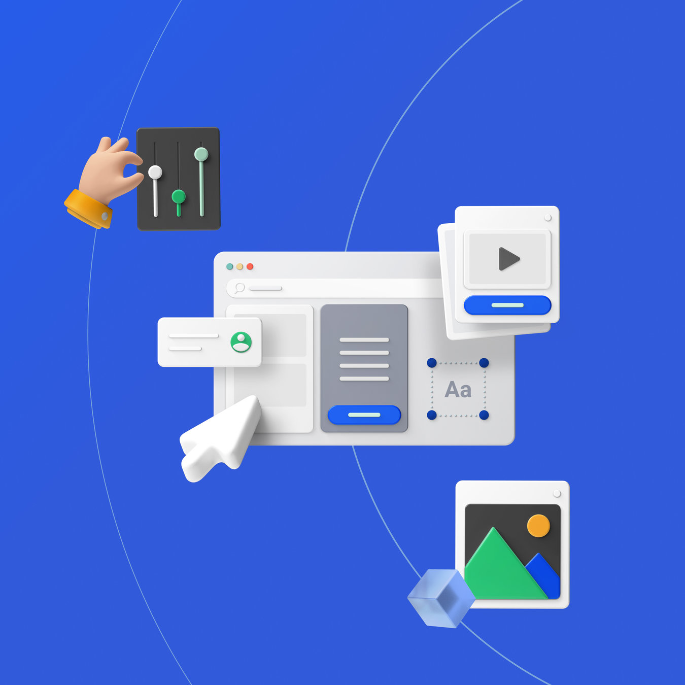
Design Systems
03
Architecting scalable user interfaces.
Process
Audit
Map all the components and where they would fall in the hierarchy.
USAGE
PURPOSE
Ubiquitous
Unique
Broad
Narrow
Form
Content
Attention
Layout
Navigation
…
Stack
Storybook
Figma
React
Documentation
Design kit
Library
Architecture
Symbols
Blocks
Globals
Components
01
02
03
04
Symbols
— brand primitives.
// Layout
export const MOBILE_MAX = '560px';
export const TABLET_MIN = '561px';
export const TABLET_MAX = '1024px';
export const DESKTOP_MIN = '1025px';


// Colors
export const UTILITY: ColorUtility = {
  WARN: ORANGE.DEFAULT,
  ACTION: THEME.PRIMARY,
  ERROR: RED.DEFAULT,
  SUCCESS: GREEN.DEFAULT,
};

// Line
export const RADIUS = {
  SMALL: RADIUS_SM,
  DEFAULT: RADIUS_MD,
  MEDIUM: RADIUS_MD,
  LARGE: RADIUS_LG,
  XLARGE: RADIUS_XL,
  ROUND: RADIUS_ROUND,
};
Blocks
— language of the interface.
// isClickable

import { css } from 'styled-components';

export const isClickable = css`
  ${area}

  &:hover {
    background-color: ${({ theme }) =>
      getFromTheme('COLOR.GREY["200"]', theme)};
  }
`;
Globals
— the canvas.
import { createGlobalStyle } from 'styled-components';

const { body } = TYPOGRAPHY;
const { link } = INTERACTIVE;
const { field, hasErrors } = FORM;

export const GlobalStyles = createGlobalStyle<{ theme: Symbols }>`
  *,
  *:before,
  *:after {
    box-sizing: border-box;
  }

  html {
    margin: 0;
    padding: 0;
    text-size-adjust: 100%;
    -webkit-font-smoothing: antialiased;
    -moz-osx-font-smoothing: grayscale;
  }

  body {
    margin: 0;
    padding: 0;
    ${body}
    color: ${({ theme }) => getFromTheme('COLOR.GREY.DARK', theme)};
  }
`
Components
— collection of patterns.
Standards
themable
i18n / l10n support
a11y
Current State
> 70 components and helpers
~80% adoption
used in various setups
governance system that supports ~100 member team
The end.

portfolio
By Ria Carmin


