Stationary
Round 2
Revised items
- Letterhead with envelope
- General notecards with envelope
- New season announcement postcard
- Appointment reminder postcard
- Old Farm Executive Park map
First things first
About the envelopes
Printing limitations
- Printing to edges not available
- If a printer can, it's extremely costly
- Best to avoid deviating from USPS standards
So, sadly.....
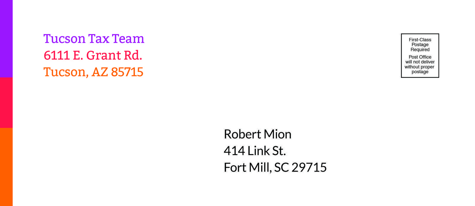
This won't work
New challenge
Find a way to incorporate the 3-color bar into the letterhead and all other elements, given that we can't use it on the envelopes
Challenge accepted
Letterhead
Now more universal, and still personalizable
See below for new animation, showing envelope, back and front of new letterhead design
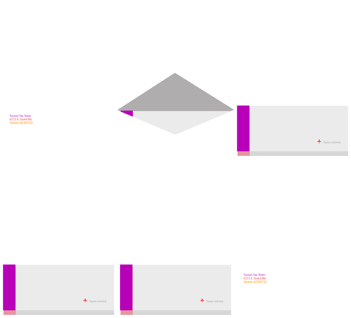
A closer look
New envelope
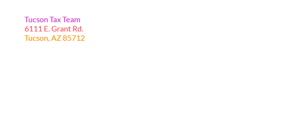
Out of the envelope
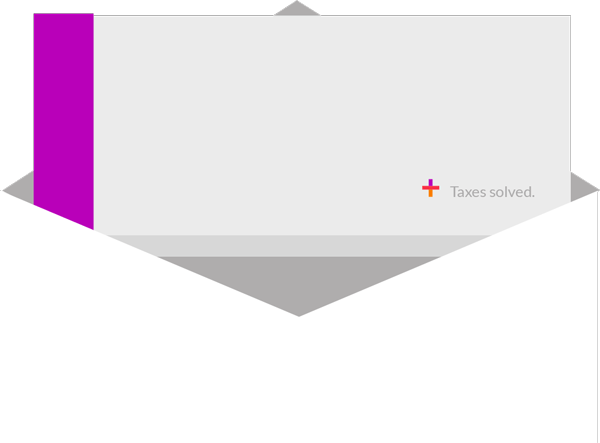
The back
Note: grey areas indicate where the folds are
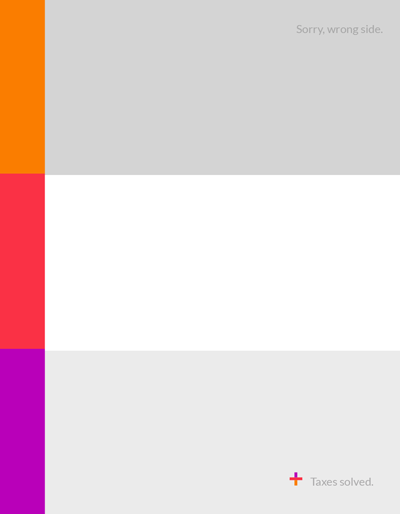
- 3-color bar now incorporated to letterhead (gorgeous, right?)
- Tagline is first thing recipients see
- Kept the 'sorry, wrong side' line as feedback for people who open wrong
The front
Note: the faded color bar indicates transparency
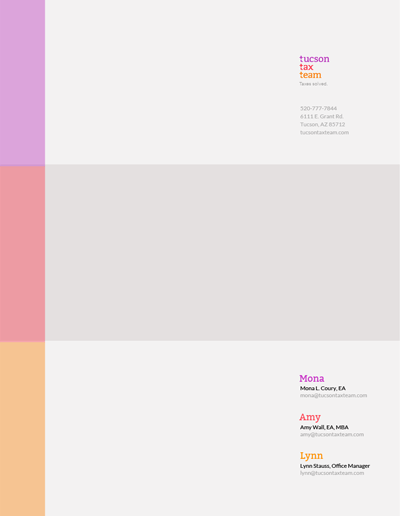
- Logo and location information appear in top right
- Added name, title and email address for each of you to bottom right
- This information will appear on each page
- Still easy to print from in-house Word doc on pre-printed letterhead
A huge improvement
Let's not stop there!
General notecards
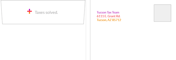
Modified envelope
Back
Front
Quick explanation
- Still no color bar, but we know why now
- Same '+' and tagline lock-up that now appears on the letterhead
- Return address is now in the logo's respective colors
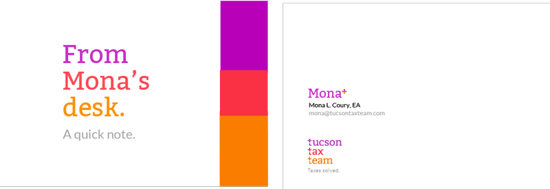
Mona's card
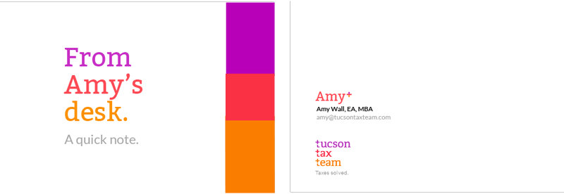
Amy's card
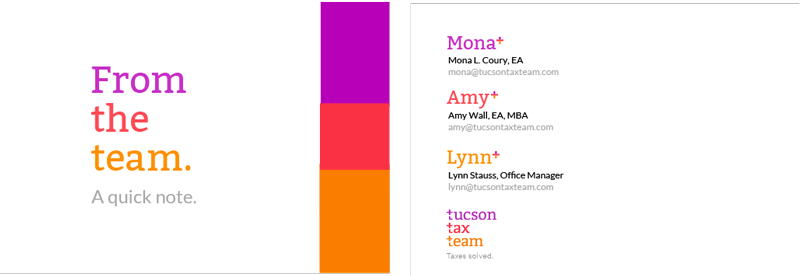
Office's card
New season announcent card
Revised option
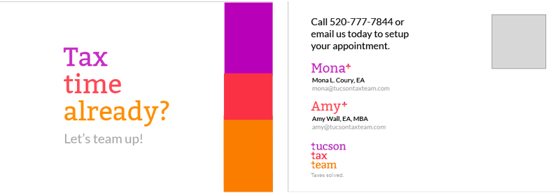
Quick explanation
- Updated front includes perfect helper text
(Let's team up!) - Removed map from back, as it is not relevant at this stage of the conversation
- Back includes call to action with Mona and Amy's email addresses and logo
Revised alternative
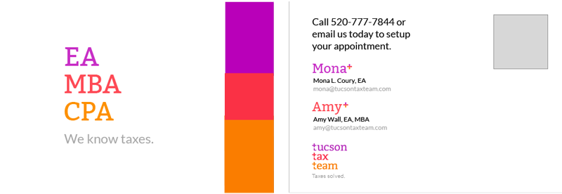
Only concern
- I wanted to confirm wether either of you are CPAs, and wether you wanted to advertise that
- If yes to the above, this seems like a great alternative solution to also have printed
Appointment reminder
Revised option
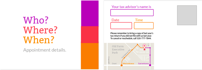
Close-up of map coming up in a sec
Quick explanation
- Revised order of WWW to flow better
- Colors of WWW on front directly relate to fields on back (purple for Who, orange for When, red on map for Where)
- Logo does not appear, as it is not necessary for this part of the client conversation (they know who you are, directions are more important given the limited space)
New map
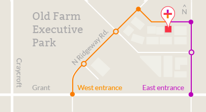
Points of interest
- Zoomed in as far as possible, while still including important cross-streets and surrounding buildings
- Your location is still clearly marked, especially which of the 3 connected buildings you are in
- Both routes from East and West entrances clearly marked, with circles indicating available turns
- Brand colors incorporated to help deliver message
And there you have it
A huge improvement
- Some fine-tuning of language
- An overhaul of the map
- Some layout adjustments given printing limitations
But overall, a much better client message
As always, let me know what you think
stationary-2
By rmion
stationary-2
- 496

