Refined Brand Identity for Tri-Square Contracting
PROPOSAL
Values
Prelude
Core business values
- Dedicated company
- Partner with team of talented builders and craftsmen
- Provide beautiful living spaces and an exceptional building process
- Add superior value to client properties
- Offer better communication, better management, and better quality
"The final result will be a newly functional space with the character that you choose"
- Tri-Square is a neutral party, the client provides the character
- Tri-Square provides domain expertise, quality craftsmanship, and reliable scheduling and pricing.
In other words:
In a few words...
- Quality
- Value
- Craftsmanship
- Timeliness
Analysis
Introduction
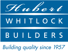
Current Logo
Small
Huge
Pros
- Features eponymous tool embedded in logotype
- Literal representation of industry tool grants immediate understanding
- Typography is legible, boldness conveys confidence
Cons
- Inclusion of try-square artwork makes logotype incredibly complex
- Typeface features characters with imprecise angles, contrary to business values
- Static, not flexible within larger brand identity
The Competition

More Competition
Brand Goals
- Update logotype to better compete in the crowded Charlotte design/build & remodeling industry
- Maintain company values of superior quality, craftsmanship and customer service
- Leverage try-square iconography to further convey company values
Now
New
???
Our brilliant idea
It's so simple. And so spot-on.
Inspiration
The Mark
Flexibility
1
2
3
Inspiration
1
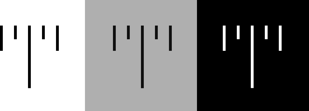
Your tool
Try-square used to calculate and mark precise measurements
Precision
Using the ruler notches to take precise measurements

Zooming in
For a closer look at the ruler's notches

Simplifying
Removing the top edge line

Simplifying
Removing the numbers
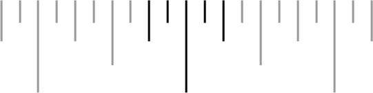
Simplifying
Centralizing our focus
Did you see?
See next slide for animation
That's it...
The Mark
2

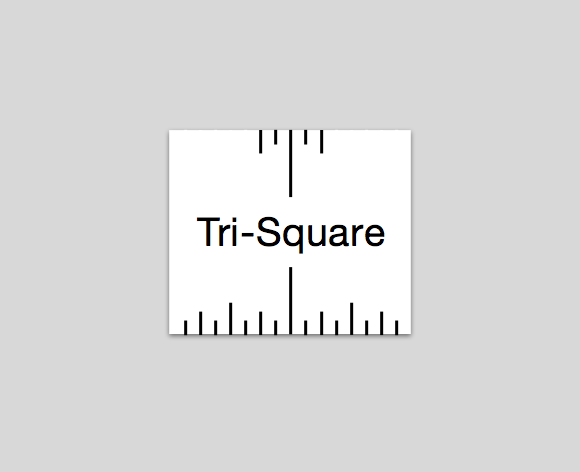
What is it?
- The letter 'T', for Tri-Square
- Made from the very lines that your contractors utilize for precise, quality measurements
- It symbolizes precision, consistency and reliability
- It is the basis for a flexible identity system that hinges upon the markings of a try-square.
Perfect...to a 'T'
Small
Huge
Normal
Reversed
Steel Grey
Works in any environment
What about the business name?
How will that lock up with the new 'T' mark?
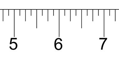
Remember our ruler?
Here's the 'T'...

...and here's Tri-Square
just like the numbers on the ruler
Why like that?
- To match the lock-up as seen on try-squares
- Using Helvetica typeface to match line-weights of 'T' with wordmark
- Helvetica is a neutral, precisely designed typeface
- This matches the company values to be a neutral but precise partner in envisioning the client's dream with each project
- Simple
- Precise
- Memorable
Flexibility
3
The Business Card
- Extend the brand identity
- Leverage the 'T' ruler lines
- Provide added value to clients
- Features brand mark and name
- Serves as 2-inch ruler
- Becomes a fun on-site tool and functional leave-behind for the client
Imagine other applications
- Vehicle signage
- Letterhead
- Project materials
Mission accomplished
- Update logotype to better compete in the crowded Charlotte Contractors industry
- Maintain company values of superior quality, craftsmanship and reliable service
- Leverage try-square iconography to further convey company values
Now
New
Simple. Precise...
Memorable.
trisquare
By rmion