Finalizing
the new logo
Where were we?
Oh yes...
Current version below

Challenges
- Improve legibility of initial 't' in each word
- Keep the '+' sign in tact
- Make all 't's identical since they repeat vertically
- Choose less generic typeface for logo and tagline that compliment each other

Let's get to fixing! >>
Trying to make the
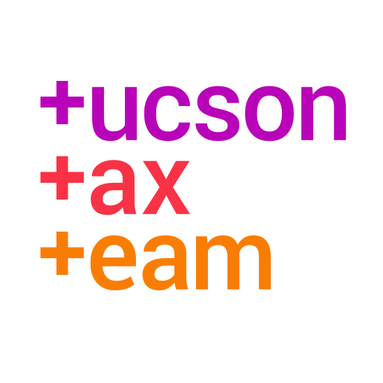
'+' as T work
- Capitalizing the 'T' in tucson, and the other two words
- Visually morphing 'T' into a '+' from top to bottom
- Aligning text so the '+' was to the left of each first letter
- and many more unfruitful attempts...
More below
Finding that perfect typeface
- Perfect balance of character and legibility
- Reads well at large and small sizes
- Includes expanded type family for use in marketing materials
An unlikely solution
So simple, too!

Summary below
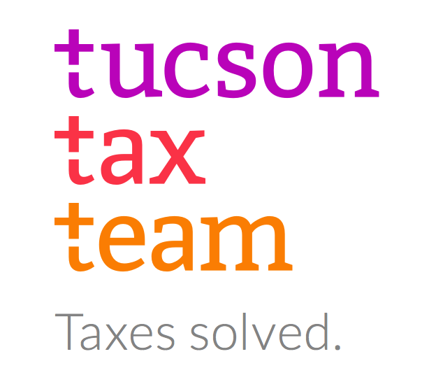
Solution
- 't' is instantly recognizable
- Overall greatly increased legibility of all three words
- + sign in tact but slightly more subtle
- + sign highlighted by the tagline, makes for rewarding 'ah-ha' moment

More below
Typeface
- Feels southwestern, but with modern twist
- Each character flows into the next seamlessly
- Customized letterforms create unique wordmark
- Overall inviting, friendly and professional letters
- Tagline is set in highly complementary typeface

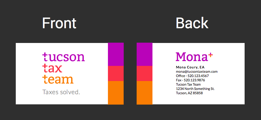
Business cards
Newly improved

Next steps
- Approve logo and business card design
- Provide necessary information and what order it should be placed on the card
One more thing >>
Bonus!


This new design makes it easy for the logo to be displayed horizontally if need be
- Paid ads, signage, etc.
Tucson Tax Team - Finalizing Brand Identity
By rmion
Tucson Tax Team - Finalizing Brand Identity
- 540


