
CODE //
EXPLORE //
CREATE //
@RakutenMKTG_UK
@codebarbrighton
@platf9rm
Download
starter-files
https://slides.com/codebarbrighton/deck/live
~ experimental css - CHROME ONLY ~
Positioning our First Elements
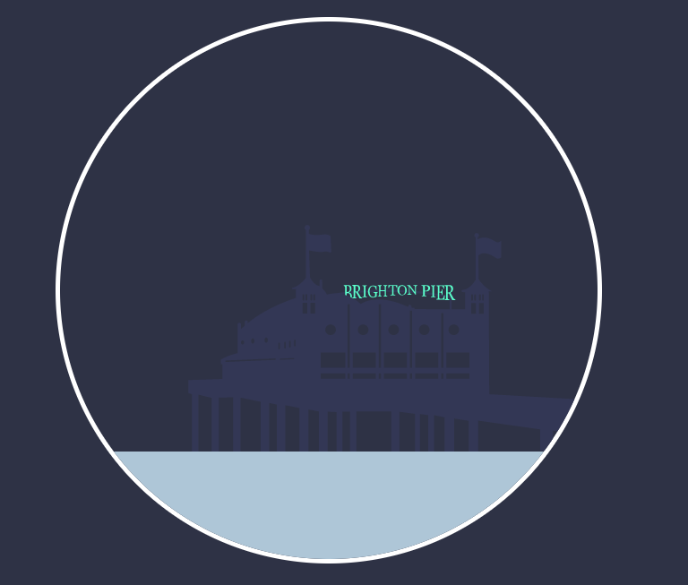
Starting off simple!
.sea {
   background: #b7cddc;
   position: absolute;
   height: 20%;
   width: 100%;
   top: 80%;
   z-index: 4;
   overflow: hidden;
}

#pier-container {
   position: absolute;
   width: 80%;
   bottom: 20%;
   right: 0;
   z-index: 3;
}
Making Our Clouds
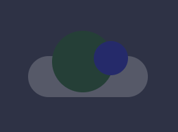
style the ::after psuedo element,
using the chrome inspector for placement
The ::before and ::after pseudo-elements can be used to insert some content before or after the content of an element. Or in our case, both.
.cloud {
   position: absolute;
   width: 175px;
   height: 60px;
   background: #F5F5F5;
   border-radius: 100px;
   opacity: 0.2;
}

#cloud1 {
   top: 38%;
   left: -2%;
}

#cloud2 {
   top: 24%;
   left: 73%;
}

.cloud::before {
   content: ' ';
   position: absolute;
   background: #F5F5F5;
   width: 90px;
   height: 90px;
   top: -70%;
   right: 30%;
   border-radius: 50%;
}
Before we move on...
Lets have a look at the box shadow property & Transforms
box-shadow: HORIZONTAL VERTICAL BLUR SIZE COLOR
comma separated.
animatable
The transform property applies a 2D or 3D transformation to an element. This property allows you to rotate, scale, move, skew, elements
Making the sun
( box-shadow: HORIZONTAL VERTICAL BLUR SIZE COLOR )
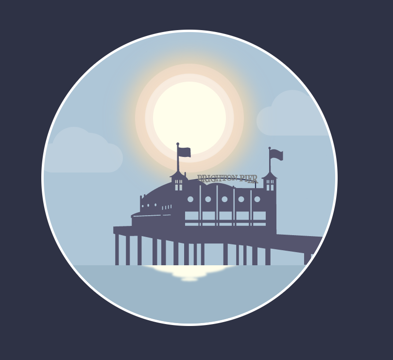
.sun {
    z-index: 1;
    position: absolute;
    top: 17%;
    left: 50%;
    width: 150px;
    height: 150px;
    margin-left: -75px;
    background: #FFFEEE;
    border-radius: 50%;
    box-shadow: 0 0 0 17px rgba(255, 255, 255, 0.42),
    0 0 0 37px rgba(252, 229, 215, 0.5),
    0 0 60px 60px rgba(255, 215, 155, 0.5),
    0 0 60px 37px rgba(255, 255, 255, 0.5);
}
Making The Night Scene
For the moon we're going to copy the sun's styling, tweak it, and add some craters.
Add the next two craters,
scale them up with transform:scale()
use the inspector to position.
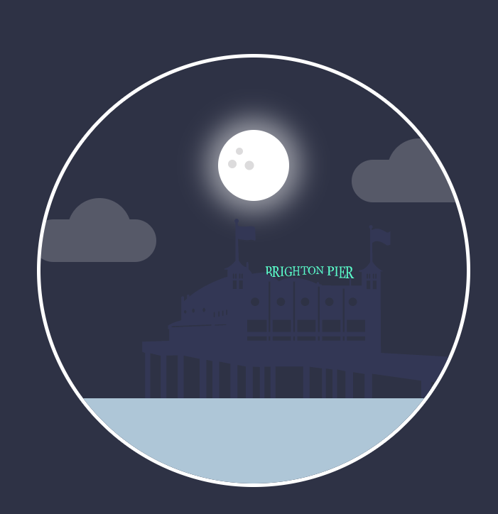
The :nth-child selector allows you to select one or more elements based on their source order
.crater {
    position: absolute;
    background: #E0E0E0;
    border-radius: 50%;
    width: 10%;
    height: 10%;
}

.moon .crater:nth-child(1) {
    top: 25%;
    left: 25%;
}
Making The Stars
The stars are going to be constructed with two pseudo elements rotated and transformed into a cross.
.star {
    position: absolute;
    width: 10px;
    height: 10px;
    top: 37%;
    left: 31%;
}

.star::before,
.star::after {
    content: '';
    position: absolute;
    width: 3px;
    height: 10px;
    background: #fff;
    border-radius: 50%;
    box-shadow: 0 0 6px 3px rgba(255, 255, 255, 0.15);
}

.star::after {
    transform: translate(-50%, -50%) rotate(90deg);
}

.star::before {
    transform: translate(-50%, -50%);
}

.star:nth-child(2) {
    top: 20%;
    left: 23%;
    transform: scale(1.4);
}
That's the lot.
Awesome.
Now.... Animation.
Animating with CSS
CSS animations are made up of two parts.
Keyframes - define the stages and styles of the animation.
Animation Properties - assign the keyframes to a specific CSS element and define how it's animated
Animation
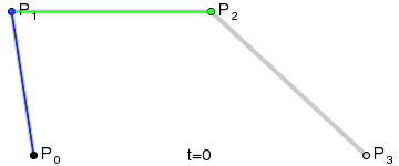
0% keyframe
from
100% keyframe
to
50% keyframe
@keyframes change-background {
0% { background: blue; }
50% { background: pink; }
100% { background: green; }
}
body {
animation: change-background 4s linear infinite;
}
Animation Properties
div {
animation-name: example;
animation-duration: 5s;
animation-timing-function: linear;
animation-delay: 2s;
animation-iteration-count: infinite;
animation-direction: alternate;
}
Animation properties can be defined individually, but for tidier code and ease of use, we condense them into a shorthand version.
div {
animation: example 5s linear 2s infinite alternate;
}
for the animation to function correctly, you need to follow the proper shorthand order AND specify at least the first two values.
Animation Properties
animation-name: name of the animation, how we bind the element to the keyframes
animation-duration: how long the animation runs from start to finish
animation-timing-function: Sets how the animation moves eg ease/linear
animation-delay: how much time to wait before starting the animation
animation-iteration-count: how many times to play the animation or to loop it
animation-direction: what direction the animation plays in
lets break down these animation properties.
Animation Timing Function
Enable you to control and vary the acceleration of an animation
Ok. Lets do this.
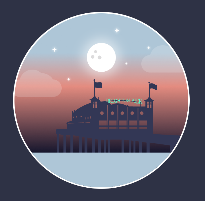
Animating a Gradient.
background: linear-gradient(to bottom,
rgb(183, 205, 220) 0%,
rgba(183, 205, 220, 1) 23%,
rgba(231, 151, 139, 1) 42%,
rgba(24, 24, 53, 1) 80%,
rgba(24, 24, 53, 1) 100%);
background-size: 100%;
animation: gradient 30s ease infinite alternate;
we're going to add a gradient to the artboard and animate it to get the three different colours of sky
day, sunset/sunrise and night
animation: name duration timing-function delay iteration-count direction
Animating the clouds
cloud1 { animation: float 3s linear infinite alternate; }
we want the clouds to float at slightly different rates from one another, so to do this, we're going to use animation delay
to make the clouds bounce, we're going to use translate(Y)
cloud2 { animation: float 3s linear 1s infinite alternate; }
Y
X
animation: name duration timing-function delay iteration-count direction
Animating the stars
animation: sparkle 1s ease-in-out infinite alternate;
In order to make the stars twinkle, we're going to animate the height from 10px to 3px
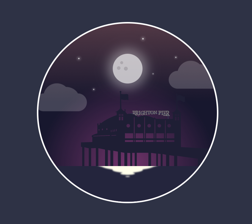
Hiding the night sky
.night {
position: absolute;
width: 100%;
height: 100%;
opacity: 1;
animation: night 30s ease infinite alternate;
}
we know that our timeline is 30seconds long,
we want to hide the night sky
animation: name duration timing-function delay iteration-count direction
Adding the sun back in
animation: sun 30s infinite ease-in-out alternate;
We want the sun to set so we're going to use transform:translateY() again to move it down the Y axis.
We can also have a bit of fun animating the box shadow.
Adding a bit more drama to the sunset.
.light {
position: absolute;
top: 30%;
width: 100%;
height: 100%;
opacity: 0;
background-image: radial-gradient(circle, rgba(163, 73, 144, 0.7), rgba(0, 0, 0, 0) 70%);
border-radius: 50%;
animation: glow 30s ease infinite alternate;
}
animation: name duration timing-function delay iteration-count direction
Waves
Using transform: translateY() and transform: scale()
We're going to create a tier of waves, each one in turn moving down the Y axis and scaling down until it disappears.
.waves {
position: absolute;
top: -30px;
left: 50%;
}
.wave {
position: absolute;
width: 220px;
height: 40px;
margin-left: -110px;
background: #FFFEEE;
border-radius: 50%;
}
.wave:nth-child(2) {
animation: wave 8s linear 2s infinite;
}
animation: name duration timing-function delay iteration-count direction
The Sea & Pier
Some really simple ones to match the colour of the sea and pier to the changing light.
@keyframes sea {
from {
background: #A7BFCF;
}
to {
background: #181835;
}
}
@keyframes pier {
from {
fill: #606079;
}
to {
fill: #181835;
}
}
animation: name duration timing-function delay iteration-count direction
Most properties that CSS can animate can be used to animate SVG's
Other ways to animate SVG
1. With Javascript.
There are a lot of awesome JS libraries out there to help with this. eg Greensock and snap.svg
2. SMIL. Synchronized Multimedia Integration Language.
There is a syntax for animations built right into SVG. Amongst the animation elements built into SMIL are:
<animateMotion> -which moves an element along a motion path.
<mpath> - used in conjunction with the animateMotion element to reference a motion path. The mpath element is included inside the animateMotion element, before the closing tag.
Lets add motion-path.svg to our HTML file and animate the plane around a loop.
<animateMotion xlink:href="#plane" dur="10s" begin="0s" rotate="auto" repeatCount="1">
<mpath xlink:href="#motionPath"/>
</animateMotion>
Bonus Rounds
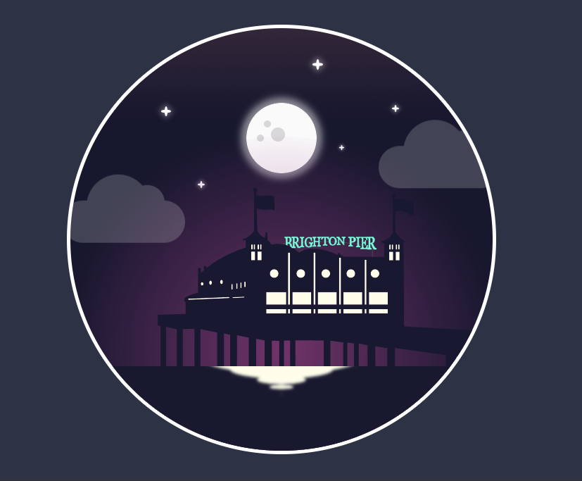
Have a go at lighting up the windows and brighton pier sign.
Make a boat. Try to utilise pseudo elements.
Animate a rocking movement, move it across the sea or make it sink. It's up to you!
This is a useful link if you get stuck making shapes with css

Copy of day2
By Roni C. De León V.


