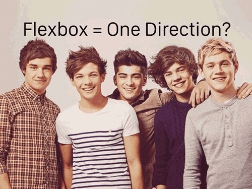
Flex your layout muscles
BY
RUPHAA GANESH
HELLO
let ruphaa = {
"job_title" : "Software Engineer- Frontend",
"product" : "Freshservice",
"desc" : "geek",
"message" : "Hey Everybody! Voila 😀"
};
What is Flexbox?
An Elegant Layout method for a more civilized age
Ordering items in single dimension

BTW,
what are its properties?
Flex-direction
row
row-reverse
column
column-reverse
Flex-wrap
nowrap
wrap
wrap-reverse
Flex-flow
<flex-direction> || <flex-wrap>
Align-items
flex-start
flex-end
center
stretch
baseline
Justify-content
flex-start
flex-end
center
space-around
space-between
space-evenly
Align-content
flex-start
flex-end
center
stretch
space-around
space-between
flex-grow
<number>
(default 0)
flex-shrink
<number>
(default 1)
flex-basis
<number> | <auto>
(default auto)
align-self
auto
flex-start
flex-end
center
stretch
baseline
order
<integer>
(default 0)
flex
<none> |
[<flex-grow> ||
<flex-shrink> || <flex-basis>]
(default 0 1 auto)
How do I build responsive layout?
<div class="parent">
  <div class="child child1">1</div>
  <div class="child child2">2</div>
  <div class="child child3">3</div>
  <div class="child child4">4</div>
  <div class="child child5">5</div>
  <div class="child child6">6</div>
</div>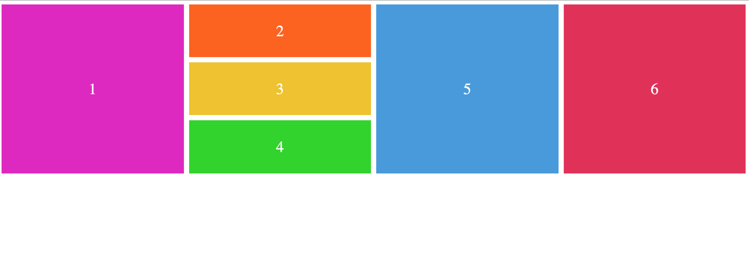
.parent {
  display: flex;
  flex-wrap: wrap;
  flex-direction: column;
}
.child1, .child5, .child6 {
  flex: 1 1 100%;
}

.child2, .child3, .child4 {
  flex: 1 1 25%;
}

.child2, .child3 {
  margin-bottom: 1rem;
}

.child5, .child6 {
  margin-left: 1rem;
}
.child1 {
  margin-right: 1rem;
}
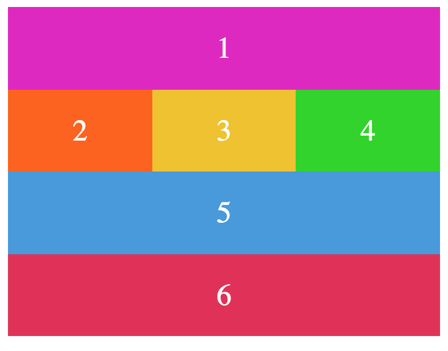
@media all and (max-width: 500px) {
  .parent {
    flex-direction: row;
  }
  .child {
    margin: 0;
  }
}
<div class="parent">
<div class="child child-1">[sidebar] 😎</div>
<div class="child child-2">[main] 🍕</div>
<div class="child child-3">1 🐯</div>
<div class="child child-4">2 🍿</div>
<div class="child child-5">3 🏸</div>
</div>
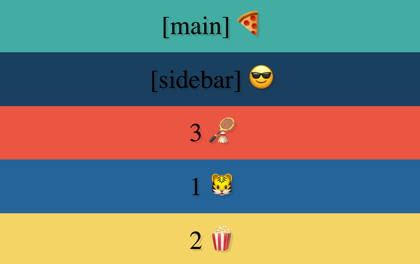

.parent {
  display: flex;
  flex-wrap: wrap;
}

.child {
  flex: 1;
  display: flex;
  justify-content: center;
  align-items: center;
}

.child-1 {
  flex: 1 1 33.25%;
}

.child-2 {
  flex: 1 1 60%;
}

.child-3 {
  flex: 1 1 30%;
}

.child-4, .child-5 {
  flex: 1 1 25%;
}
@media all and (max-width: 1040px) {
.child {
flex: 1 1 100%;
}
.child-1 {
order: -1;
}
.child-2 {
order: -2;
}
.child-3 {
order: 2;
}
.child-4 {
order: 3;
}
.child-5 {
order: 1;
}
}
@media all and (max-width: 500px) {
.child-3, .child-4, .child-5 {
flex: 1 1 20%;
}
}How do
they save my
life for
God's sake?

Navigation
Split Navigation

Centering an item (or) text
Card layout and sticky footer
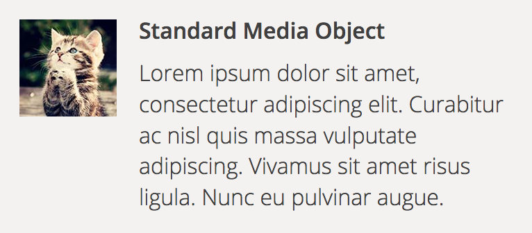
Media Object
Form Inputs


Browser Support

Chrome
21+
Edge
All
Firefox
22+
Opera
12.1+
Safari
6.1+
IE
10+
So what happens to the older IE versions?🤔

Awesome 🤩 Where can I learn more?
FUN RESOURCES
Serious Resources
> A Complete Guide to CSS Flexbox
> Flexplorer
> SmashMag - Flexbox Reading List
> Wesbos' Flexbox tutorial
> Flexbox Patterns by CJ Cenizal
> Flexbox Froggy
> Flexbox Zombies
> Flexbox Defense
> Flexy boxes
> Mini Project
Intro to Flexbox
By Ruphaa Ganesh


